Aug 31, 2022
Tips and Tricks for Power BI Map visualizations
Maps are one of the most important data visualizations for businesses these days. With the rise of globalization, companies are looking to expand and transcend borders. This makes it necessary to track and analyze data on a geographic level, presenting a new element of map visualization when making data-driven decisions.
Maps are one of the most important data visualizations for businesses these days. With the rise of globalization, companies are looking to expand and transcend borders. This makes it necessary to track and analyze data on a geographic level, presenting a new element of map visualization when making data-driven decisions.
What is a map chart?
Maps are one of the most important data visualizations for businesses these days. With the rise of globalization, companies are looking to expand and transcend borders. This makes it necessary to track and analyze data on a geographic level, presenting a new element of map visualization when making data-driven decisions. But how do you incorporate location-based data into your Power BI reports without diving into full-on cartography? Read on to find out how to keep business data at the heart of a Power BI map chart, and create stunning Power BI map visualizations using Power BI desktop.
When do you use a Power BI map chart?
A Power BI map chart can be used for many purposes. The most common ones are:
- visualizing environmental, sociodemographic, and health data
- mapping sales and marketing data
- monitoring production and equipment data by site location (e.g. mining sites)
Here are some use cases that show Drill Down Map PRO in action:
Latvian Export Barometer
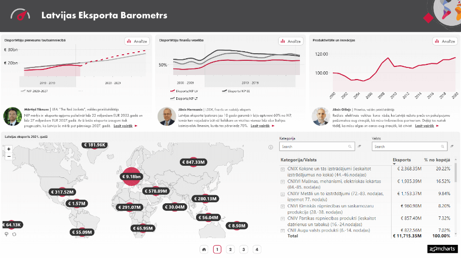
Drill Down Map PRO nestles neatly into this report as it shows a glimpse of Latvia’s international trade and is surrounded by line charts depicting different aspects of Latvia’s financial progress. The focus is kept strictly on financial numbers in relation to location, without diving too deep into geographical information.
Check out the full report here.
Sales Overview Report
Using the same custom visual Drill Down Map PRO, we can see it looks quite different thanks to its vast customization options. Here the map fulfills a more illustrative role, quickly giving the user an overview of sales in relation to their respective locations.
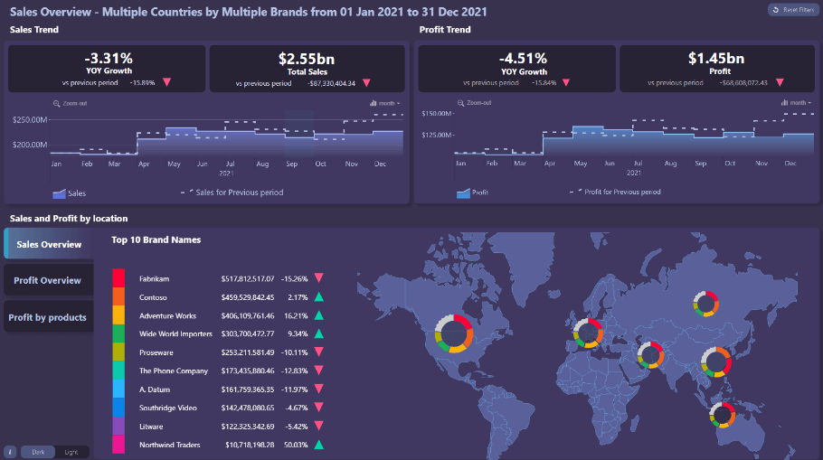
You can also check out this report here.
Microsoft Dynamics 365
Drill Down Map PRO can also be used to monitor manufacturing data. Here is an example of Microsoft using this custom map visual together with Drill Down Network PRO, creating a product that gives users the chance to gather actionable insights on the fly, tweaking their manufacturing process accordingly, thus avoiding any unprecedented drawbacks and delays.

What kind of maps can you make with Power BI
There are plenty map visualizations you create using Drill Down Map PRO. Here are just a few Power BI map examples.
Shape map
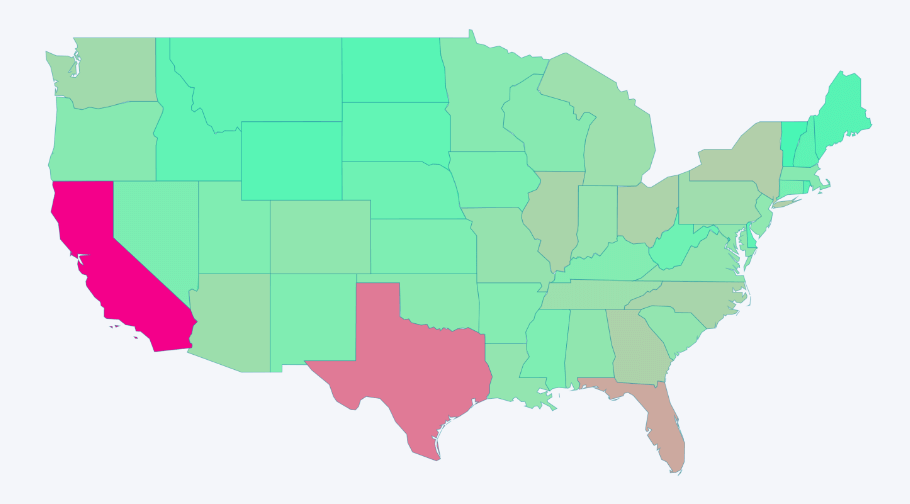
The shape map is a very basic map you can create in Power BI. The main purpose of a shape map is to compare regions by assigning different colors. Regions with higher values would show a more saturated color. This is one of the simpler types of maps you can create in Power BI, and is useful when your users don’t need to know any additional geographical data.

Heat map
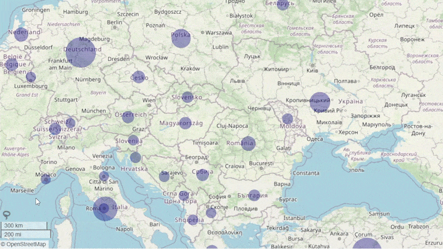
You’re probably familiar with the type of heat map you see during weather forecasts. Since Drill Down Map PRO keeps the focus mainly on business data, you can create a Power BI heat map that’s similar in concept using color saturation. By tweaking the opacity of the nodes, you can create a heat map that shows where data overlays in certain regions. As the nodes overlay, you can gauge hot spots through the intensity of their respective color. The result is a simple heat map provides an immediate visual summary of information.
Choropleth map
A choropleth map also uses the intensity of color to compare data. However, unlike the heat map, a Power BI choropleth map uses shapes, letting you stick strictly to regions. By removing the base layer and minimizing the node shapes, you can use diverging colors to gauge out intensity between certain areas.
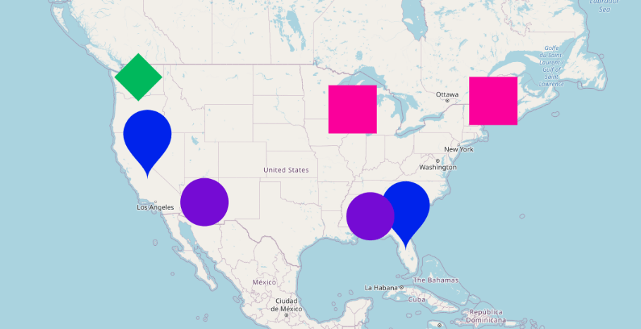
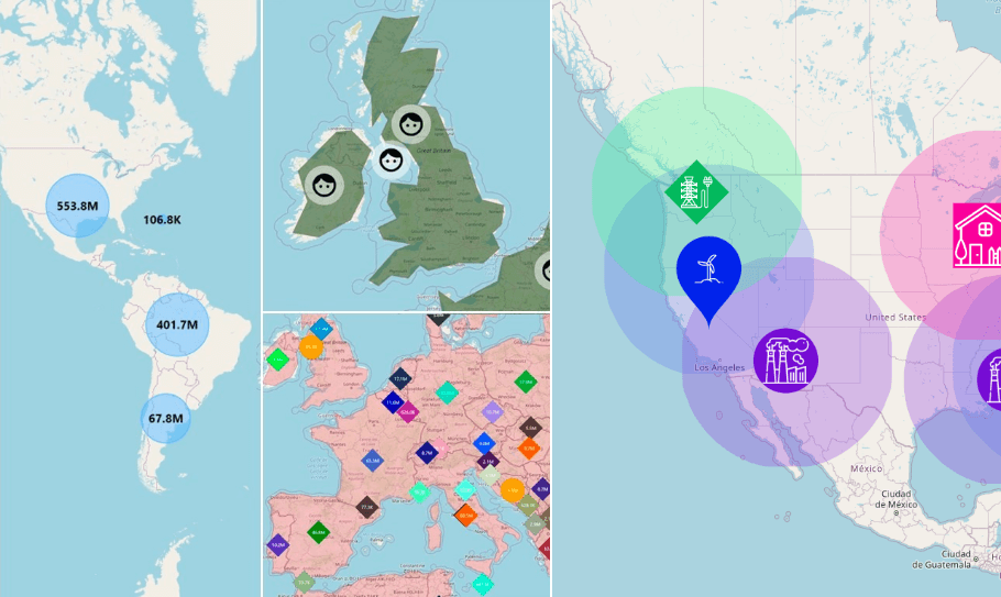
Bubble map
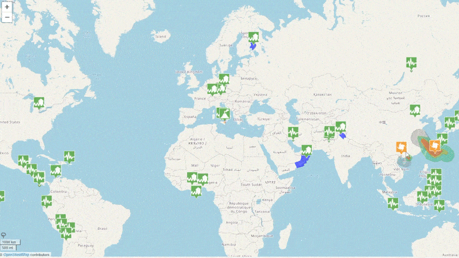
Bubble maps are also called node based maps. These maps use bubble size to display differences in data. Drill Down Map PRO lets you change the shape of the nodes, so you can choose between circles, diamonds, or droplets, depending on the preference of your end users.
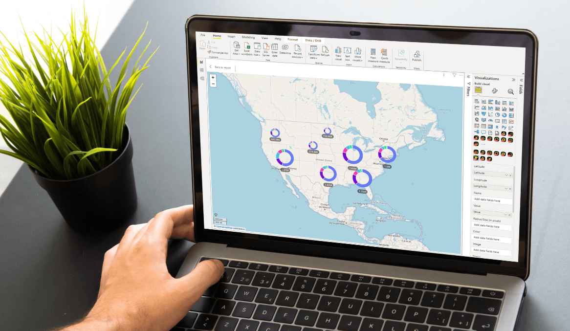
How to make a great Power BI map with Drill Down Map PRO
Drill Down Map PRO is a custom visual for Power BI that combines geographic data with business data – one of the most sought-after data visualization combinations in the age of globalization. This custom Power BI visual makes the report creator’s job easier by letting them simply fine-tune the interactive data visualization experience of their Power BI map, instead of heading into full on cartography. This is made possible through various customization options.
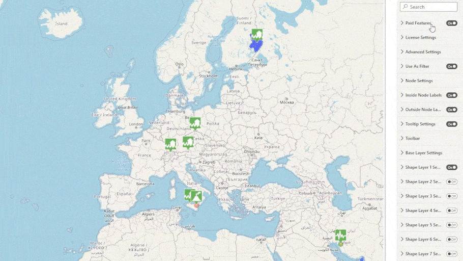
Base Layer Settings
After you’ve dragged and dropped in the custom visual, you’ll find a useful setting called ‘Base Layer Settings’. Simply go under formatting options, look at Base Layer Settings, and you’ll find four settings.
None
This could be considered the most confusing option - why would you want to have a Power BI map without a map? If you’re only in need of high-level information, using shape layers would be enough. Just a basic outline of countries, states, and cities will do – you don’t need to know about districts or other areas that deviate from the defined standard. In this case, you would end up with a Power BI shape map.
Power BI shape maps also come with the benefit of taking less time to load, as opposed to loading in a fully fleshed out map into Power BI.
Drill Down Map PRO supports up to 10 shape layers. This means you as the creator have the freedom to create your own hierarchy. For example, create a country layer, drill down to reveal a state layer, drill down again to reveal a county layer, and so on and so forth. You can also use your own custom shape files which can be provided as either a GeoJSON or KML after a simple Google search.
Image
This option lets you to use an image of a map as the base layer.
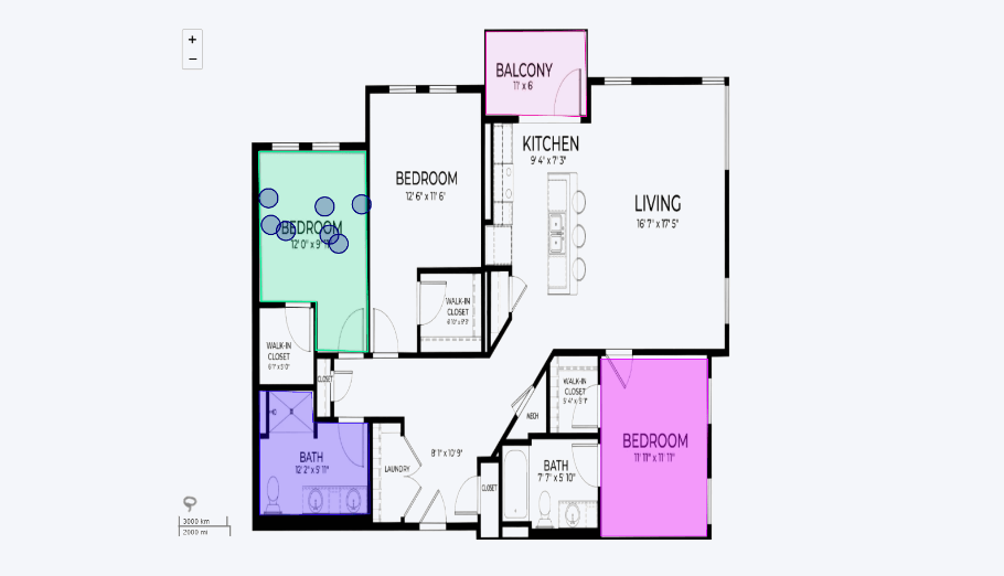
Since this option allows you to import an image as your Power BI map, it doesn’t have to always be a standard map. It can be a layout of a building, floor plans etc. You can also add nodes to display certain metrics. To filter and drill down, the lasso tool can draw shapes directly on the visual and save those for later.
Azure maps and Custom maps
You can also use maps from other providers, such as Google maps, Azure maps, CartoDB maps, Open Street maps and more. If you plan to use Azure maps, you will need to define the sub-domains and API keys.
For using any other custom map, you will need to provide the link to the tile server for the map by the provider of your choice.
More customization options
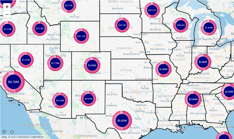
Drill Down Map PRO gives the report builder full control over creating the data visualization experience of the map chart. You can choose from multiple node shapes. You can add auras, assign a different color for each node category, adjust node sizes, fonts, and labels.
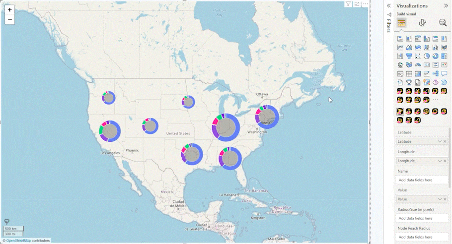
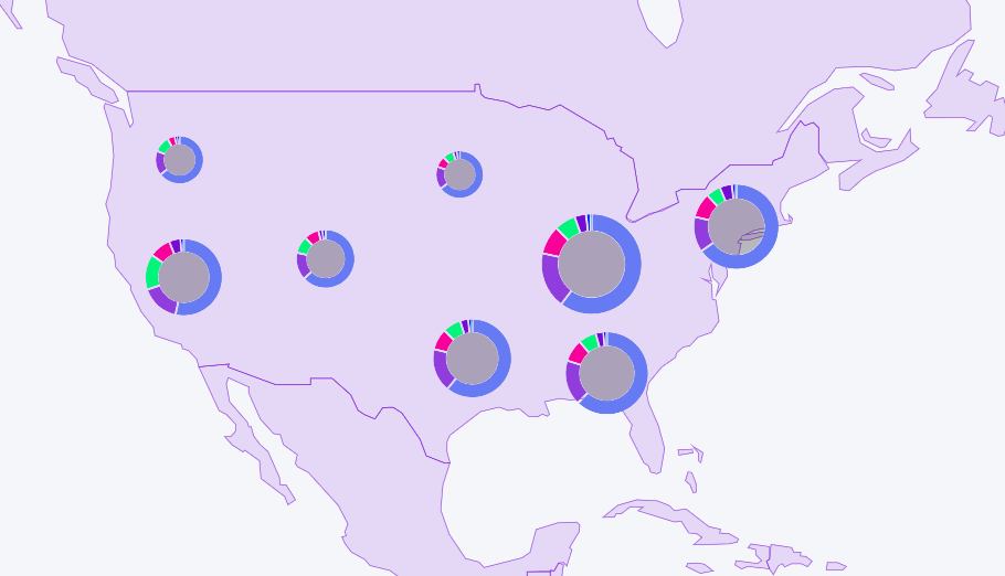
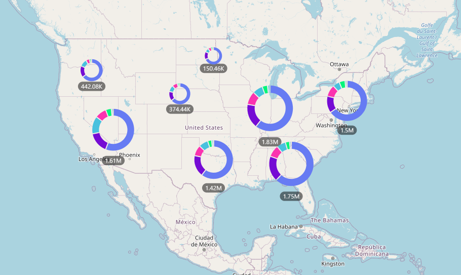
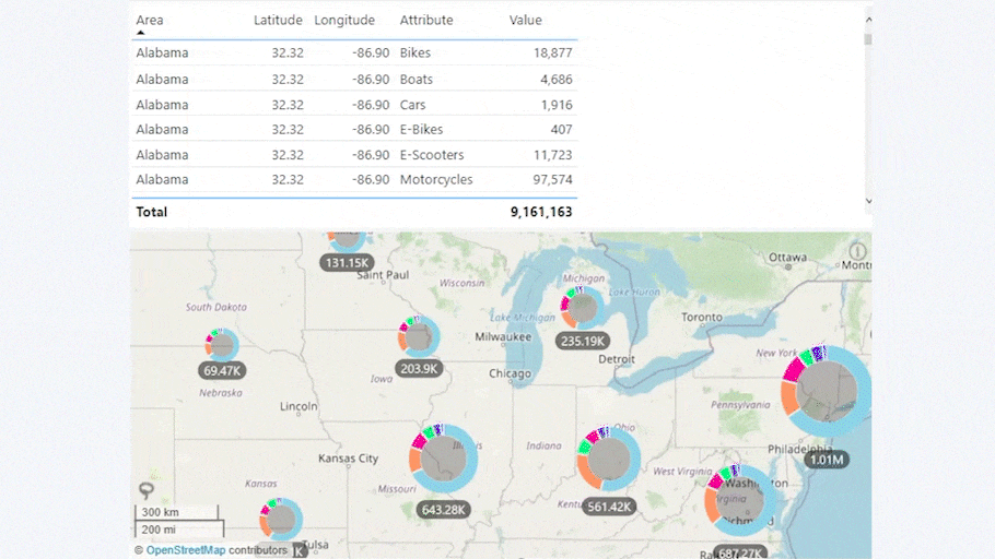
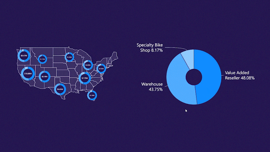
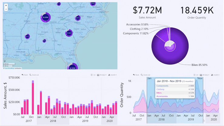
To additionally display a different type of data onto your Power BI map, you can turn clustered nodes into donut charts. When grouping data in clusters based on their location and proximity, turning them into donut charts will show the contents of the cluster. Data will be automatically grouped by the category field, and slices will act as category filters.
You can add a multi-page tooltip to show additional information for each category. A neat detail that enhances user experience is the navigation arrows that let users browse more information.
How do I navigate a Power BI map chart?
The basic controls for navigating a Power BI map chart are quite simple. You left click on the Power BI map itself and you move it in any direction. This allows you to quickly move between different areas of the map itself that you are using in your base layer.
Cross-chart filtering
You can left click on nodes and donut charts to apply filters. To clear any selections, simply click outside on a part of the Power BI map chart where there are no active elements.
Drill Down Map PRO also applies cross-chart filtering with other Power BI visuals. For example, here is an instance using Drill Down Donut PRO. This donut chart can be used as a filter that helps quickly navigate the user to a certain point on the map.
Drill Down Map PRO really shines when using additional Power BI visuals that showcase business data, giving them a geographical context. Using other custom visuals such as Drill Down Timeline PRO, Drill Down TimeSeries PRO, Drill Down Combo Bar PRO, you can create a fully-fledged report that showcases all the data your end users want to see.
Tooltips
Right click, on the other hand, calls out a tooltip when you're using single nodes. Keep in mind that when you are using clusters, you're calling out a multi-page tooltip.
Zoom
Zoom-in and zoom-out are also important interactions when it comes to analyzing a Power BI map chart. To perform a zoom action, simply scroll the wheel of your mouse. You can also use the zoom buttons which are in the upper left corner or simply double click as another way to zoom in.
There are more interactions you can perform with Drill Down Map PRO that prove useful for effective data analysis. To find out how to perform them, you can watch this free guide.
Lasso tool
With Drill Down Map PRO, you can create additional custom filters with the lasso tool by drawing directly on the Power BI map visual. The lasso tool comes in handy when you need to quickly check something that isn’t already a standard shape within the Power BI map. If your end users wish to perform ad hoc analysis and answer a question on the fly using your report, the lasso tool will let them do exactly that.
Sometimes pre-defined shapes just aren’t what you’re looking for. Using the lasso tool, you can draw any shape you want, then save it as a filter for later. Keep in mind that end users can also create their own filters on-the-go but won’t be able to save them for later use.
Summary
Drill Down Map PRO for Power BI is the tool to have when you need to incorporate geographical data into your report or dashboard. Specifically designed to be used by report creators, the focus is left on interactive data analysis of geographical information, without the need to dive into full-on cartography. Intuitive controls help end users feel comfortable when making major decisions using location-based data.
You can start making your own maps now by getting Drill Down Map PRO now!
Want to experience Drill Down Map PRO in action? We have a video demo ready with the best tips and tricks when working with this custom visual! You can watch it now here.

Want more info like this?
Subscribe to our newsletter and be the first to read our latest articles and expert data visualization tips!