Oct 18, 2022
Create a Power BI Org Chart & More with Drill Down Graph PRO
Drill Down Graph PRO is one of our most advanced data visualization tools, and in this article, we will explore the many ways you can use it in your Power BI reports, including org charts, AML graphs and more. Furthermore, we will go through some tips & tricks on how to create graphs in Power BI with this powerful visual.

Drill Down Graph PRO is one of our most advanced data visualization tools, and in this article, we will explore the many ways you can use it in your Power BI reports, including org charts, AML graphs and more. Furthermore, we will go through some tips & tricks on how to create graphs in Power BI with this powerful visual.
Creating a basic organizational chart isn’t a hard task, and you can do that even in Word. However, creating an interactive Power BI org chart that supports various drill down features and is smooth and responsive on PCs and touch screens alike? That’s a whole different ballgame, and if you feature a well-made graph chart in your report, you can impress your users and make your data easier to navigate.
For a long time, there wasn’t any way to create an interactive Power BI graph, but that changed when we released Drill Down Graph PRO. If you want to create network graphs or link charts that show the relationships between tens, hundreds or even thousands of nodes, there isn’t any substitute for this Power BI graph visualization.
It is one of our most advanced data visualization tools, and in this article, we will explore the many ways you can use it in your Power BI reports, including org charts, AML graphs and more. Furthermore, we will go through some tips & tricks on how to create graphs in Power BI with this powerful visual. Let’s dive in!

What are Power BI graphs?
Each tool is best suited for a specific job. For example, if you are visualizing category-based data, you can create a simple donut, bar, or column chart. However, when you introduce hierarchies and relationships into the mix, things can get more complicated, and that’s where Power BI graphs come in.
Almost everyone has used or created a flowchart at some point, and it’s the most rudimentary way to display a hierarchical data structure. Most flowcharts are made up of nodes (or vertices) that branch out into sub-nodes, and their relationships are denoted by links (or edges) that connect them.
Flowcharts are popular because of their simplicity. However, when you have hundreds or thousands of nodes with complex and inter-connected relationships, they can get cluttered and hard to read. With data visualization software getting more advanced, one of the solutions for this conundrum emerged in the shape of Power BI force directed graph charts. Drill Down Graph PRO introduces the ability to create such graphs in Microsoft Power BI Desktop.
Use Cases for Power BI Graphs
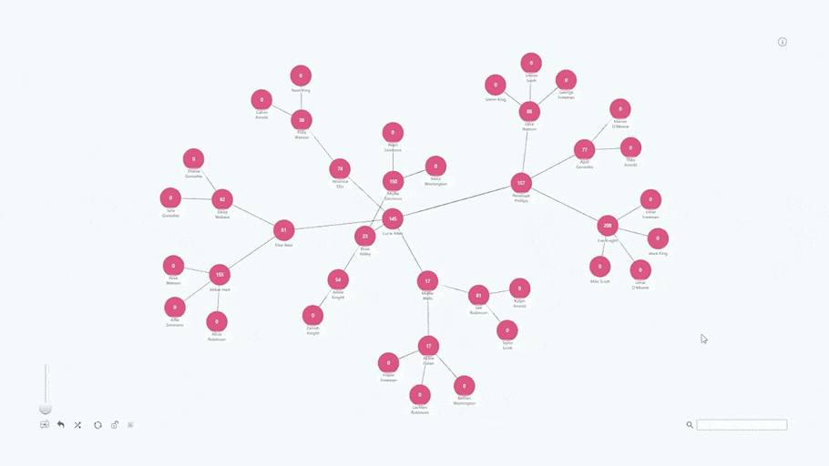
If you need to visualize your network and show hierarchies, dependencies, and relationships, then Drill Down Graph PRO is just the tool for the job. With it, you can display a large number of nodes in neat and tidy force-directed graphs that will space out the data and prevent the nodes from overlapping. In addition, you can visibly show the relationships by using bidirectional links.
Think of anything that a flowchart can do, and chances are that Drill Down Graph PRO will do it even better. Here are some Power BI graph examples of how our clients use Drill Down Graph PRO to create stunning and information-rich reports.
Power BI org charts
Org charts have been a staple of the business world since the 19th century, and almost any organization uses them to visualize the organizational structure in a simple and apparent way. However, modern organizations have thousands of employees who work in various departments across the entire world. That’s why it’s easy for things to get out of hand when using a regular org chart.
With Drill Down Graph PRO, you can create a neatly structured and easy-to-read Power BI org chart that does not overwhelm the user with the sheer amount of nodes, links and labels. There are many interactive features that you use to find the department or employee you need, such as the search bar or drill down. You can even highlight specific workgroups with auras.
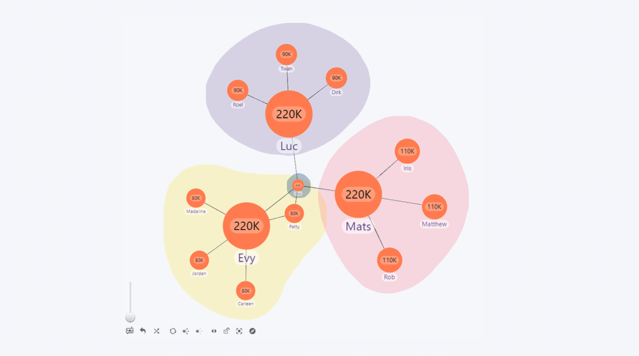
Another useful feature to simplify your Power BI social network graph is Focus Nodes, which lets you show only the most important nodes in the default view. You can use it to create nodes for each department manager, and let your users click on them to see the entire staff that’s working in that department.
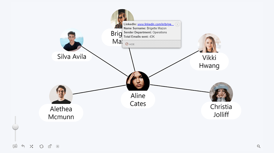
Furthermore, you can add an employee picture to each node, and attach a hyperlink to their LinkedIn profile or e-mail address in the tooltip.
Information Technologies
Even for the most experienced IT professionals, keeping track of complex IT infrastructures can prove to be a hassle. When your company operates multiple servers and hundreds of end user devices, you need a tool to visualize your assets in a visually apparent way.
If you’re building or maintaining a network infrastructure, Drill Down Graph PRO is a handy tool to create a network diagram that maps all your servers, routers, switches, client devices and other equipment. You can then use the fully customizable links to visualize the connections between each device, and mark subnetworks with auras.
A clear and well-organized Power BI network graph visualization will prove its worth when you’re performing diagnostics, resolving issues, or, in the worst-case scenario, identifying attack vectors and limiting damage during a cyberattack.
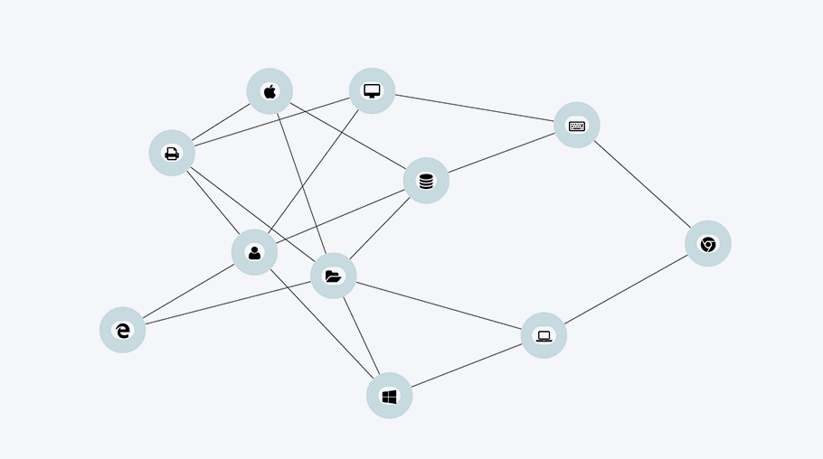
Drill Down Graph PRO is also an incredible tool for asset management. In addition to the core infrastructure, you can easily keep track of all your client devices, such as computers and their peripherals, smartphones, tablets, etc.; and you can list each software license as a subnode to the corresponding device. To declutter the graph, simply mark the devices as focus nodes, and all the software licenses or peripherals will be collapsed until you drill down.
Finance and Banking
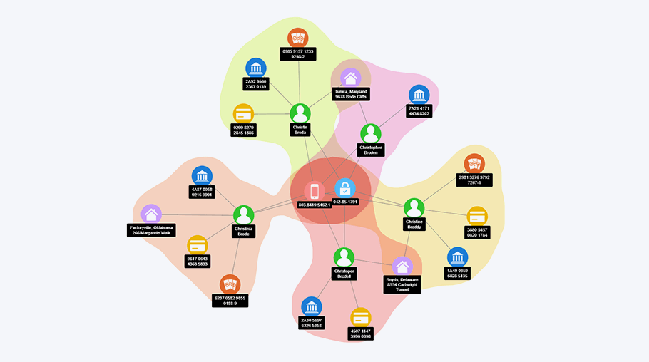
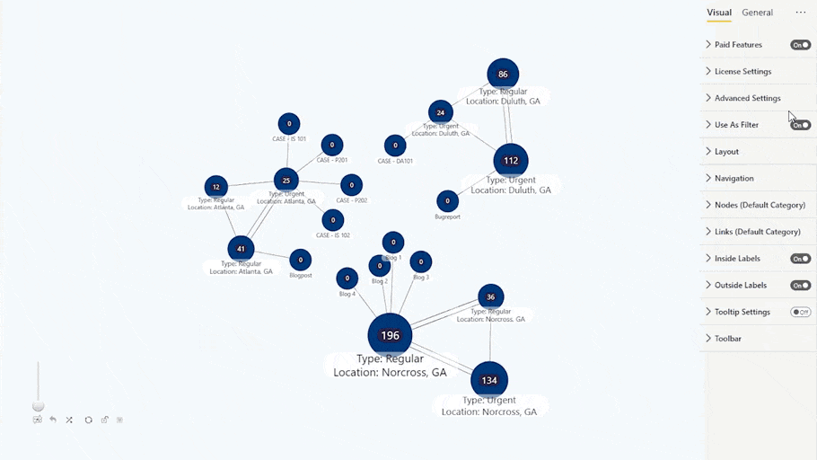
With money laundering techniques getting more complex and intricate, the tools used to monitor and analyze money trails should become equally advanced. That’s why Drill Down Graph PRO will be a great addition to any AML compliance officer’s toolbox. With it, you will be able to create interactive AML control graphs that are easy to explore and analyze.
When tracking thousands of transactions spread across various involved persons, what you’ll usually end up with will be a very crowded and cluttered graph. That’s why the extensive filtering and drill down capabilities will come to aid when trying to spot patterns and connections. Furthermore, you can visually distinguish suspected parties with colorful auras.
Benefits of Drill Down Graph PRO
Drill Down Graph PRO is an incredible way to display complex networks with a large amount of mutually interlinked elements. While their basic principle is very similar to regular flowcharts, this tool is scalable to any network size.
Interactive & easy-to-use
If you want to make a simple family tree or an org chart for a small business, you can easily do that with just a few clicks. Conversely, if you need to lay out a huge and complex network with hundreds of nodes, Drill Down Graph PRO will make it easy to navigate this data and find exactly what you need.
These graphs are truly interactive, and you can zoom in, drill down and explore each node. If you want to quickly find a specific node or category, simply filter them with the search bar.
Rich customization
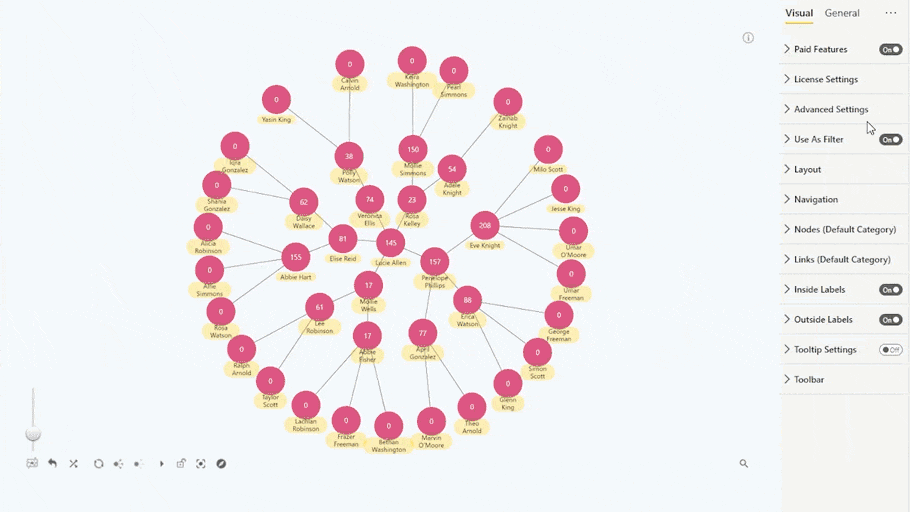
There are multiple ways you can visually distinguish different categories, hierarchy levels or node types to make your graph easier to read. For example, you can change the color, shape, outline, and other properties of a single node, or apply formatting to multiple nodes of the same hierarchy level or category. Another way to signify that a certain cluster of nodes belongs to the same category is with auras, which will highlight an area in a color of your choice.

Cross-chart filtering
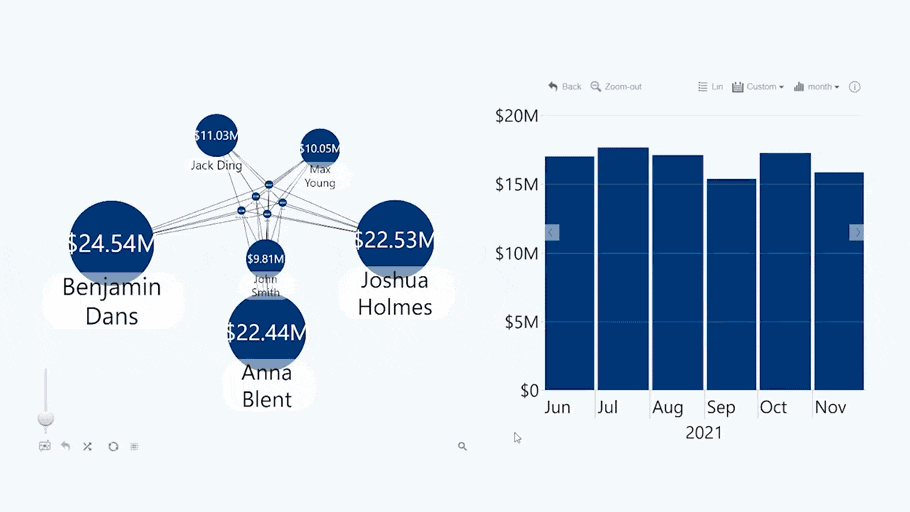
Of course, like all ZoomCharts visualizations, Drill Down Graph PRO has cross-chart filtering. This feature allows you to create interactive reports that are an absolute joy to navigate, and each visualization will work together to bring you the exact data you need to see, without the need for any slicer menus or other specific controls.
As an example, let’s imagine that you have created a Power BI sales report that features a Drill Down Graph PRO visualization of all your sales departments, and a Drill Down Timeline PRO chart of all the sales activity within a set period. If you select multiple sales agents on the graph, the timeline chart will automatically show only the sales that were made by the selected people.
This is just one example of how to make a graph in Power BI with our Drill Down Visuals, and we recommend browsing our Use case gallery for inspiration.
How to create a graph in Power BI with Drill Down Graph PRO
After reading a couple of examples of how you can use Drill Down Graph PRO to make your reports more exciting and interactive, you probably have a few ideas of your own. Here’s a quick Power BI graph tutorial to explain how to get started with this visual in a couple of steps and create stunning Power BI graphs. However, if you want to delve deeper into our powerful visualization tools, we recommend visiting ZoomCharts Academy!
Step 1: Define hierarchy
In a link graph, the nodes are connected based on their relationship, hence your data source needs a clearly defined hierarchy. Before Drill Down Graph PRO can visualize your data, you’ll need to provide info for three fields – source node, target node, and value.
-
Source node is the parent of a node. In this field, you should define which node precedes the particular node in the hierarchy.
-
Target node is the child of a node. They are one or multiple nodes that will succeed the specific node in the hierarchy.
-
Value field contains the information related to the node. If it’s numerical data, the visual can also automatically adjust the node sizes according to their values.

These are the three mandatory fields that are required by Drill Down Graph PRO, but you can also provide additional data. For example, one such field is Focus Node, which can define which ones are focus nodes (1) and which ones are not (0).
Step 2: Choose the layout
Once you have entered your data, it’s time to make the graph look exactly how you need. The first choice you should make is what layout to use. This visual has three dynamic layout options.
-
Dynamic
-
Hierarchical
-
Radial
Dynamic layout is the most flexible choice, and it will space out the nodes across the entire dimensions of your graph. However, if you need your data arranged in a certain order, hierarchical layout will be the best choice. Lastly, radial layout will be best suited for compact charts that need to be screen-space efficient.
You can then adjust specific settings for each layout. For example, hierarchical layout will have several options for the orientation, smart ordering, and node spacing. Feel free to try out these options to create your perfect graph!
Step 3: Customize your nodes
Whether you want to display the difference between various levels of hierarchy, set apart different kinds of data, or simply make your chart look more fun, you’ll find the wide range of formatting options handy. You can make these adjustments on all nodes, multiple nodes of the same category, or a particular node.
Distinguish different nodes or node groups with custom color, shape, and outline options, or even add custom images. If you want to adjust the size of the nodes manually, simply modify the Size field. Furthermore, you can customize the formatting of the labels, and choose whether it’s shown inside or outside the node. There’s also the option to choose between Power BI’s native tooltips or our custom solution, and you can add extra info or even hyperlinks to them.

We recommend that you play around with all these features to explore the full power of Drill Down Graph PRO!
Step 4: Customize the links
In a graph that needs to clearly show the relationships between various elements, the links connecting your data are just as important as the nodes themselves. That’s why Drill Down Graph PRO offers you peerless customization options that give you full control over how your data relationships and hierarchies are displayed in your Power BI graphs.
Sometimes two nodes can have symbiotic relationships, and in those cases, the ability to make bidirectional links will prove to be very useful. You can do that by customizing the decorations at either end of the link and choosing between none, arrow, or circle. You can even connect the same two nodes with multiple links.
You can then apply labels to each link, which is a great way to easily explain the relationship between the nodes. For example, if you’re building a graph of your IT infrastructure, you can use link labels to denote whether two devices are connected via Ethernet, Wi-Fi, or other connection types.
Use Case: Power BI Org Chart in an HR Report
Here’s a great example of how you can integrate a Power BI org chart into your report. As the centerpiece of this HR Workload Overview report, the graph visualizes the company structure and literally gives a human face to the numbers.
Here, the org chart provides a helpful reference to the HR worker using this report and gives more context to the data in the surrounding visual – but this report takes it even further by using it as a navigation tool as well. All visuals work together, and as you filter data in one chart, it gets applied to the entire report.
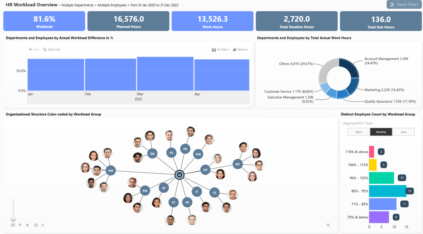
For example, you can click on a specific employee or department node (use the search bar to quickly find the one you need). The KPI cards on the top will instantly provide a summary of their workload, whereas the time series chart will show the employee’s historical data.
Conversely, as you filter data in the other visuals, the org chart will show only the relevant departments or employees. Use this to quickly find the overachievers in your office – simply click on the top percentages in the bar chart on the right, and the org chart will reveal who they are (so you can know how many Employee of the Month certificates you will have to print). Similarly, the donut chart can quickly filter the entire report to specific departments, or you can select a specific time period on the time series chart.
Words do no justice to how great this report looks and feels in action, so we invite you to play around with the live demo and try it out for yourself! What’s more, you can download the free .pbix file and try it out with your own data. Check it out!
Conclusion
A link graph or network graph in Power BI are the best way to visualize complex relationships or hierarchies, and, with Drill Down Graph PRO, you can finally create slick and interactive Power BI graphs.

Want more info like this?
Subscribe to our newsletter and be the first to read our latest articles and expert data visualization tips!