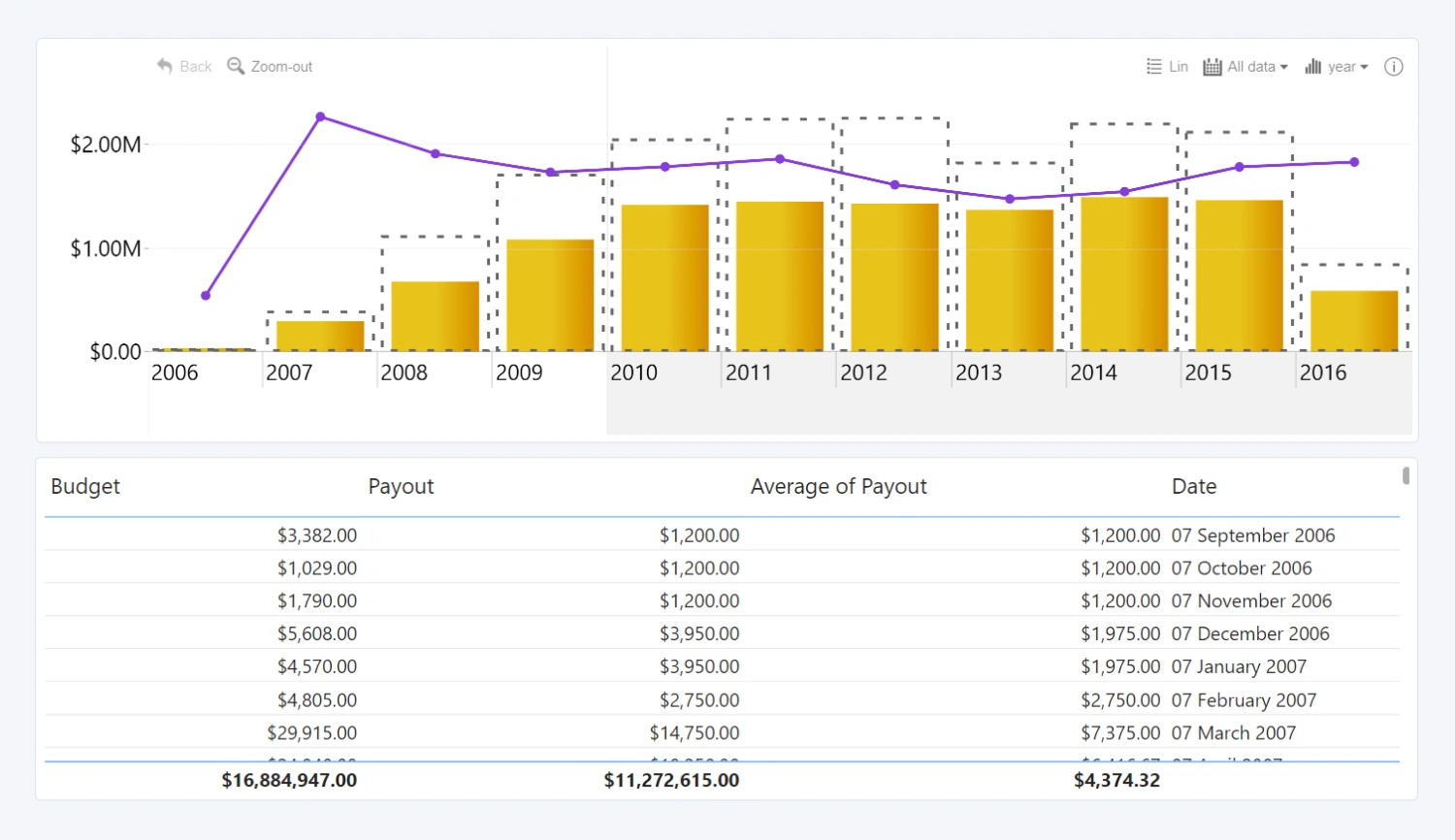
Perform a multi-level analysis of your data and explore your timeline in a simple and comprehensive way with Drill Down TimeSeries PRO. With this visual, you can build stunning and interactive time series charts from date/time data with just two mandatory fields. You can even feature up to 25 different series on the same chart for an all-encompassing data storytelling narrative.
Before you begin
This visual is designed for date/time based data. Your data set will require a column that contains a date/datetime value to create data points on the x-axis, and one or multiple series with numerical values that the visual will use to visualize each data point on the y-axis.
Drill Down TimeSeries PRO is a different visual from Timeline PRO. You can read a detailed comparison between the two visuals in this blog article.
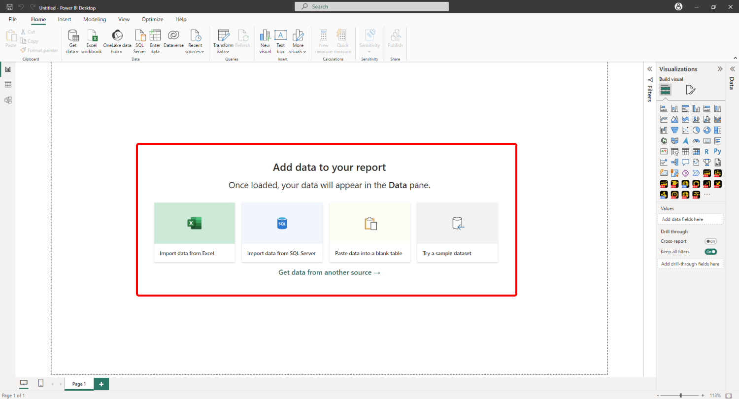
When you create a blank Power BI report, you will be presented with multiple options: you can import your own data, paste it into a blank table, or try a sample data set that’s provided by Power BI. The latter option is recommended if you want to experiment with the features of Drill Down TimeSeries PRO without using your own data.
Adding Drill Down TimeSeries PRO to Power BI
If you have downloaded this visual from Microsoft AppSource within Power BI Desktop, its icon should automatically appear in the Visualizations pane on the right side of your Power BI window.
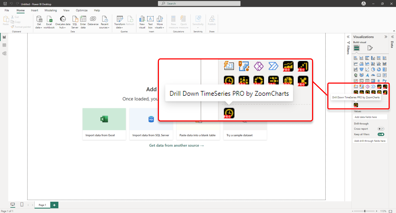
If you have acquired Drill Down
TimeSeries PRO externally, you may need to add it to Power BI manually. You can
do that by clicking the ellipsis button at the end of the visualizations list,
and pressing Import a visual from a file. Locate the .pbiviz file and
the visual will be added to the Visualizations pane.
Creating a time series chart with Drill Down TimeSeries PRO
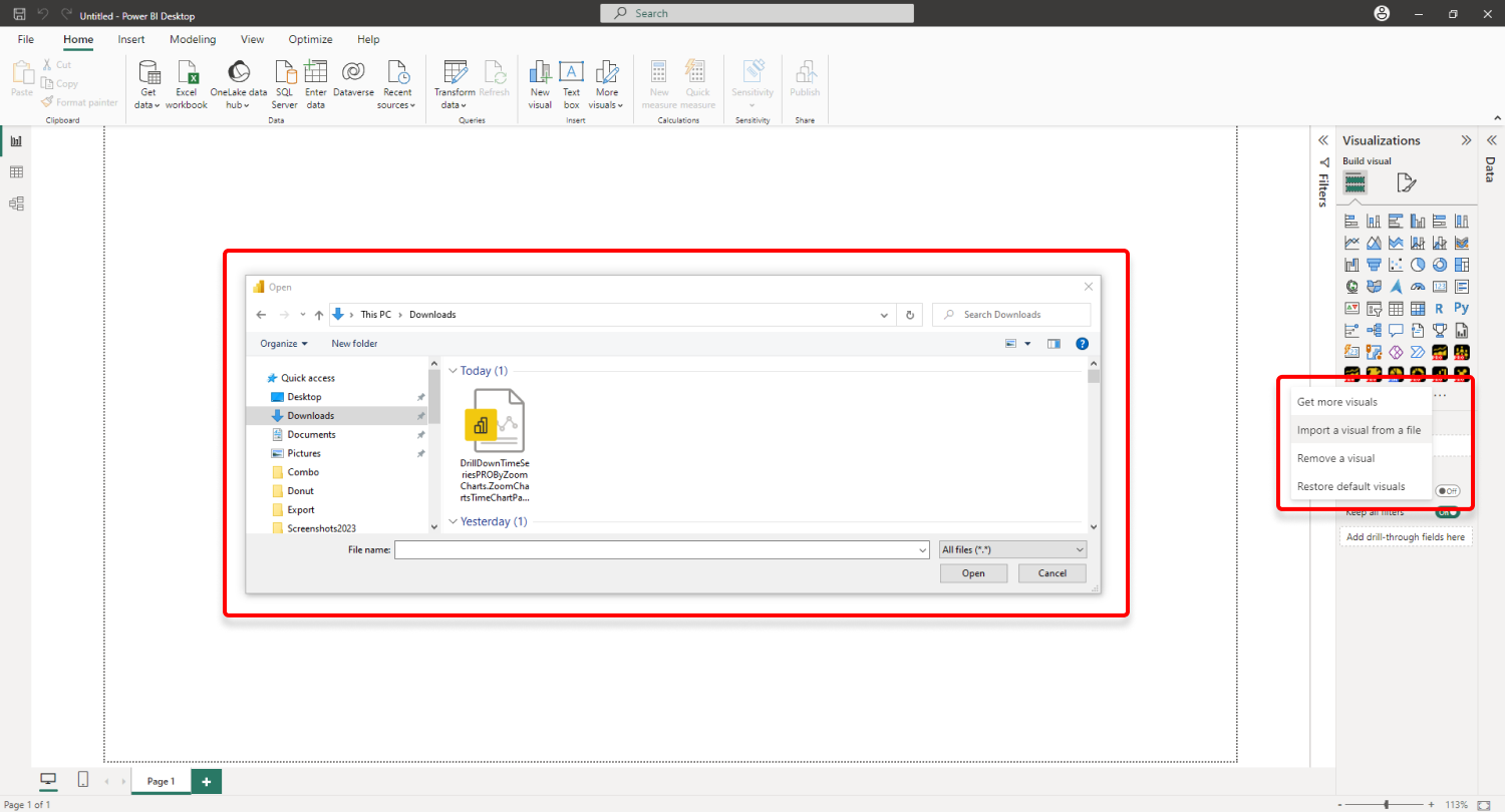
Add Drill Down TimeSeries PRO to your Power BI report by
clicking the visual’s icon in the Visualizations pane. Doing so will
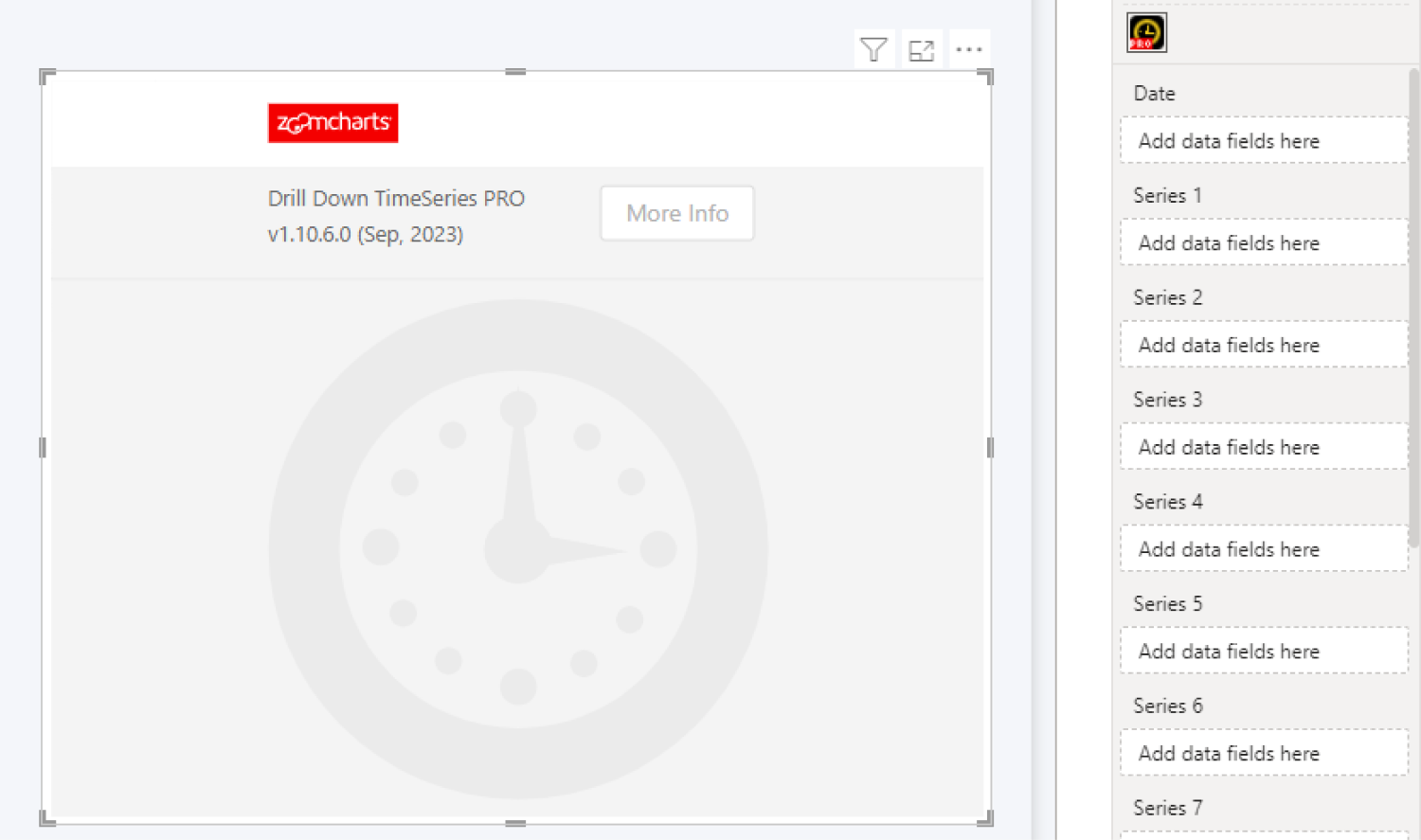
create a blank visual that contains no data. Once you add at least one valid
column in each of the required fields – Date and Series –
TimeSeries PRO will visualize your data (as columns by default). You can read
more about the required fields on this page.
This visual functions similarly to Drill Down Combo PRO by visualizing the
values of each x-axis data point as columns, lines, or areas on the y-axis.
However, unlike Combo PRO which uses its Category field to create points
on the x-axis, TimeSeries PRO creates points for date/time units instead, and
uses the Date field to assign each value within the series to a specific
date or time.
TimeSeries PRO has a single Date field for date/time units. Timeline PRO, which is another ZoomCharts custom visual, has Date Hierarchy and Date Value (X-Axis) fields instead.
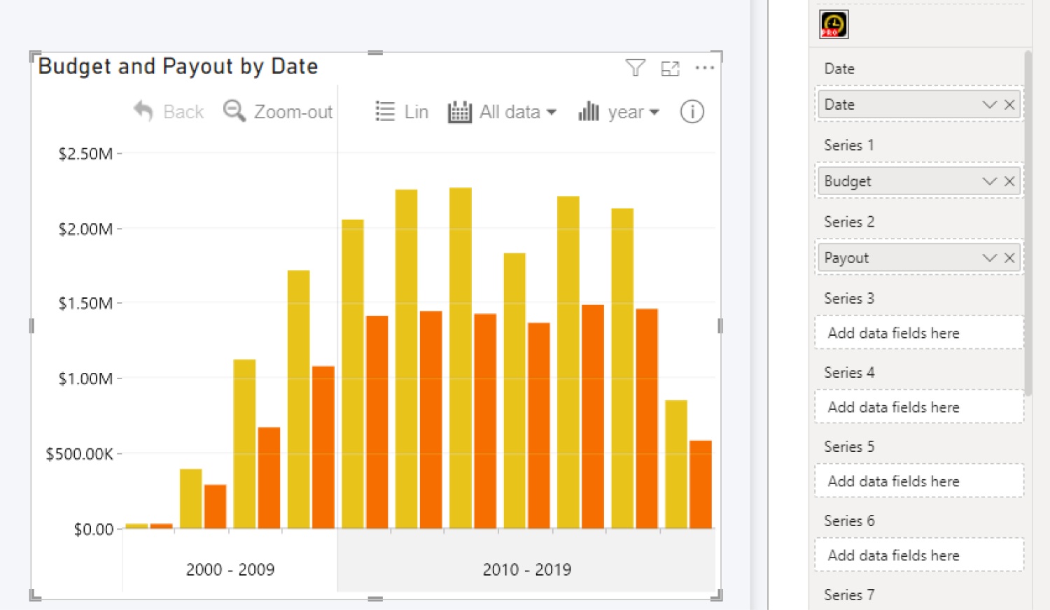
The visual also requires at least one series of numerical
values, and once you’ve added a valid column to the Series 1 field, the
visual will create a time series chart. Each Series field can contain
only one column, so if you want to display additional series on the same chart,
you can add each column in its separate field (Series 1, Series 2, Series 3,
etc.).
You can now explore the Formatting Options to customize the
look and behavior of your chart. Head to the Series Configuration menu
for each series to change the chart type, adjust color fill and outlines,
change series width, adjust clustering or stacking behavior, and many other
settings.
Format Visual tab also contains various options to
adjust global formatting settings, customize legends, tooltips, thresholds and
more, or enable a secondary Y-axis. If you want to enable cross-chart filtering
to use this visual as an interactive filter for the entire report (or vice
versa – filter your time series chart with other visuals), you can do that with
the Use as Filter toggle.
Was this helpful? Thank you for your feedback!
Sorry about that.
How can we improve it?