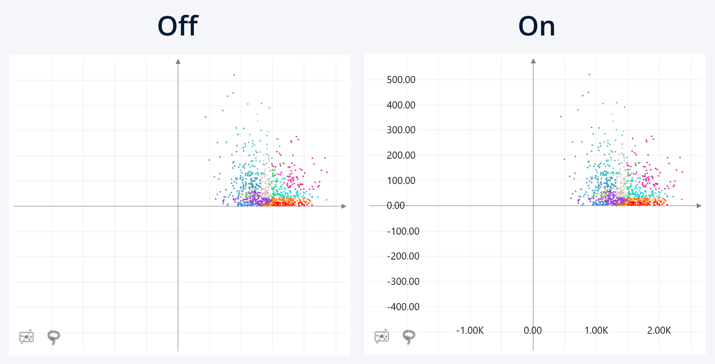
Use this toggle to show or hide the axis scale labels on the
scatter chart. By default, this setting is enabled.
This setting affects only the ‘axis scale’ element of the
value axis, and other elements like axis line, gridlines, axis titles, or
regression lines will still be visible as long as their respective settings are
enabled.
By default, this setting affects both value axes. If you have enabled the Configure Axes Separately toggle, this setting will be located in the Value Axis X and Value Axis Y sections of the Format Visual tab, allowing you to adjust each axis separately.

Was this helpful? Thank you for your feedback!
Sorry about that.
How can we improve it?