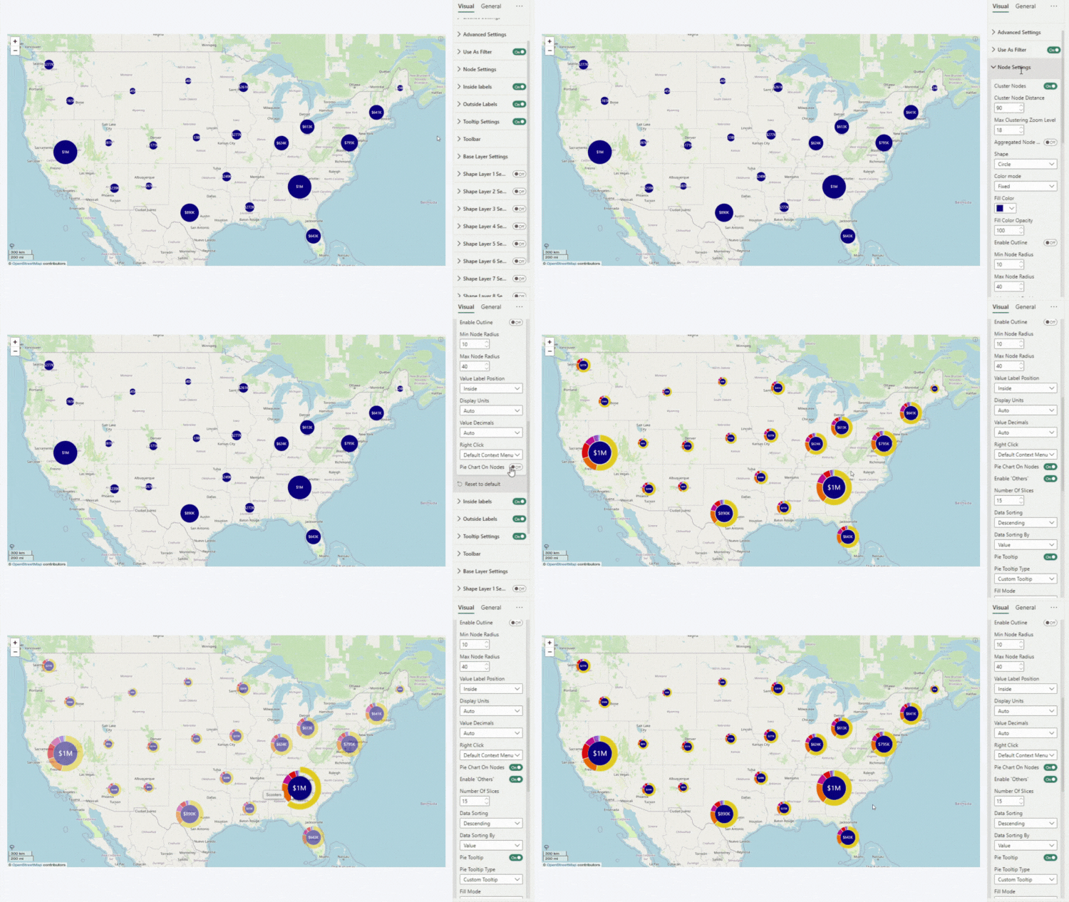
Are you using Cluster Nodes and you want to provide quick and simple insights about the data within each cluster? With Drill Down Map PRO, you can turn each cluster node into a pie chart by enabling the Pie Charts on Nodes setting.
This feature will place small and easy-to-understand pie charts directly on the map, visualizing the data within each cluster node. It will use the Category and Value fields to create slices and determine their sizes, providing valuable insights about the specific location at a glance. Furthermore, users can click or tap on a slice to quickly filter by category.

Was this helpful? Thank you for your feedback!
Sorry about that.
How can we improve it?