About FP20 Analytics ZoomCharts Challenge
Want to learn to build PRO reports? With personalized feedback and informative workshops, this is your opportunity to take your report-building skills to the next level, build your professional portfolio, and network with like-minded people.
The ZoomCharts challenge is hosted in partnership with FP20 Analytics – a group that unites passionate and inspiring data enthusiasts, and helps new data analysts improve their skills and build a competitive portfolio. Join in and sharpen your skills together with this open and friendly data community. Read more about the challenges on the FP20 Analytics website. Join the community on LinkedIn.
Participate in FP20 Analytics ZoomCharts Challenge to enrich your skill in creating PRO reports that help business users explore data quickly and intuitively.
- Free License: All participants receive a free ZoomCharts Developer License that gives access to the full Drill Down PRO visuals library. License will remain active for 1 year after the challenge.
- Learn from Experienced Professionals: As part of the challenge, we host live workshops on report building and visualizing the challenge’s dataset in Power BI. Challenge participants can also book an individual consultation with an experienced Power BI mentor to ask questions and get personalized tips.
- Tailored Feedback: Every challenge submission will receive personalized feedback, giving participants the chance to hone their skills and improve their reports.
Prizes
The best report’s creator will receive a $300 Amazon gift card from ZoomCharts. The ZoomCharts winner will be announced in a special live webinar session on July 25, where we will review the Top 5 entries from the challenge.
Webinar recordings
How to participate in FP20 Analytcis challenge with ZoomCharts?
1. Register for the challenge:
- Register for the FP20 Analytics ZoomCharts Challenge using the form on this page.
- Download the Challenge dataset on this page or from FP20 Analytics website.
- Activate your free Drill Down Visuals Developer License for Power BI. Read license setup instructions.
- Read the challenge brief (see "The Brief" section) for additional info about the dataset and to see what questions your report should answer.
2. Build your report in Power BI:
- Set up an account in Power BI using the assigned license details (if you have participated in ZoomCharts Challenges in the past, you can use the same account you set up before).
- Use the account to access the full library of custom ZoomCharts Drill Down visuals.
- Use the dataset to build a Power BI report including at least 2 ZoomCharts Drill Down Visuals in one report page.
- The recommended number of pages in the report is up to 3 pages, including drill-through pages.
- Canvas size is 16:9 (Default Power BI size) or Full HD size = w:1920 - h:1080
3. Improve your report and learn new skills:
- To learn more about applying ZoomCharts visuals in your reports, participate in the challenge workshop.
- If you have any questions or need advice, you can book a free individual consultation.
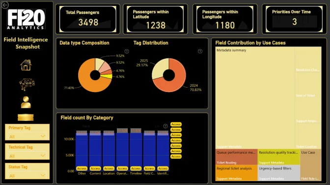
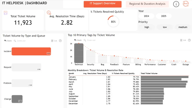
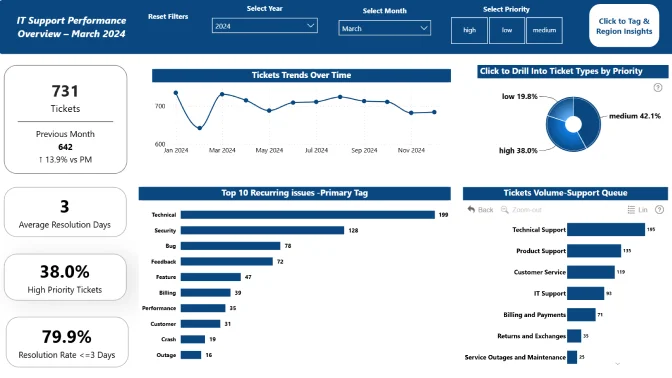
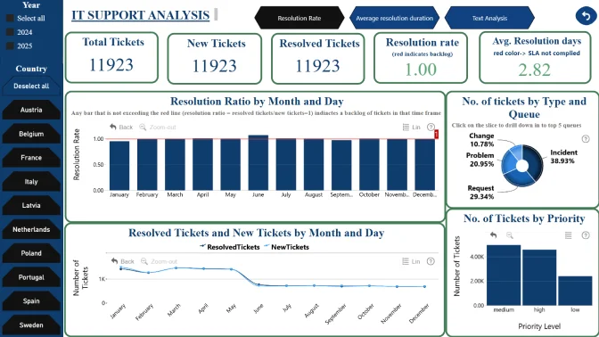
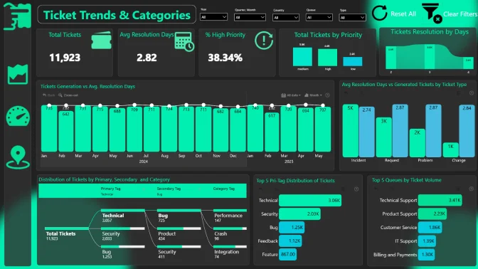
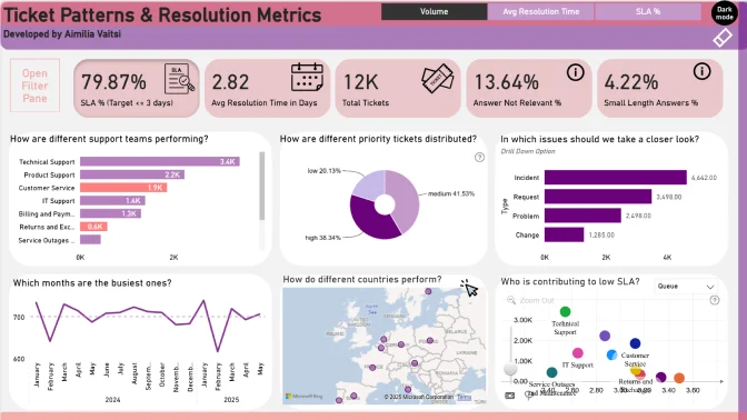
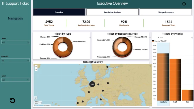
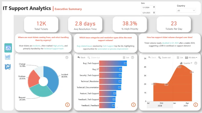
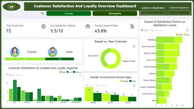
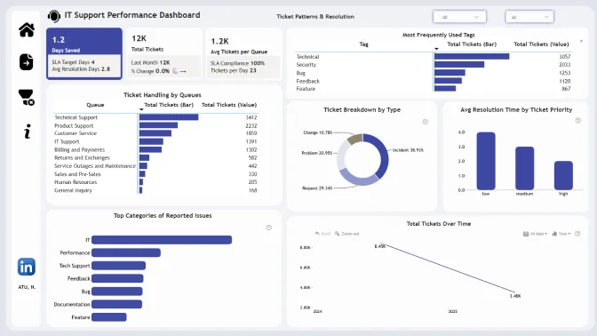
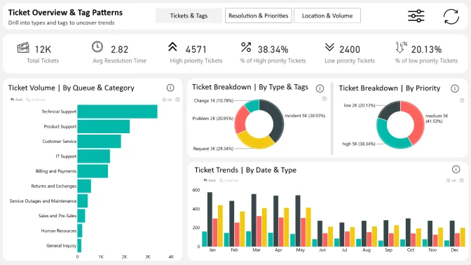
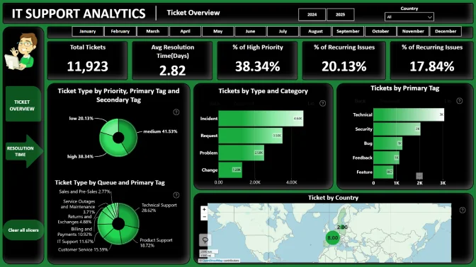
- Check out the submissions from past challenges for inspiration.
4. Submit your challenge entry:
- Log in to your account on this challenge page and submit your report in .pbix format for validation.
If your submission doesn’t match the challenge criteria, you will be notified by email indicating the reason. Don't worry if this happens! You can fix the issue and resubmit your report.
- Your report will be reviewed within 1–2 business days. Once it’s validated, you’ll receive a Publish to Web link via email. You can use this link to add the report to your portfolio or share it publicly online.
- All validated entries will also receive personalized feedback from the evaluation team via email within 1-2 business days. Use this feedback to revise your report and resubmit it before the deadline.
Note: Feel free to resubmit your entry as many times as necessary before the deadline.
5. Finalize your participation to compete for the ZoomCharts grand prize:
- Post the final version of your submission in PDF format on your LinkedIn profile.
- Use the caption "I am participating in FP20 Analytics Challenge 28".
- Include a summary of your report's key insights and add the ZoomCharts publish to web link (if available).
- Use #FP20Analytics, #builtwithzoomcharts, tag @Federico Pastor and @Zoomcharts.
- Additionally, post your report in the FP20 Analytics LinkedIn Community group.
- Follow ZoomCharts on LinkedIn
6. Attend challenge closing webinar to hear the results:
- The submissions are evaluated by ZoomCharts team (see "Judging criteria" for more info). The submissions of Top 5 ZoomCharts Challenge finalists are analyzed live during the challenge closing webinar to share the best practices and learning opportunities with the community.
- The author of the best report is awarded with a $300 Amazon gift card.
Technical requirements
- Build your report using Power BI
- The recommended number of pages in the report is up to 3 pages, including drill-through pages.
- Canvas size is 16:9 (Default Power BI size) or Full HD size = w:1920 - h:1080
- The report should contain at least 2 ZoomCharts Drill Down visuals within a single page. See a practical guide for using Drill Down PRO visuals
The Brief
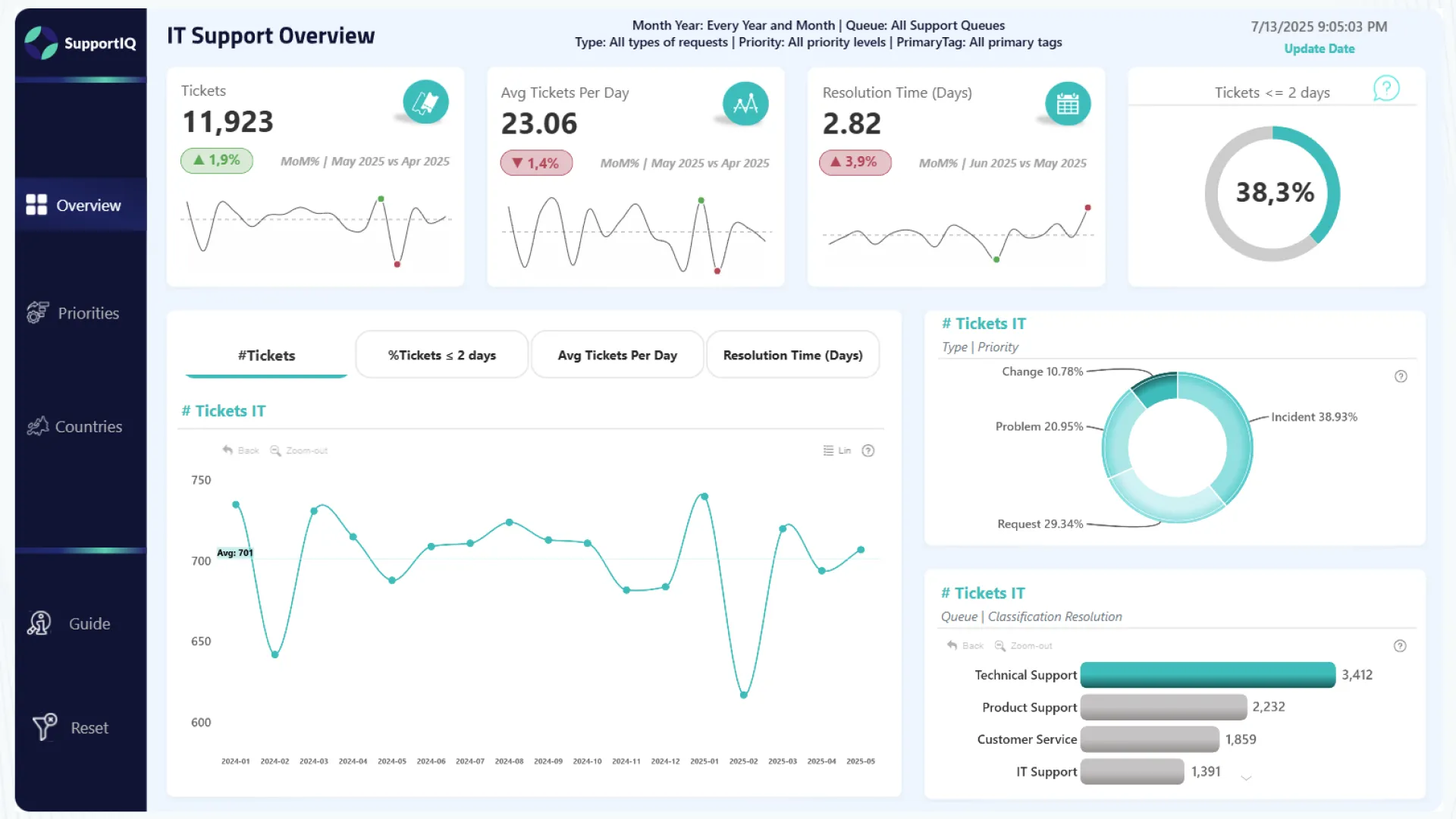
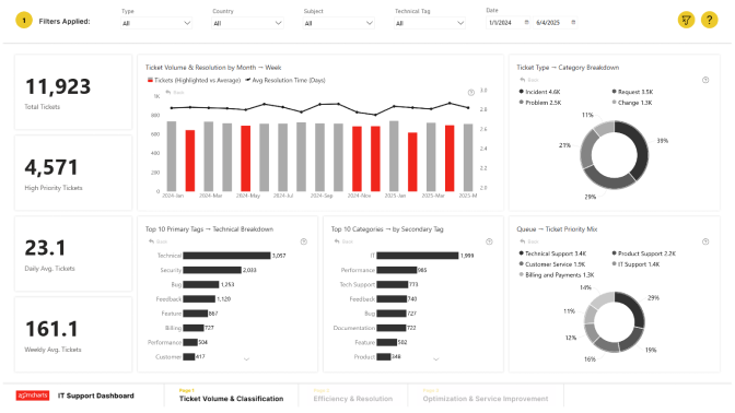
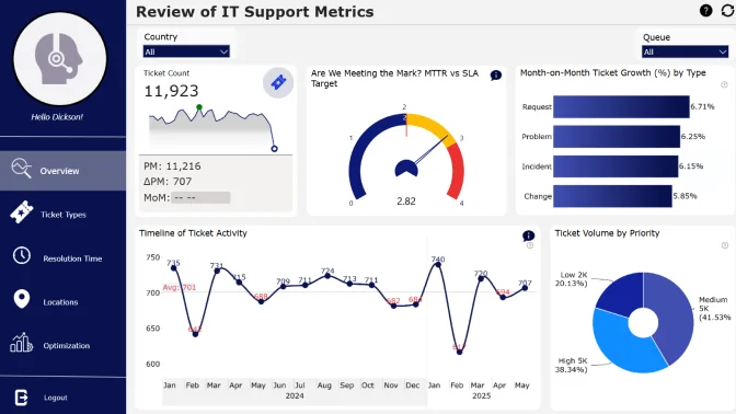
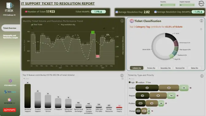
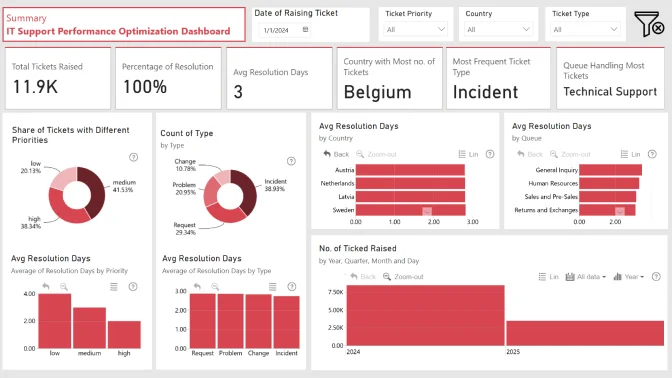
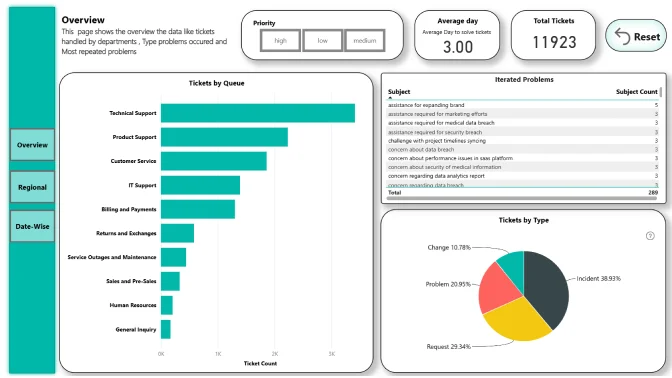
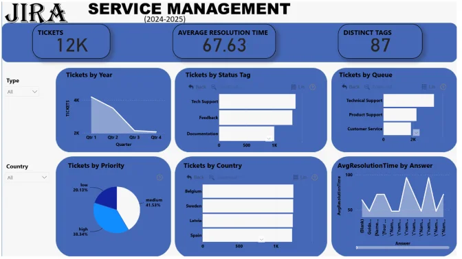
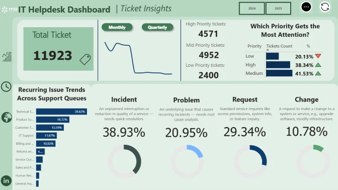
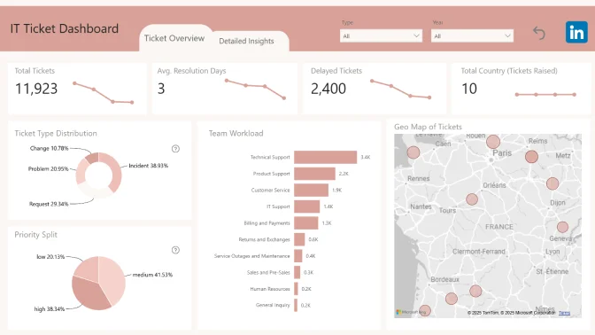
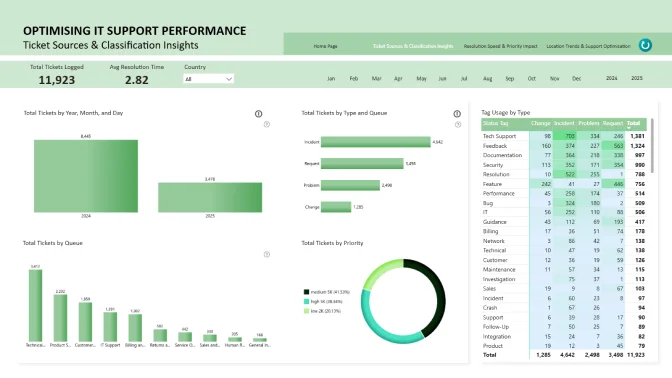
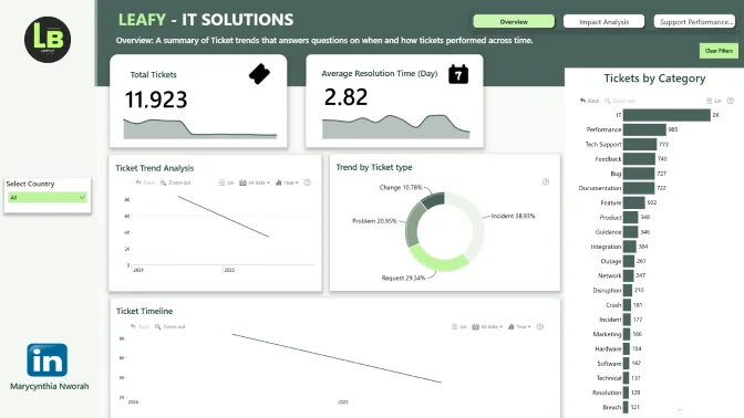
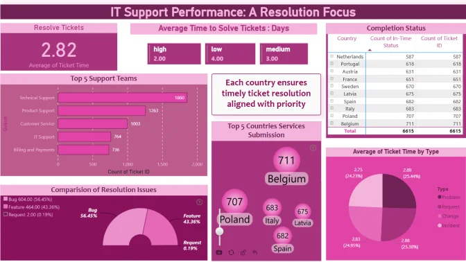
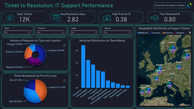
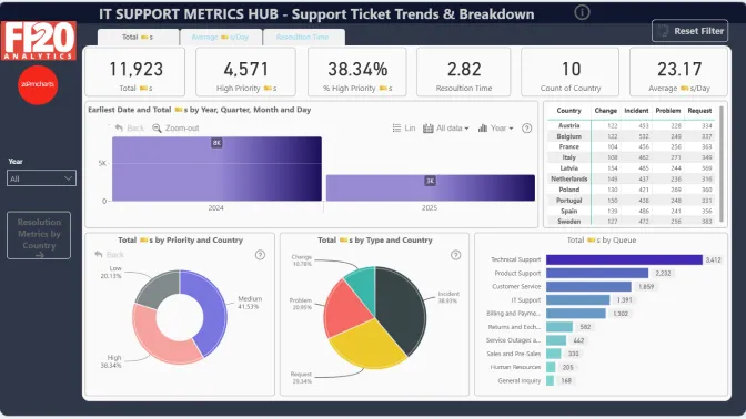
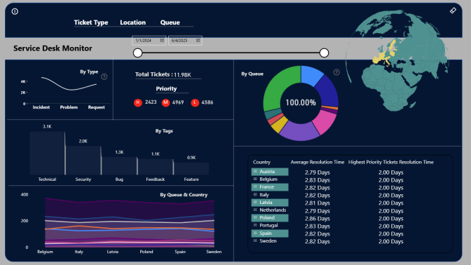
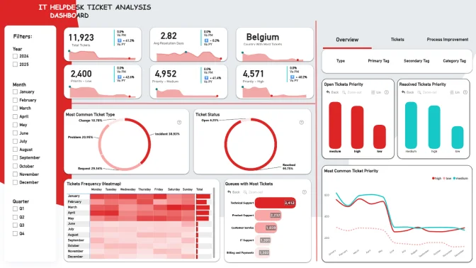
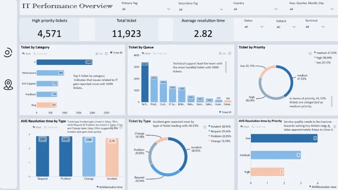
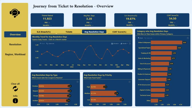
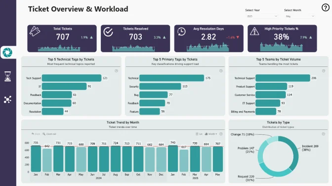
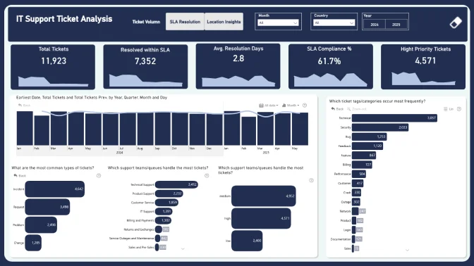
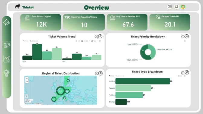
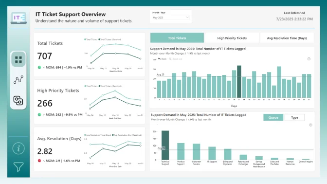
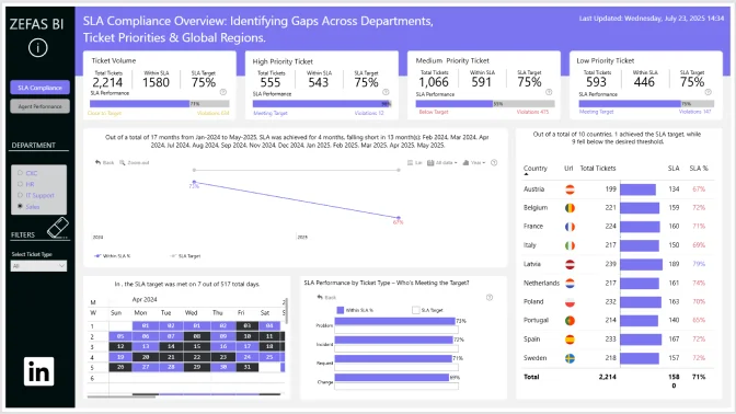
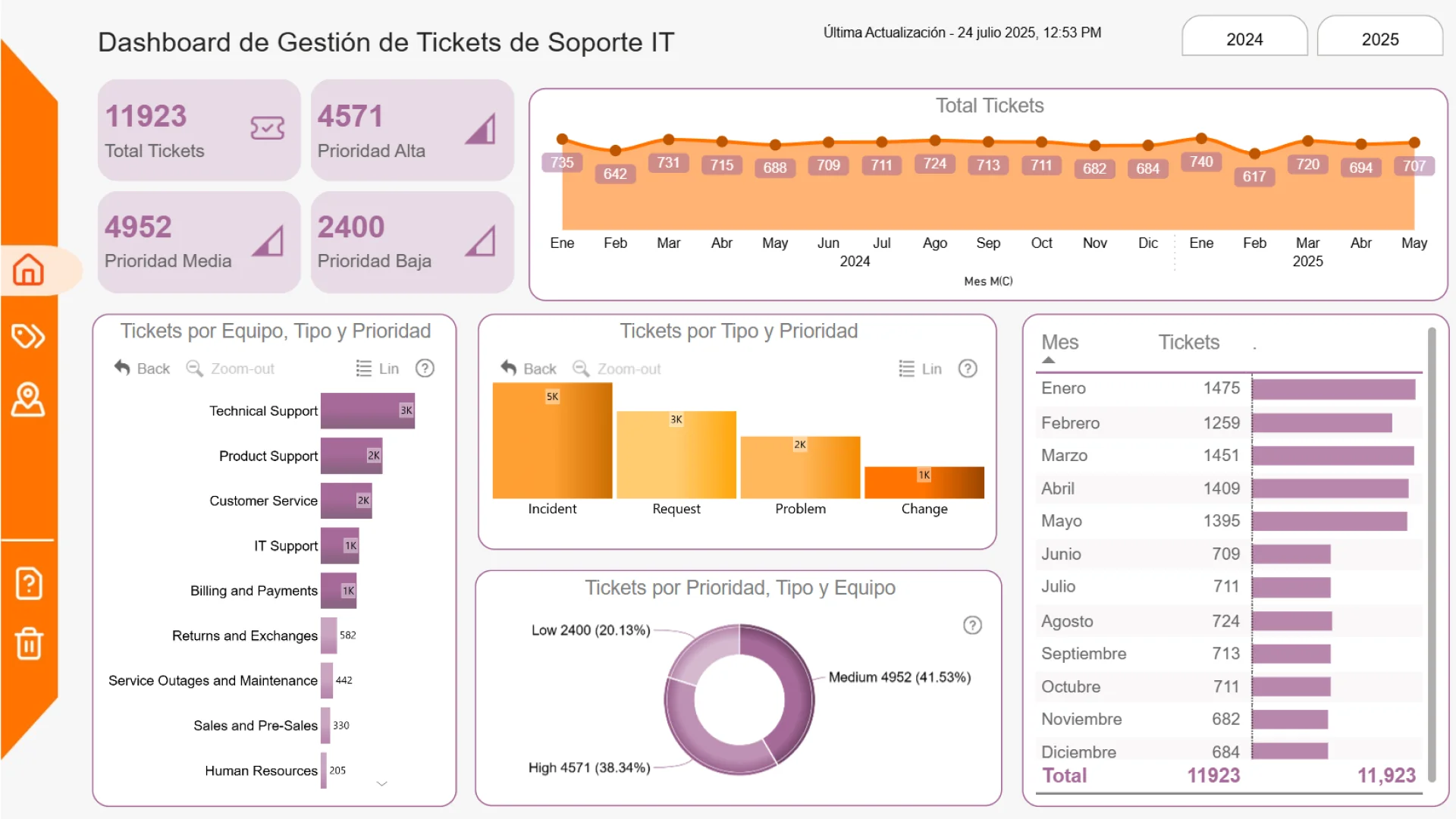
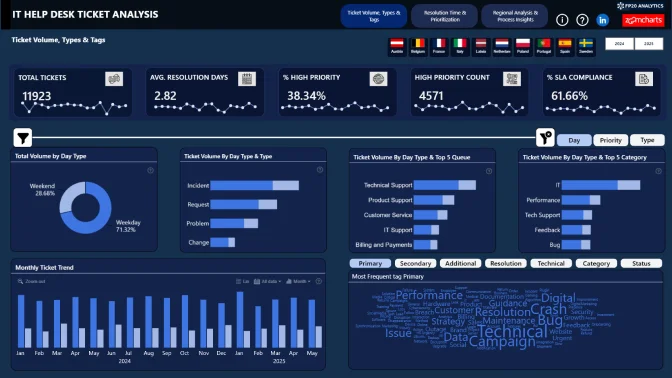
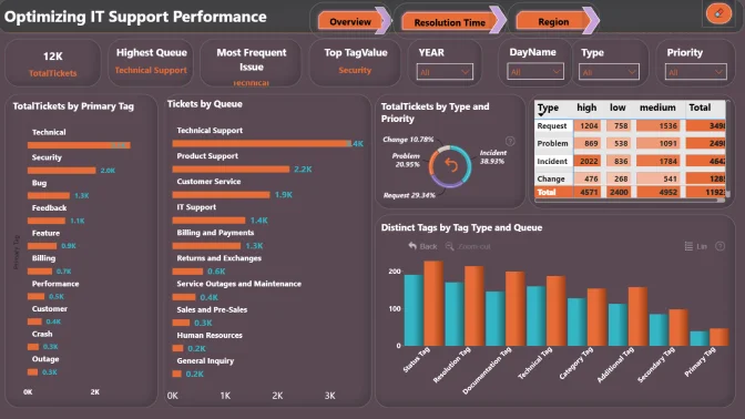
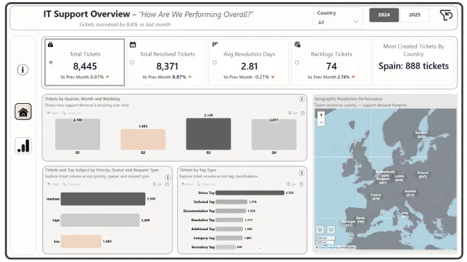
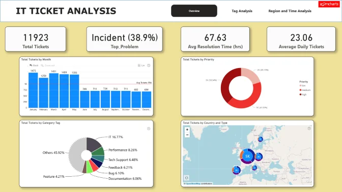
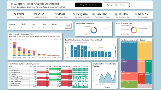
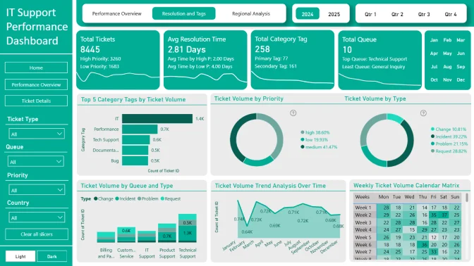
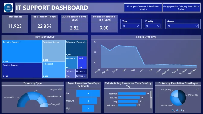
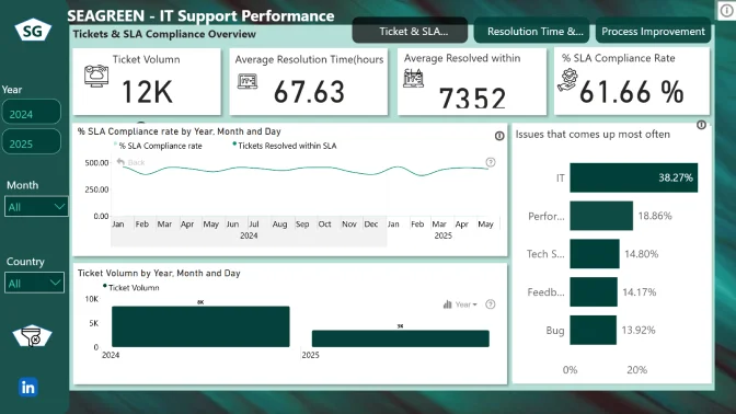
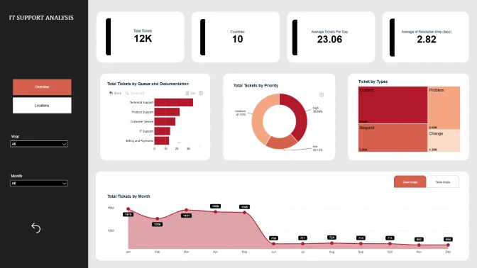
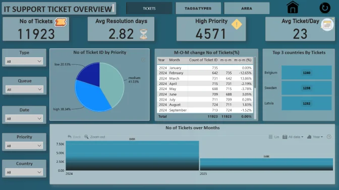
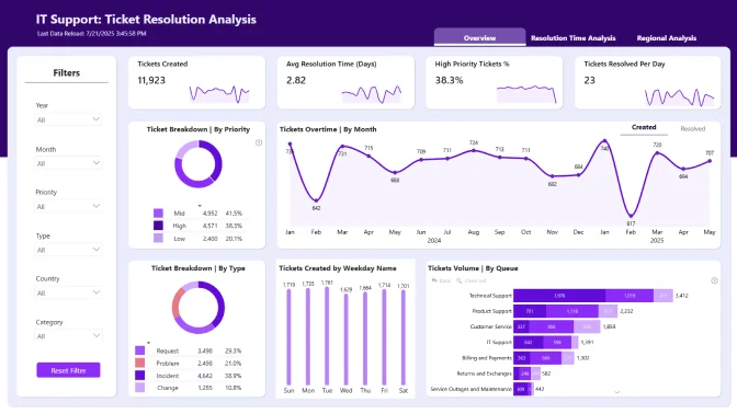
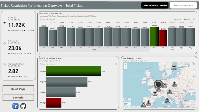
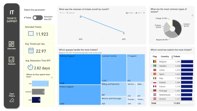
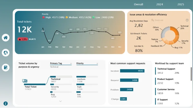
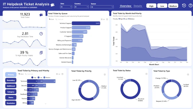
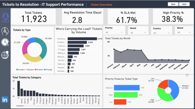
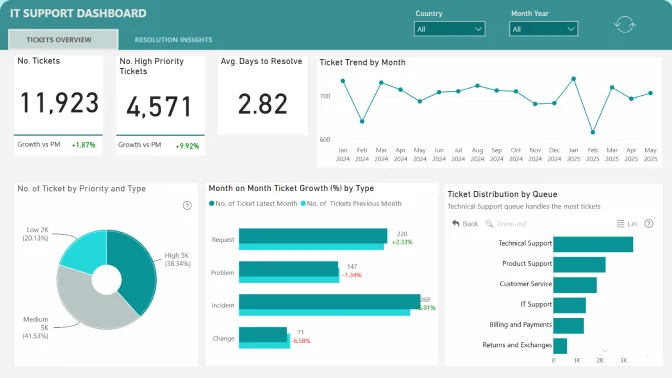
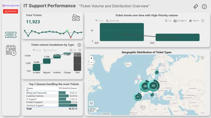
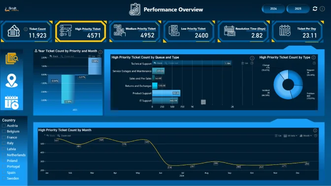
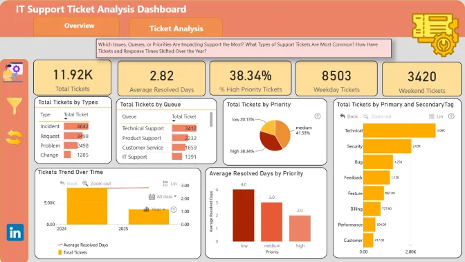
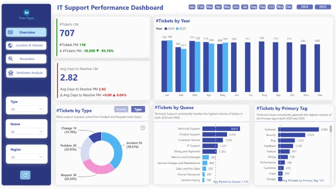
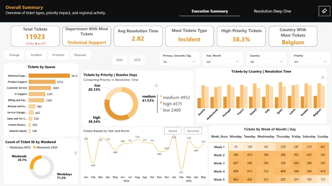
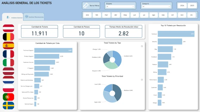
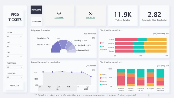
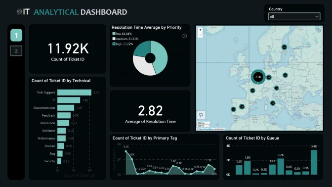
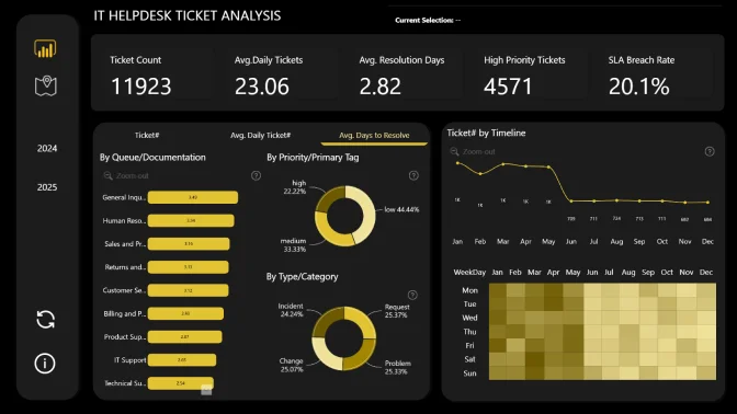
Ticket to Resolution: Optimizing IT Support Performance
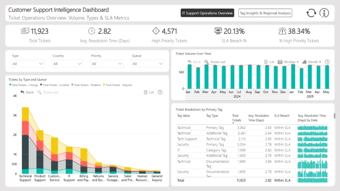
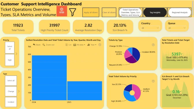
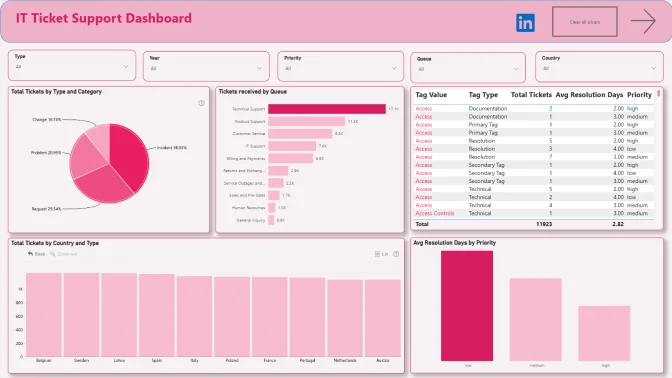
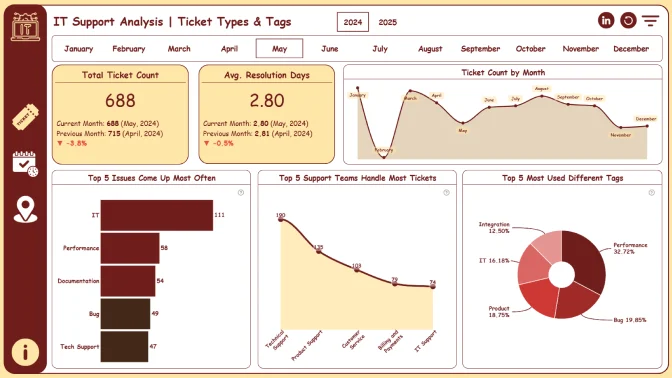
In this challenge, you’ll take on the role of an IT support analyst working with a dataset that looks like it came straight from a real service desk system, such as Jira Service Management. The goal is to explore and analyze support tickets to understand how the IT team handles different requests and how they can improve their performance.
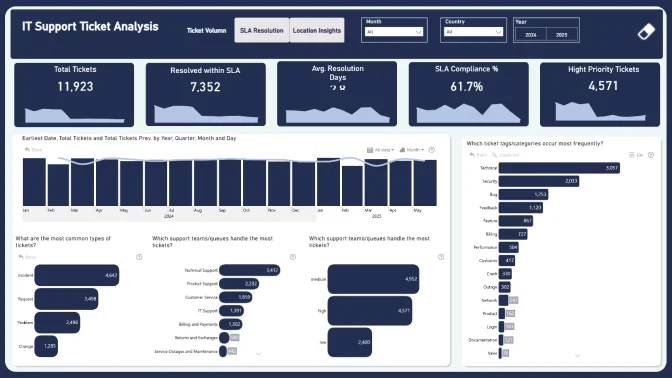
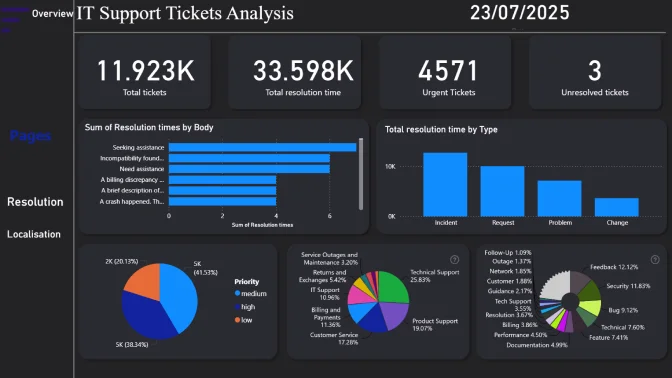
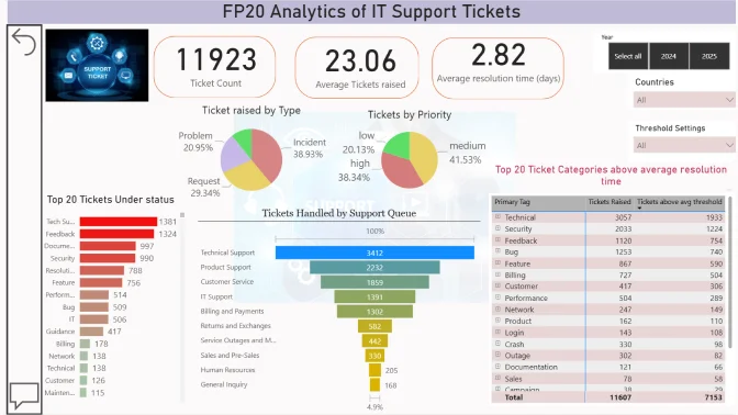
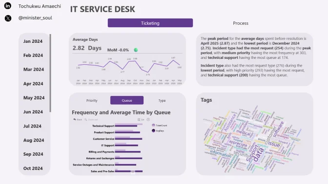
This dataset includes over 1,000 IT support tickets. Each ticket is similar to what you'd see in a tool like Jira with details like:
- Ticket ID, creation date, and resolution date
- Subject and description of the issue or request
- Response provided by the support team
- Ticket priority (like High, Medium), queue, and type (e.g., Bug, Feature, Request)
- Tags for category, technical topic, and documentation
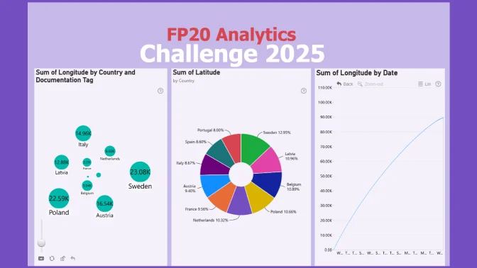
- Country and location info for the requester
Your job is to dig into the data to find patterns that can help the IT team:
- Spot common or recurring issues
- Understand which requests take the most time or effort
- Improve workflows and customer satisfaction
Key Questions to Explore
- What kinds of issues (bugs, requests, features) come up most often?
- Which support teams or queues handle the most tickets?
- How are different tags (like "Security", "Integration", or "Documentation") used?
Resolution Time & Priorities
- How long does it take to resolve tickets, on average?
- Do higher-priority tickets get resolved faster?
- Which types of tickets take the longest to close?
- Which countries or regions submit the most tickets?
- Are there certain locations that see more delays or specific issues?
- Can we group similar tickets to create automated replies or help articles?
- Are the agent responses helpful and aligned with what the user asked?
- Where can the support team save time or improve service quality?
Judging criteria
Business users use reports to make data-driven decisions. That’s why reports are called effective if they enable users to drill down and filter data quickly and intuitively to find answers to any question they might have and analyse data in all possible directions and dimensions.
Each report is evaluated based on three main criteria: intuitiveness, insightfulness, and interactivity. These factors ensure that the reports are not only accurate and functional, but also meet the target audience's needs and are ready to be presented to the end-users.
- Intuitive: How clear and easy it is to understand the report at a glance? (max 15 points)
- Is the report visually appealing?
- Choice of charts and visual elements
- Does the report tell a story?
- Is it not overwhelming to the user?
- Choice of tooltips, titles, and legends
- Interactive: How engaging and seamless is the report exploration and interaction with data? (max 15 points)
- Clear navigation that allows user to explore the report
- Use of slicers and other interactive elements
- Smooth cross-chart integration
- Is report optimized for touch devices?
- Are tutorials and guiding elements helpful to the user?
- Insightful: How accurate, complete, and meaningful is the data in driving decisions? (max 15 points)
- Depth of analysis
- Data cleaning and preparation
- Does data show up accurately in the report?
- Is report optimized for quicker loading time?
- Does the report provide deeper exploration of data (drill-down)?