Jun 12, 2022
Power BI Waterfall Charts: A Detailed Guide
Do you know how to make a waterfall chart? Here are 7 tips you should know when building user friendly Power BI waterfall charts. Customize it to tell a data story that helps you make data driven decisions. Bar and column charts work great for visualizing a beginning and ending value. However, these charts fail to display the full data story by leaving out all the unique factors that contribute to a final net value. In this article, we will look at the basics of waterfall charts and what practices you can implement to build the best waterfall charts in Power BI.

Do you know how to make a waterfall chart? Here are 7 tips you should know when building user friendly Power BI waterfall charts. Customize it to tell a data story that helps you make data driven decisions. Bar and column charts work great for visualizing a beginning and ending value. However, these charts fail to display the full data story by leaving out all the unique factors that contribute to a final net value. In this article, we will look at the basics of waterfall charts and what practices you can implement to build the best waterfall charts in Power BI.
What is a waterfall chart?
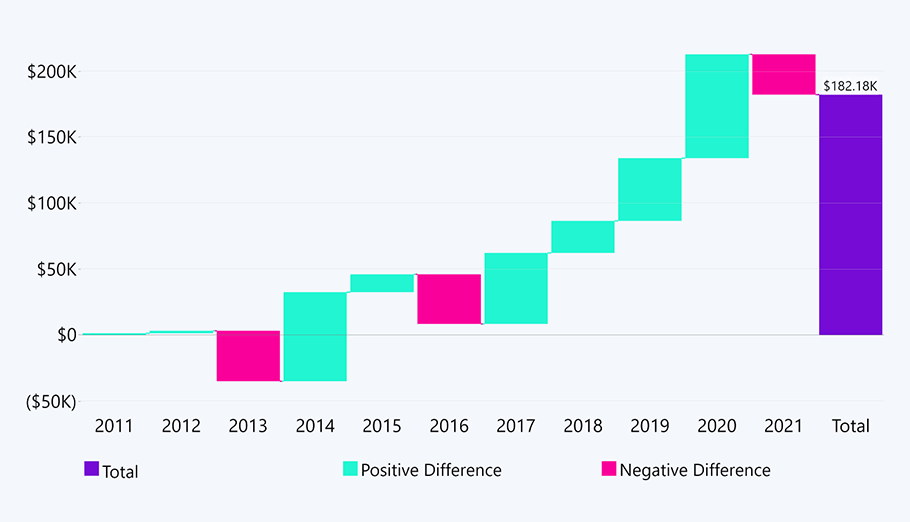
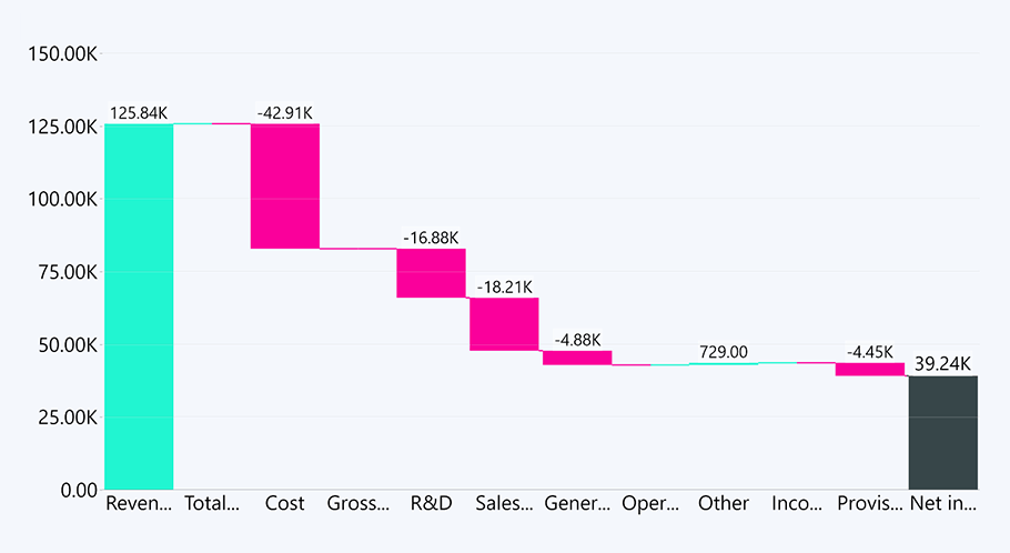
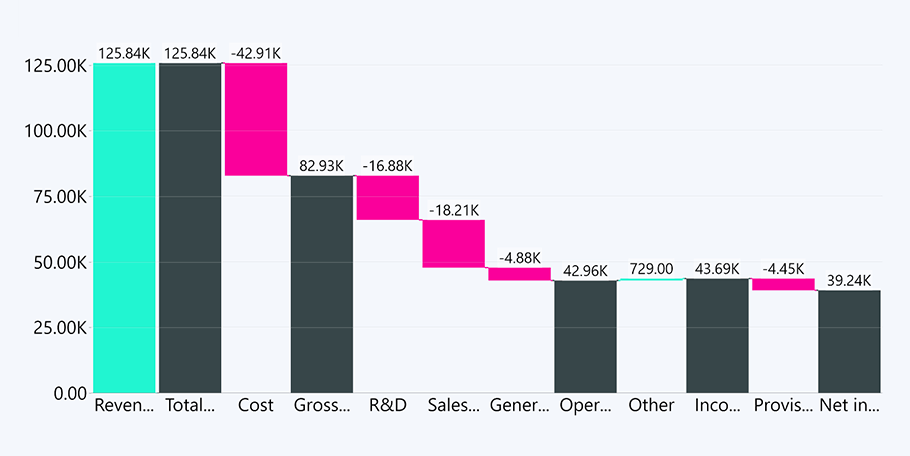
The Power BI simple waterfall chart displays each individual component that contributes to the final value. This is where the waterfall chart gets its name, as the water for most waterfalls rarely flows perfectly in unison. We have a starting bar that represents the initial value and starts from a baseline of zero. Then we have a couple of bars that seemingly float in space – these are transitional values that represent positive and negative changes to that initial value. These can be either time or category based. Lastly, we have an ending bar that represents the final value and takes into account the effects of all the displayed transitional values.
What's the difference between a waterfall chart and a bar chart?
As the waterfall chart is usually used in very specific use cases, only a certain demographic interacts with the waterfall chart on a regular basis. Upon first interaction, most users intuitively associate the waterfall chart with the bar or column chart. But the difference is very simple.
A column or bar chart visualizes the total value of a measure in each category with the help of bars. Each bar has a baseline of zero.
A waterfall chart visualizes positive and negative changes to a value. Thus, we have a starting and ending bar – both with a baseline of zero. The floating middle bars each have their own baseline, which is the previous bar’s end. This baseline can start either at the top or the bottom, depending on whether that bar is representing a positive or negative change.
When should you use a waterfall chart?
The waterfall chart serves a very specific but useful use case, which makes it an especially popular choice in finance. There isn’t really an alternative to the Power BI waterfall chart that focuses on net total changes.
Waterfall charts are mostly used for profit and loss statements and financial analysis. However, if you look at the bigger picture, there are multiple things you could visualize using Power BI waterfall charts, as long as the focus is on cumulative values and their respective changes.
7 tips for creating a waterfall chart in Power BI
Drill Down Waterfall PRO is a solid custom waterfall visual for Power BI. Using all the available customization options, you can be sure to create a user-friendly waterfall chart. Here are just a few things you can keep in mind to create the ultimate waterfall in Power BI.
1. Use colors to tell a story
Make sure you use different colors for positive and negative values, and preferably a third color for your starting and ending totals. If you want to learn how to adjust colors for your columns in Drill Down Waterfall PRO, check out this guide.
As for what colors to use – that really depends on the data story you are trying to tell. When analyzing profits, growth is a good thing. However, that’s not really the case when looking at expenses. As with all reports, it’s important to consider the context of the data you are visualizing with your Power BI waterfall chart.
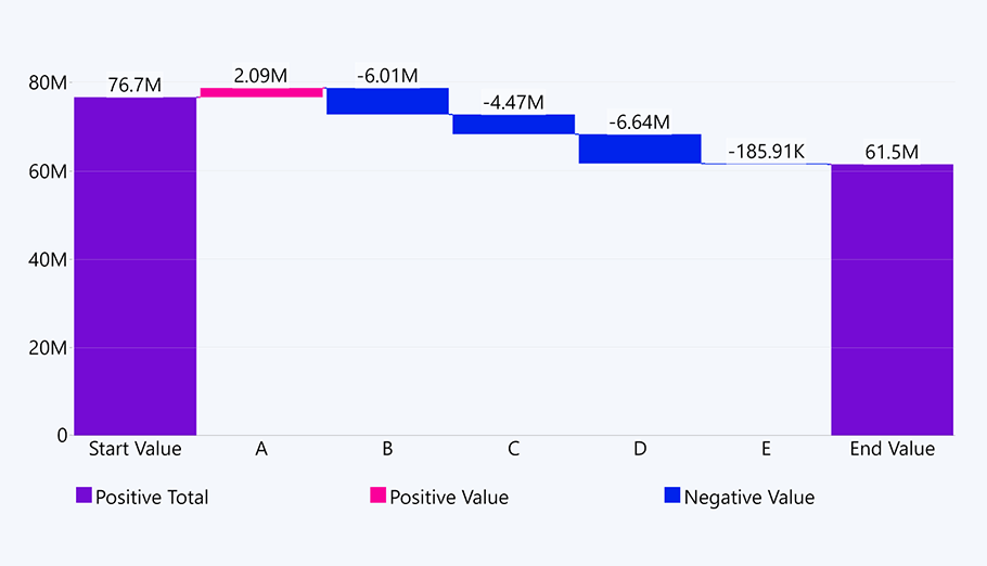
2. Add connection lines
Even if your users have encountered a Power BI waterfall chart before, you still want to guarantee the easiest readability for them. A problem that can occur with the Power BI waterfall chart is when the values are too close in size, the user may get confused when trying to decipher the beginning or end of a value, especially if they are more used to regular column charts.
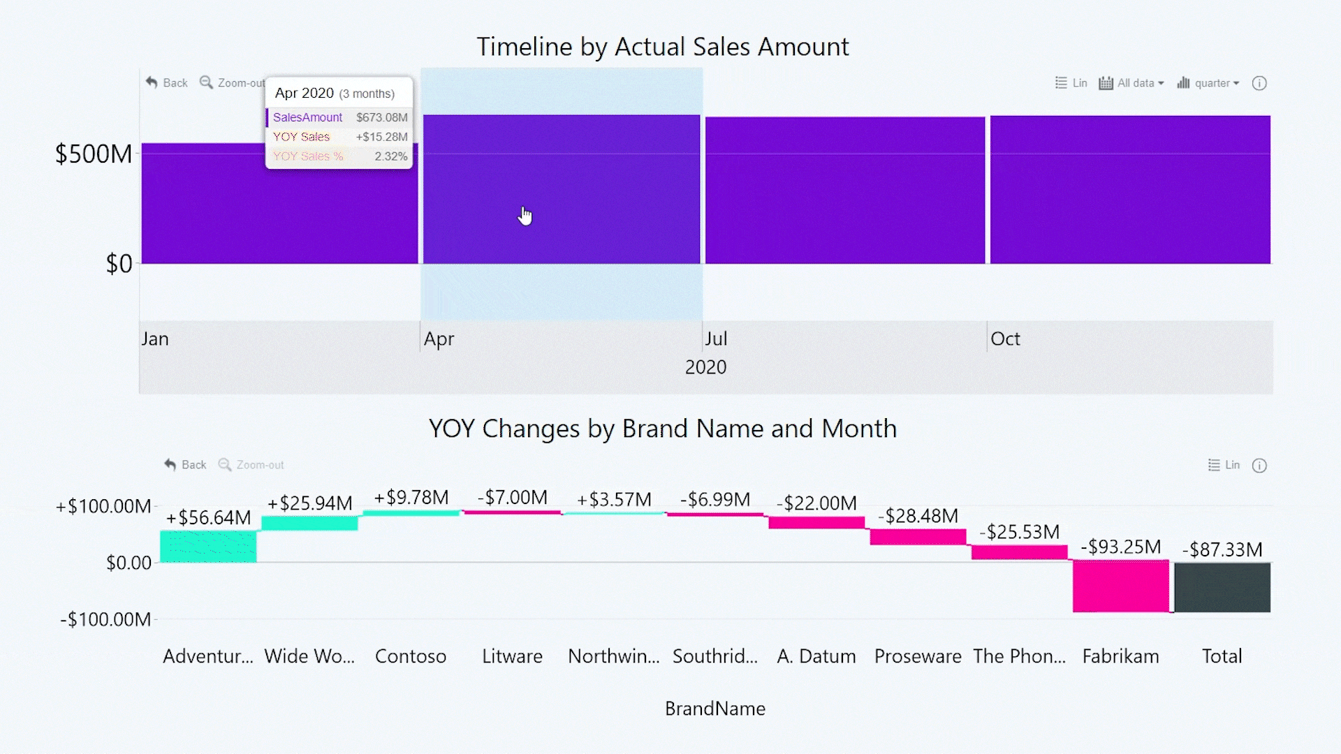
To guide your end user’s eye, you can add connection lines between each value. This will show the correct sequence of the positive and negative values, so your user doesn’t get confused when quickly reading a waterfall chart.
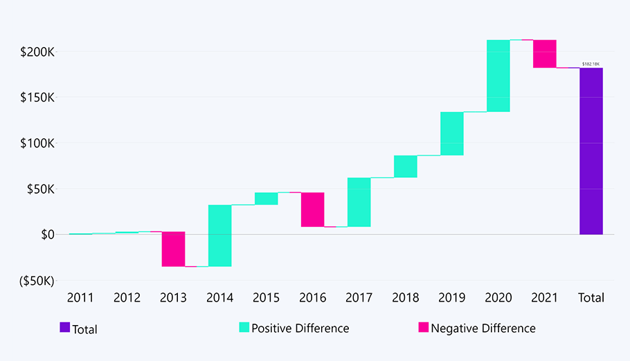
To add connection lines, simply go to Column Settings and adjust the column and cluster padding fields to suit your liking.
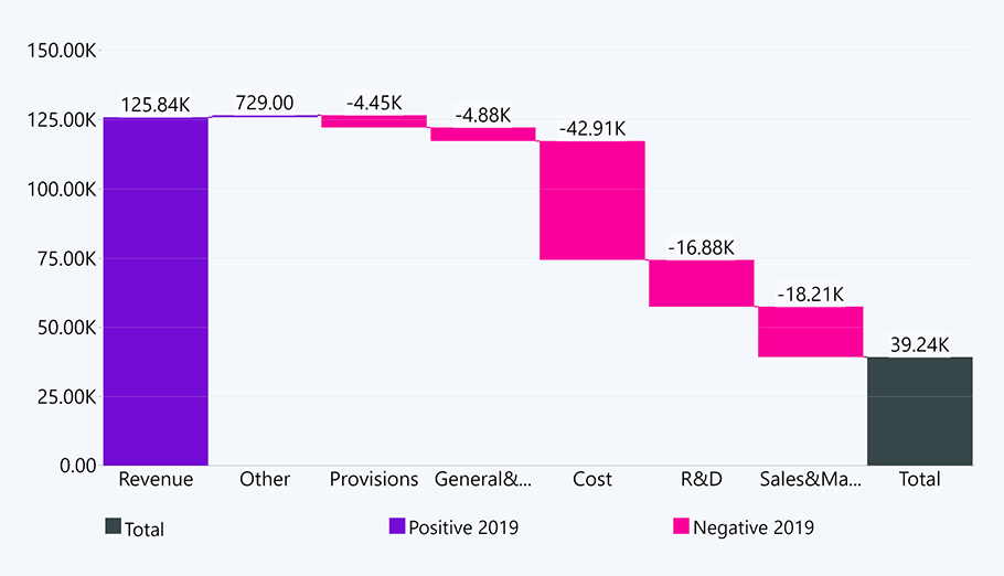
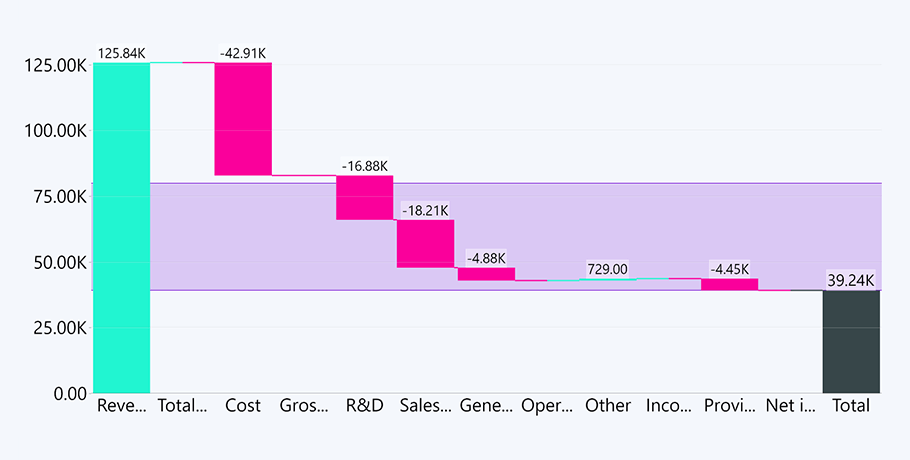
3. Create and customize labels
Following the same principles as the Combo Bar PRO custom visual, Waterfall PRO lets you customize each label for each series. So, you can change the backgrounds and emphasize specific values that your user can pay extra attention to, thus enhancing report readability.
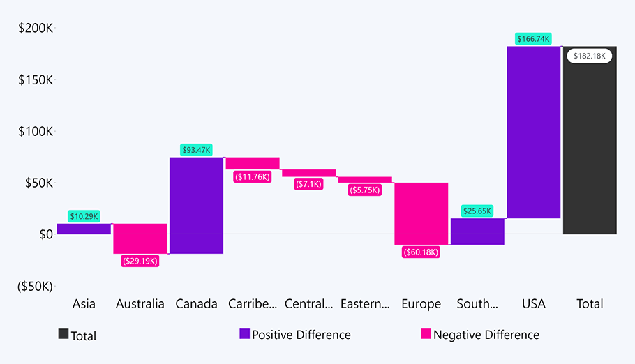
The labels in the above chart are neatly placed and color-coded in a way that emphasizes the respective positive and negative values. As you can see, this also helps in cases where value changes are visually small, and you can leave it up to the label to show the relevant information. There's plenty more that you can achieve with value labels - we've compiled a full guide if you want to know the full picture.
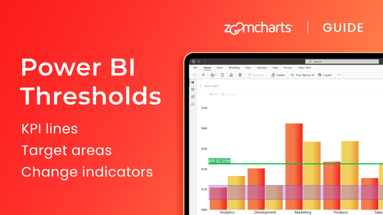
4. Set target with thresholds
For users that want to read a chart quickly, consider adding thresholds. If you want to show where your values are in relation to any set targets or benchmarks, Drill Down Waterfall PRO grants the option of adding thresholds. You can set both area and line thresholds, depending on your user’s preference.
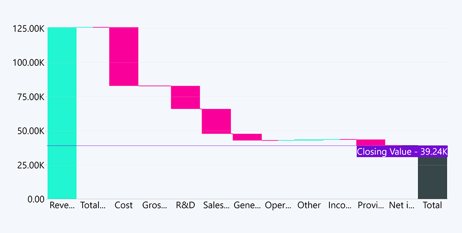
Additionally, Waterfall PRO has the option of enabling both static and dynamic thresholds. So, you can either set a constant threshold line manually by inputting your own values or choose one of the many Power BI aggregation options – the choice is entirely up to you.
5. Define the sequence
This feature is optional but could prove useful in achieving better readability. Unlike our custom combo chart visual with its 25 series, Drill Down Waterfall PRO has just one field that processes values, called Change. This field only needs your values, and the chart does the rest of the work for you by automatically calculating the positive and negative differences and how they impact the resulting net value.
Once you’ve got your values in, you have the option to design the sequence. The Sequence field allows you to define the order for you all the categories in your waterfall chart. This seems like a minor detail but can prove very useful in certain cases. Let’s say you’re creating a performance report that’s going to be shown to various teams. The Sequence field will give you the option to cater to each respective team by marking their performance value as number 1 in the sequence order, thus improving readability for those particular users.
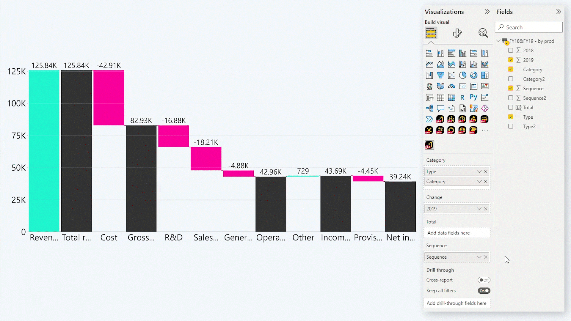
To learn more about the sequence field for Drill Down Waterfall PRO, learn about its initial setup in our guide.
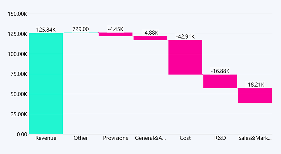
6. Choose Sub-Total Mode
So now you have the sequence for your categories sorted, but some are missing their values. Waterfall PRO can calculate and display them independently, should you choose the Sub-Total Mode option.
If you run into a situation where you have set the sequence, but some fields are missing their values, the waterfall chart will calculate these dynamically instead of ignoring them. There are four options to choose from. You can find them under the Format tab in Column Settings.
Total

None
Last
All
Quick rundown on how the sub-total modes differ:
-
None –ignore any resulting sub-totals and the final total.
-
Total – calculate and show only the final total.
-
Last – add into account only the last sub-total. You can provide a dynamic name for the last sub-total.
-
All – calculate all sub-totals, no final total.
You can also learn about each sub-total mode in more detail by following this video.
As previously mentioned, this feature is optional. If you want total control of the data, Drill Down Waterfall PRO lets you also calculate any missing values independently by dragging in your own data containing all the necessary calculations.
7. Cross-chart filtering
The Waterfall PRO custom visual for Power BI comes with a user-friendly cross-chart filtering feature. You can create a waterfall chart that serves as a sort of index for your report that your viewers can use to filter the rest of the report. To give you some ideas, this would work great in combination with our Combo PRO and TimeSeries PRO custom visuals for Power BI.
These interactions and drill downs are also workable on touch input devices, making the Drill Down Waterfall PRO custom visual a great choice for chart analysis at the executive level where decisions need to be made swiftly. Makes sense if you're making a profit and loss waterfall chart.
Conclusion
Drill Down Waterfall PRO is a fully customizable waterfall visual for Power BI. You can use it both alone and as a filter for the rest of the report. Using all its features, you can make the visual do most of the work and uncover unique insights your users might have otherwise missed. As with all custom visuals by ZoomCharts, end-user friendliness is a priority. This custom visual can be customized to suit various user demographics that are very familiar with waterfall charts or are just learning how to analyze them.

Want more info like this?
Subscribe to our newsletter and be the first to read our latest articles and expert data visualization tips!