Sep 04, 2022
Power BI Donut Chart
The donut and pie charts are some of the most ubiquitous charts around. Instantly recognizable by people who have very little to do with charts, every report creator is bound to have to include a Power BI donut chart into a report at some point. This is not a commentary on whether you should love or hate donut charts, but rather a guide on getting the most out of donut and pie charts. Strap in tight, we're going to go over the whys, hows, do's and don'ts of Power BI donut charts.

The donut and pie charts are some of the most ubiquitous charts around. Instantly recognizable by people who have very little to do with charts, every report creator is bound to have to include a Power BI donut chart into a report at some point. This is not a commentary on whether you should love or hate donut charts, but rather a guide on getting the most out of donut and pie charts. Strap in tight, we're going to go over the whys, hows, do's and don'ts of Power BI donut charts.
Why would you use a donut chart?
The strength (some might say downfall) of the Power BI donut chart is in its simplicity and ease of showing proportional data. A bar graph can only show part-to-part data, while a Power BI pie chart and donut chart shows you part-to-whole data. In a donut chart, each slice represents the proportion of each series or category.
So, immediately you can spot how the Power BI donut chart is useful – you can break down items for comparison within, for example, a budget, demographics, survey results, and more. The donut chart tells you what is the most and least in relation to something.
How do you make a good donut chart?
A donut chart works best when its individual parts sum up to a whole. Its purpose is to visualize how each part contributes to that whole. The inherent circle of the donut chart makes it carry an implied 100%, which makes it intuitive to everyone. This is why a lot of report viewers may actually ask for a Power BI donut chart within a report, as it's such a universally recognized shape.
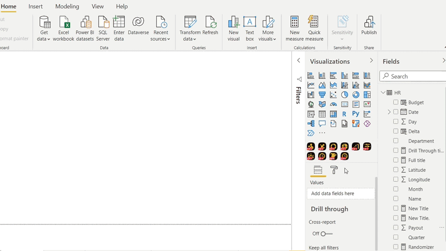
To create a Power BI donut chart, simply select or drag in the donut visual of your choice, whether built-in or custom. When setting up a Power BI donut chart using Drill Down Donut PRO, you only need two fields. You have Category, which is the field that defines your hierarchy. That's where you drag in different columns from your data sources. And the second field is going to be Values that accepts both columns and measures.
And just like that, you have created your first instance of the Power BI donut visual with the help of Drill Down Donut PRO. After that, you can focus on customization and formatting. The same steps also work when creating a Power BI pie chart.
How do you interact with a donut chart?
Drill Down Donut PRO is one of the best examples of the donut chart’s evolution when it comes to Power BI reports. It features many useful add-ons to the built-in Power BI donut chart to fully unlock the potential of interactive data visualization. Some of these include:
-
Cross-chart filtering or the ability to use a Power BI donut chart as a slicer (more on that later), instead of clicking through native Power BI slicers separately.
-
Drill down on left click which allows for a more dynamic data navigation experience, instead of activating this feature separately with a right click each time. Works great with cross-chart filtering as well.
-
Long-press with left click to select and filter a slice without drilling down into the second level of the Power BI donut chart. You can also do this with multiple slices by holding down CTRL while you click.
-
Animated interactions that help your end user keep track of the data storytelling experience.
-
Desktop and mobile-friendly navigation so you can explore data anywhere at your own leisure in an intuitive way. The above-mentioned single click drill downs are easily integrated into mobile touch devices.

What are some ideas for incorporating donut charts into reports?
There are many useful ways you can incorporate a Power BI donut chart for interactive storytelling. Here are a few ideas for using Power BI donut charts with some additional improvements from Drill Down Donut PRO.
-
Filtering the rest of the report page with a Donut chart
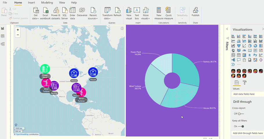
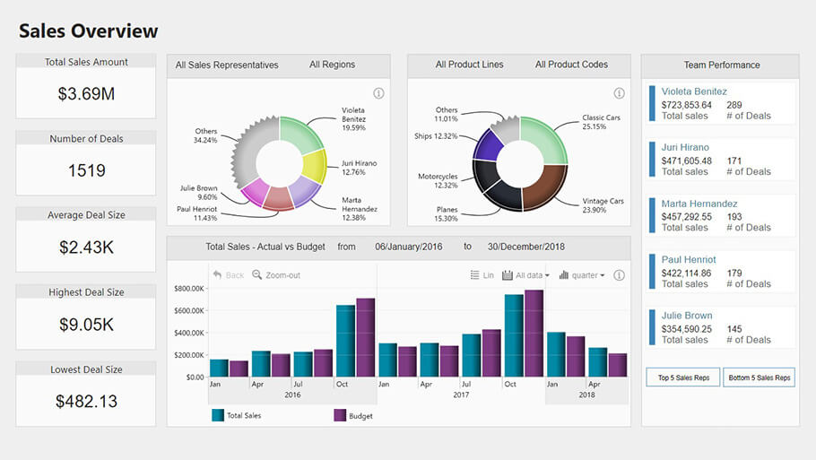
Since the Power BI donut chart is great for efficiently displaying categorical data, you can use it as a filter for the rest of the report page. Each time you click on a slice, it acts as a filter for the rest of the report. You can also select multiple slices with CTRL + click and apply those as the filter. To reset, simply click outside of the chart, or use the Reset button that comes with ZoomCharts Drill Down PRO Visuals.
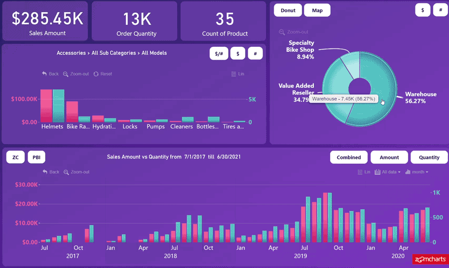
Using this method, you don't need to use slicers to filter the rest of the report, but instead end up saving screen space and making your reports feel more interactive. Using a donut as a filter can also be applied to a multitude of other chart types. Just to name a few - Map, TimeSeries, Graph, and others. This makes your report easy and intuitive for everyone. For example, if you have a lot of data points on the Map visual, it can be hard to sort through and filter. If you place a donut right next to it, it's an easy way for the end-user to see all the categories within the map chart, so they can click on the right slice and filter accordingly.
This is great for interactive storytelling and grants your end user full flexibility when navigating your Power BI report. By combining the Power BI donut chart visuals with other chart types, your end user gets the best of both worlds – a greater proportional view of each category, and a more concise view of other charts.
-
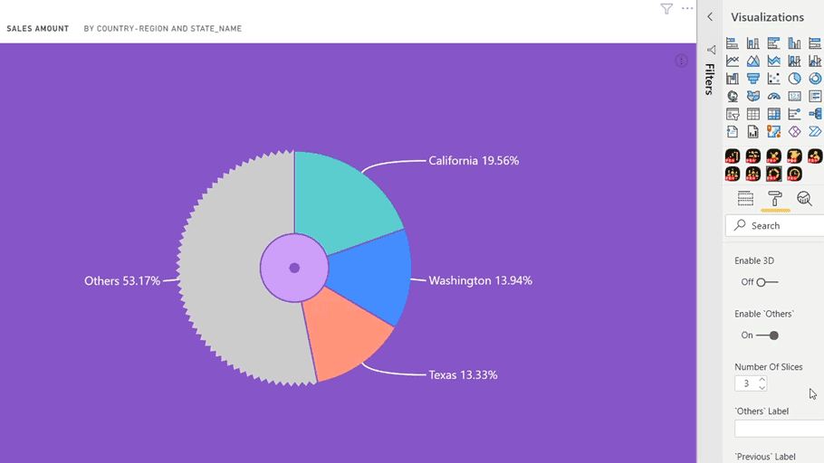
‘Others’ slice
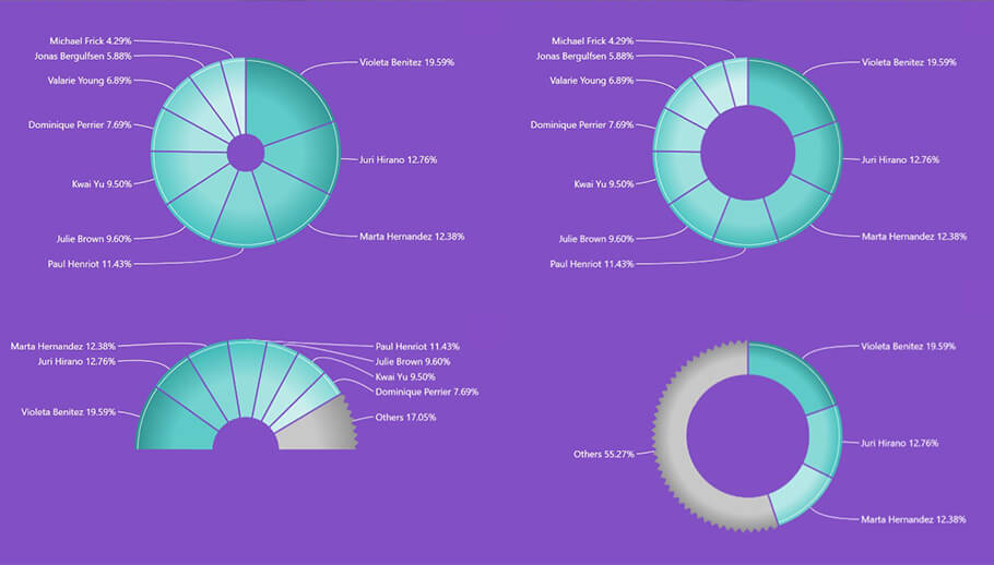
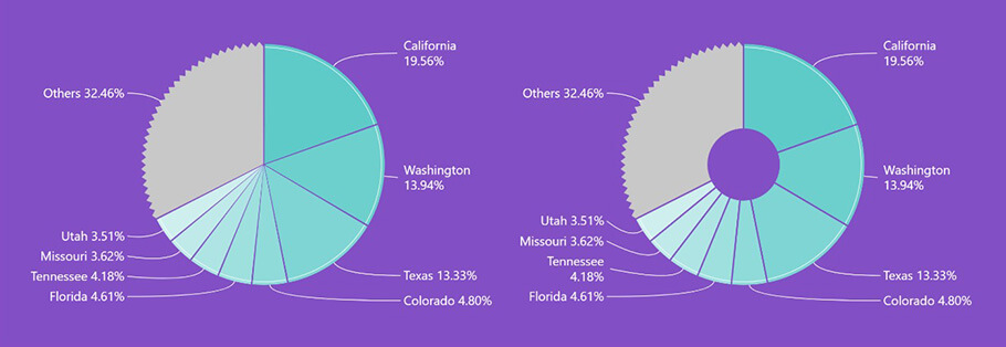
So, one of the main disadvantages (some might call it an inescapable fault) is the fact that a Power BI donut chart can’t display too many categories at once, otherwise the chart becomes hard to read. To combat this, the Drill Down Donut PRO visual allows you to add an ‘Others’ slice. We covered the benefits and features of the ‘Others’ slice in our previous post. In short, it`s a great way to avoid cluttering up your report when the total number of slices within your donut adds up to more than 5-6. This feature is also incredibly useful for Power BI pie charts.
 \
\-
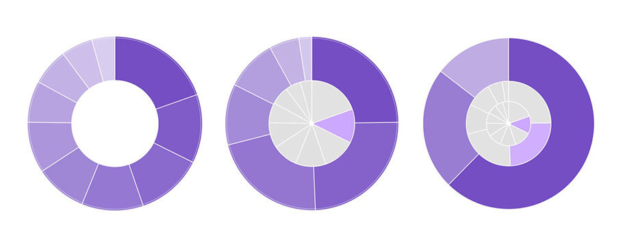
Inner donuts
Putting a donut inside your donut may sound redundant, but this is a great method for adding subcategories and showing hierarchical relationships on just one Power BI donut chart. Inner donuts show previously selected categories; they keep their size and color for easier reference. This helps the end user trace their previous steps, so that they don't get lost while exploring the Power BI donut chart.
This works great when you combine it with the outer ring that we've added to Drill Down Donut PRO. The outer ring indicates that the donut chart has another level available to drill down into. Along with the inner donut on display, this creates a very seamless data navigation experience by helping the end user position themselves within the data.
We also mentioned that inner donuts are great for adding subcategories. Why would you want subcategories? Adding subcategories allows you to create an interactive slicer where you can drill down and see how these subcategories have performed in proportion to their parent category within the whole. The inner donut allows you to see all this on the surface. So, just from one donut, you would be able to see, for example, Team > Team member > Product. Showing it all on one level makes for better UX and report readability.
The Drill Down Donut PRO visual itself currently supports up to 9 drill down levels. But it's preferable to keep it at around 3-4 as going any deeper would make you end up with overly specific filters, which may prove counter-productive in practice. As a workaround, you can always split the visual into 2 different visuals and apply cross-chart filtering.
And remember, it all comes down to picking the right colors and clever sorting to avoid confusing your end user and instead help them reveal some powerful insights and comparisons.
-
Base Fill Color
We thought long and hard about improving UX when there are multiple visuals showcasing the same data metric on display. And this is the incredibly simple but powerful solution we came up with that just uses color as an indicator. When you’re visualizing multiple categories and subcategories using a Power BI donut chart, it’s a good idea to assign a specific color and keep each slice in the same shade range. With Drill Down Donut PRO you can easily achieve this with the Base Fill Color setting.
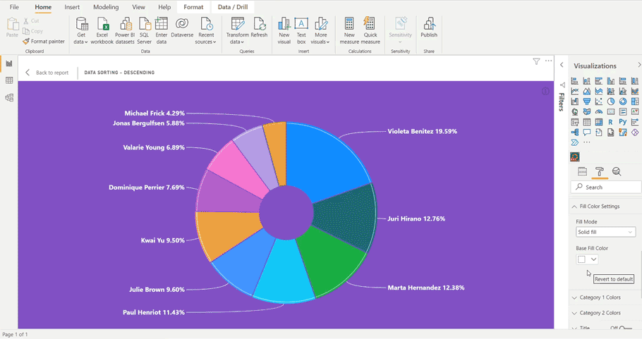
One of the main benefits of the Base Fill Color setting is when you are using the same metric for multiple visuals, you can assign the same base color for the corresponding Power BI pie or donut for easier reference. This just makes it easier for your end user to understand what they’re looking at as well as navigate the chart if there are multiple visuals on display. Or you can go for a monochromatic look for your report if that’s your style.
What are some use cases featuring a donut chart?
Some might say that the only good use case for a Power BI donut chart is when you have a few high-level items to visualize, and you want to compare these items or see how they contribute to a whole. Really, a Power BI donut chart can be used in a lot of clever ways, it all comes down to the designer. Just remember that the point of a donut chart is that implied 100% whole.
The most popular use cases for donut charts include:
-
Accounting & Finance – income or expense analysis, billings.
-
Project management – risk distribution and resource allocation.
-
Human Resources – staff composition, salary distribution, survey responses (with some exceptions).
-
Sales and marketing - sales and campaign data, KPIs, sales team performance in relation to total sales.
When visualizing the above mentioned, keep in mind that it's all about showing part-to-whole data or a category's place in the bigger picture. A donut chart cannot show the progress of your data and does not work when you have ordinal variables either. In short, it can't show categories that feature either a temporary or socially conditioned order - you're better off just picking a different type of chart that point.
If you do choose to show progress, you could get away with it by using a donut to show capacity usage (similar to CPU) or as a way to measure the completeness towards a set target (the target being 100%, of course). This would work great with something like KPIs, where you monitor how far along a company is in relation to its goal. However, once we go into minus percentage or exceed our 100% goal, then it's best to consider using a different type of chart.
The Power BI donut chart can also work as a starting point for introducing your viewer to your report. Since the donut chart is so universally recognized, it's very likely that a less tech-savvy end user would start playing around with a donut chart first as a warm up, before they venture into exploring other charts. So, keep this use of a Power BI donut chart in mind when thinking of ways to familiarize end users with interactive charts.
What is the difference between a pie chart and donut chart?
A Power BI donut chart practically does the same things a Power BI pie chart can do; they still show proportional data. But there are a few main differences. Donut charts take the simplicity aspect of pie charts one step further by cutting out the middle.
In the case of Power BI pie charts, by assuming a circle as the 100%, you end up comparing areas of that circle – how much space each slice takes up within the Power BI pie chart. And chances are, because of the pointed tips of each Power BI pie chart slice, your eyes will be drawn to the middle point, rather than the outer arcs of each slice.
But if you cut out the middle, proportional relations actually become easier to see. Each donut slice has the same width, just like a Power BI pie chart slice, but a different arc length. All you have left to compare is the length of each donut slice/arc. This speeds up the chart reading process for your end user, as all their eyes have left to compare is the length of each arc.
The empty center of a Power BI donut chart can also be used as a neat way to display some key numbers of the data you’re working with, or you’d just like that extra bit of negative space in your report for aesthetic reasons, if you're not a huge fan of the bulkiness of Power BI pie charts. Your donuts don’t always have to be skinny, so feel free to play around with the width and size of that middle space.
Since donut charts use less pixels, you end up with less space for categories. While for a Power BI pie chart anything up to 8 slices is still plausible, with Power BI donut charts you should stop at 6 slices. A donut chart, due to the deletion of a middle point and a better focus on arches, actually makes it easier to compare datasets. But it comes at the cost of the amount of categories you can include before it just starts to look cluttered.
What SHOULDN'T you do with a donut chart and pie chart?
-
Don’t make each slice of your chart add up to more or less than 100%.

Often, news channels like to distort the proportions of their charts to sell a certain narrative. Sometimes clumsy chart making can reveal a hidden motive aside from carelessness.
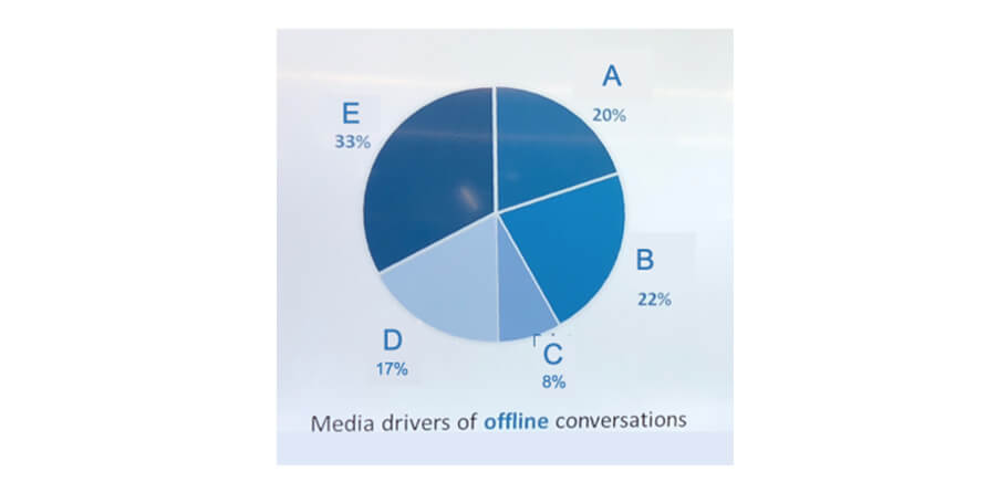
On the other end of the spectrum, none of the donut slices in this infographic add up to 100%. How can that be possible?
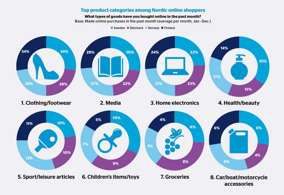
Top product categories among Nordic online shoppers (PostNord, 2017) PDF
Most likely that each slice represents a percentage of shoppers from the retrospective country that bought from each category of items. So when comparing, they shouldn't add up to 100% – but then why use a donut chart? A bar chart would have worked better as this is a total misuse of the donut and pie chart.
-
Don’t visualize your pie and donut charts at an angle.
Unfortunately, this is a very typical pie chart sighting in annual corporate reports.
This instance is given by IELTSBuddy as a writing test. Luckily for most people encountering this particular pie chart, they only need to showcase their English skills, so the listed numbers are enough to get by, even for that microscopic 0.4% slice. For actual data analysts, a pie or donut chart at an angle can distort the proportions of the slices, thus making it hard to draw any real comparisons.
Yes, it looks fancy, but in turn, makes the chart utterly useless. The view becomes distorted, making it difficult to gauge out the proportions of each slice.
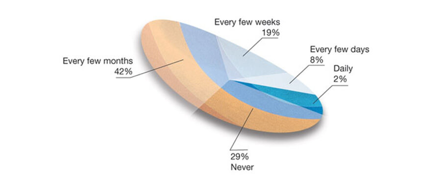
So, this pie chart is supposed to show how often people share recommendations online. Aside from the crazy visual effects and choosing to show most of the slices with a white overlay for some reason (why is only one of them blue?), you can't properly compare the slices due to them being at an angle. Keep your angle simple with a top-down view of the pie chart.
-
Don’t sort your categories by name.
This just clutters up the chart and confuses your end user’s eyes, as you've just thrust upon them the task to sort through each slice’s size on their own. Avoid giving your end users tasks they didn’t sign up for.
This is an example dug up by Junk Charts. As you can see, sorting the slices in alphabetical order just makes the pie chart harder to read. The best practice would be to sort by size, usually in descending order, and use color to encode data differences. For example, the Base Fill Color setting found in Drill Down Donut PRO does exactly this.
-
Don’t squeeze in too many categories into your donut or pie chart.
This just muddles the visibility of your Power BI pie chart. You also risk overloading your end user’s eyes. Imagine if the legend depicted anything other than emojis - if you were in your end user's shoes and saw this chart, would you really understand what to look at?
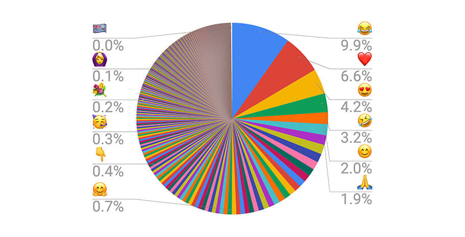
And if you were wondering – yes, this is a real pie chart made to measure Emoji Frequency.
-
Don't try to show intervals or growth with donut or pie charts.
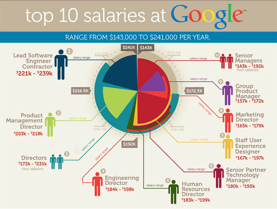
Okay, so somebody really tried to solve the 'too many categories' problem and thought this is a good way to get away with showing intervals on a pie chart.
Granted, they are trying to show salary interval per position – but why use a pie chart for that? It's not very intuitive to read, as donut and pie charts will always have that implied whole or 100%. The slices here aren't a percentage of anything, they're just intervals. Junk Charts demonstrated a better way of visualizing this type of data.
Intervals are very tricky to visualize with a donut chart as they risk exceeding 100% or can even go into negative numbers. You're just not going to be able to logically visualize that type of data with a Power BI pie or donut chart, so don't try to reinvent the wheel.
Is it Donut or Doughnut chart?
Short answer: it's both. Slightly longer answer: 'doughnut' is the generally accepted spelling, as most dictionaries would tell you. Most would say the shorter spelling of 'donut' is accepted only in American English. However, you'll find the shorter version has snuck into other English-speaking nations through advertising.
When it comes to charts, feel free to use your preferred spelling, whether that's 'Power BI doughnut chart' or 'Power BI donut chart'. However, here at ZoomCharts, we take charts seriously. So, we like to use 'donut chart' instead, just to avoid too close of an association with glazed treats.
Did we give you any ideas for your next Power BI donut chart? Bring them to life now with Drill Down Donut PRO!
There's always more to come. Don't miss out on other Power BI related news by subscribing to our newsletter!

Want more info like this?
Subscribe to our newsletter and be the first to read our latest articles and expert data visualization tips!