Drill down and drill up
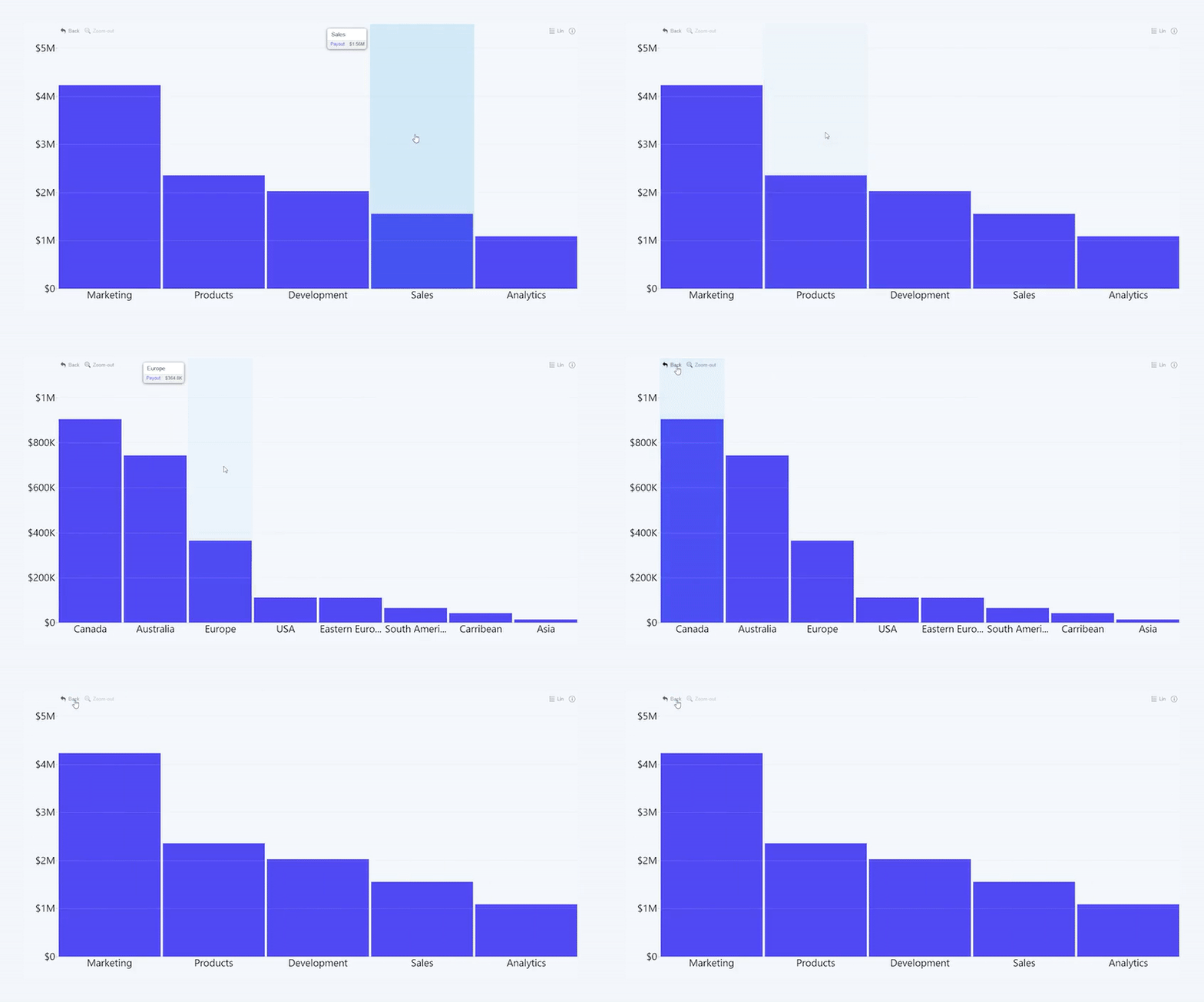
Drill down to the next date/time unit by left-clicking on the desired data point. To go back one level, click anywhere on the chart and drag up until you see the drill-up animation. You can also drill up by pressing the Zoom-out button on the toolbar of the visual.
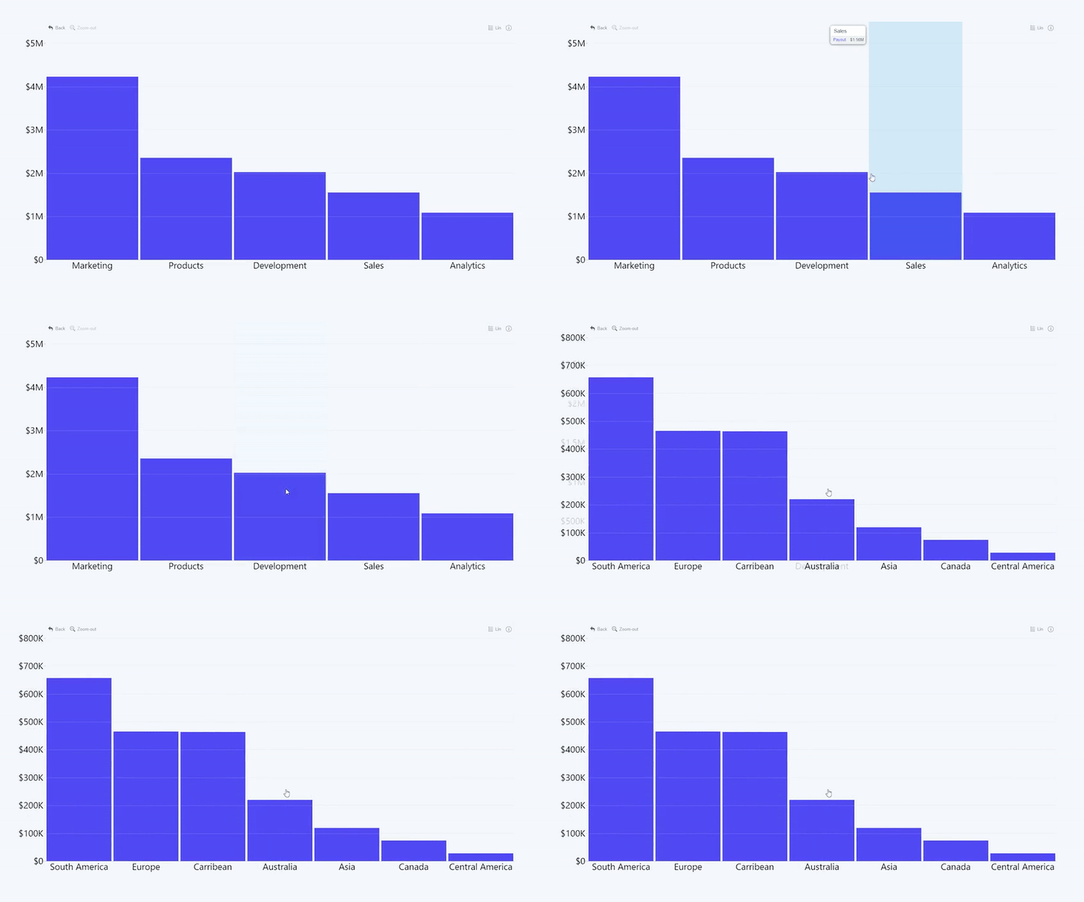
Drill down to a larger time period
The X-Axis (timeline axis) has two informational elements about the time scale. The upper line displays the time scale for the currently displayed granularity level. The bottom line shows a larger time scale. You can reposition and zoom the visible time range to fit a larger timeframe by left-clicking on the time unit displayed on the bottom line.
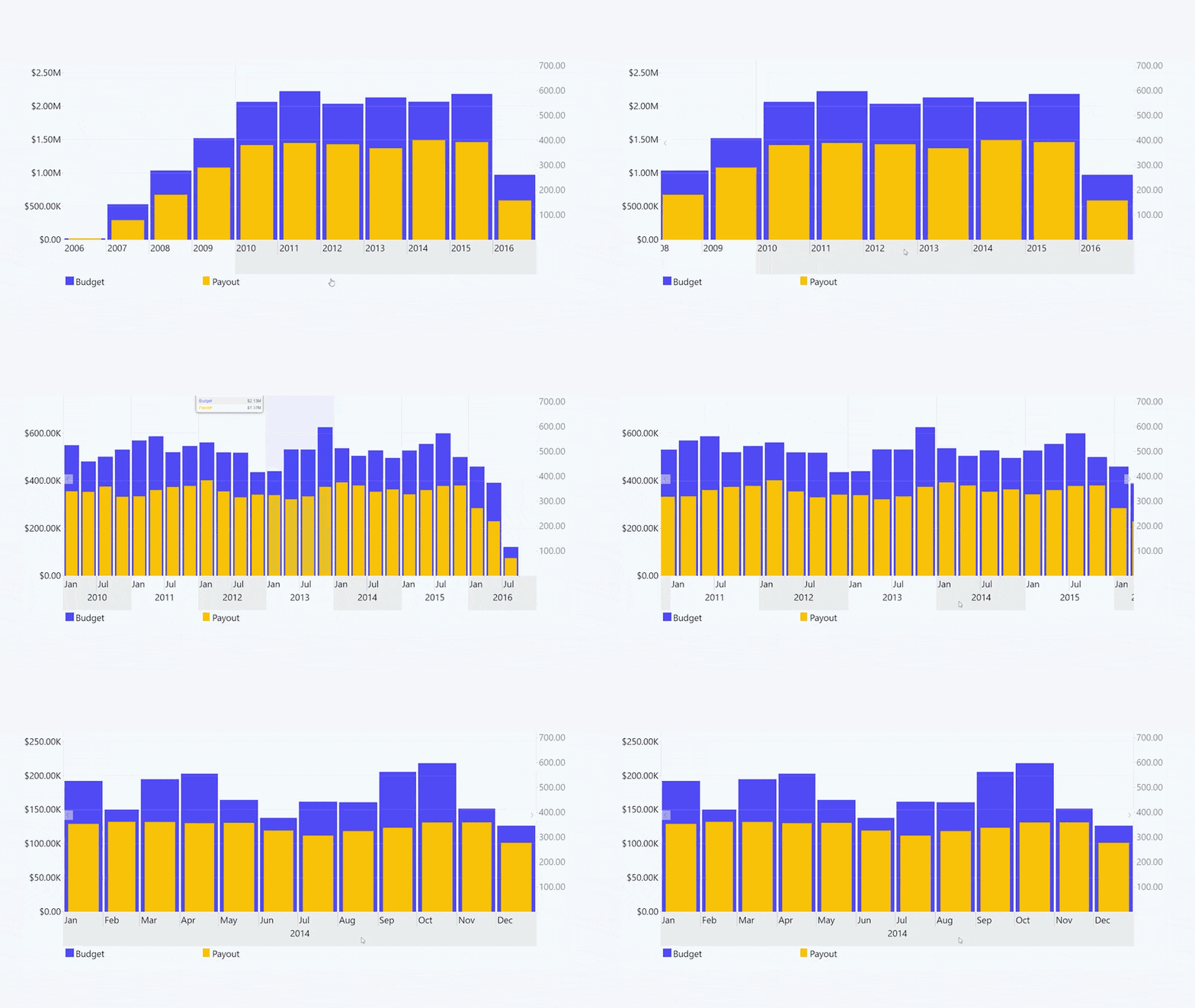
Zoom in and out
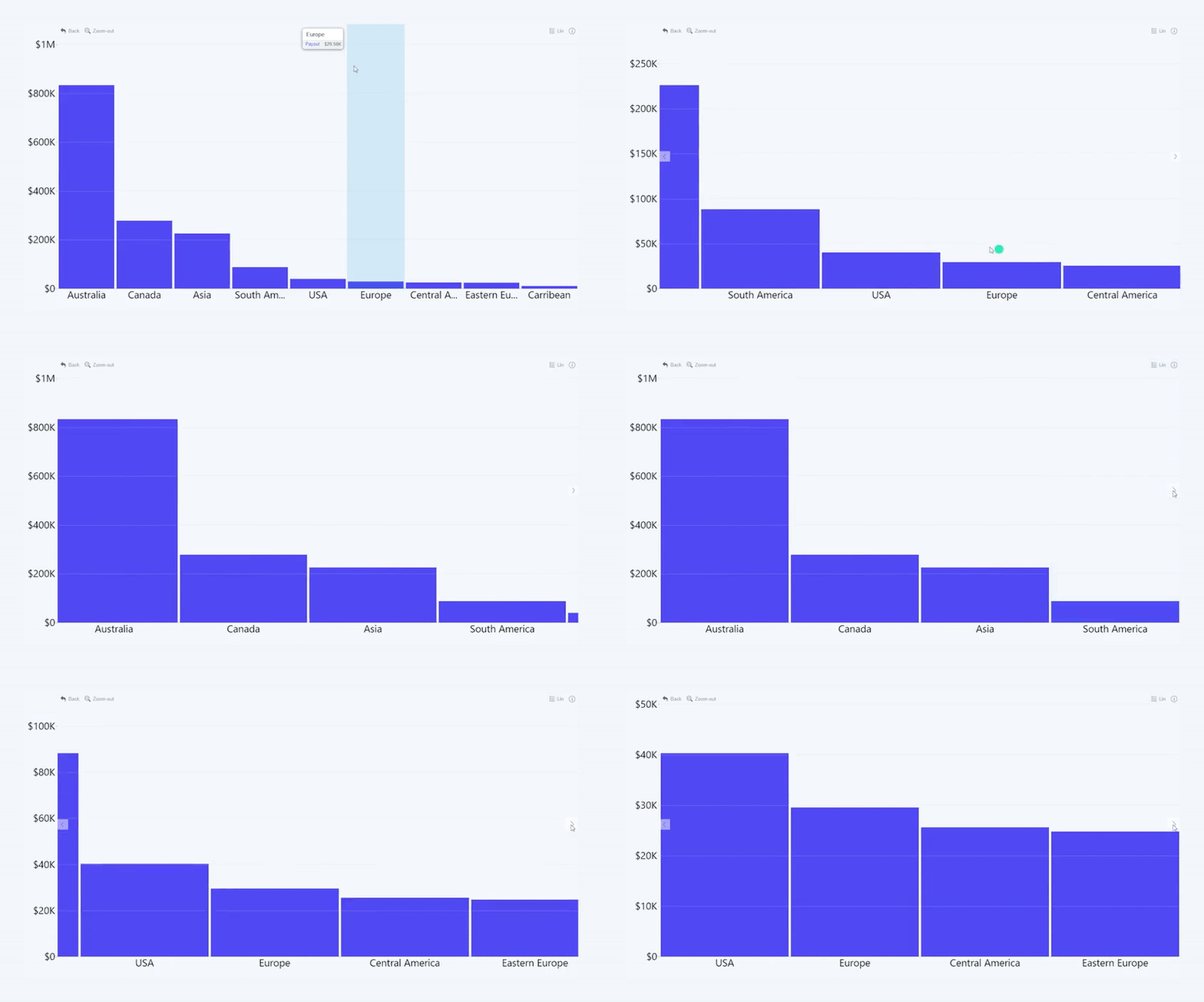
You can change the visible time period by clicking anywhere on the chart and dragging up or down. Left-click on the chart and drag upwards to zoom out. Left-click on the chart and drag down to zoom in. Alternatively, you can zoom out by pressing the Zoom-out button on the toolbar.
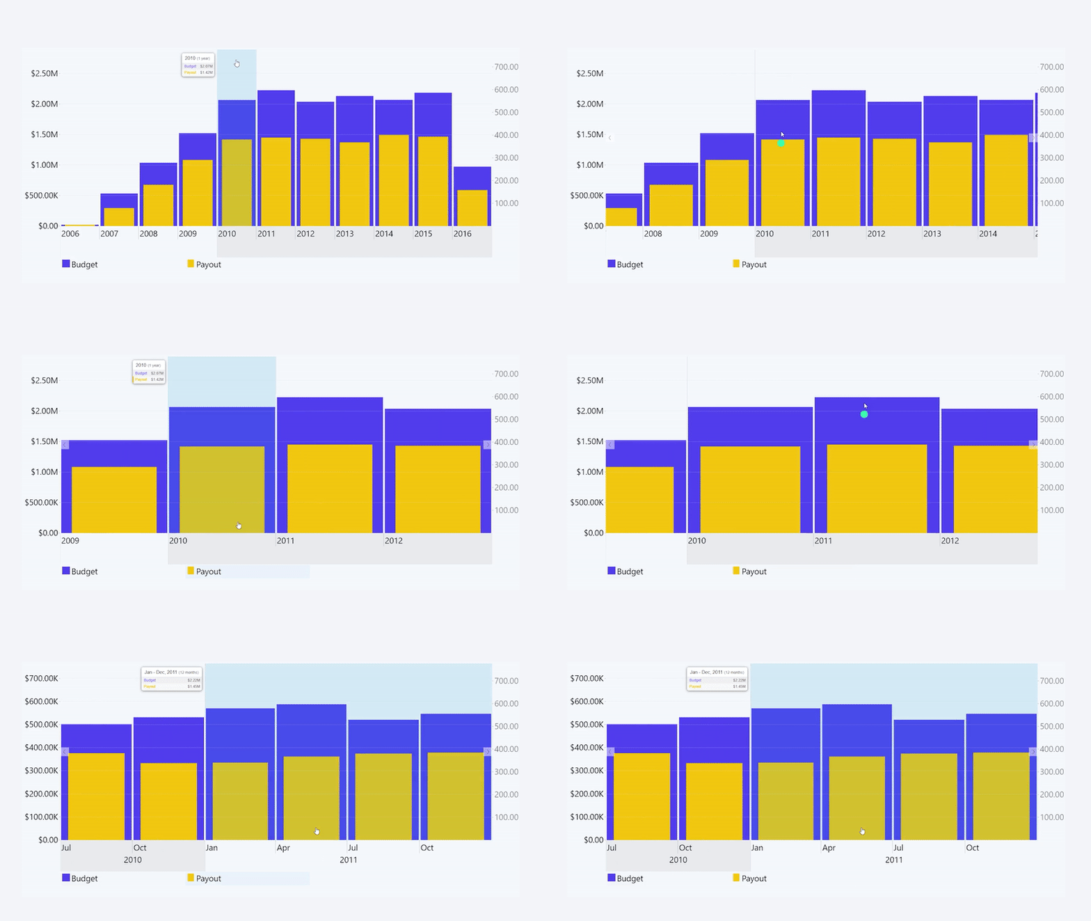
Scroll horizontally
Change the visible time period and reveal more data by moving the X-Axis to the left or right. Left-click on the chart while dragging left or right.
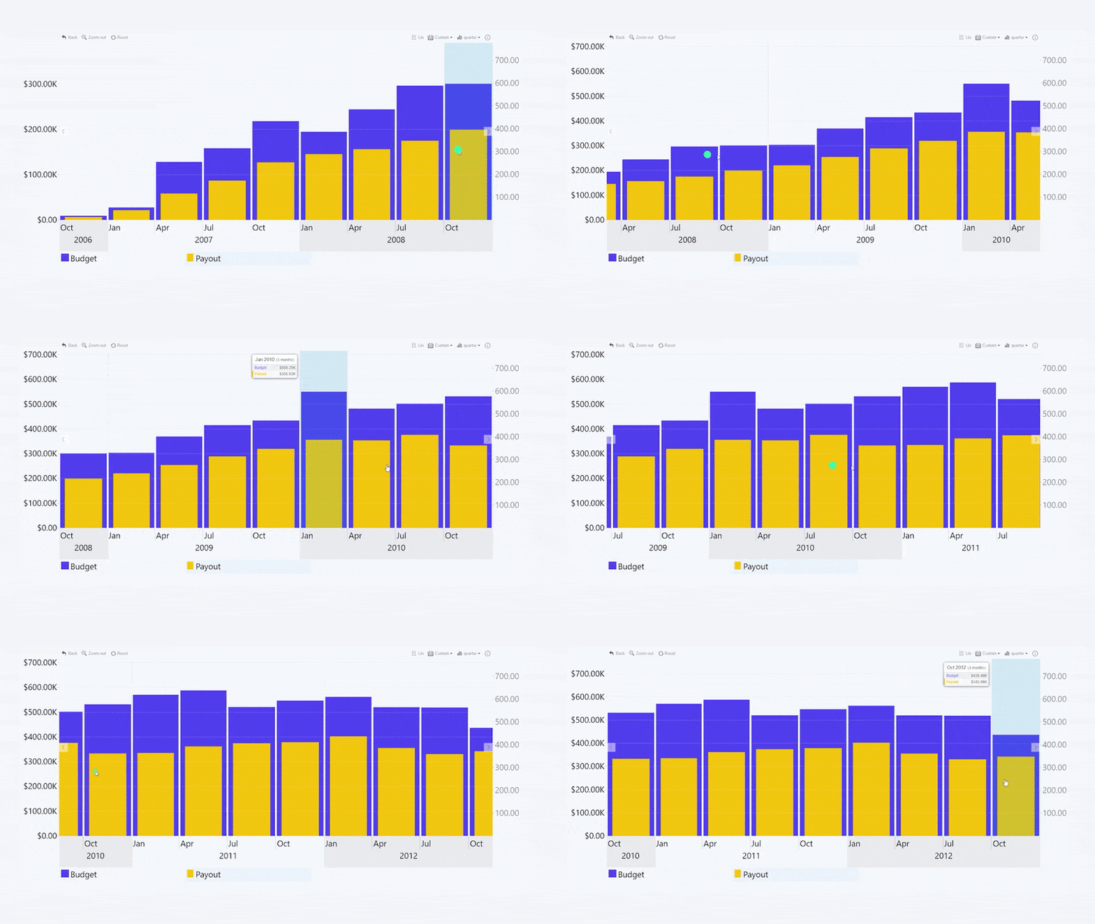
Go back
Use the Back button on the toolbar (if it's enabled), which will undo the last interaction with the chart.
Finetune zoom level
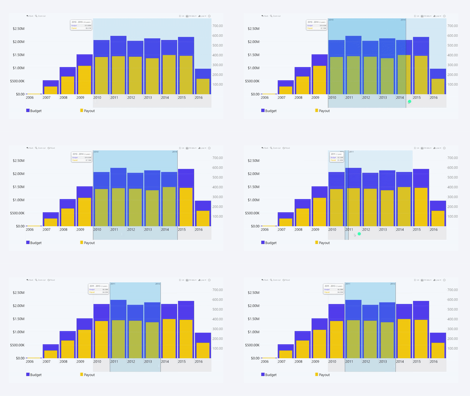
You can finetune the visible time period and adjust the start and end points of the visible X-Axis range by left-clicking on the chart and dragging in any direction until reaching the desired zoom level.
Select a time period
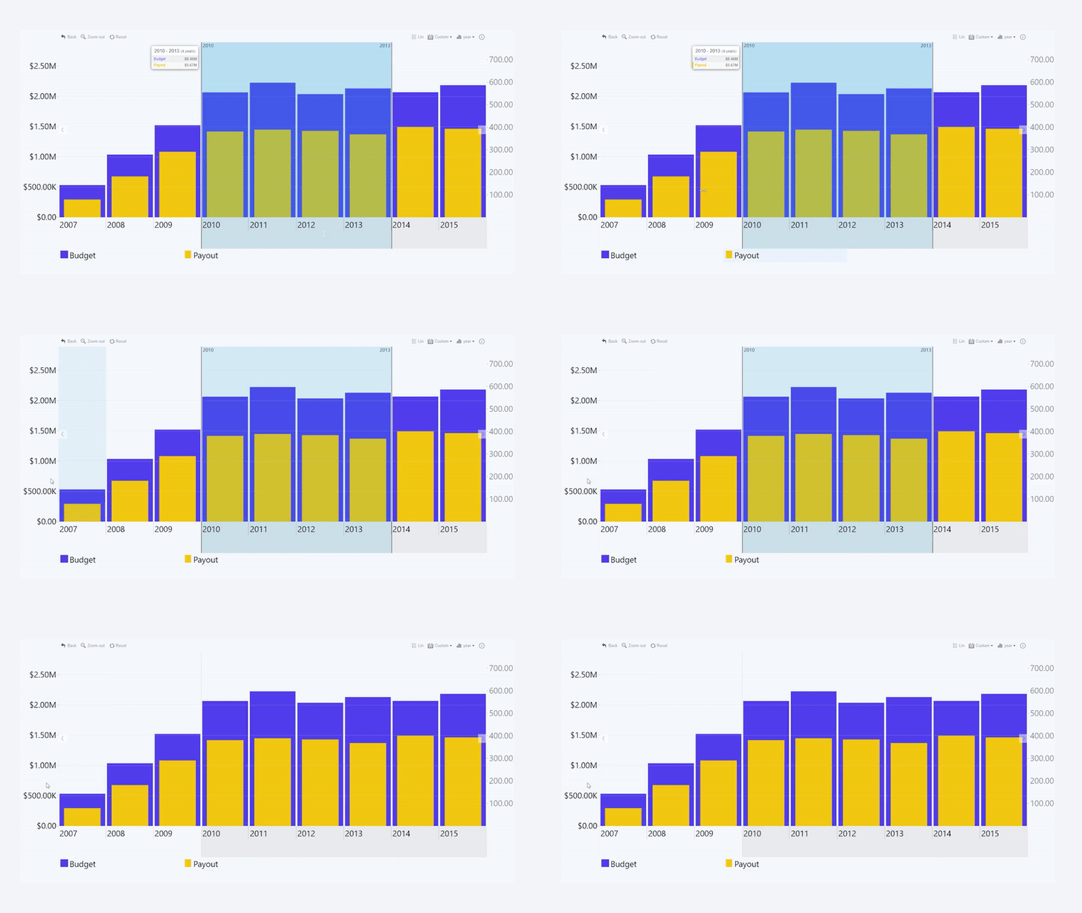
Click and drag horizontally on the X-Axis to select a specific time period. This interaction will highlight all data points within a specific time range and display aggregated values in the tooltip; and allow you to drill down to a specific time period by left-clicking on the selection.
Modify selection
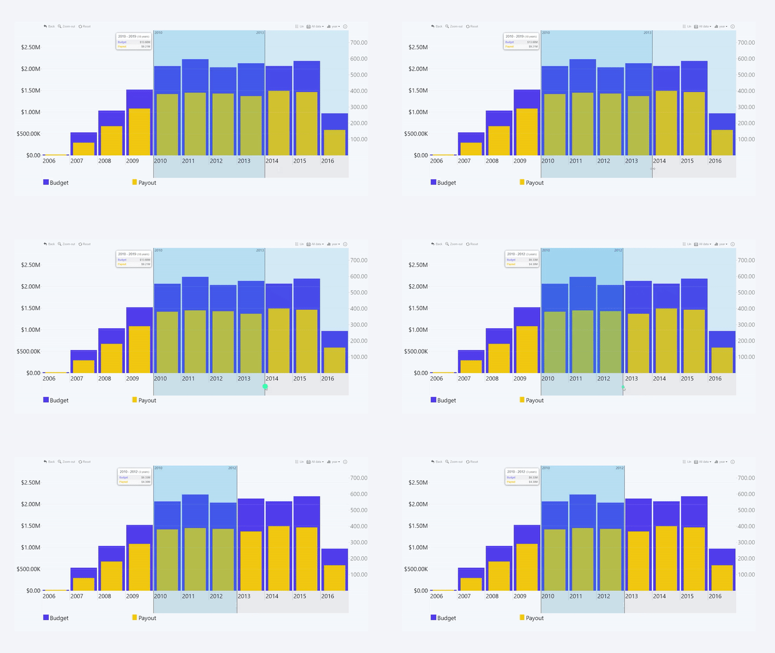
You can alter the selected time period on the X-Axis by left-clicking and dragging the edges of the selection.
Clear selection
Remove the selected time period by right-clicking anywhere on the chart.
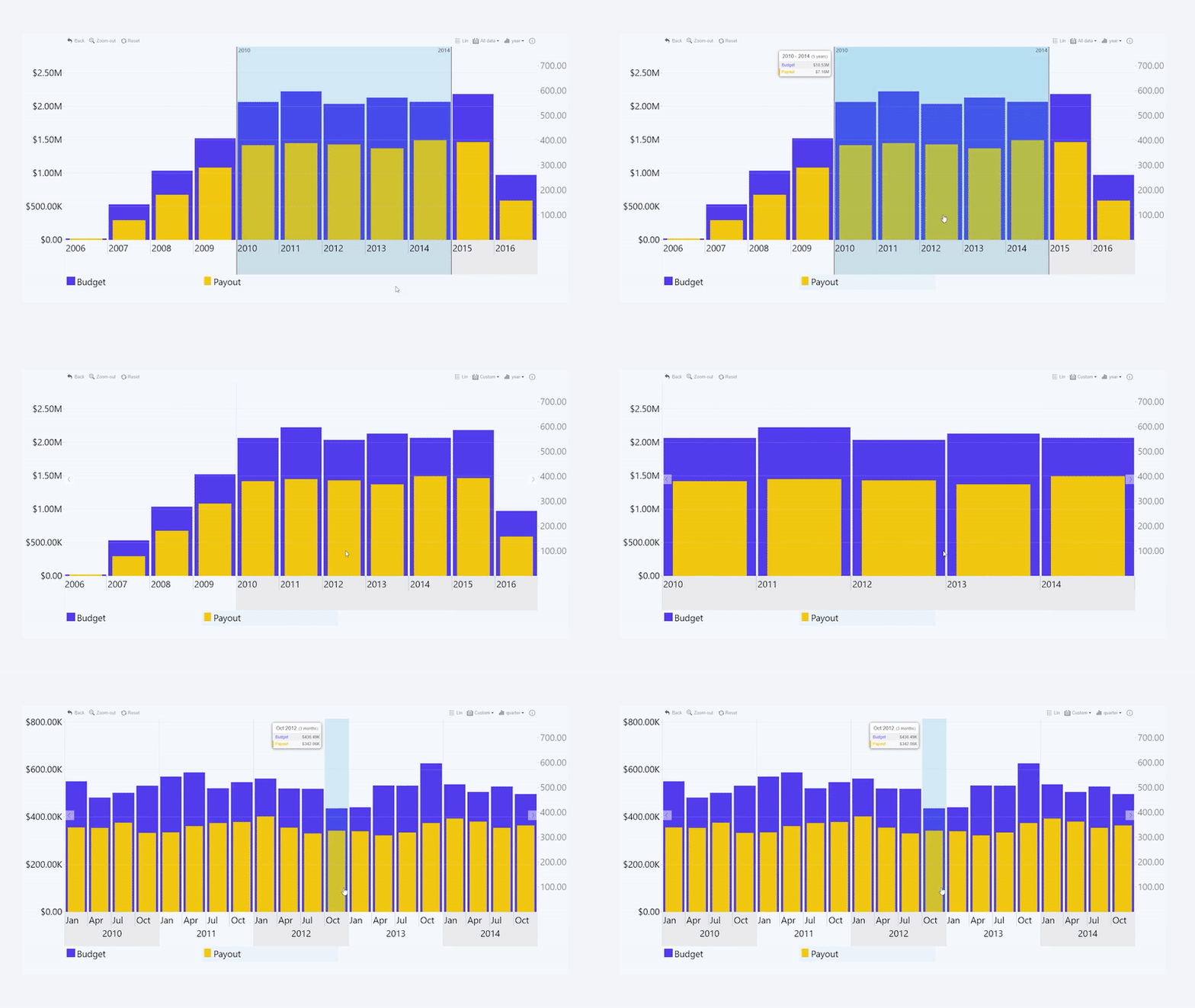
Drill down to selection
Drill down to the selected time period by left-clicking anywhere in the selected area.
Change granularity level
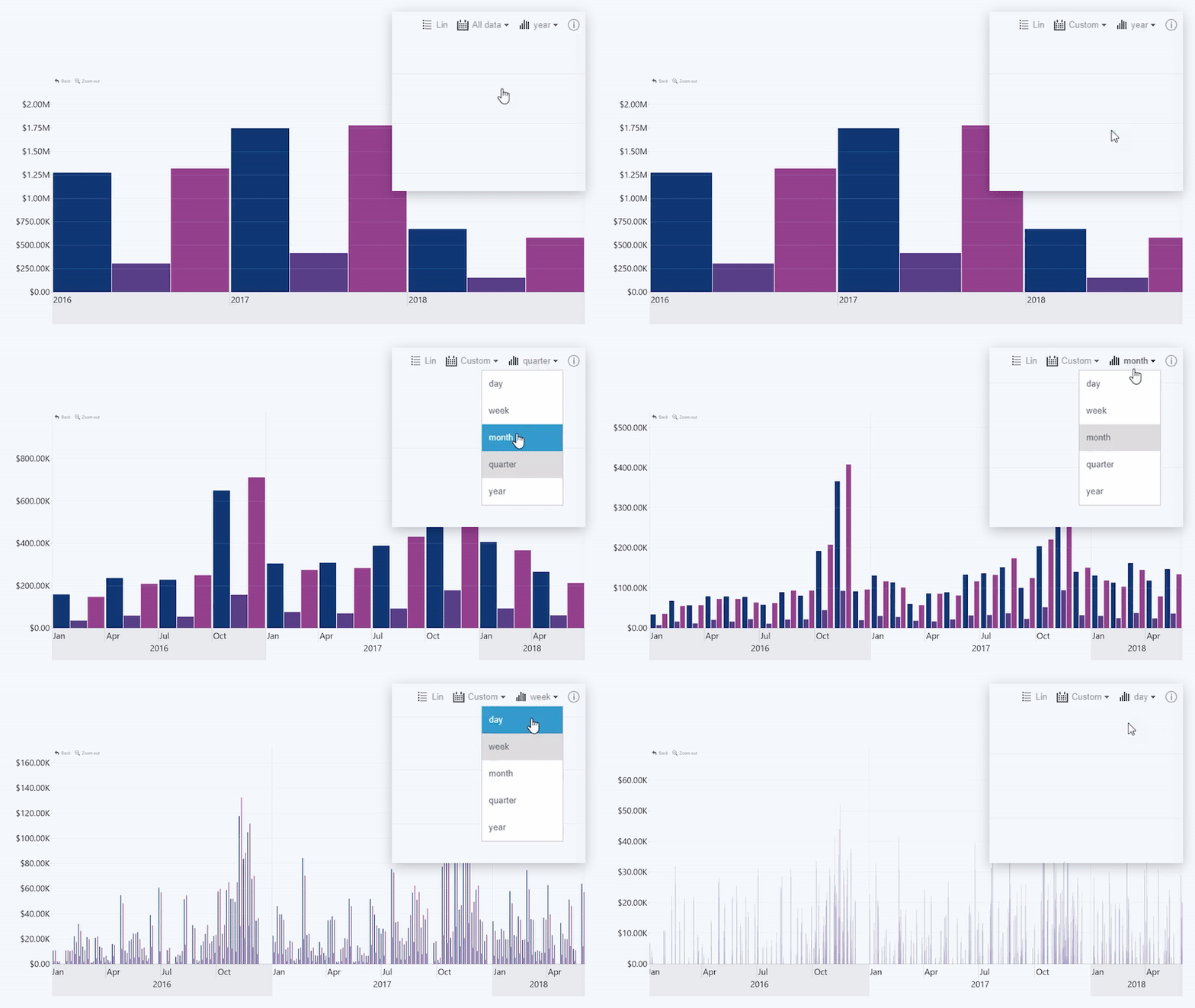
Choose a different time aggregation unit with the Display Unit button on the toolbar if it's enabled.
Toggle linear or logarithmic scale
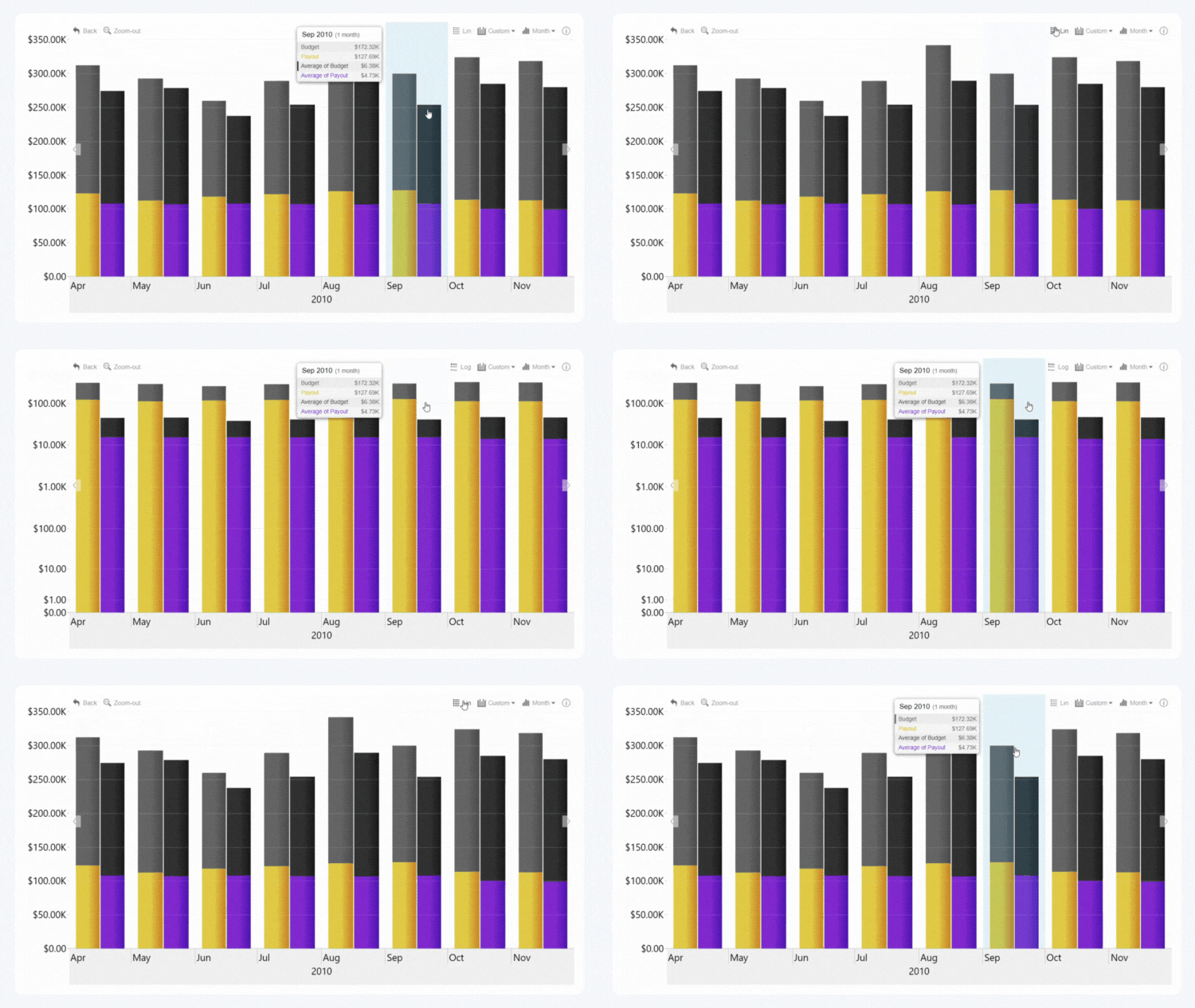
Change the Y-Axis scale to display values on a linear or logarithmic scale by pressing the Lin/Log Scale button on the toolbar if it's enabled.
Was this helpful? Thank you for your feedback!
Sorry about that.
How can we improve it?