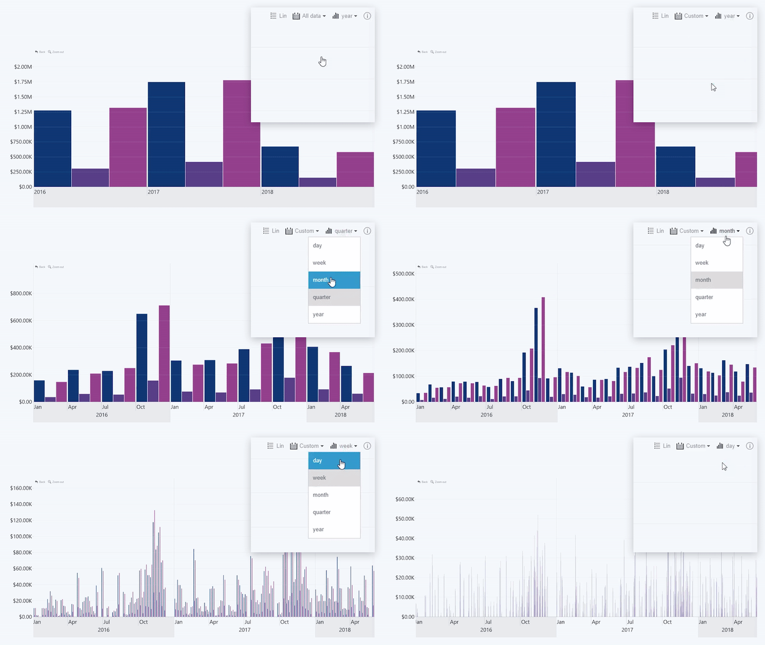
Enabling this toggle will add a Display Unit button
to the toolbar. Pressing this button will open a menu that allows the user to adjust
the data granularity on-the-fly by selecting a time unit.
If the user chooses larger time units (like years or months),
the chart will show fewer data points on the X-Axis, while smaller time units
(like days or hours) will show more data points for more accurate insights.
This button will not deviate from the current view, and it affects only the
display behavior of the chart on the user’s instance.

Was this helpful? Thank you for your feedback!
Sorry about that.
How can we improve it?