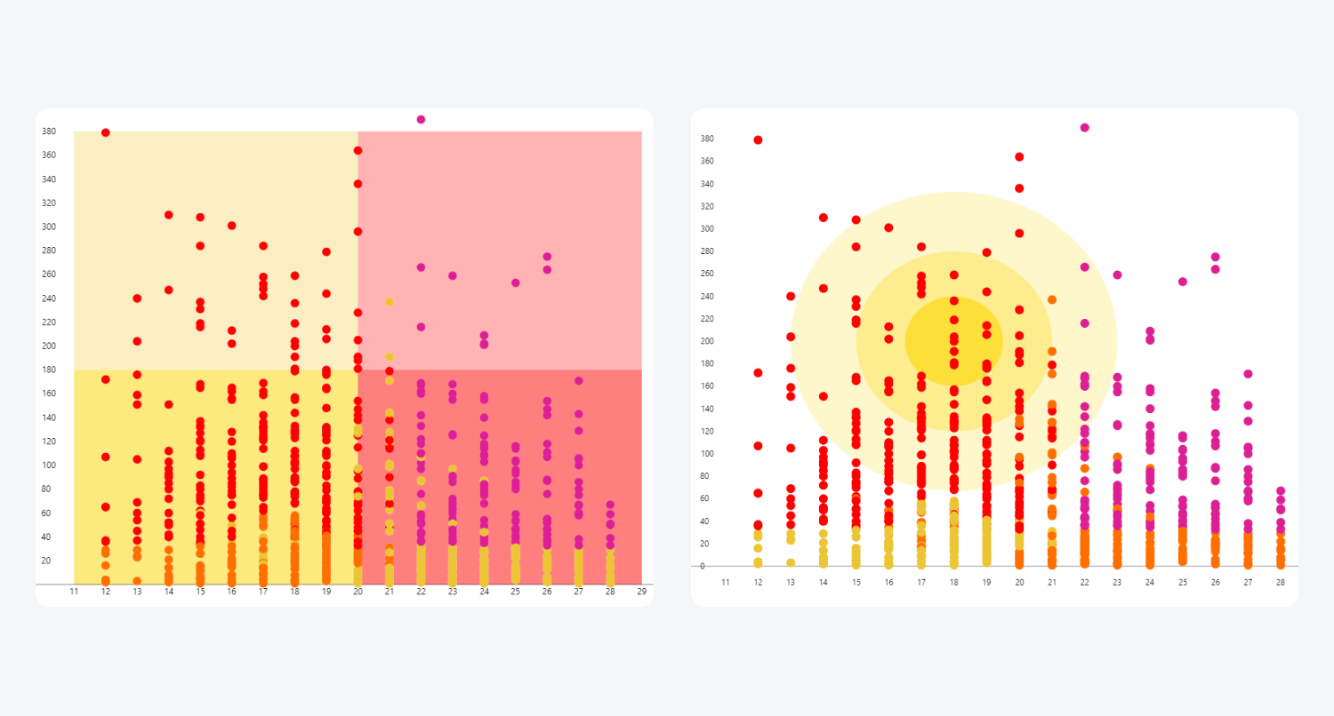
If you need to emphasize a specific area, visually distinguish
certain segments, or color-code quadrants, you can display up to eight custom
shapes on your scatter plot. Each shape will be displayed at the background of
your chart, which means that the shapes will not obscure data points or other
chart elements.
The Area Shading section contains eight toggles (Enable
Area 1-8), and you can turn each toggle on to create a new area that
can be configured separately from others. Each enabled area will reveal a new
section in the Format Visual tab (Area 1-8 Settings) that contains
various settings for customizing the shape, position, and appearance of the
specific area:
- Area Shape
- Area Start (X-Axis)
- Area Start Coordinate (X-Axis) (available if Area Start (X-Axis) is ‘Value’)
- Area End (X-Axis)
- Area End Coordinate (X-Axis) (available if Area End (X-Axis) is ‘Value’)
- Area Start (Y-Axis)
- Area Start Coordinate (Y-Axis) (available if Area Start (Y-Axis) is ‘Value’)
- Area End (Y-Axis)
- Area End Coordinate (Y-Axis) (available if Area End (Y-Axis) is ‘Value’)
- Fill Color
- Fill Opacity
- Line Width
- Line Color
- Line Opacity

Was this helpful? Thank you for your feedback!
Sorry about that.
How can we improve it?