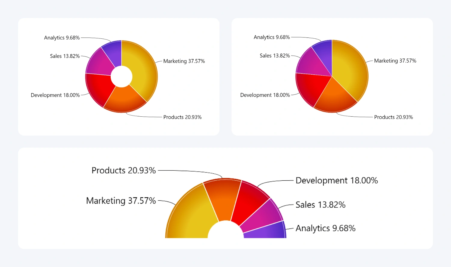
Drill Down Donut PRO can visualize your data in three distinct ways to help you create the perfect visualization for your data. You can find these settings in Visualizations pane -> Format Visual tab -> Donut menu.
- Donut chart: The default behavior of Drill Down Donut PRO. The chart will have an empty middle section. You can adjust the size of the “donut hole” with the Inner Radius setting.
- Pie chart: Functionally the same as a donut chart, but with no empty middle section. You can achieve this chart style by setting the Inner Radius to 0.
- Gauge: Instead of a full circle, this setting will visualize the same data on a semicircle. Set the Enable Gauge toggle to On.
Furthermore, you can use the Enable 3D toggle to create a subtle emboss and drop shadow effect for your chart, adding a stylistic flair without compromising readability or data accuracy.

Was this helpful? Thank you for your feedback!
Sorry about that.
How can we improve it?