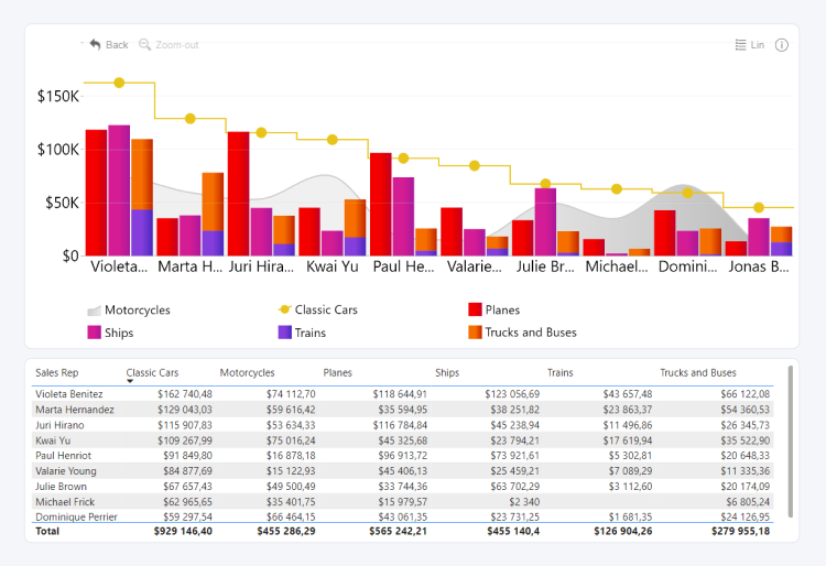
Drill Down Combo PRO lets you combine up to 25 data series in a single visual. Each series can be displayed as columns, a line, or an area, allowing you to compare multiple measures and trends across categories.
You can also create a drill-down hierarchy and customize the appearance and behavior of each series independently.
Before you begin
To create a chart, add categorical data to Category and numerical data to at least one Series field.
The Category field defines the data points displayed on the X-axis. Add multiple fields from the highest hierarchy level to the lowest to create a drill-down hierarchy. For example, add Region before Country and Country before City.
Add each numerical measure to a separate Series field. Each series can be independently configured as columns, a line, or an area.
Each Series field supports one numerical measure. Drill Down Combo PRO supports up to 25 series.
Additional fields are optional and provide further customization options. For more information, see the Data Fields page.
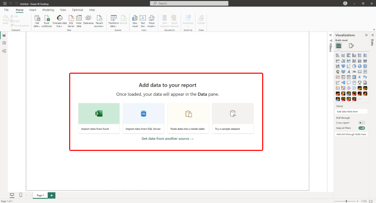
Initial Setup
Drill Down Combo PRO includes a guided setup experience that helps you start with a common chart configuration.
To add Drill Down Combo PRO to your Power BI report, select the visual in the Visualizations pane.
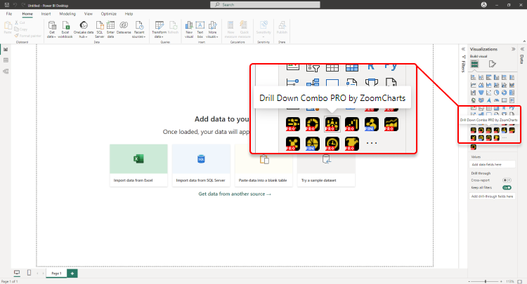
You will be presented with several chart configurations. Select the configuration you want to create
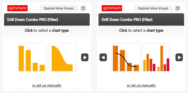
Required Fields Guidance
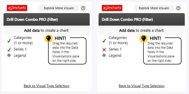
After you select a configuration, the visual displays the data fields required to create it.
Field Validation and Visual Generation
As you add data, the visual indicates which required fields have been provided and whether the assigned data is valid. Once all required fields contain valid data, the chart is generated. You can then customize it further in the Format visual pane.
Manual Setup
To configure the visual without selecting a predefined configuration, select Manual Setup at the bottom of the initial setup window.
Was this helpful? Thank you for your feedback!
Sorry about that.
How can we improve it?