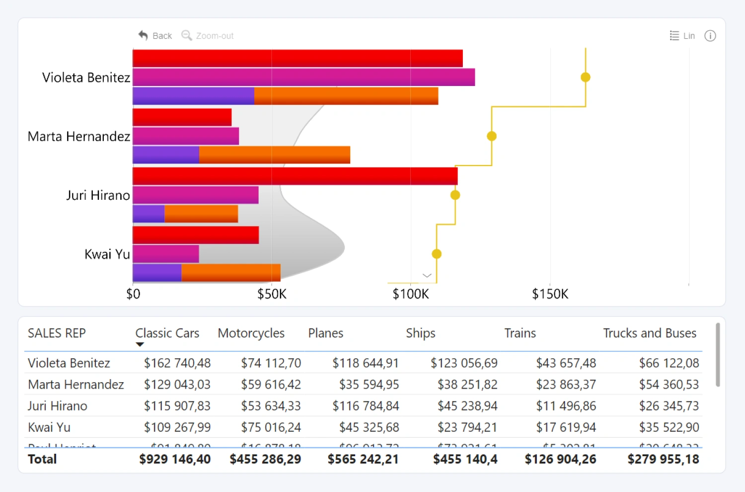
Drill Down Combo Bar PRO is a multi-purpose visual for categorical data. You can combine up to 25 different series on the same visual and display each series horizontally in three different ways – bars, lines, or areas. With this visual, you can build data-rich visualizations that your users can effortlessly explore with intuitive on-chart interactions.
Before you begin
This visual is designed for categorical data. Your data set
will require at least one column that contains categories, and at least one
column containing a series of numerical values.
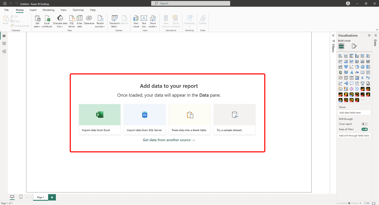
When you create a blank Power BI report, you will be
presented with multiple options: you can import your own data, paste it into a
blank table, or try a sample data set that’s provided by Power BI. The latter
option is recommended if you want to experiment with the features of Drill Down
Combo Bar PRO without using your own data.
Adding Drill Down Combo Bar PRO to Power BI
If you have downloaded this visual from Microsoft AppSource within Power BI Desktop, its icon should automatically appear in the Visualizations pane on the right side of your Power BI window.
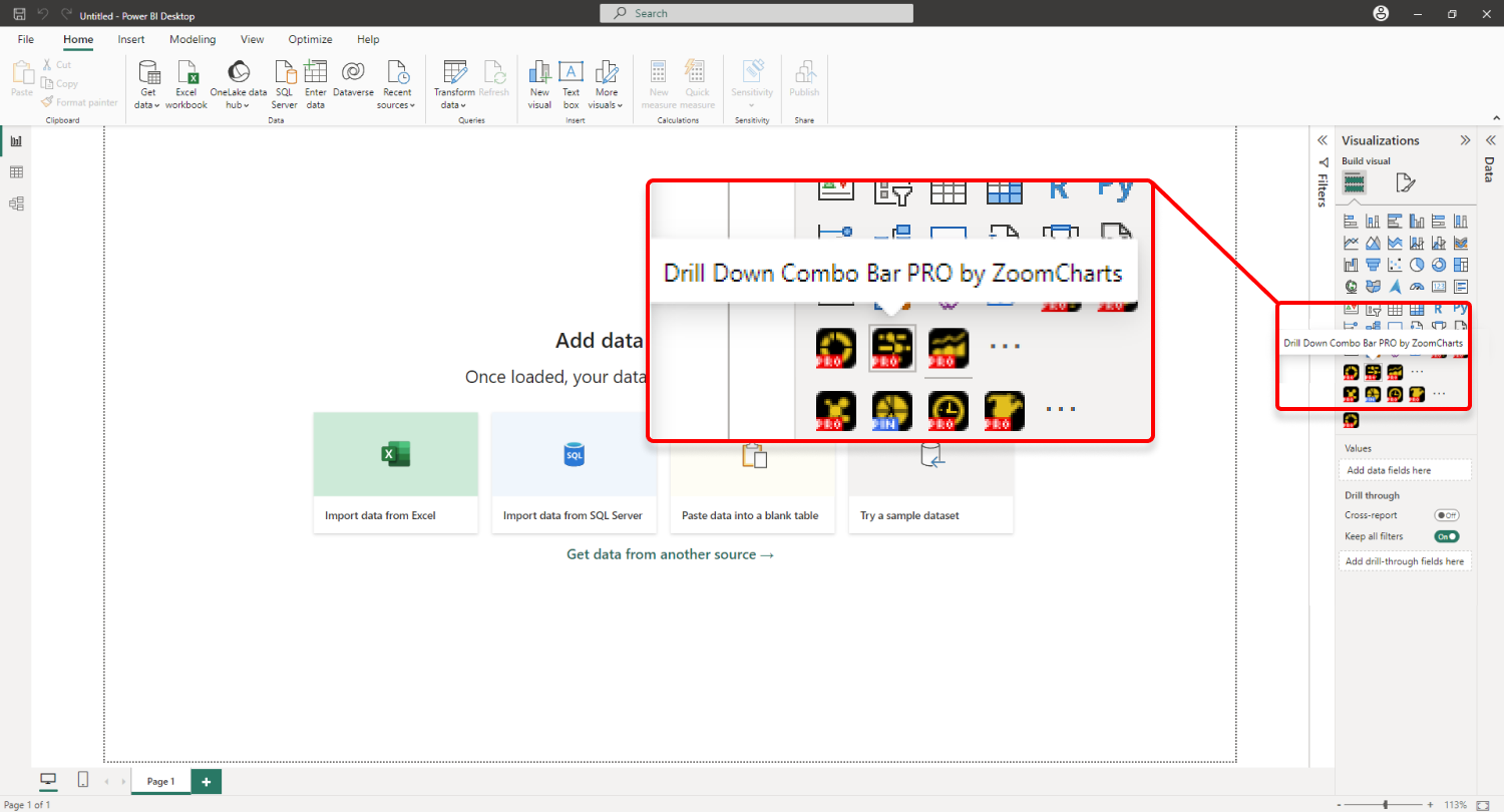
If you have acquired Drill Down Combo Bar PRO externally, you may need to add it to Power
BI manually. You can do that by clicking the ellipsis button at the end of the
visualizations list, and pressing Import a visual from a file. Locate
the .pbiviz file and the visual will be added to the Visualizations pane.
.webp)
You need to activate your trial or have a valid license to use the PRO features of this visual. Read more about licensing on this page.
Creating a combo chart with Drill Down Combo Bar PRO
Add Drill Down Combo Bar PRO to your Power BI report by
clicking the visual’s icon in the Visualizations pane. Doing so will
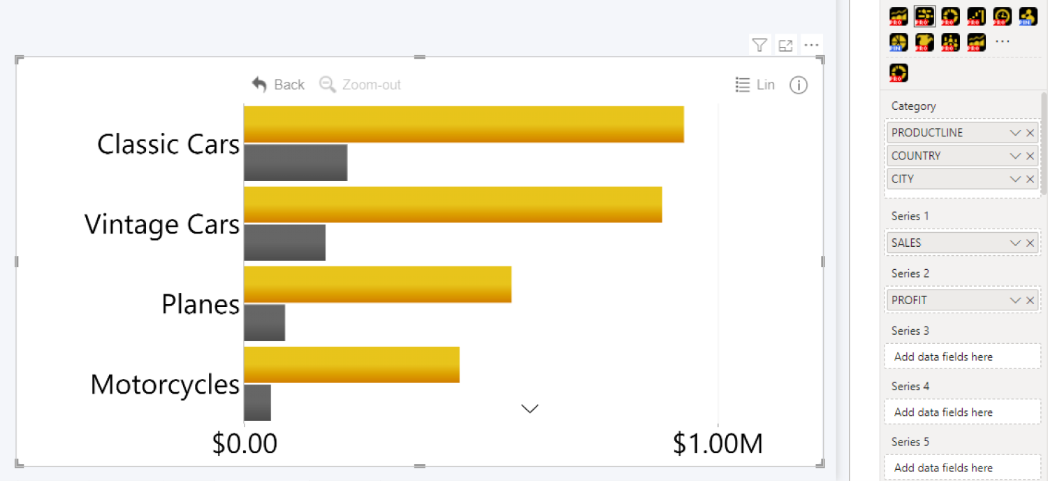
create a blank visual that contains no data. Once you add at least one valid column
in each of the required fields – Categories and Series – Combo Bar
PRO will visualize your data (as a bar chart by default). You can read more
about the required and optional fields on this page.
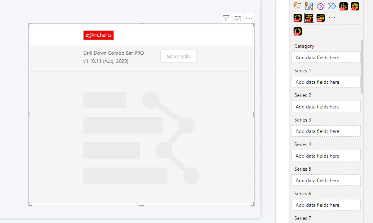
Categories field is used to create data points on the Y-axis,
and each Series field will assign numerical values to each category to
determine how the bars, areas, or lines are displayed on the x-axis. Adding
multiple columns to the Categories field will create a drill down
hierarchy based on the column order in that field.
Conversely, you can add only one series per each Series field.
This means that you will see a separate Series field for each column (Series
1, Series 2, Series 3, etc.) and each additional column you want to feature
in your chart must be added to its own respective field. Doing so will allow
you to adjust specific settings for each series independently. Once you have
added the required data, Drill Down Combo Bar PRO will instantly create a bar
chart.
You can now explore the Formatting Options to customize the
look and behavior of your chart. Head to the Series Customization menu
for each series to change the chart type, adjust color fill and outlines,
change series width, adjust clustering or stacking behavior, and many other
settings.
Format Visual tab also contains various options to
adjust global formatting settings, customize legends, tooltips, thresholds and
more, or enable a secondary x-axis. If you want to enable cross-chart filtering
to use this visual as an interactive filter for the entire report (or vice
versa – filter your combo chart with other visuals), you can do that with the Use as Filter toggle.
Was this helpful? Thank you for your feedback!
Sorry about that.
How can we improve it?