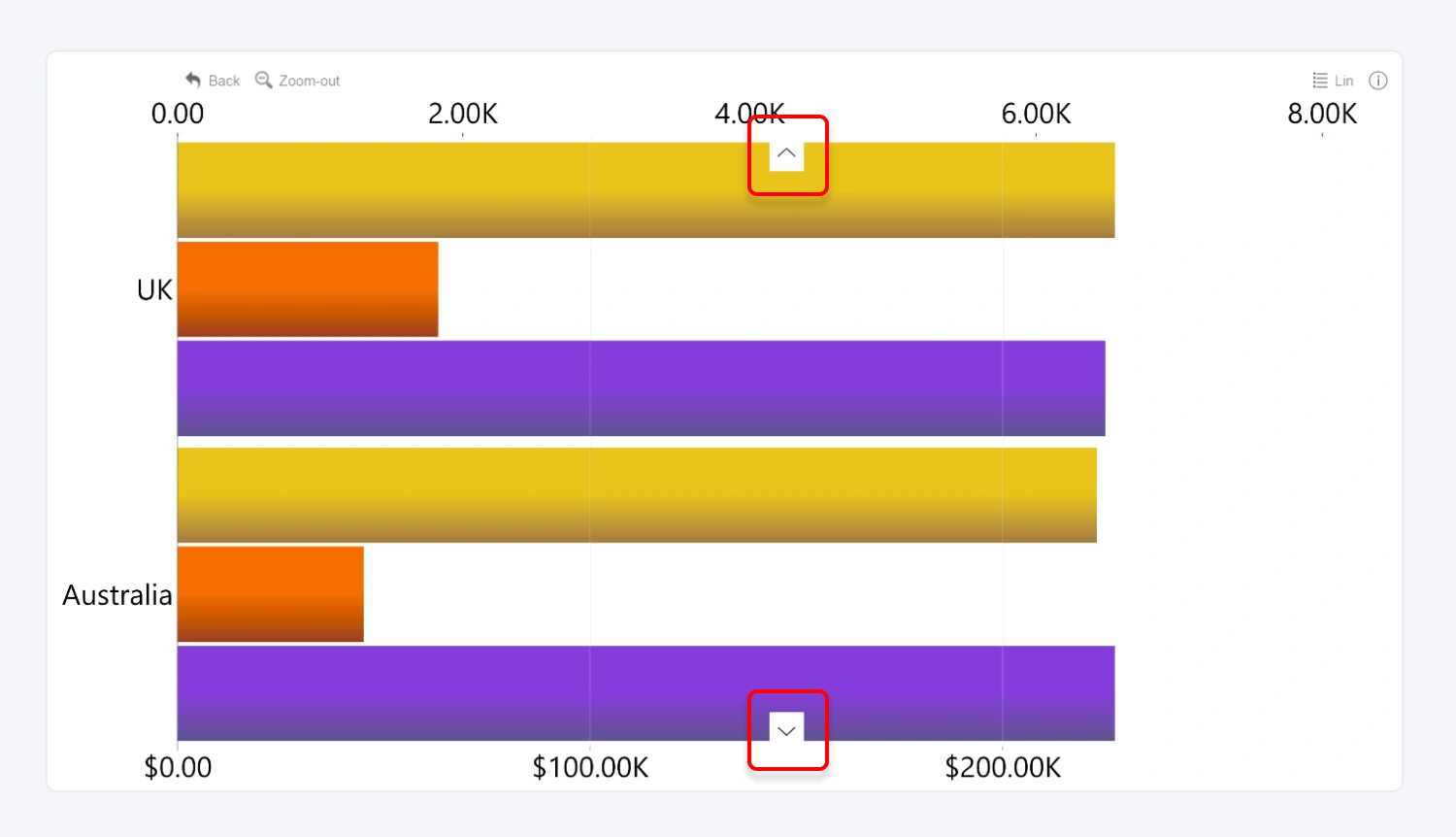
This toggle will enable navigation arrows that will be displayed on the top and bottom of your combo visual. These arrows provide an additional way for the user to vertically scroll the Y-axis if the viewport cannot display all categories.

After enabling this setting, additional options will be revealed for further customization:
- Arrow Color
- Arrow Color Opacity
- Arrow Background Color
- Arrow Background Color Opacity
- Arrow Size
- Different Settings on Hover
- Arrow Location
Enabling Different Settings on Hover will reveal additional settings for when the user hovers over the navigation arrows:
- Arrow Color on Hover
- Arrow Color Opacity on Hover
- Arrow Background Color on Hover
- Arrow Background Color Opacity on Hover
- Arrow Size on Hover
Was this helpful? Thank you for your feedback!
Sorry about that.
How can we improve it?