About ZoomCharts Mini Challenge
ZoomCharts Mini Challenge is part of the global DataDNA – Dataset Challenge by Onyx Data, which unites 25K+ data enthusiasts worldwide, ranging from beginners to seasoned professionals, including Microsoft MVPs. Read more about the DataDNA challenge on the Onyx Data website. Join the community on LinkedIn
The ZoomCharts Mini Challenge provides a platform for a growing community to learn how to build PRO reports, aiding business users to explore data quickly and intuitively.
- Free License: All participants receive a free ZoomCharts Developer License that gives access to the full Drill Down PRO visuals library. License will remain active for 1 year after the challenge.
- Learn from Experienced Professionals: As part of the challenge, we host live workshops on report building and visualizing the challenge’s dataset in Power BI. Challenge participants can also book an individual consultation with an experienced Power BI mentor to ask questions and get personalized tips.
- Tailored Feedback: Every challenge submission will receive personalized feedback, giving participants the chance to hone their skills and improve their reports.
Prizes
The best report’s creator will receive a $300 Amazon gift card from ZoomCharts.
Webinar recordings
How to participate?
1. Register for the challenge:
2. Build your report in Power BI:
- Set up an account in Power BI using the assigned license details (if you have participated in ZoomCharts Challenges in the past, you can use the same account you set up before).
- Use the account to access the full library of custom ZoomCharts Drill Down visuals.
- Use the dataset to build a Power BI report including at least 2 ZoomCharts Drill Down Visuals in one report page.
3. Improve your report and learn new skills:
- To learn more about applying ZoomCharts visuals in your reports, participate in the challenge workshop.
- If you have any questions or need advice, you can book a free individual consultation here.
- Check out the submissions from past challenges for inspiration.
4. Submit your challenge entry:
- Submit your report in .pbix format for validation using the form on this challenge page.
If your submission doesn’t match the challenge criteria, you will be notified by email indicating the reason. Don't worry if this happens! You can fix the issue and resubmit your report.
- Your report will be reviewed within 1–2 business days. Once it’s validated, you’ll receive a Publish to Web link via email. You can use this link to add the report to your portfolio or share it publicly online.
- All validated entries will also receive personalized feedback from the evaluation team via email within 1-2 business days. Use this feedback to revise your report and resubmit it before the deadline.
Note: Feel free to resubmit your entry as many times as necessary before the deadline.
5. Finalize your participation to compete for the prize
- Post the final version of your submission as a single image on your LinkedIn profile, including the tags @ZoomCharts and @OnyxData, as well as the hashtags #dataDNA and #builtwithzoomcharts.
- After posting the report on LinkedIn, please submit it to the Onyx Data DataDNA Main Challenge
- Follow ZoomCharts on LinkedIn
- Follow Onyx Data on LinkedIn
- All participants of ZoomCharts Mini Challenge need to submit reports main Onyx Data DataDNA challenge for a chance to win additional prizes.
6. Attend challenge closing webinar to hear the results:
- The submissions are evaluated by ZoomCharts team (see "Judging criteria" for more info). The submissions of Top 5 ZoomCharts Mini Challenge finalists are analyzed live during the challenge closing webinar to share the best practices and learning opportunities with the community.
- The author of the best report is rewarded with a $300 Amazon gift card from ZoomCharts.
Social Media Marketing Performance Analytics Challenge
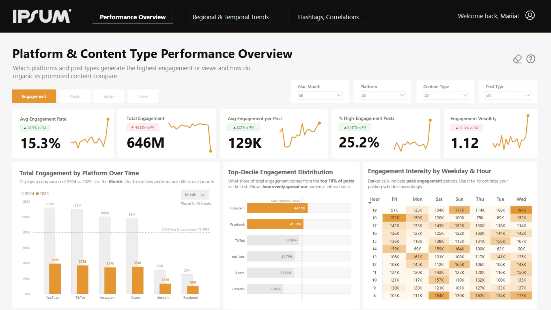
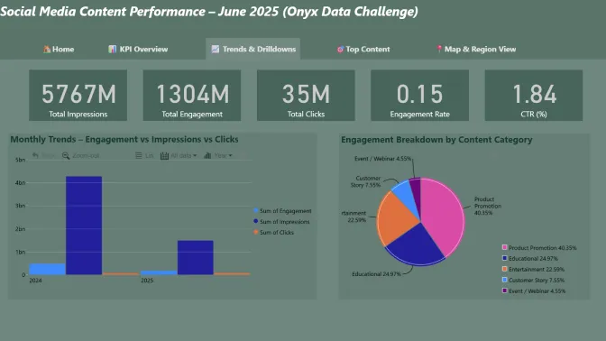
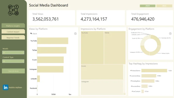
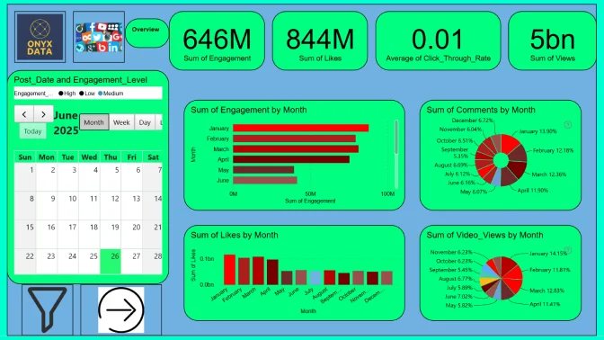
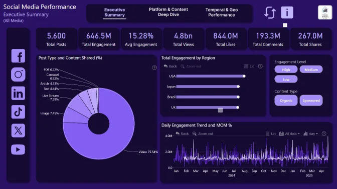
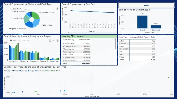
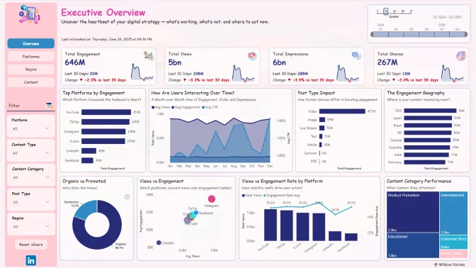
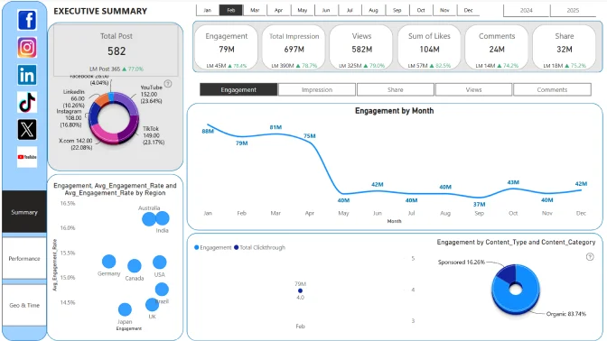
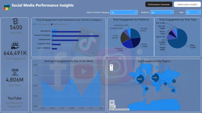
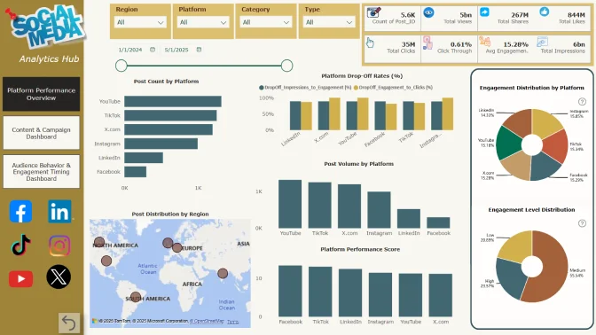
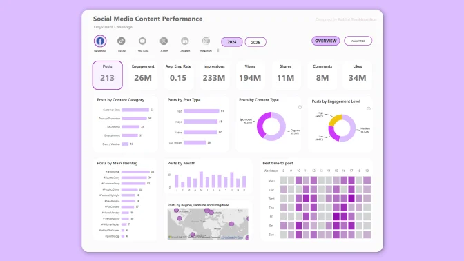
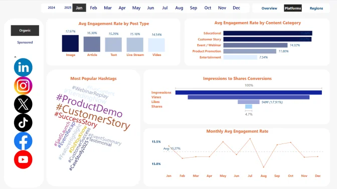
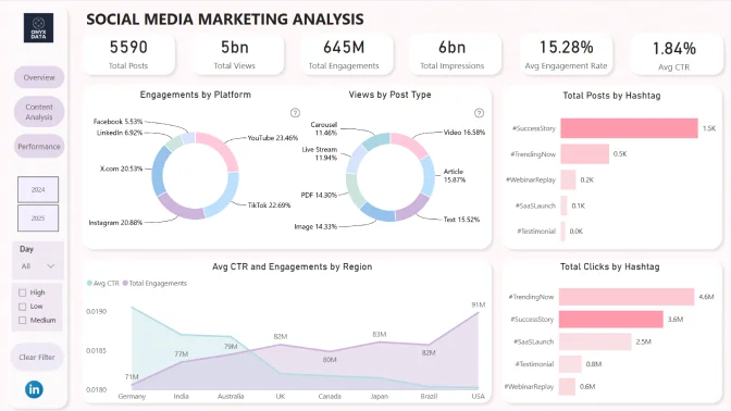
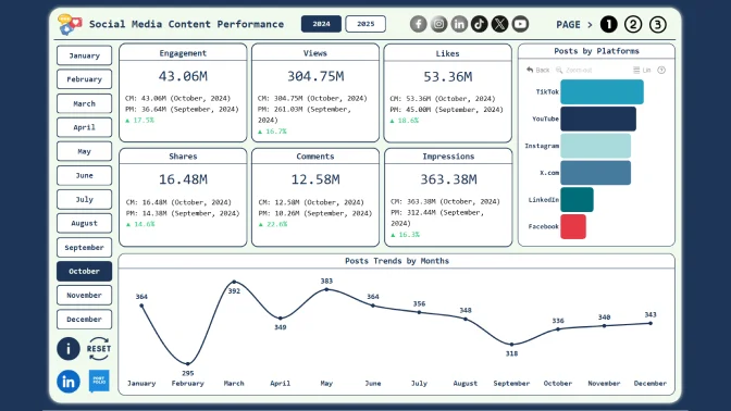
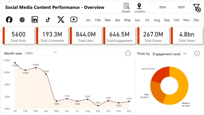
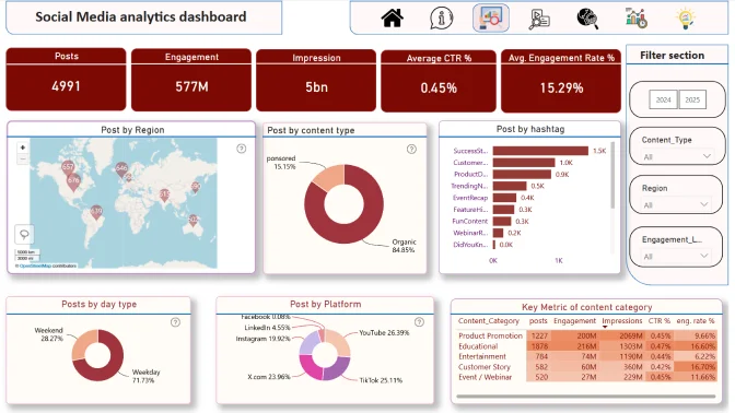
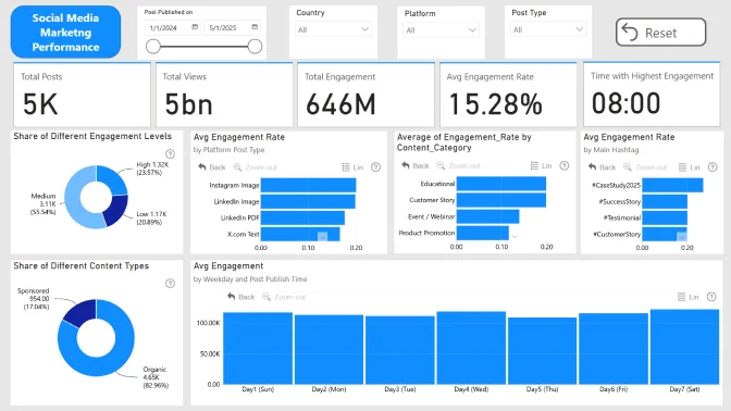
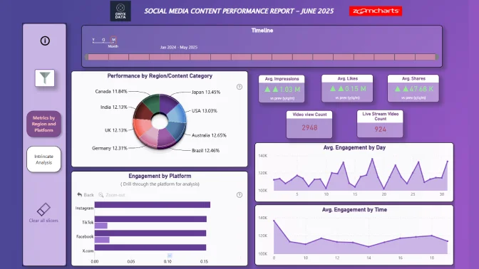
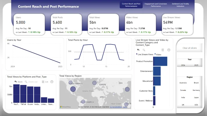
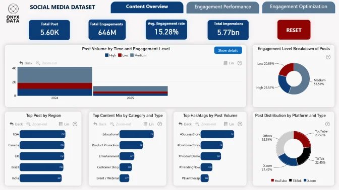
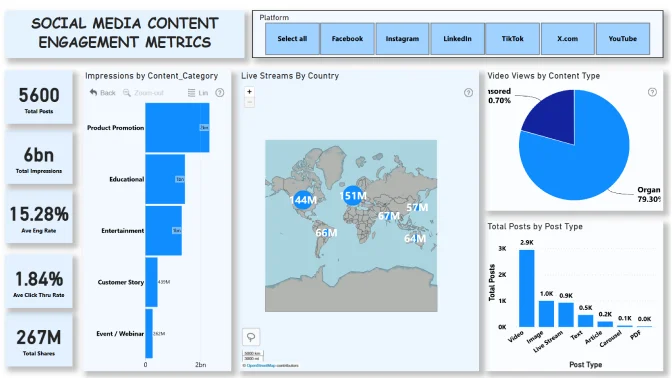
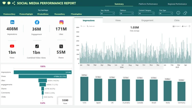
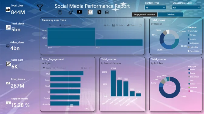
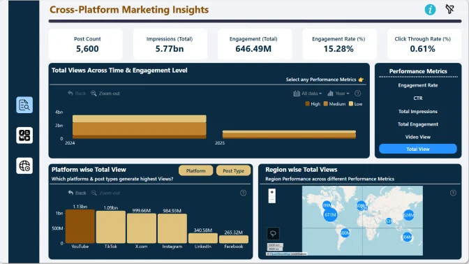
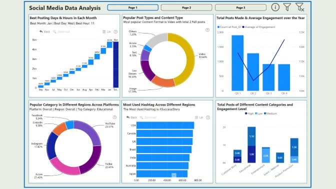
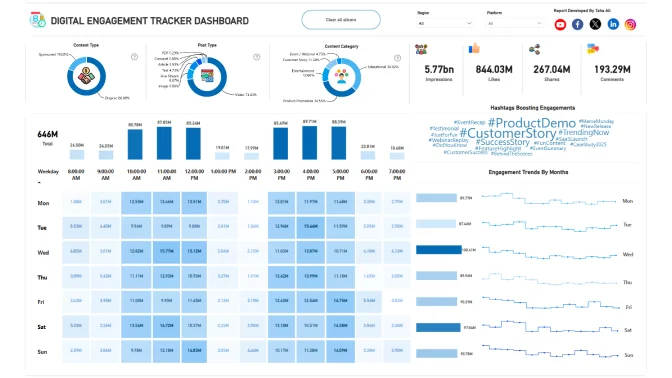
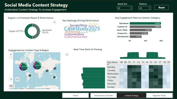
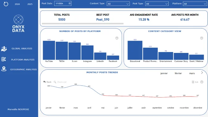
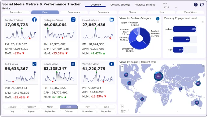
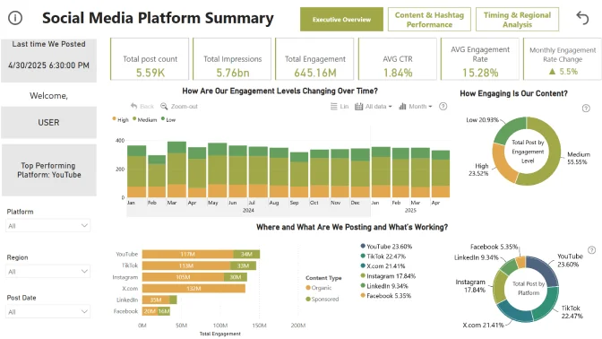
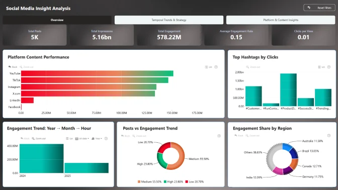
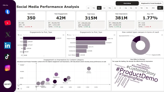
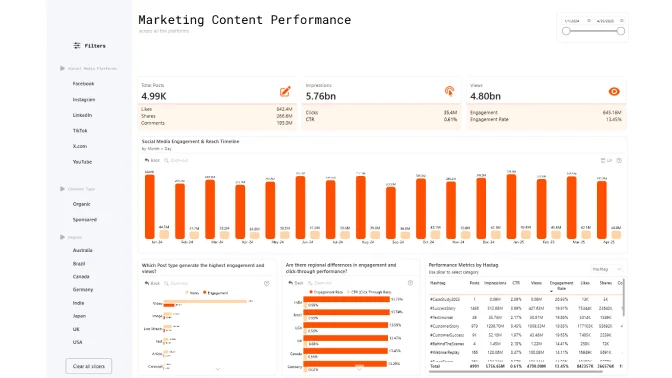
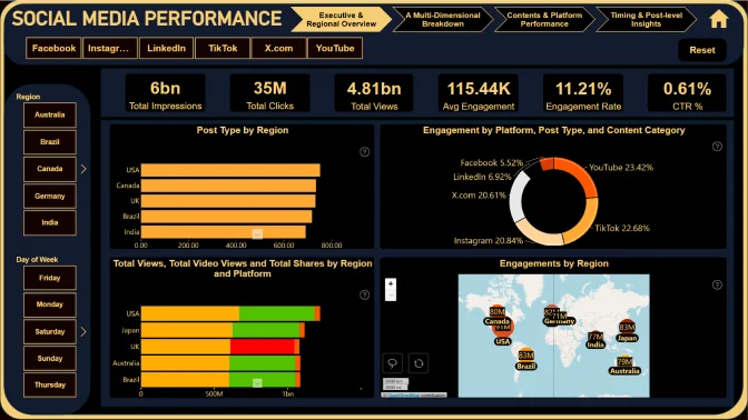
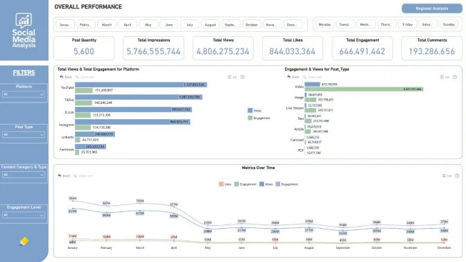
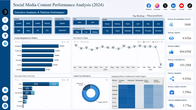
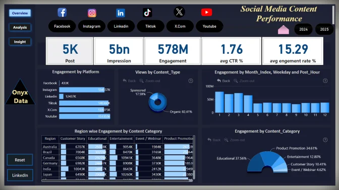
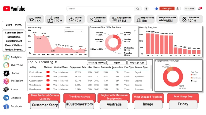
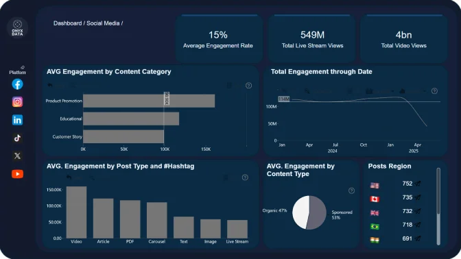
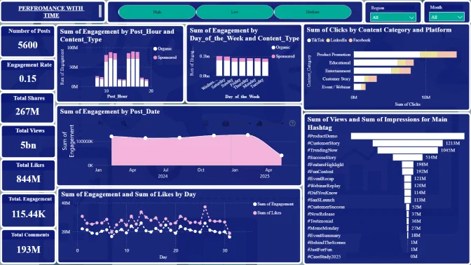
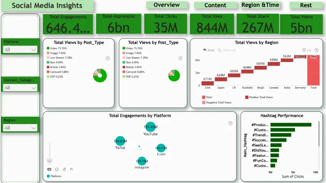
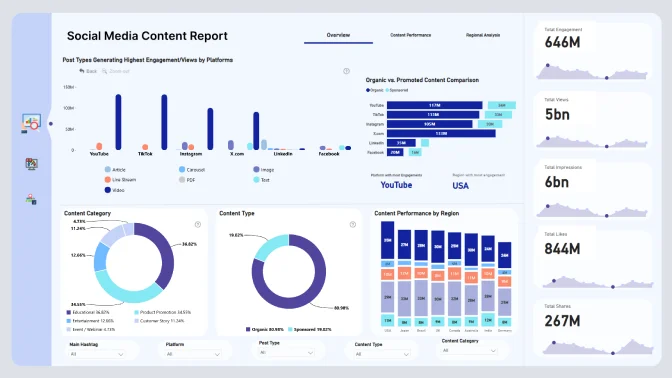
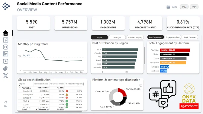
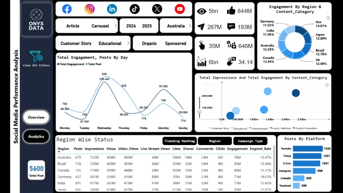
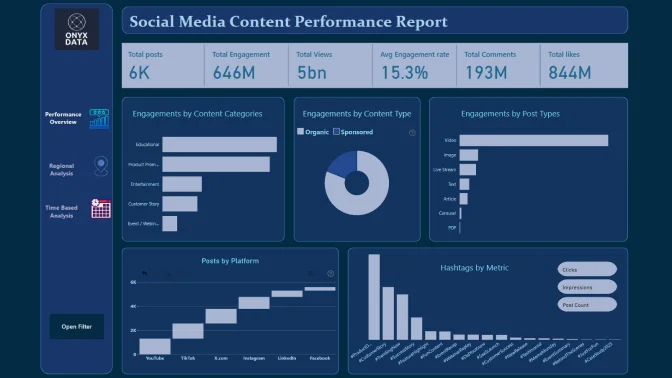
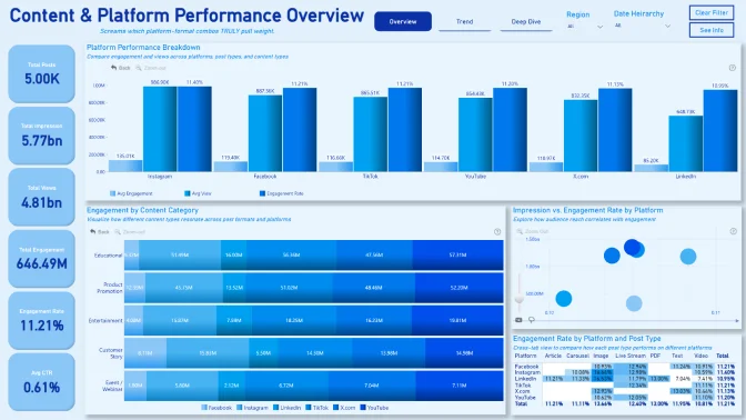
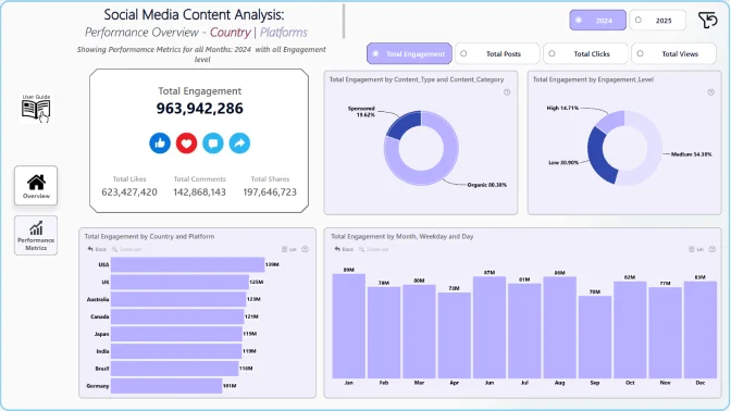
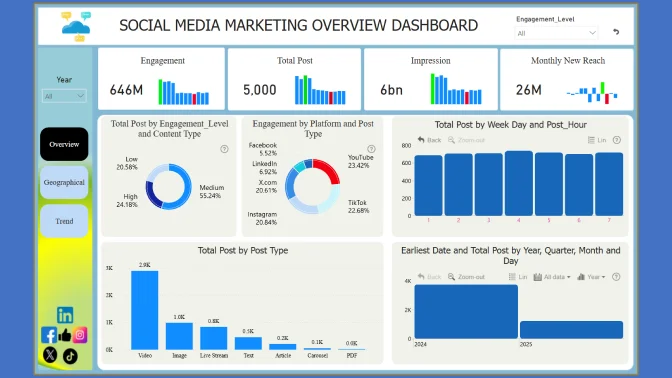
Join this challenge to take the role of a data analyst for a global IT company actively running content campaigns across multiple social media platforms. You’ve been given a 2024 dataset capturing detailed records of post-level performance metrics, platform details, content types, and geographic reach.
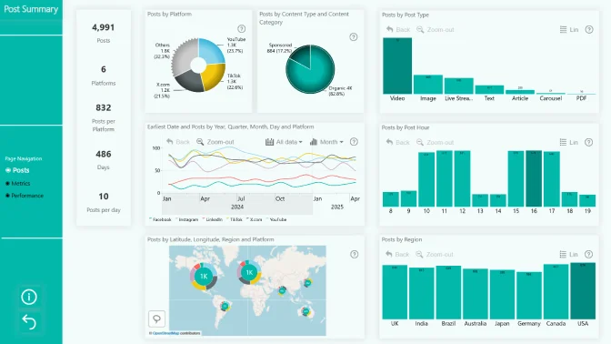
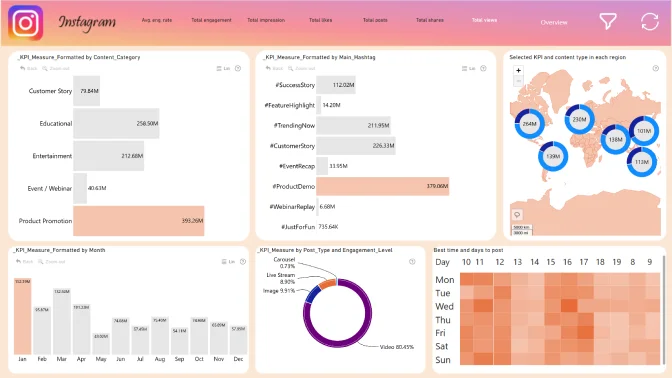
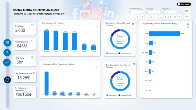
The dataset consolidates information about various posts published across TikTok, Instagram, LinkedIn, and X.com. It includes metadata such as post type (video, carousel, text), content category (product promotion, educational, entertainment), publishing times, and associated hashtags. It also tracks performance indicators like engagement, views, impressions, clicks, click-through rates, and post reach across countries and regions.
Your goal is to build a report that reveals what makes content successful on different platforms, explains regional trends in engagement, and informs better content and platform strategy decisions.
Key questions to answer in your analysis:
- Which platforms and post types generate the highest engagement or views?
- What content categories (e.g., product promotion, educational) drive the best performance across different regions?
- How do performance metrics vary by platform, post format, or hashtag usage?
- What are the ideal days and hours to publish content for maximum engagement?
- Are there regional differences in engagement and click-through performance?
- What hashtags are most effective in increasing impressions or clicks?
- Which countries or regions consistently show high video view counts or live stream interest?
- Are there correlations between engagement levels and content categories or publishing time?
- How do organic vs. promoted content types compare in terms of reach and performance?
These questions serve as a launchpad for your analysis, feel free to go beyond them and craft your own insights based on the story you want to tell with the data.
Technical requirements
- Build your report using only Power BI
- The number of pages in the report is not limited
- At least one report page has to contain a minimum of 2 ZoomCharts Drill Down Visuals. See a practical guide on Drill Down Visuals here
Judging criteria
Each report is evaluated based on three main criteria: intuitiveness, insightfulness, and interactivity. These factors ensure that the reports are not only accurate and functional, but also meet the target audience's needs and are ready to be presented to the end-users.
- Intuitive: How clear and easy it is to understand the report at a glance? (max 15 points)
- Is the report visually appealing?
- Choice of charts and visual elements
- Does the report tell a story?
- Is it not overwhelming to the user?
- Choice of tooltips, titles, and legends
- Interactive: How engaging and seamless is the report exploration and interaction with data? (max 15 points)
- Clear navigation that allows user to explore the report
- Use of slicers and other interactive elements
- Smooth cross-chart integration
- Is report optimized for touch devices?
- Are tutorials and guiding elements helpful to the user?
- Insightful: How accurate, complete, and meaningful is the data in driving decisions? (max 15 points)
- Depth of analysis
- Data cleaning and preparation
- Does data show up accurately in the report?
- Is report optimized for quicker loading time?
- Does the report provide deeper exploration of data (drill-down)?