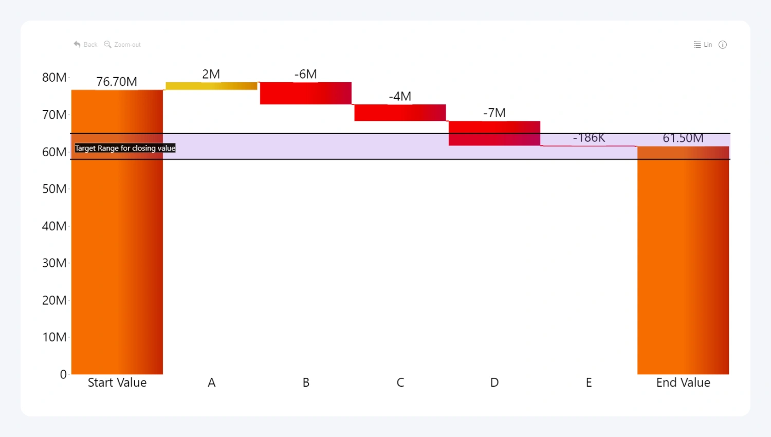
Add up to four threshold lines or areas to your waterfall chart to see how your data compares against your KPIs, performance goals or other metrics. You can access this feature in the Thresholds menu under Format visual tab in the Visualizations pane.
Each threshold can be set at a constant value, or you can choose between various dynamically calculated values (percentile, average, median, minimum, maximum, first, last). Furthermore, you can customize the line or area color, label content, size and font, and many other formatting options for your thresholds.

Was this helpful? Thank you for your feedback!
Sorry about that.
How can we improve it?