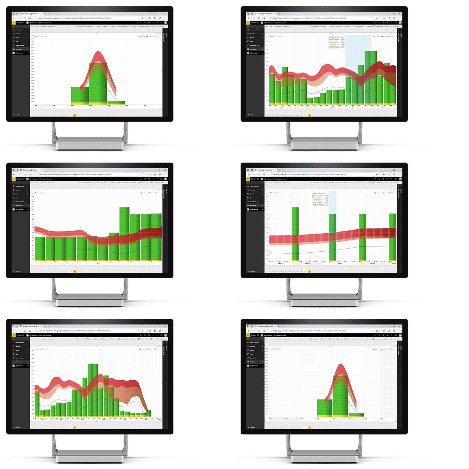
Click or tap any chart element to drill down and explore data in more detail. This way, users can get a full overview and pinpoint accuracy, both within the same visual.
For example, the initial view can show aggregated monthly values, and the user can easily drill down to a specific time span and reveal a more detailed breakdown that shows days or even smaller values, down to even milliseconds.
Simply choose what time spans can the user drill down or drill up to with the Display Units setting, and the visual will create drill down levels by aggregating values within those units.

Was this helpful? Thank you for your feedback!
Sorry about that.
How can we improve it?