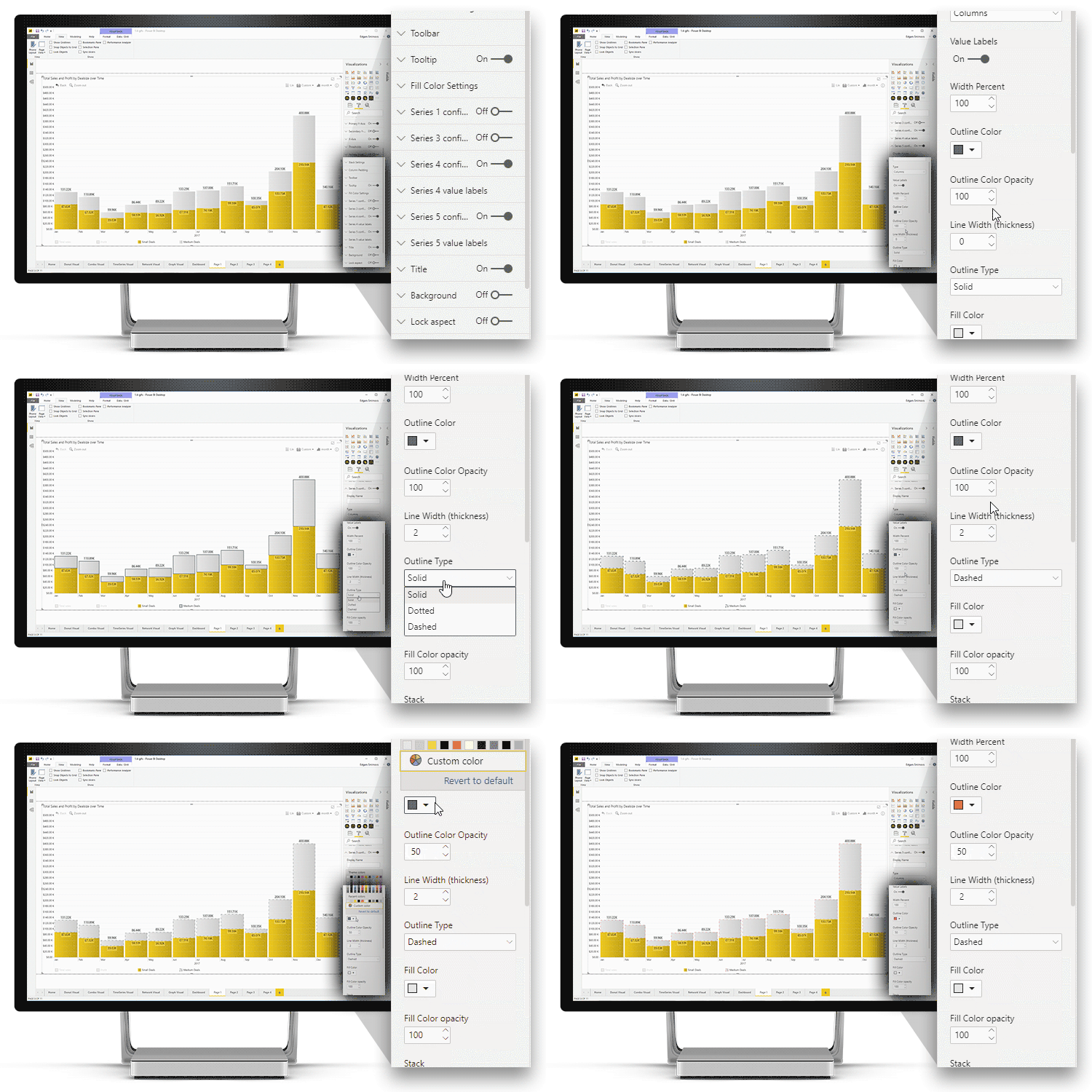
For series with Column type, you can adjust the outline
color and opacity separately from the column itself. This way, you can create
new and creative ways to enhance your data storytelling.
Example: two stacked column series with zero-based stacking,
where one column (Budget Completion) is fully opaque, and the second column
(Budget Target) displays just a dashed outline.

Was this helpful? Thank you for your feedback!
Sorry about that.
How can we improve it?