Type
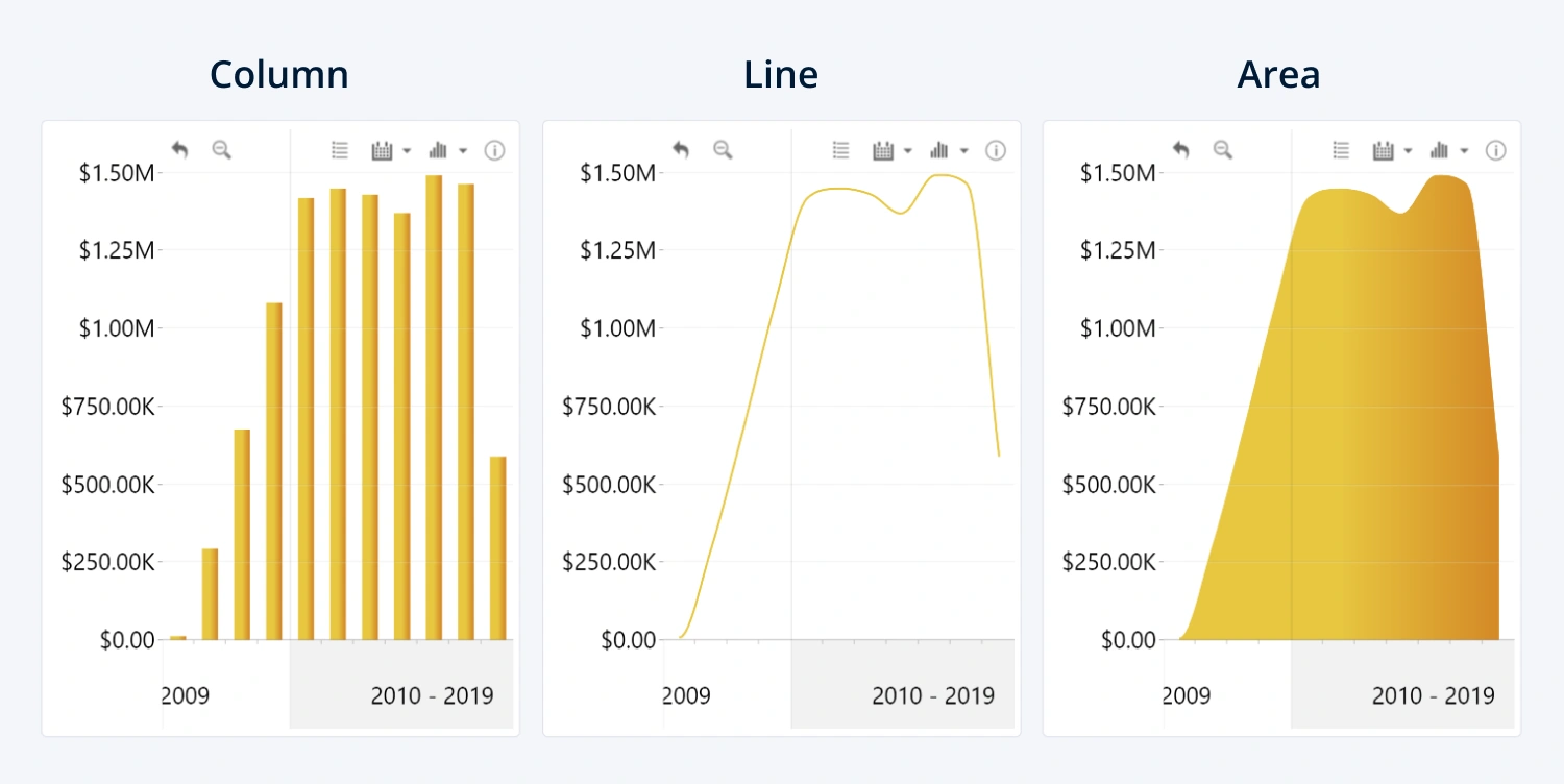
With this setting, you can select a
chart type for the specific series. Choose between three chart types to better
represent your data:
- Column: Each value will be represented by a column. Best used to represent independent values for direct comparison.
- Line: A continuous line will connect all values in the series. Best used to represent change between values.
- Area: Similar to Line, but with a color or gradient fill. Best used for stacks of multiple series, or as a background element.
You can mix and match various chart types for multiple
series to create unique combinations for your specific use case.

Was this helpful? Thank you for your feedback!
Sorry about that.
How can we improve it?