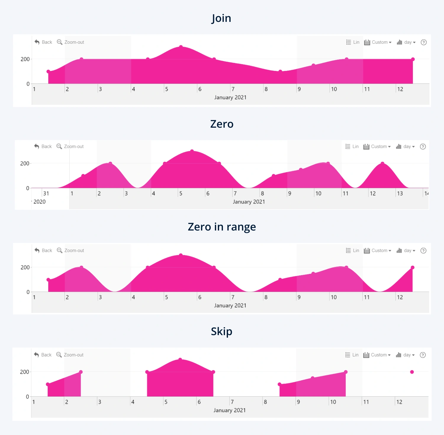
Choose how the visual displays data points with missing
values.
- Join: The line or area will connect the two nearest data points that contain values, acting as if the data point with no data doesn’t exist. It’s the most visually pleasing solution but it might be misleading.
- Zero: The visual will display all empty data points as if they’re zero values and place them on the zero line of the Y-Axis. Keep in mind that not all empty values are synonymous with zero, so consider whether this option will show your data accurately before using it.
- Zero in Range: This setting will act similarly to Zero, but it will ignore empty values at both ends of the chart’s range.
- Skip: The line or area will create an empty gap over the empty values. It’s the most accurate way of displaying no data.

Was this helpful? Thank you for your feedback!
Sorry about that.
How can we improve it?