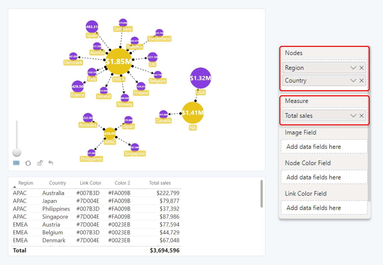
Drill Down Network PRO generates an interactive network chart from category-based data. The chart will visualize the relationship between categories and subcategories, as well as take into consideration the total value for each category, adjusting node size accordingly.
It is a great alternative to stacked or clustered column and bar charts or even multi-level pie charts, as it makes it very easy to compare different data categories in a fun and interactive way. You can compare important metrics such as sales by different markets, regions and subregions, or product categories and subcategories.
Like any ZoomCharts Drill Down Visual, Drill Down Network Pro comes packed with rich customization options (labels, links, legends, image support), smooth animations and user-friendly on-chart interactions.
How to build a simple Drill Down Network PRO visual?
Network uses nodes and links to demonstrate relations among data categories. You will need at least two data columns to create nodes (category and subcategory), and a value (measure)for these columns.
Add Category and subcategory data into the Nodes data field. Add values in the Measure data field. And you will have a simple network chart, which you can further customize using various formatting options and additional data fields.

Watch the video series below for a more detailed and in-depth tutorial for building a network chart.
Was this helpful? Thank you for your feedback!
Sorry about that.
How can we improve it?