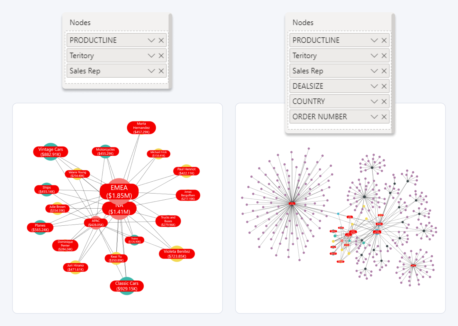
Add up to 9 categories of nodes for an in-depth exploration of your data. Each column in the Nodes field will be displayed as an additional hierarchy level in your network chart, allowing you to build data visualizations that are just as complex as you need.
Each category that you have added in the Nodes field will have its own category-specific section in the Format Visual tab, allowing you to apply different customization settings than the default settings to visually distinguish the category.

Was this helpful? Thank you for your feedback!
Sorry about that.
How can we improve it?