Node Type
Choose the default node type. This setting alters the node appearance:
- Shape (default): Nodes will be displayed as shapes (as selected in the Shape menu). Provides more customization and visual appeal at the cost of screen space.
- Text: Nodes will be displayed as text labels on a colored background. Results in compact and space-efficient nodes.
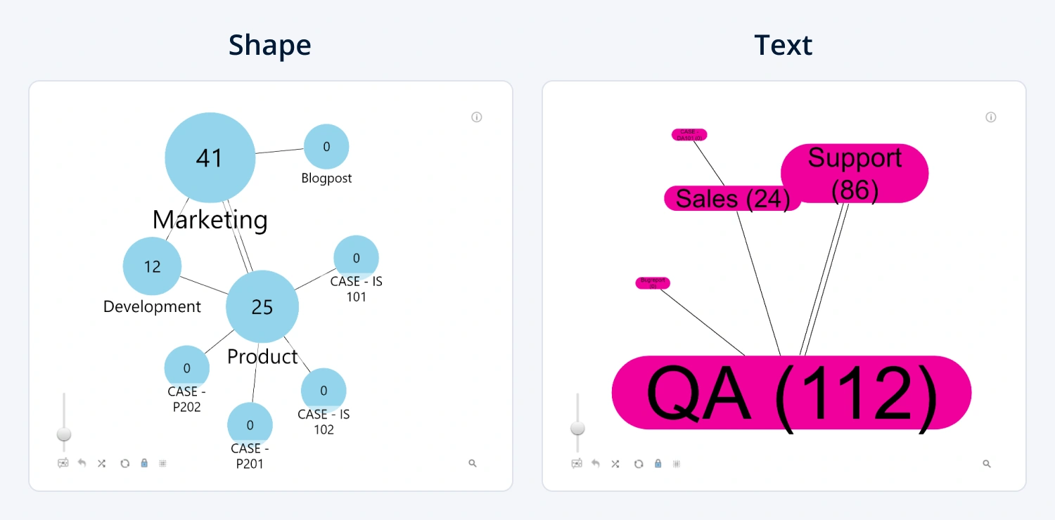
This setting will be applied to all nodes by default. You can override this setting for specific nodes by creating a category using Source Category Class and/or Target Category Class fields, which will reveal category-specific settings for each category (Node Category X).
Was this helpful? Thank you for your feedback!
Sorry about that.
How can we improve it?