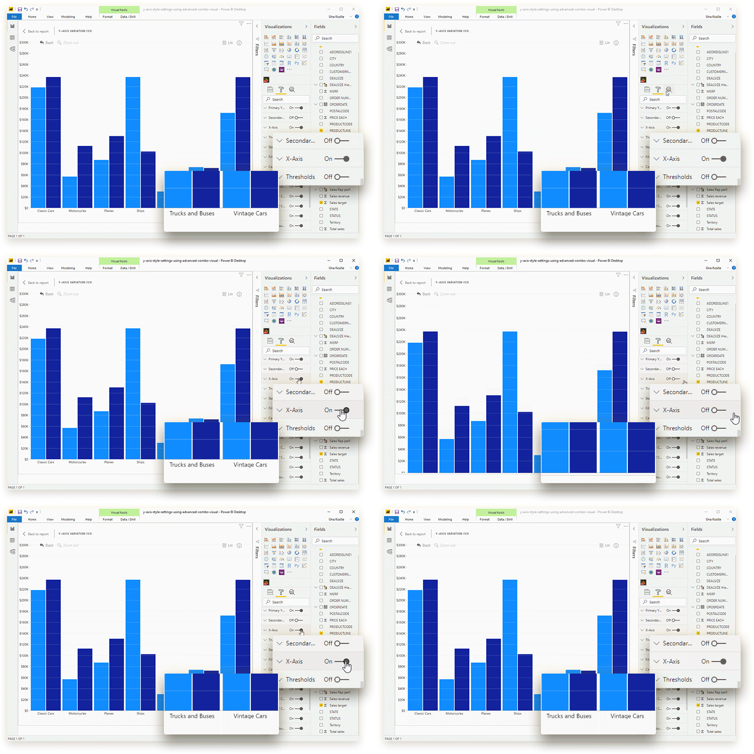
With this toggle, you can enable or disable x-axis display on your combo chart. If enabled, the chart will display a scale for the x-axis which will show a tick and text label for each category. You can further customize the x-axis with the following settings:
- Label Orientation
- Axis Height*
- Axis Labels Expand Height*
- Wrap Axis Labels*
- Allow Extended Axis Labels
- Max Label Length (available if Allow Extended Axis Labels is enabled)
- Max Unit Width
- Initial Unit Width
- Font Color
- Font Family
- Font Size
- Title Enabled
- Title Text**
- Title Font Color**
- Title Font Size**
- Title Font Family**
- Title Font Style**
Note: Settings marked by asterisk (*) on this documentation page will be available only if the Label Orientation is set to Vertical. Settings marked by double asterisk (**) will be available if the Title Enabled toggle is set to On.

Was this helpful? Thank you for your feedback!
Sorry about that.
How can we improve it?