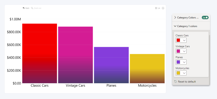
Category Colors
Category Colors are available if your combo chart contains only one series in the Series field, and the Category Colors Enabled toggle in the Format Visual tab of Visualizations pane is switched to On.
This section allows you to individually choose custom colors for each category. Separate color settings will be available for each category on the x-axis, and you can use the Power BI color picker to visually distinguish them.
If you have added multiple columns to the Category field, an additional section (Category Colors 2, 3, etc.) will be created for each.

Was this helpful? Thank you for your feedback!
Sorry about that.
How can we improve it?