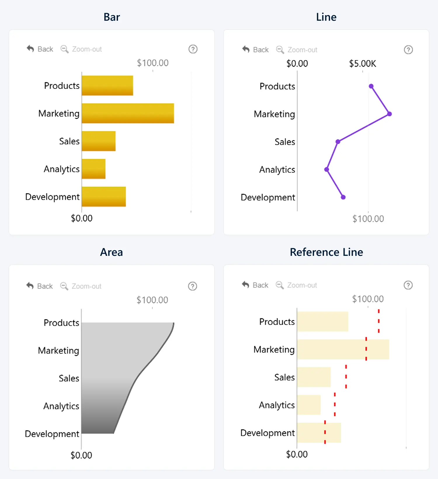
This setting will apply the same chart type to all series by default. Choose between three chart types to better represent your data:
- Bar: Each value will be represented by a bar. Best used to represent independent values for direct comparison.
- Line: A continuous line will connect all values in the series. Best used to represent change between values.
- Area: Similar to Line, but with a color or gradient fill. Best used for stacks of multiple series, or as a background element.
- Reference Line: Represents a specific value, average, target, or benchmark. It is well suited for use with conditional formatting, as it helps viewers quickly interpret how the data relates to that point

You can override the Series Defaults by choosing a specific Chart Type in the Series Configuration section of the series you want to customize.
Was this helpful? Thank you for your feedback!
Sorry about that.
How can we improve it?