May 21, 2015
Why Data Visualization is a Necessary Tool of the Future
It’s no secret that we live in a data driven world: a world where technology has allowed us to get to the point where, according to IBM, more than 90% of the...


It’s no secret that we live in a data driven world: a world where technology has allowed us to get to the point where, according to IBM, more than 90% of the...
The problem is that the massive amount of data that we generate is difficult to keep up with, access, comprehend, and thus effectively use to our benefit.
The Purpose of Data Visualization
Emerging heavily as a result within the last few years are data visualization tools, designed to help us work more effectively with data.
Most of us interpret and understand information best visually and thus information visualization is often key to true comprehension. Data visualization is, as its name suggests, a visual representation of data, its main benefits being in making complex data more accessible, interpretable, and presentable. It is closely related to the fields of information visualization, information graphics, scientific visualization, and statistical graphics.
David McCandless, London based author, data journalist, information designer, and founder of the website Information is Beautiful acknowledges that, in an age where we are often plagued by “information overload,” in addition to looking really cool, visualizing information allows us to see patterns and connections that matter and thus design information to make more sense, to focus only on the information that’s important, and to tell stories.
Challenges and Limitations of Data Visualization Tools
The challenge in not only recognizing the value in big data, but in actually making use of it, lies in the ability to effectively understand it. There are some obvious limitations when it comes to using data visualization tools to decode your data and actually benefit from the results.
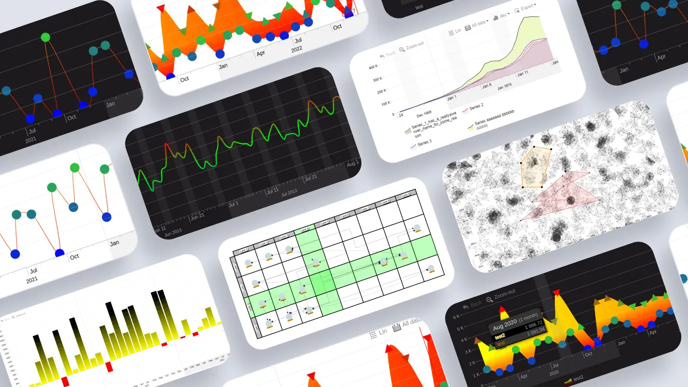
The original ZoomCharts team recognized these limitations. There was no data visualization library available where data could be explored interactively on all modern devices. What was out there was either data visualization tools where data could be displayed on modern devices in static visualizations, or where it could be displayed interactively, but not on all modern devices.
How ZoomCharts Aimed to Solve These Issues
The story of how ZoomCharts got started began with recognizing the limitations of simply working with current technology, and not anticipating the needs and desires arising with the advancement of newer and future technologies. The team’s focus thus became creating charts and graphs that would be supported by the technology of tomorrow. The resulting software:
• Is 100% interactive and responsive, allowing users to see only the information they need, and drill down further into the data when necessary
• Is able to support massive data sets
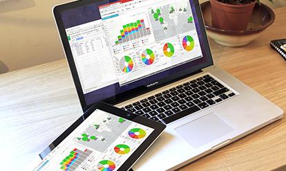
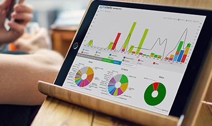
• Works with any modern device, including tablets, phones, and other mobile devices that use touch screens, giving users the ability to tap, swipe, and pinch their way to exploring the intricacies of their data
• Performs at incredibly fast speeds, with no lag or waiting time involved when making changes to data presentation, even with big data sets

Want more info like this?
Subscribe to our newsletter and be the first to read our latest articles and expert data visualization tips!
