Dec 18, 2024
What’s New in ZoomCharts JavaScript Charts: 2024
We have added a lot of new features to our JavaScript visuals, and released the V2 public beta. Learn more in this article!

We have added a lot of new features to our JavaScript visuals, and released the V2 public beta. Learn more in this article!
PieChart: Pie Markers
Pie Markers is a new property for PieChart that can display one or multiple static overlays on top of the chart to visually distinguish specific sectors. The pie markers are independent of the actual slices, and they will not be affected by changes in the chart, such as drill down interactions.
The start and end of each marker is determined by position and endPosition numbers. For example, if position is 0 and endPosition is 0.25 or 1/4, the marker will be displayed at the first quarter of the pie chart. Multiple pie markers may overlap.
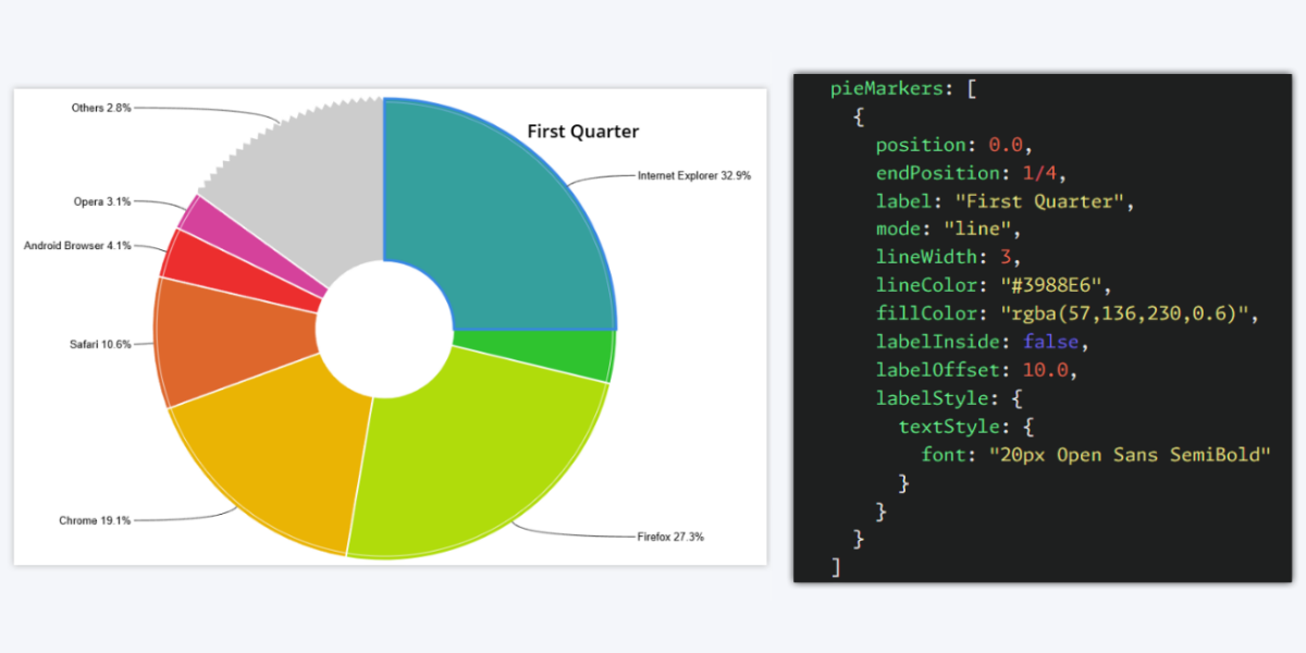
Additional customization strings include fill color, outline color and thickness; label text, font and position; and more. This feature can be used to call attention to specific sectors of the chart or visually separate it into segments. Learn more:
All Chart Packages: Inline Legend Display Mode
By default, ZoomCharts visuals arrange legend items in a fixed grid. While this ensures clear and balanced appearance, it may use unnecessary space, especially in smaller charts.
Grid layout (default)
That’s why we have added the Inline display mode, which uses space more efficiently by displaying each legend item next to each other without unnecessary white space.
Inline layout
Another benefit of the inline layout is that it can also display legend items as a horizontally scrollable list if they cannot fit within your selected legend dimensions.
Inline layout with single line legend height
You can choose the display mode for the legend with the displayMode property that accepts the following strings: grid for grid layout and inline for inline layout.
NetChart: Category Hierarchy Layout Mode
One of the main features of the NetChart package is its flexibility, and we have expanded it even further by introducing an additional layout mode for the nodes. The new Category Hierarchy mode is similar to the existing Hierarchy mode, but it will group nodes that have matching hierarchyCategory strings together and display them at the same level regardless of their relationships.
An example use case for the Category Hierarchy layout mode is scheduling – if each node represents a specific task to be done, and links show dependencies, the hierarchy categories can be used to show which resource is responsible each task, allowing each resource to prioritize tasks and highlight circular task dependencies.
The Category Hierarchy layout mode can be enabled within layout object by entering categoryHierarchy as the string for mode property.
All Chart Packages: Long Press Event
Long press is now a configurable event, allowing you to choose which function is called upon this user interaction. This can be done with the new onLongPress property within events object.
- PieChart: events > onLongPress
- FacetChart: events > onLongPress
- TimeChart: events > onLongPress
- GeoChart: events > onLongPress
- NetChart: events > onLongPress
This will provide more flexibility and allow developers to streamline user experience across mouse and touch input. By default, long press on touch will emulate right click interaction in certain scenarios – onLongPress can be configured independently from onRightClick.
Here’s an example: to better illustrate the difference, we used onRightClick to call a function that creates an orange node, and onLongPress event to create a blue node instead. In real life, this property will most likely be used to activate specific user interactions like multi-select, display tooltip, select all, or others.
V2 Beta Release
We have released the beta version of ZoomCharts JavaScript Charts V2. It is a major update that introduces various new features and significant improvements. The main focus of the V2 release was NetChart, which received WebGL integration and new customization options. All other chart packages were updated to support integration with the new NetChart.
Visit the link below to download the V2 Beta and explore live and editable demos in JSFiddle which showcase the new features in action. Please note that this is a beta version that is provided on an “as-is” basis, and V2 is still undergoing final testing before its stable release.
NetChart V2: WebGL Performance Improvements
With the V2 version for NetChart, we have introduced WebGL, which enables GPU-accelerated rendering. This was done to ensure better performance and smoother animations even when rendering complex graphs with thousands of nodes.
Over the course of 2024, we have further refined NetChart to achieve even better WebGL performance. The latest beta build of V2 has improvements that have resulted in a more consistent framerate and better hardware utilization. The largest gains were observed with intermediate-sized networks (around a few thousand nodes), where V2 provided a significantly higher framerate.
NetChart V2: Central Gravity Factor
The V2 beta of NetChart also introduces a new feature called Central Gravity Factor. If enabled, all nodes will be pulled to the center of the chart. This can be enabled in layout object using centralGravityFactor property, where larger values increase the intensity of the effect.
Here’s an example that demonstrates central gravity in action – as new nodes are spawning with each cycle, they will be pulled to the center.
NetChart V2: Value Axis Enhancements
NetChart is a highly configurable JavaScript chart library that provides a lot of flexibility, and the V2 introduces additional enhancements that cater to developers who use it for scatter plots or similar use cases.
Background Shapes
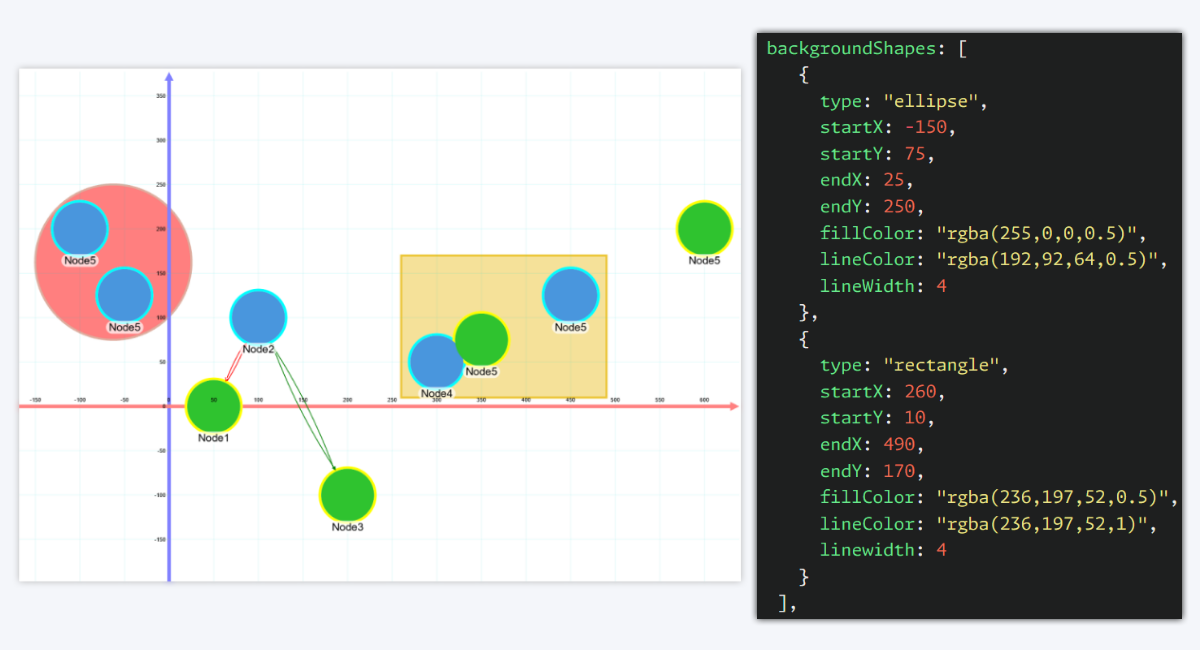
If you want to visually emphasize specific areas of the chart (for example, to highlight outliers), you can now use the backgroundShapes object under valueAxis. It works similarly to Area Shading in our Scatter PRO visual for Power BI, allowing you to create one or multiple custom background shapes at manually selected coordinates.
Regression Line Improvements
NetChart V2 also introduces various performance enhancements to the regression line(s). It will be recalculated faster upon changes in the chart, and the animations for the regression line will be smoother.
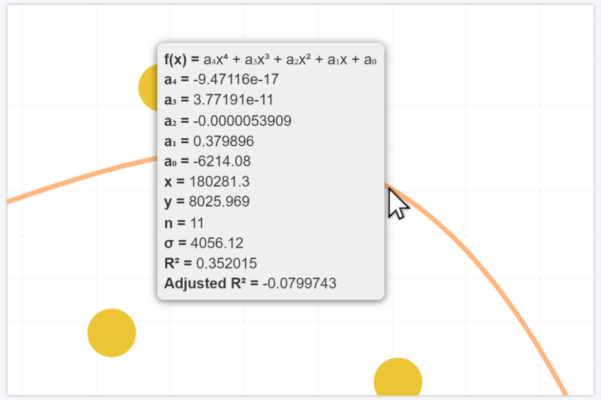
Furthermore, you can now enable a tooltip that will be displayed on mouseover. The tooltip can display various values pertaining to the regression, such as regression equation, parameters, current x and y coordinates at the cursor position, standard deviation, R2 and others.
New Pricing Model
In addition to the new features and improvements, we have also made significant changes to our pricing model, making it more accessible and scalable than ever before. The new pricing tiers are:
- Public Webpage: USD 4.99/mo per each URL. This plan will be great for small projects that use our visualizations in one or a few pages.
- Public Website: Starting from USD 19.99/mo. This plan will grant a ZoomCharts license for the entire website.
- SaaS / OEM Startups: Starting from USD 49.00/mo. If you have a brand-new product idea and want to integrate ZoomCharts, this is a special offer for you!
- SaaS: Starting from USD 99.99/mo. If you want to integrate ZoomCharts in your SaaS solutions, this plan is for you.
- OEM: Request a quote. Suitable for OEM or other custom use cases.
- Enterprise: Request a quote. This plan is tailored for businesses who want to use ZoomCharts for internal reporting and data visualization.
Visit the Pricing page and find the best plan for you! In addition, you can get the 30 day trial and try ZoomCharts for free.

Want more info like this?
Subscribe to our newsletter and be the first to read our latest articles and expert data visualization tips!
