Feb 20, 2025
JavaScript Network Charts: Turning Data into Interactive Graphs
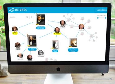
JavaScript network charts are incredible for visualizing relationships, such as social networks, data flows or org charts. If you are looking for an interactive, configurable and easy-to-implement network chart library, this article explores the main features of NetChart by ZoomCharts.
JavaScript network charts are incredible for visualizing relationships, such as social networks, data flows or org charts. If you are looking for an interactive, configurable and easy-to-implement network chart library, this article explores the main features of NetChart by ZoomCharts.
JavaScript Network Chart Use Cases
If you are reading this article, it’s most likely because you are looking for a way to create a network chart using JavaScript. This language is versatile, popular, and supported by all modern web browsers and many app development frameworks, so if you find a JavaScript network chart solution that meets your needs, you will be able to easily implement it in a wide variety of projects. Here are some examples.
Websites & Online Services
98.9% of websites use JavaScript as the client-side programming language (W3Techs, 2025). So, if you want to add a network chart to your website, online service or web app, JavaScript is the natural choice for that. And the versatility of JavaScript for web development is matched by the versatility of network charts as a visualization type for various scenarios.
For example, a journalist is writing an exposé and wants to visualize their findings in an interactive chart instead of a static image infographic for their news site or blog. Or a company wants to create an organizational chart with JavaScript for their intranet portal or the public About Us page. Some more specialized use cases also include social networks, knowledge graphs, blockchain transaction flows, neural networks and other scenarios.
Mobile & Desktop Apps
A large number of mobile and desktop applications nowadays are developed using frameworks like React Native, Flutter, and Electron, which allow developers to write them in JavaScript and compile as native apps for each platform – iOS, Android, Windows, macOS, and others.
So, if you are developing an app using a JavaScript-based framework, deploying a ready-made JS visualization library will be a breeze. This will allow you to quickly and easily implement new features that enable users to interact with their data.
For example, a JavaScript network chart would be a natural fit in a project management or CRM app, visualizing mind maps, task dependencies or relationships between customers and sales/support teams. Similarly, various communication apps can benefit from visualizing social networks on an interactive network chart. It can also be a useful tool for a CMS backend, cloud storage admin panel or an IT management console to visualize file system trees, dataflows, or networked devices.

Business Dashboards
Even though business intelligence solutions like Power BI are the most popular way to visualize and analyze corporate data (and we offer our visualizations for Power BI too!), some companies may choose to build custom dashboards from scratch. It can be done for various reasons – to achieve incredibly specific requirements or use cases, to integrate with unique or proprietary tech stacks, or to have more flexibility over appearance and user experience.
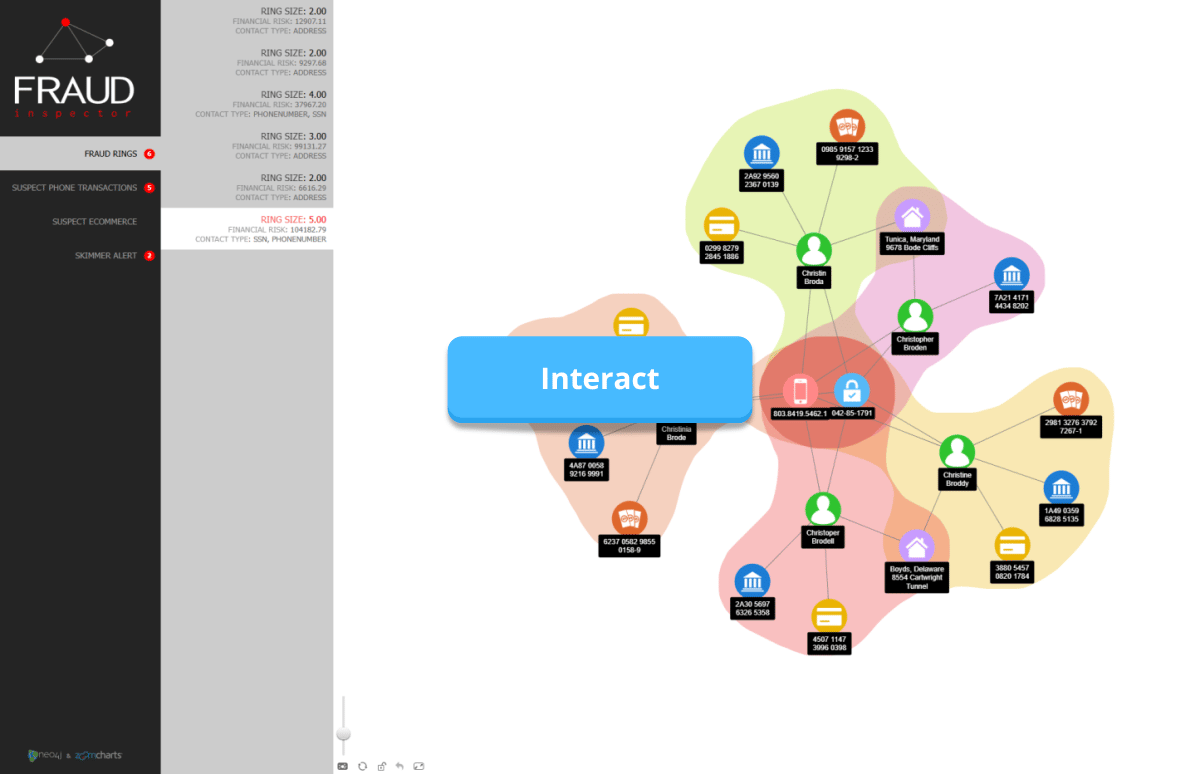
Some business dashboards that can benefit from an interactive JavaScript network chart include HR dashboards (e.g. org charts, team structure), supply chain and retail dashboards (e.g. supplier network), or sales and marketing dashboards (e.g. CRM or partner networks). Network charts can also be invaluable in law enforcement or anti-money laundering.
Here’s an example of an interactive fraud investigation dashboard, created with ZoomCharts NetChart using a Neo4j graph database. You can visit and explore the live demo here.
IoT & Embedded Development
Whether it’s a fully native firmware or a container for platforms like Docker or Kubernetes, JavaScript often finds its way to IoT (internet-of-things) and embedded solutions. Ranging from embedded systems like car infotainment, medical devices and building management systems to IoT solutions like smart homes, security networks or car remote services, it’s not a rare sight to find a management panel or web UI that includes JavaScript.
In these cases, a JavaScript network chart can vastly improve the user experience for managing networks of any size and complexity. For example, a smart home control panel that displays all connected IoT devices in a network chart, or a building management system that visualizes each component (e.g. HVAC, lighting, electrical grid, security cameras etc.) and shows its status. For these use cases, the visualization library should be purely JavaScript, highly configurable, and compatible with a wide range of devices and input methods.

JavaScript Network Chart Libraries
JavaScript developers can choose from a wide variety of data visualization solutions, including excellent open source or freeware libraries like D3, vis.js, Cytoscape.js and sigma.js. Developers can easily find a library that caters to their requirements and provides the necessary features, with some libraries being easy to deploy and use out-of-the-box, and others being flexible and configurable in exchange for requiring more coding work.
However, if the free solutions are already great, what is the purpose of premium JavaScript visualization libraries like ZoomCharts JS? We believe that our NetChart library is the best choice for JavaScript network charts because of its class-leading user experience and data exploration capabilities, flexible configurability, wide data source support (including MongoDB, Neo4j, and MySQL), and seamless integration with various frontend libraries like React, Angular, and Vue.js.
You can easily deploy it by simply embedding ZoomCharts in your project and providing your data to instantly create an interactive JavaScript network chart. But, if you want to get more hands-on and configure every aspect of your chart, including appearance, layout, behavior and other aspects, it’s also possible – the choice is yours!
What Sets ZoomCharts NetChart Apart
The ZoomCharts JS data visualization library includes five interactive and configurable chart packages, one of which is NetChart. It is designed for beautiful and easy-to-explore JavaScript network charts of any size – be it a simple org chart or a vast big data network. It operates on graph data structure, with “from” and “to” values for each node and link. In this section, we will highlight the main features and show live examples of NetChart in action.
1. User Experience
Smooth and intuitive user experience was our main focus when developing the ZoomCharts JS visualization library. This has resulted in three massive benefits that set NetChart and our other visuals apart from the competition.
Full touch support. ZoomCharts JS is intended for a wide range of use cases, ranging from websites and mobile apps to embedded systems and enterprise solutions. To ensure that users get the best user experience and full feature parity on any input device, we included a complete set of user interactions for mouse/keyboard and touch devices. Furthermore, each user interaction has its own ‘event’ property, which means that you can fully customize the navigation to suit your needs.
| Default Action | Mouse/Keyboard | Touch |
|---|---|---|
| Interact | Click | Tap |
| Move node | Hold-click and drag on a node | Hold-tap and drag on a node |
| Pan chart canvas | Hold-click and drag on empty area | Hold-tap and drag on empty area |
| Reveal node tooltip | Right click on node | Hold-tap on node |
| Rectangular selection | Hold-click on empty area & drag | Hold-tap on empty area & drag |
| Zoom in/out | Scroll wheel up/down or double-click on empty area | Multi-touch spread/pinch or double-tap on empty area |
Fluid UI animations. Each user interaction is accompanied by an animation, which will provide instant feedback to user inputs and make your project feel smooth and responsive. Animations also assist the user with data exploration by bringing attention to changes in the chart and visualizing the ‘direction’ of data (for example, nodes appear by “popping in”, and disappear by “popping out”).
Intuitive data exploration. ZoomCharts JS is designed not just for data visualization, but also data exploration. This means that you can include multiple levels of data, allowing the user to see an easy-to-read overview in the initial view or quickly drill down to reveal more detailed insights – all within the same chart.
Furthermore, NetChart can natively integrate with other ZoomCharts JS visuals and seamlessly cross-filter data, allowing the user to instantly view the same data from multiple perspectives and get a more complete picture. This makes ZoomCharts JS a great choice for interactive dashboards, webapps or other projects with multiple visuals in the same page.
2. Focus Nodes
Whether you need a simple JavaScript network chart with just a few items, or you want to visualize big data with thousands of nodes, NetChart can handle it with ease. However, if you have a lot of nodes in your JavaScript network chart, it may be overwhelming for the user to find what they’re looking for.
That’s why in NetChart, you can control what is displayed in the initial view and ensure the best readability for your network chart. Users can then easily ‘collapse’ or ‘expand’ nodes to quickly hide or reveal its subnodes on-demand.
With the navigation -> mode property, you can select one of three modes for the initial view: showall, which will display all nodes within your dataset in the initial view; manual, which will expand manually selected nodes in the initialNodes array and collapse all others; and focusnodes, which is a dynamic mode designed for big data exploration.
In the focusnodes mode, you can assign the focus node status to specific nodes, and the initial view will only expand focus nodes + their surrounding nodes within your selected radius. You can also apply specific style settings to visually distinguish focus nodes (e.g. thicker outlines, larger size etc.). Furthermore, you can also enable the ability for the user to add or remove focus nodes on-the-fly with a tooltip button or other interaction events. You can read more about focus nodes in the documentation.
3. Layouts
In NetChart, you can choose between multiple layout modes for your JavaScript network chart with the layout -> mode property. The available options also include specialized cases like static, categoryHierarchy, and swimlane, but the following modes will be the most relevant if you are looking to create a network chart:
- dynamic (default): Force-directed layout that uses all available area for node placement. Nodes have simulated physics that respond to user inputs like node movement or changes in visible data.
- hierarchy: Nodes will be arranged top-down based on their relationships. Best suited for JavaScript organizational charts and similar use cases.
- radial: The top hierarchy level will be placed at the center, with the subnodes branching outwards.
You can read a more detailed description of each layout and its settings in this documentation article. Try out the live demo below and see the difference between layout modes when displaying the same data!
4. Interaction Events
Even though NetChart’s out-of-the-box setup for user interactions is designed to provide optimal user experience for KB/M and touch input methods, it can be fully configured to suit your requirements. Each user interaction in NetChart is an ‘event’ (similar to HTML event listeners) that calls a specific function, and if you want to disable or change the default behavior, simply provide your own functions in the events array.
Event listeners range from user interactions to general chart events like settings changes or data errors, and you can assign custom navigation actions, data transformation functions like custom filters or add/remove data, and other custom actions like call a custom tooltip, popup or visual, export logs etc.
This way, you can have full control over the user experience and functionality of your JavaScript network chart. For example, you can integrate custom features to achieve what you need, or better integrate NetChart in your app and make the interactions more consistent with other UI elements. You can learn more about event configuration in this video:
5. Charts on Charts
One of the most exciting applications for the previously described event handlers is charts-on-charts. As part of the ZoomCharts JS data visualization library, you get access not just to NetChart, but also our other visuals – PieChart, FacetChart, TimeChart and GeoChart. You can display these visuals on top of your JavaScript network chart by calling them in an event.
This will open up new ways to enhance your data storytelling and provide instant on-demand insights to users. Here’s an example of a JavaScript social network chart; clicking on a node opens up a pie chart, and when you drill down and select a slice, a small time series chart reveals even more detailed data.
6. Appearance Customization
Each element in NetChart is fully configurable, allowing you to achieve the exact look you want so your JavaScript network chart adheres to your branding guidelines or matches the design language of your project. What’s more, you can use the theme setting to instantly apply one of the default themes (for example, dark theme), or create your own CSS styles that you can apply for multiple ZoomCharts visuals for an unified appearance. Here are some of the main examples of what you can customize in NetChart.
Node Customization
You can apply style settings to all nodes at once, custom settings to specific node categories in the nodeClasses array, or provide node-specific style parameters in data. You can also customize how specific conditions like expanded, collapsed, focused, hovered, selected and others affect node appearance (e.g. highlight selected nodes with a thicker outline). Here are some of the settings that you can customize:
- Node fill color or gradient: provide color names, hex codes or RGB color codes.
- Node border: configure the color, thickness, and dashing of the node outlines.
- Node shape: choose between shapes like circle, rectangle, diamond, simple text label, or create a custom shape with a customShape array.
- Node images: display images from URLs inside the node, choose cropping method.
- Labels: provide label text, configure position, background color, size and shape, text size, font and color, shadows, and more.
- Node items: show additional text or images and configure placement, sizing, and other settings.
- …and other settings.
Here's an example of different node shapes - try changing them and see how they differ!
Link Customization
Similarly, you can customize various style properties for all links, provide values for specific links in data, create categories using linkClasses array, and apply conditional settings for hidden, hovered and selected states. Here are some examples:
- Line appearance: adjust thickness, color, dashing, and curvature; customize drop shadow effect.
- ‘From’ and ‘to’ link decorations: show circles, arrows (regular, hollow, open), or nothing at either end to signify relationship directions.
- Link labels: show descriptive text on links, and adjust label font, background color, position, alignment, and scaling behavior. You can even show images inside link labels.
- Link items: display additional text or images on the links, and configure their size, position and appearance.
Auras
In a network chart, there may be cases where some nodes can belong to the same group, even if they cannot be linked directly. For example, in an org chart, a task group may have people from different departments. That’s where NetChart’s Auras feature comes in handy.
With the aura array under nodes, you can assign each node to one or multiple groups. Each group will be visually emphasized with a colorful ‘aura’ that will encircle all nodes with the same aura ID. You can then customize auras, including fill color, intensity, outlines, shadows, overlap behavior, and other settings.
This is a simple, yet beautiful way to represent groups, clusters, indirect relationships and other scenarios. Here’s an example where Auras are used to visualize different departments. You can disable each aura by clicking its name in the legend.
Create JavaScript Network Charts with ZoomCharts
For many projects, the free and open source JavaScript network chart solutions like D3 or sigma.js will be more than enough. However, if your project requires best-in-class user experience and drill down interactions, compatibility with a wide variety of data sources and frontend libraries, or if any of the above features are something that could be useful for your project, then we recommend you try NetChart and other ZoomCharts JS visuals for yourself.
In the Get Started page, you can start using ZoomCharts in three ways – by accessing the JS package directly from our CDN, downloading the chart package locally, or installing via npm. You can try out all ZoomCharts features and create charts without the watermark by starting the free 30-day trial.
We recommend watching our six-part tutorial series that explains all you need to know to get started with ZoomCharts in three hours: deployment, configuration, data integration, event handling, cross-chart filtering, and other topics. Watch the entire playlist here.
Our pricing model is designed to allow easy scaling for any use case. If you need JavaScript visuals just for certain pages, the Public Webpage plan allows you to pay for each URI that uses ZoomCharts. If you want to use the visuals in any public , the Public Website plan will provide a license for the entire domain. We also have a dedicated tier for SaaS products, or you can request a quote for customized OEM and Enterprise solutions. Find the best plan for you in the Pricing page!

Want more info like this?
Subscribe to our newsletter and be the first to read our latest articles and expert data visualization tips!