ZoomCharts Documentation
Switch to Version 2.0 (BETA)
Themes
Theme is a collection of configuration options that extends the default configuration.
Specifying theme
Theme is specified by setting settings.theme field.
Time chart provides several default themes to start with:
TimeChart.themes.flat- a simple flat theme.TimeChart.themes.round- a simple theme with round accents.TimeChart.themes.gradient- a nice shaded theme.
Developing themes
Time Chart consists of a combination of DOM and Canvas layers. This approach provides optimum performance while maintaining great visual look.
This approach splits theming into two parts - customizing DOM via CSS and customizing parts rendered on Canvas via settings.
CSS
The HTML structure has fixed class names you can use to define CSS rules.
The root element has a configurable class, that is specified using settings.themeCSSClass setting.
Time Chart uses the following HTML structure.
<div class="DVSL-container DVSL-valueAxisInside chartThemeClass">- Main container, theme class name is specified here.<div class="DVSL-background" </div>- Area background layer.<canvas class="DVSL-canvas" </canvas>- Canvas containing area grid and data series.<div class="DVSL-valueAxis" </div>- Value axis background.<div class="DVSL-TC-timeAxis" </div>- Time axis background.<div class="DVSL-resizer" </div>- Resizer handle.<div class="DVSL-border" </div>- Extra full chart layer for outer border.<div tabindex="0"></div> </div>- Mouse and keyboard input tracking layer.<div class="DVSL-hover DVSL-hover-right">- Hover info bar.<div class="DVSL-info-left"></div>- Left part containing value.<div class="DVSL-info-right"></div>- Right part containing date.<div class="DVSL-bar DVSL-bar-toolbar"></div>- Toolbar.
</div>
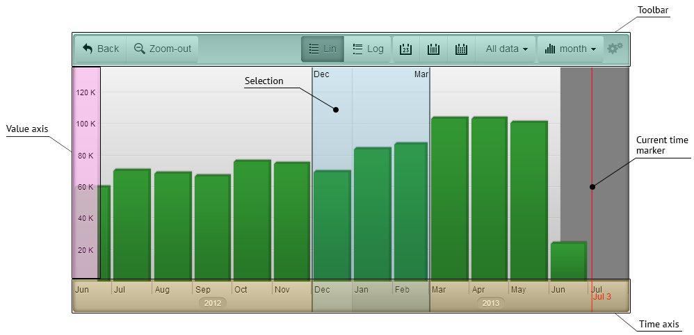
Elements rendered on Canvas
The following elements are rendered on canvas and their style is specified via settings object.
- Series
- Selection
- Current time marker
- Labels on value axis
- Labels and ruler lines on time axis
- Alternating shades on time axis
Style parameters in settings
We stay close to CSS syntax when defining style for rendered elements.
Some fields have custom attributes for element specific aspects. See Settings documentation for details.
Common attributes:
fill- CSS color string for filling areas and painting text.shadowOffsetX- shadow offset X in pixelsshadowOffsetY- shadow offset Y in pixelsshadowBlur- shadow blur size in pixelsshadowColor- CSS color string for shadow
Text attributes:
font- CSS font string.
Line attributes:
lineColor- CSS color string for painting lineslineWidth- line with in pixels
Color strings can be one of the following:
"#123456"or"#123"- HTML color code"red"- HTML color name"rgb(100,120,120)"- opaque color"rgba(100,120,120, 0.5)"- transparent color