Jan 30, 2015
How to Use Time Chart - Using Dashed Lines
The possibilities for data analysis are opened up with ZoomCharts’ advanced data visualization software. Start planning for the future today with the Dashed...

The possibilities for data analysis are opened up with ZoomCharts’ advanced data visualization software. Start planning for the future today with the Dashed...
ZoomCharts’ Dashed Lines feature is enhancing the data visualization needs of various educational fields, including sciences and mathematics, such as anatomy, biochemistry, ecology, microbiology, nutrition, neuroscience, physiology, zoology, chemical engineering, geochemistry, molecular biology, geology, paleontology, physics, astronomy, algebra, computer science, geometry, logic, and statistics, and the arts such as, music, dance, theatre, film, animation, architecture, applied arts, photography, graphic design, interior design, and mixed media.
- Designate between current and proposed figures with separate line styles
- Expand and zoom in and out of data with a simple click or scroll
- Filter and display data according to specific time intervals
- Export data to open in various file types
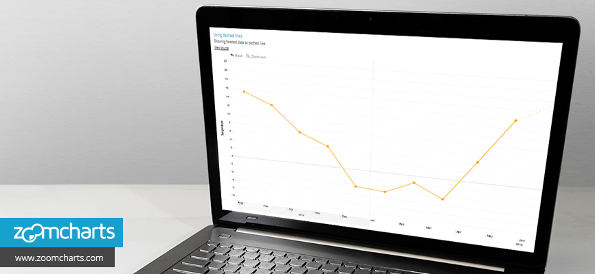
Step 1 Add forecast data to your timeline and differentiate it using the dashed line style

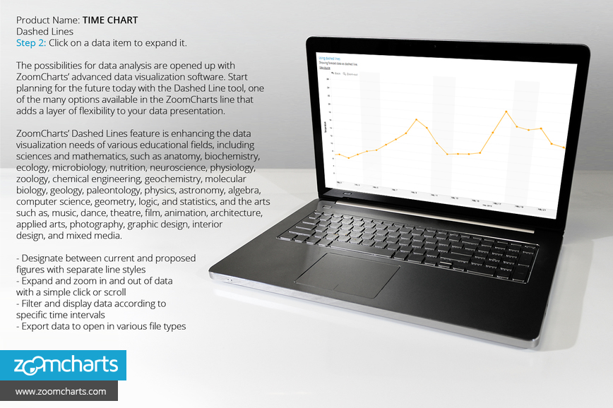
Step 2 Click on a data item to expand it.
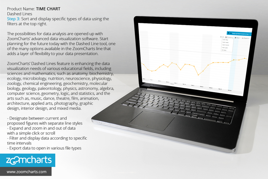
Step 3 Sort and display specific types of data using the filters at the top right.
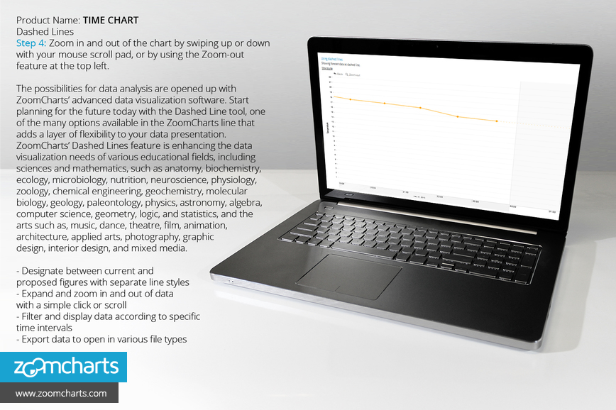
Step 4 Zoom in and out of the chart by swiping up or down with your mouse scroll pad, or by using the Zoom-out feature at the top left.
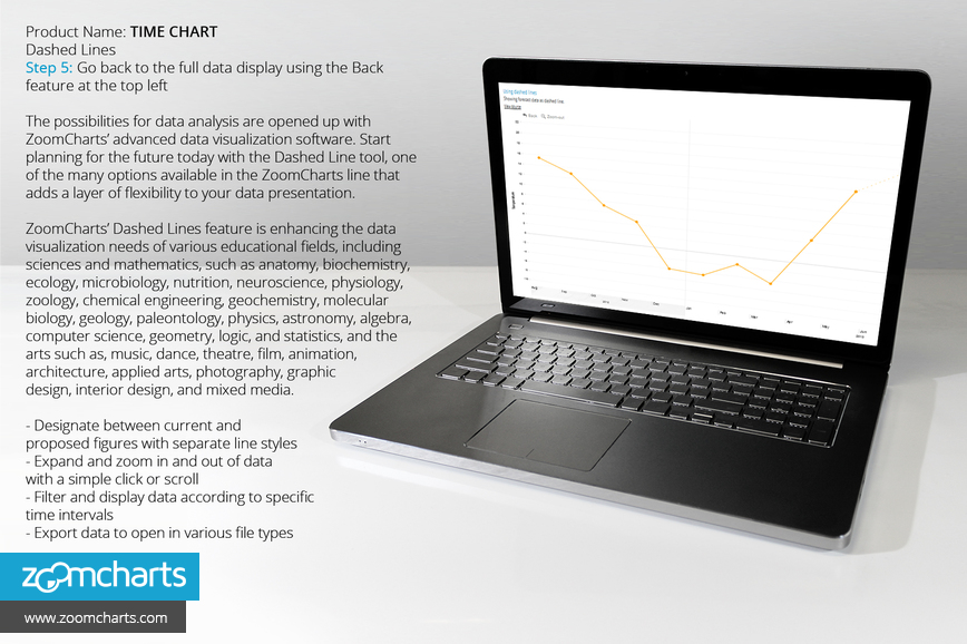
Step 5 Go back to the full data display using the Back feature at the top right.

Want more info like this?
Subscribe to our newsletter and be the first to read our latest articles and expert data visualization tips!

