Jan 16, 2015
How to Use Net Chart - Label Style Example
Customizing your data displays to suit your company’s needs is a cinch with the label style feature from ZoomCharts. Style functions let you style your data...
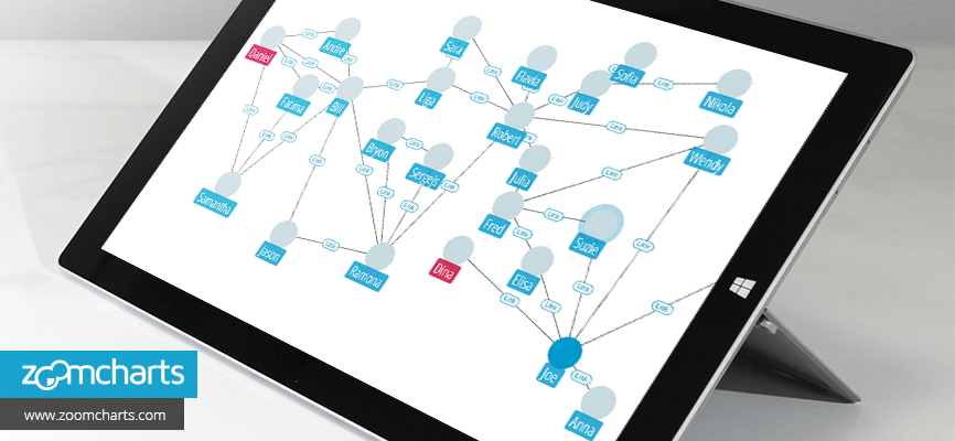

Customizing your data displays to suit your company’s needs is a cinch with the label style feature from ZoomCharts. Style functions let you style your data...
ZoomCharts’ Label Style is one of the many features being used to meet the advanced data visualization needs among many industries in education, including sciences and mathematics, such as anatomy, biochemistry, ecology, microbiology, nutrition, neuroscience, physiology, zoology, chemical engineering, geochemistry, molecular biology, geology, paleontology, physics, astronomy, algebra, computer science, geometry, logic, and statistics, and the arts such as, music, dance, theatre, film, animation, architecture, applied arts, photography, graphic design, interior design, and mixed media.
- Interactive and customizable chart with fluid data points
- Labels can be styled to suit your needs
- Easily change data to keep information up-to-date
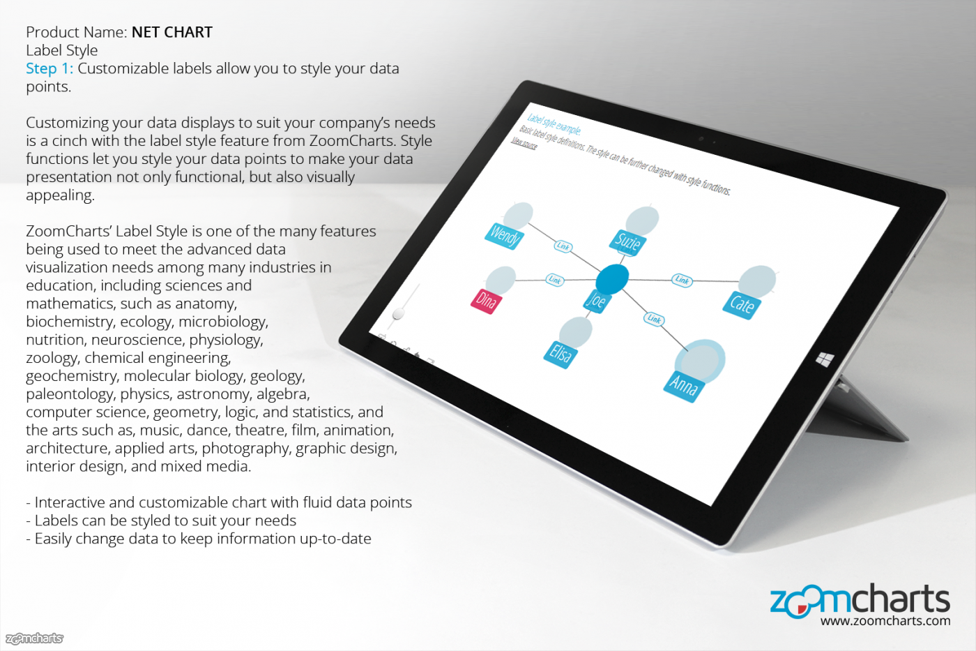
Step 1 Customizable labels allow you to style your data points.
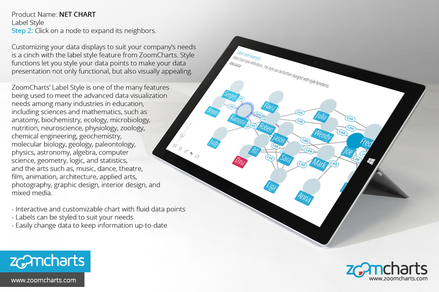
Step 2 Click on a node to expand its neighbors.
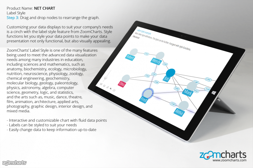
Step 3 Drag and drop nodes to rearrange the graph.
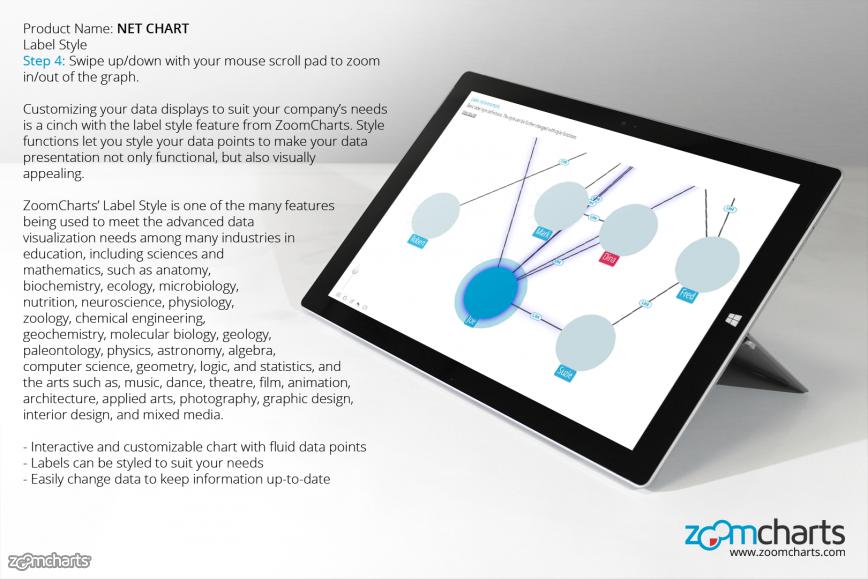
Step 4 Swipe up/down with your mouse scroll pad to zoom in/out of the graph.

Want more info like this?
Subscribe to our newsletter and be the first to read our latest articles and expert data visualization tips!

