Feb 17, 2015
ZoomCharts: Making Future UI Available Today
ZoomCharts Co-Founder and CEO Janis Volbergs gave a well received presentation at a UI/UX meetup event to talk about the array of progressive ZoomCharts...


ZoomCharts Co-Founder and CEO Janis Volbergs gave a well received presentation at a UI/UX meetup event to talk about the array of progressive ZoomCharts...
Check out this overview of Volbergs’ presentation to discover why ZoomCharts is a world leader in interactive data visualization software:
The name of our product is ZoomCharts, and what we are producing is ZoomCharts SDK, which is the world’s most interactive data software. We are a new startup established in Latvia just last year. The product, since March of this year, is available for purchase and has been purchased by many different customers from all over the world. The actual product is entirely new data visualization software development GIT, which puts in the center not the technology, but the person sitting behind the device that every one of us has in the pockets; users of mobile phones, users of iPads.
We wanted to make such a development toolkit that would allow developers to create interfaces that make it easy to access data, to analyze data, to interact with data. We are not a library that lets you create a chart, we are a library that lets you create an interface that then engages the user into an immersive, interactive data exploration venture.
To give you an idea of what sort of visualizations you can achieve using our development kit, we have products like the network chart. The network chart lets you visualize different networks of data, whether they are social networks, whether they are Internet of things networks. All of that you can visualize on any device you have, basically, whether it’s an iPhone, iPad, notebook, or touch TV. The interactive time chart lets you access big data with time and explore what happens within specific areas of that data without using any other interface component. We have also reinvented the pie chart and the facet chart.
What makes our SDK unique? First of all, it’s built to make data navigation engaging, so it won’t be just a boring chart or boring interface. It will be interesting for people to actually use your software that would include a ZoomCharts application. We also know that most of you like the performance of the application, so we put a lot of effort in creating this development kit such that it will be super nice looking and super fast on most contemporary devices. We have also added different aspects of how you can visualize different data in a compelling way. And for those of you who already have some applications or products, ZoomCharts helps you sell your product because when we show our products to actual consumers, when they see the interface built with ZoomCharts, they love it, and they can immediately see how they can use it for other purposes. So basically, what we are doing with ZoomCharts is accelerating the emergence of new ideas that couldn’t have been done yesterday because there wasn’t such development yet available.
I could talk a lot about it, but it’s better to show you some real life examples of how we have applied ZoomCharts to tackle some of the issues in the real world. With a product called myinstabank, the Internet account statements show a long boring list, and when you need to see the big picture, you just can’t. All you get is just a list. Normally you would just use the export option to make some Excel charts. We found that we could use our interface to give all this information another meaning in the hands of users. We applied our charts to the already existing data within the Internet banks.
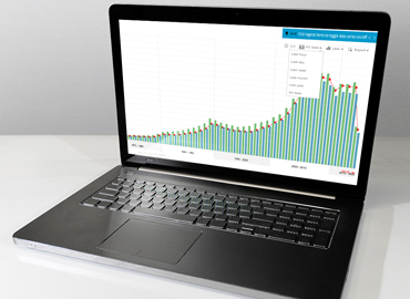
What we have here is a time chart. It shows you data aggregated by timestamps. So if you have any data that has timestamps, you can use the time chart. The picture is where most of the chart libraries end; it is the end product of their libraries. In our case, the chart is just the beginning of your venture because now let’s imagine you wanted to see what happened in the year 2012. What do you have to do? One click. You just click on it, and immediately the chart communicates with the banking database, retrieves more data for that period, and immediately aggregates data. No more dropdowns where you have to pick specific dates or unintuitive actions. The rest of the interface then responds to the time period you have selected. The list is there, but now it’s filtered for that one year you just selected. If you need some other information, just one click, and the interface is communicating back to the server and fetching data. Speaking about the pie charts, they immediately show you where your money is coming from, and how you spent your money. All our charts are interactive, so you can click on any slice to filter out the time chart. I said before that we have reinvented certain aspects of the pie chart and one of the key aspects that we have reinvented is, normally if you have a pie chart, you have a grey area that says “others” and you never know what’s inside there. Well, we have fixed that problem. Just one click and it automatically expands. So now, using one pie chart, you can explore all the data.
All of this is interactive, so on iPad, you can use gestures to swipe in, swipe out, do all sorts of things. All charts come bundled with extensive API, which means that you can combine these charts with other JavaScript components that exist within your application to create an interface and an experience to your user that you are looking forward to. The time chart is big data ready because it comes with a very smart data cache and if you attach it to the data sources that handle a lot of data, whenever you do some navigation, it automatically reflects only data for that particular period of time, so there is no unnecessary data being fetched from your servers. Thus, you keep the loads small, the interface fluid, and the overall experience very nice.
One of the very unique products that we have within ZoomCharts is the network chart component. The network chart component lets you visualize different social, financial and other network structures directly within your device. In this particular example, what we did is fetch a subset of the IMDb database to show you how you can use the network chart to visualize information that is already there but in a totally different way. So imagine you get home and you would like to see a new movie but you are not really sure what you want to look for. You know that you like Al Pacino, so what you do is type in “Al Pacino” and immediately you see the actor and the top movies of his. This is the point where your joy of data exploration begins. With a single tap, you can explore what other actors are involved in that particular movie. And you can continue this exploration until you find content that you’d be happy to consume. What is good here is this moment of trust because you started with Al Pacino, you trust that person, you love movies with him, and now you can see that there is Andy Garcia that is linked to him. So you think, “hmm, if I like Al Pacino, they are linked in this movie together, maybe that’s something worth watching today.” With a right click, you can instantly access more information about the movie, and watch a trailer or buy the movie. So what I’m saying here is, using ZoomCharts as a core component of visual interface, you can let people discover your content, find something they like, and also buy it or consume it. So it’s not just seeing the big picture, but it’s interacting and consuming. And all of this is happening within one interface.
In the next year, we’re also thinking about expanding the charts to let cross device communication, which would mean that you would go home, take your iPad, open up this software, and when you find a movie that you want to watch, you would click ‘buy’ or ‘watch’, and it would start playing on your TV. So, devices would be cross linked through using the ZoomCharts interface.
This chart comes with extensive API so you can apply different filters to the data. For instance, in this particular example, we have applied this IMDb filter here, so if you’re really are not looking at anything below 9, you can click on 9 and see that there are not that many movies within this subset. If you are not that kind of person, you can put the star limit to something smaller, and movies appear.
Another interesting aspect is the time machine within which you can filter out movies that are very old, or on the other hand, you can focus on movies that are contemporary. All of that can be easily configured for your application, for your customers, for your product, as you need it. You can style any aspect of your charts with pictures line, arrows.
Many companies, among which is Hewlett-Packard from the United States have already found usage for their cloud solutions to visualize all sorts of different things.
If you go to our webpage you can see other examples of ways you can use our charts. Our charts can be cross combined in very interesting ways. What you see here is Julia’s social network and who her friends are. You can play around with the network and expand and see what other people are there in real time, but when you click again on Julia, a pie chart pops up and says what social networks Julia is using most. So in this user interface, we are already combining a lot of data that is easily accessible with just a few taps. And it doesn’t stop there. So, she loves Facebook. We can click on Facebook, and the second level of the pie chart comes up. There can be unlimited levels. The second level shows which tags she is using within that social network. So now we know that Julia loves Facebook, and within Facebook, she loves to talk about love. Another thing you can do is click on Love, and you get this interactive time chart that says when exactly she is talking about love on Facebook.
In the close future, in a year or two, we are looking forward to integrating support for a number of new human-machine interfaces that are emerging. We are also looking forward to integrating voice control into our charts so you can easily zoom in, zoom out or do other sorts of navigational things.
There are many new chart types coming up, such as the GeoChart, which will let you easily put those interactive pie charts on a map so you can display different statistics for people within one chart.
We are also looking forward to creating a bunch of cloud services that would enable cross chart communication on the one hand, and other things that I’m not really allowed to tell you now, but there will be some big things that you will hear about.
What is good is availability. As I mentioned before, the software is already available to download on our webpage. You can easily get a 30 day free trial to just play around with it. We are giving away free licenses also for non commercial projects, for students, for charities. But if you have a commercial project you would still need to obtain a developer license.

Want more info like this?
Subscribe to our newsletter and be the first to read our latest articles and expert data visualization tips!


