Jan 27, 2015
Using ZoomCharts’ Network Graph in Management Theory
ZoomCharts is a world leader in advanced data visualization software with good reason. ZoomCharts graphs can support a massive amount of data input, allowing...


ZoomCharts is a world leader in advanced data visualization software with good reason. ZoomCharts graphs can support a massive amount of data input, allowing...
With ZoomCharts tools, mundane data presentation becomes not only much more efficient than in traditional methods, but also visually stimulating and interactive. Users can tailor their own experience by customizing the graph to look exactly the way they want, and by tweaking it to present only the data they need.
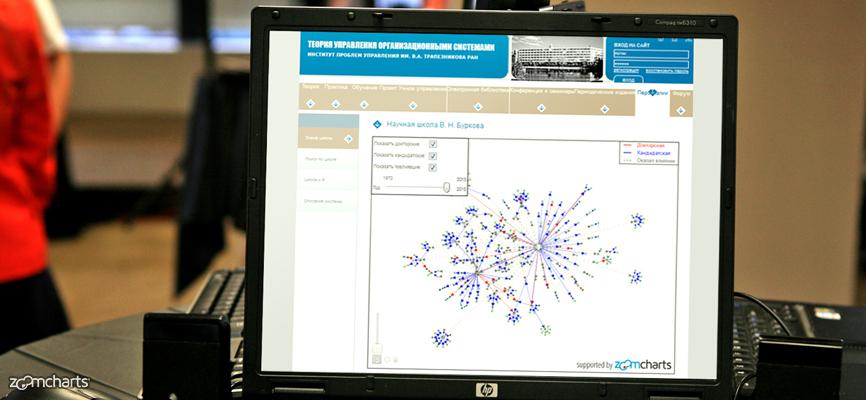
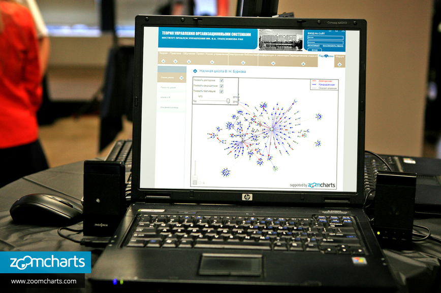
ZoomCharts tools are being used in myriad ways for educational purposes. One excellent example that reveals the truly wide range of ZoomCharts capabilities is in Russian management theory website MTAS’ use of a network graph.
MTAS is a Russian organization that caters to professionals in management theory and organizational systems, including scholars, teachers, graduate students, and students, and provides a place for them to exchange and share ideas. MTAS uses a ZoomCharts network graph to explore students who studied under the scientific school of VN Burkova over a 45-year range.
With ZoomCharts’ interactive network graphs, a variety of options are available to allow users to fully customize their experience:
1. Display all information in one chart. Legends help you distinguish between different data series.

2. Hide or show any combination of data with a simple click of your mouse.

3. Filter data using a handy slider.

4. Data nodes can be moved around with simple drag and drop using your mouse.

5. Zoom in and out of desired areas of the graph.

6. Hover over data nodes to display more information.


Want more info like this?
Subscribe to our newsletter and be the first to read our latest articles and expert data visualization tips!


