Jan 03, 2015
How to use Time Chart - Mixed - Columns and Area
Working with a mass amount of data can seem daunting, but the process is becoming increasingly easier with advanced data visualization tools. ZoomCharts’...
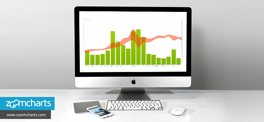

Working with a mass amount of data can seem daunting, but the process is becoming increasingly easier with advanced data visualization tools. ZoomCharts’...
Clients from many different fields, including science, medicine, business, law, administration, information technology, transportation, media, marketing, engineering, consulting, education, and more, have unlocked the possibilities of analyzing and using their data with ZoomCharts’ data visualization tools.
- Display large amounts of data in one place
- Work with mixed data in the same graph or chart
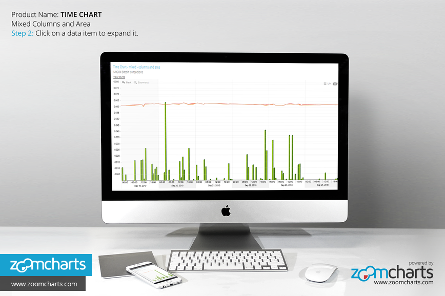
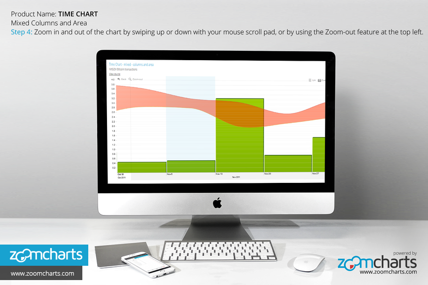
- Expand and zoom in and out of data with a simple click or scroll
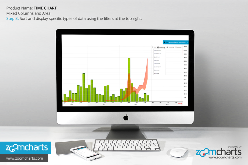
- Filter and display data according to specific time intervals
- Export data to open in various file types
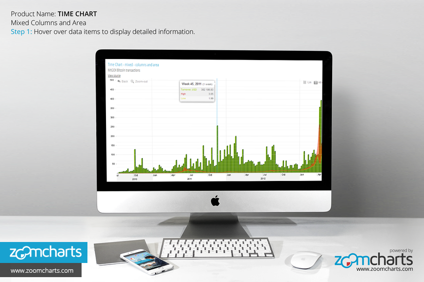
Step 1 Hover over data items to display detailed information.


Want more info like this?
Subscribe to our newsletter and be the first to read our latest articles and expert data visualization tips!
