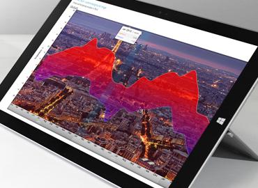
Ever stared at a spreadsheet feeling like you are looking for a needle in a haystack? Well, the haystack keeps growing by quintillions and quintillions of bytes of data ever day. For those of you in the growing business analytics and intelligence industry there’s no time to despair, you will just have to visualize your way out of the haystack.
Nate Silver
in his famous 2012 book
The Signal and the Noise put it most eloquently:
“We face danger wherever information growth outpaces our understanding of how to process it.” Data visualisation plays a crucial role in this processing of information by making the data easier to grasp and allowing to demonstrate patterns and a larger context. Any organizations that has so much as thought of using a spreadsheet can benefit from it. The business analytics industry really has no way around it.
Businesses are used to spreadsheets. That does not mean that they are not tired of them and that they are the best tools for delivering a business analytics message. Actually, we’re pretty sure that
ZoomCharts is the best tool for delivering the message. Whether it’s update on KPIs or a breakthrough insight, our html5 charts and graph library is up for the task.
The “renaissance” of business analytics and business intelligence
Deloitte in its
Analytics Trends 2016 report speaks of analytics renaissance in business. Businesses have always relied on business and financial data analysis to develop strategies and make decisions. However, increasingly they are looking to make sense of the wealth of data out there to draw actionable insights on everything from consumer behavior to human resources. Data driven, evidence based decision making is in and for good reason - MIT Center for Digital Business study has found that organizations driven most by data-based decision making had 5% higher productivity rates and 6% higher profits.
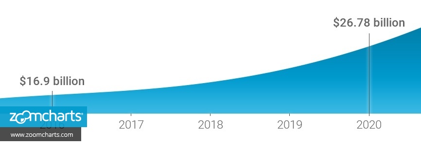
Indeed, demand for “can you explain this data?” is rising. World’s leading IT research and advisory company Gartner forecasts that the business analytics and business intelligence market will grow to reach
$16.9 billion in 2016 – that’s an increase of 5,2% from 2015. Business and Markets projects that the market will be worth
$26.78 billion by the end of 2020.
So, whether you’re in the BA camp and analyzing the given data of business performance or BI camp and providing future forecasts to businesses, you’re in for some exciting few years. However, the story is not just about the rise in demand, it is also about democratizing business analytics and making it more accessible.
The challenge for BA and BI
The challenge of business analytics and intelligence industry is to deliver the analysis in a way that can be easily digested and that keeps up with the needs of modern businesses - acting swiftly to stay ahead of competition and minimizing repetitious tasks to unleash individual creativity.
Desktop platforms with outdated design that require periodic update installation are on their way out. Business are more and more adopting mobile technologies, cloud services and technologies that are intuitive and agile. All that means that business analytics also has to move from IT-led reporting to self-service analytics. And it is, with the help of data visualization.
Business analytics anytime, anywhere
Here’s just a few reasons why data visualization and business analytics and intelligence work together so well.
- Data visualization brings BA and BI to life. Interactive charts and graphs allow you to discover the story behind the data and to present it in, what the data journalist David McCandless calls, the “language of the eye”. Data visualization engages by providing context and welcoming interaction with the data through drilling-down, layering of data.
- Data visualisation saves time big time. Businesses are not immune to the ASAP zeitgeist. They are under pressure to make decisions quickly to keep up with trends, capitalize on opportunities, adjust course. That requires quick access to real-time data analysis that can be easily read and comprehended. Data visualization allows to absorb wealth of data with just a glance. Furthermore, if before business analytics was IT-led and time consuming, now data visualization tools allow to analyze data of whichever size and sources to reveal patterns, trends and correlations instantaneously.
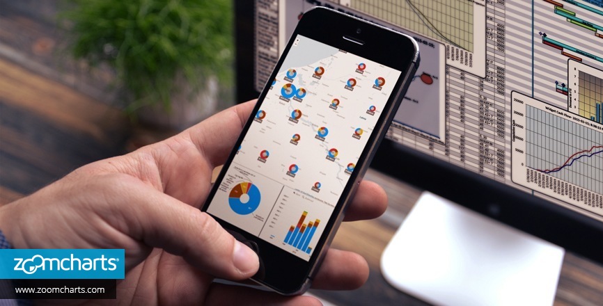
- Data visualization fits the dynamic work style. Mobile devices, touch screens, clouds have become and indispensable part of the entrepreneurial life. Managers, marketers, data analysts want the freedom to access data from their preferred device be it desktop, smart phone or a tablet any time, anywhere. Data visualization is positioned to deliver decision makers information they need in a user-friendly manner
- Data visualization wows. Interactive data visualization might be the only hope for the boring, dense presentations and reports and those snooze fests that sometimes meetings can be. If you want to impress and engage your partners and clients indulge them in data vizualisation.
Why ZoomCharts best delivers the BA and BI messages
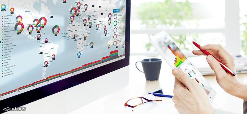
ZoomCharts is visual data discovery at its finest. With the help of diverse html5 chart and graph library you’ll be able to master the “language of the eye” and not just tell but show the story behind the data. Complex relationships, unexpected correlation, breakthrough insights – they come alive with ZoomCharts charts and graphs.
If you and your business wants to embrace data visualization, here is what ZoomCharts can promise you and your BA and BI business.
- Self- service. ZoomCharts empowers individuals to explore and better understand data. The intuitive and adaptable platform does not require you to be an IT guru and data wiz, just curious.
- Live data stream. ZoomCharts doesn’t stand still, it adjusts to the dynamics of the business. ZoomCharts javascript charts and graphs will be living and breathing, updating in real time to deliver up to date information.
- Visual discovery that will excite. Being built for multi-touch devices and having an extensive html5 graphs and charts library, ZoomCharts encourages curiosity and engagement with many opportunities for interaction and drilling-down on data. The “Other” slice in a pie-chart has never been so interesting.
- Destined for mobile. ZoomCharts provides full responsiveness and delivers superior performance on most contemporary mobile devices allowing businesses and individuals with any device preference to embrace it.
Think of the realm of possibilities our pie, time, facet, net and geo charts can offer your BA and BI business and how joyous it can make the data discovery process for you and your clients and partners. Learn more about ZoomCharts service delivery in the business page.
The bottom line
If your business chooses ZoomCharts, you will be in a fine company – many businesses, among them Fortune 500 companies, have already chosen ZoomCharts as their data visualization solution. It just may be the answer your business is looking for in this hectic, cluttered data driven world. Frankly, we don’t know a more fun way for looking for the needle in the ever growing data haystack, so sign up today!
