May 27, 2025
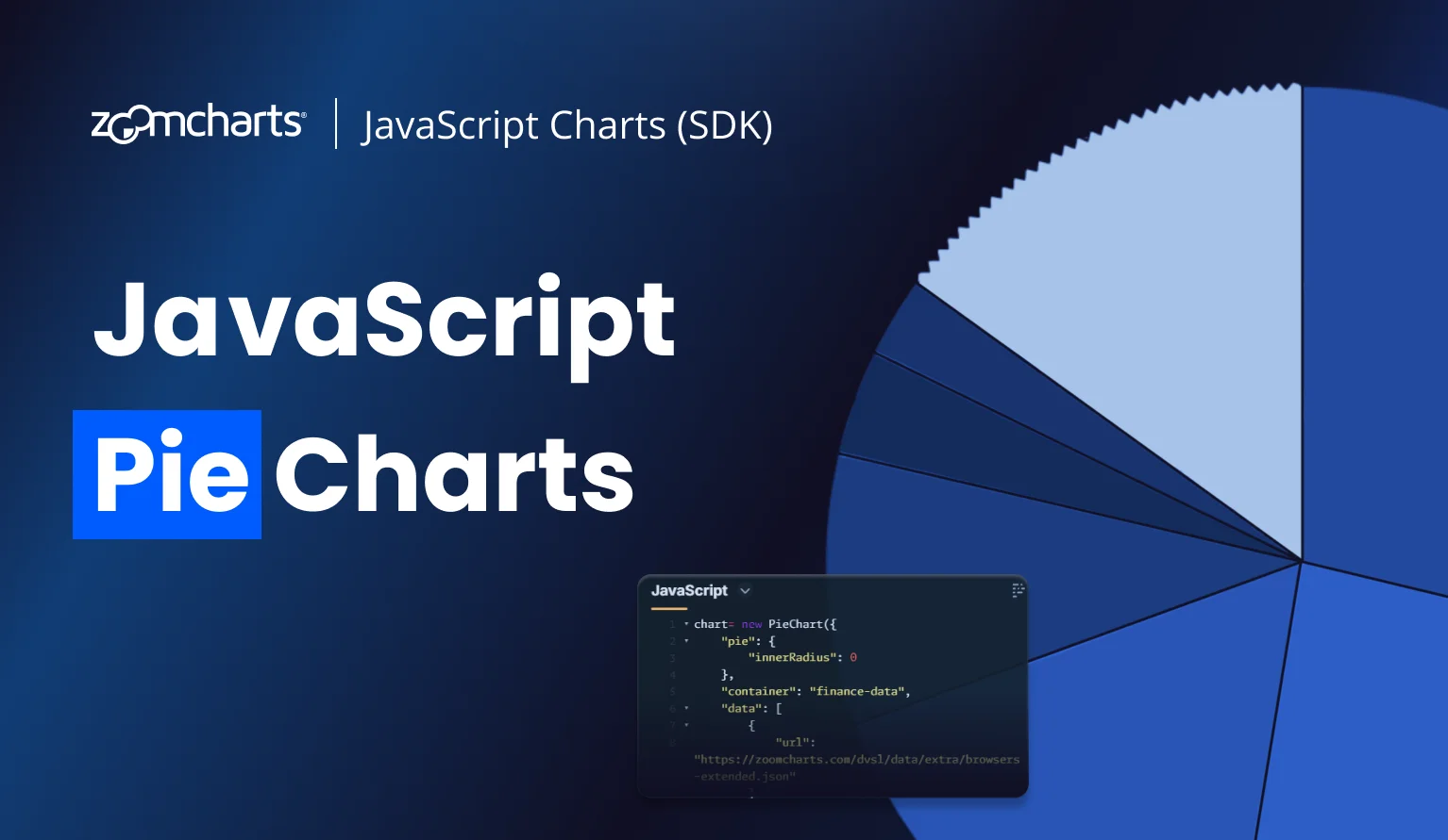
Building Smarter JavaScript Pie Charts for Web, Apps, Dashboards and Big Data
Pie charts are one of the most recognizable forms of data visualization—and for good reason. When built with the right tools, they become more than just static visuals: they transform into interactive, real-time insights. In this article, we’ll explore JavaScript pie charts, how they can power dashboards, work as interactive filters, and even act as part of more complex visuals.
Pie charts are one of the most recognizable forms of data visualization—and for good reason. When built with the right tools, they become more than just static visuals: they transform into interactive, real-time insights. In this article, we’ll explore JavaScript pie charts, how they can power dashboards, work as interactive filters, and even act as part of more complex visuals.
JavaScript Pie Chart Uses
Almost everyone knows what a pie chart is and how to read it. They can be found anywhere, from primary school textbooks to business reports or academic papers. So, when developing something that visualizes data, a JavaScript pie chart is one of the most crucial tools in the developer’s toolbox. Because no matter what, sooner or later it will find its use.
A capable and versatile JavaScript pie chart library will be useful for almost anything that is developed using JavaScript or JS-based frameworks (React, Flutter, etc.) – websites and webapps, desktop and mobile apps, business intelligence dashboards, IoT control panels, and more. Here are some examples on how you can use JavaScript pie charts in your next project.
Pie Charts for Data Visualization
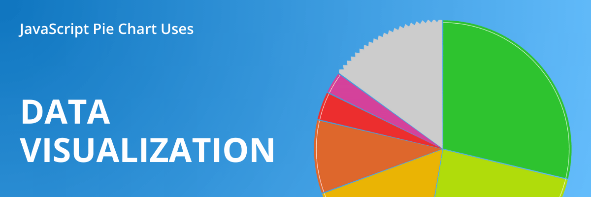
Let’s leave the ages-old debate on whether pie charts are good or bad for data-viz for another time. The simple truth is that they are one of the most prevalent chart types, and for a good reason. When you need to show how multiple parts contribute to a total, nothing does it better than a pie chart.
The entire circle represents 100%, and each value will be displayed as a slice that is sized based on how many % it is of the total. That’s what pie charts are made for – representing parts-to-whole relationships. If the main purpose of your visualization is comparing values against each other in detail, column charts would be a better choice.
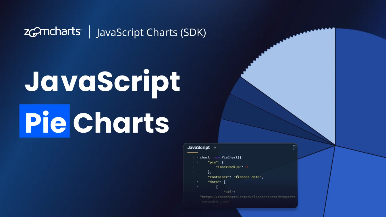
Of course, since its invention in 1801, the pie chart has seen multiple additions to expand its capabilities while still retaining its simplicity and ease-of-use. For example, our PieChart library supports drill down, which allows you to create multi-level JavaScript pie charts.
This example shows new car registrations per brand, but simply click on a slice to drill down and reveal the models per each brand, and model years in the level underneath. The animations will show the “flow” of data, and the middle part will display a snapshot of the previous level so the user knows where they are.
One of the main issues with pie charts as a data visualization type arise when you have too many slices (especially if they are small) - the chart may become difficult to read. But, if you combine them into an “Others” category, they become hidden from the chart. How to hide the small slices but give the user a way to access them?
ZoomCharts PieChart resolved this with the interactive ‘Others’ slice, which will show only the developer’s selected number of slices in the initial view – all others will be combined into a slice. If you want to see them, simply click on the ‘Others’ slice and it will reveal all hidden slices.
This example also shows that PieChart can also create donut charts – with the innerRadius property, you can control the size of the “donut” hole – use “0” if you want a classic pie chart, but this example uses “0.3” which results in a donut chart.
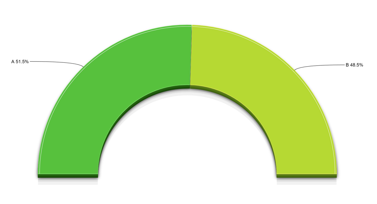
Pie Chart as a Real-Time Gauge
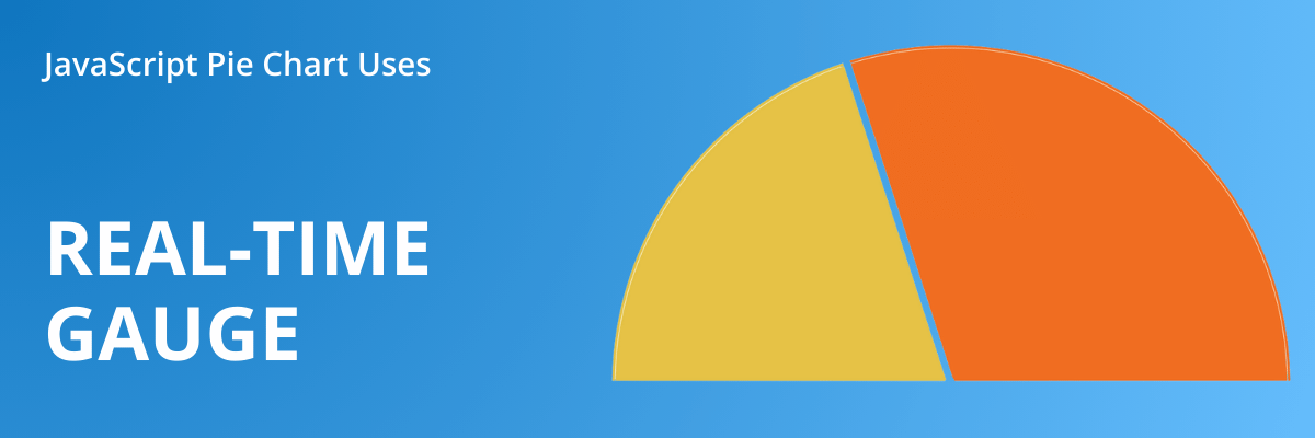
A close relative of pie charts is JavaScript gauge chart, which is basically a semi-circle instead of a full one. Since it looks like a speedometer or the RPM counter in a car dashboard, it’s often used to visualize process status (completion %), binary option statistics (e.g. yes/no polls), or other simple stats that need to be quickly and easily readable at a glance.
Along with JavaScript donut charts, it is yet another way how you can configure ZoomCharts PieChart – simply make it a half-circle or your desired shape by setting custom startAngle and endAngle values for the pie.
Try live chart example & see JS code in the Gallery
This example also showcases real-time data update support in PieChart. For demonstration purposes, we used simulated data in the example. But if you integrate it with your own live data source, your gauge chart could be a slick and interactive way to visualize things like real-time voting results or stats like ball possession during a soccer game.
Pie Chart as an Interactive Filter
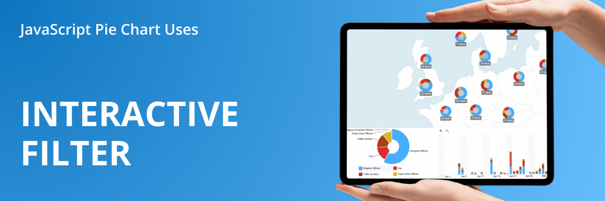
One of the most underrated ways to use pie charts is as a UI element. Since each slice represents a category, then selecting a slice could easily apply a filter to other elements and show only data pertaining to that category. Basically, the pie chart can do two things at once - be a visualization and also function like a slicer or a drop-down filter.
The design lead of our Power BI team, Aivis Pavlovs, calls this approach “an interactive steering wheel for the entire report”, and you can see this in many of our report examples. When it comes to JavaScript development, filtering data via visual interactions can be a slick way to make the entire UI more responsive and intuitive.
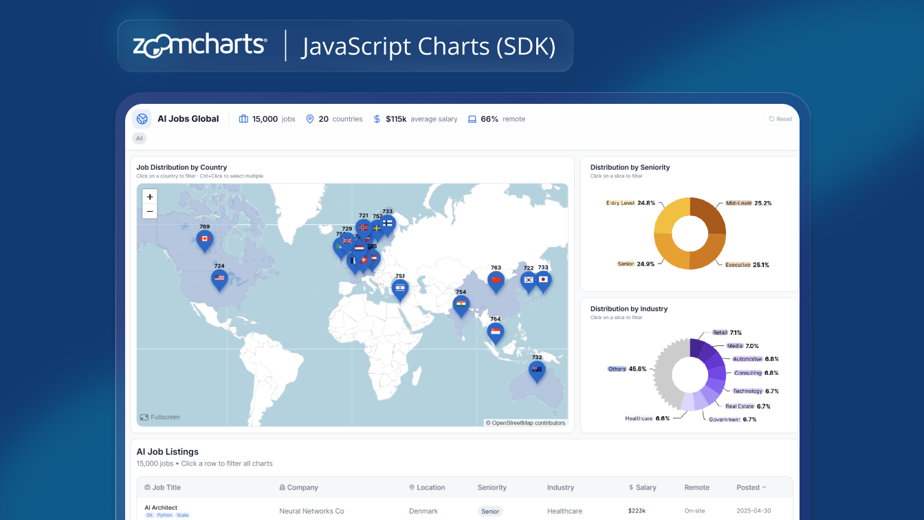
A web dev example for this could be an online bank statement: the pie chart groups the client’s transactions by type (bills, grocery purchases, transportation, personal transfers, etc.), and clicking on a slice could instantly apply a filter to the full statement below, showing only activities of that type. Or a marketing or web traffic analysis dashboard where pie charts can also filter data per specific demographic, channel, device and other categories – in this example, it is browsers.
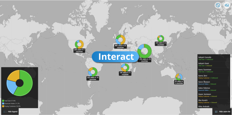
Here's an another example, this time of an interactive map chart for customer analysis. In the bottom left corner, there’s a large pie chart as a floating element that categorizes all customers in the visible area based on their status (trial user, bounced, paying customer). Click on a slice to drill down, and as you do that, the map will automatically get filtered so it shows data for the selected user group. Try the dashboard here – you can import your own data or use the sample dataset.
PieChart and all other components of the ZoomCharts JavaScript library are designed for cross-chart connectivity, allowing you to build interactive dashboards or other visualization projects for data analysis. You can learn more about configuring cross-filtering in this video tutorial.
PieChart as Part of Other Visuals
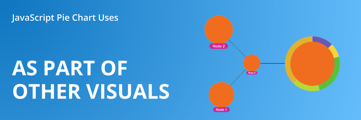
One underrated way of using JavaScript pie charts is by integrating them as part of another element. For example, the pie chart could be drawn on top of another chart (e.g. map chart) to represent the proportions of data in a specific range. Or the pie chart could be called by an event – for example, show related info in a pie chart when the user clicks and selects a data point.
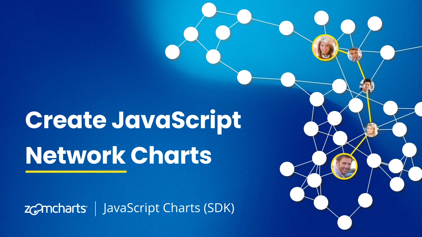
In the ZoomCharts JavaScript library, we call it charts-on-charts, and it means that all five components – PieChart, FacetChart, TimeChart, GeoChart, and NetChart – can be integrated within each other. One way of using this is by referencing another component when an event is fired – in this example, the network chart will draw a pie chart whenever the user selects a node, and a time series chart when the user drills down in the pie chart.
Another way to use charts-on-charts is by integrating a component as an element of a different component, such as a map chart layer. For example, here’s an interactive map chart created with GeoChart. By default, each data point is displayed as a node (usually a circle), and multiple nearby nodes can be clustered. This example shows what happens when we use PieChart as a layer – each node displays a pie chart instead, showing the category distribution of all data points within a cluster.
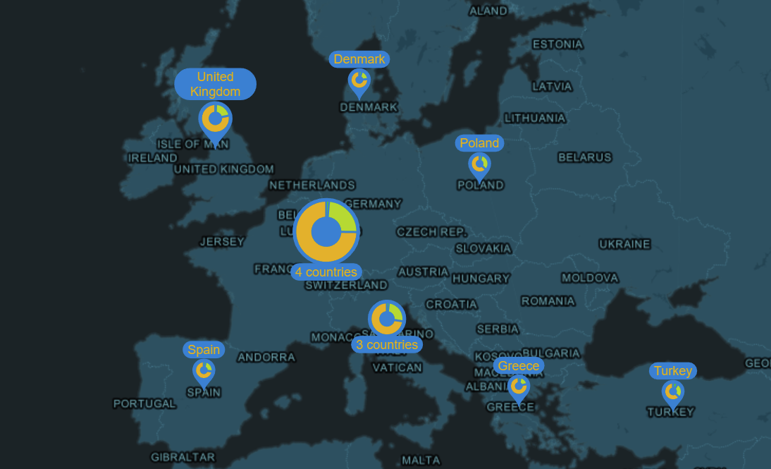
Try live chart example & see JS code in the Gallery
JavaScript Pie Chart Libraries

Since pie charts are one of the most prevalent data visualization types, developers have a lot of choice between free, open source and paid JavaScript pie chart libraries. For a simple and easy-to-read visualization of category proportions, FOSS options like Chart.js, D3.js and ApexCharts or free ones like Google Charts will be more than plenty.
They look slick, do their job well, and provide good configurability. So, if the free JavaScript pie chart libraries are enough, why would a developer opt for a premium solution like ZoomCharts instead? Here’s why.
- Drill down: click or tap on a slice to instantly reveal subvalues
- ‘Others’ slice: combine smaller slices into an ‘Others’ slice that can be expanded with a click
- Extensive configuration options: chart types (pie, donut, gauge), slice colors, labels, legends, themes
- Interactivity: intuitive and responsive UI with native KB/M and multi-touch support; customize user experience or implement your own functions with event listeners
- Performance: canvas-based rendering, optimized for big data
- Charts-on-charts: reference other ZoomCharts components to combine multiple charts into one
- Integration: ZoomCharts can be used on its own or as a part of any JavaScript framework (such as Vue, React, Angular, etc.); TypeScript definitions are also available if you prefer to write your code in TypeScript
- Data sources: works with preloaded data or can reference any data source from a URL (including MongoDB, MySQL and more); supports incremental loading and real-time updates
ZoomCharts JavaScript library includes five components – PieChart, FacetChart, TimeChart, NetChart, and GeoChart – and each is designed to be not just a tool for data visualization, but also interactive data exploration. With intuitive user interactions and responsive, smooth animations, they will be a great fit for any project – from a simple pie chart on a website to advanced dashboards for big data.
Ready to Try It Yourself?
Head to our Gallery to see live JavaScript examples of PieChart and our other visualizations in action. You’ll find various demos of specific features like drill down, ‘Others’ slice, clickable legends and many more, each accompanied by a code snippet that shows how it was achieved, and a JSFiddle link so you can experiment on your own in a live playground. The gallery also has multiple examples of JavaScript dashboards and other prototypes, giving you inspiration for your next project with ZoomCharts.
Once you’re ready to start creating your own charts, visit the Get Started page which has all you need to implement ZoomCharts into your project – a video tutorial series that covers the initial setup, configuration, event handlers and cross-chart filtering; CDN and download links or NPM package, and guides for integration with frameworks like Next.js, React, Vue, and Angular.
Try out all ZoomCharts features without our watermark by starting the free 30-day trial – you will receive unlimited access to all five components of the ZoomCharts JavaScript library. Afterwards, if you felt the difference made by our interactive visuals, you can find a pricing plan that is tailored to your use case – from a single public webpage or domain to specialized SaaS, OEM and enterprise plans.
Key Takeaways
- Pie charts are best suited for representing proportional differences between multiple categories.
- JavaScript pie charts are a useful tool for any developer – from a simple infographic for a news article to an interactive navigation element in a dashboard or an app.
- PieChart by ZoomCharts expands on JavaScript pie charts with features like multi-level drill down, and interactive ‘Others’ slice.

Want more info like this?
Subscribe to our newsletter and be the first to read our latest articles and expert data visualization tips!