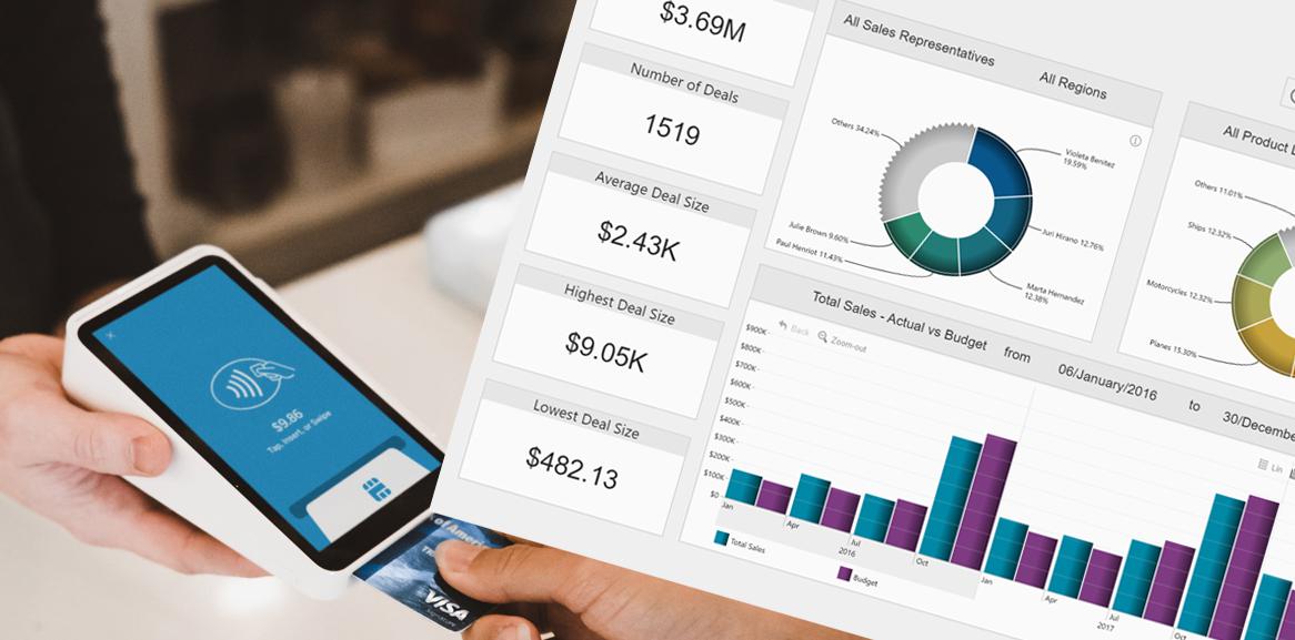
Whether its sales, finance, HR, security or operations, all of these are not possible without internal communication. This very fundamental information exchange process can be invisible in day-to-day business cycle; however, it may reveal many important aspects about your company.
For instance, do you know who is communicating with whom in your company? How often? How much of communication is happening outside the working hours? Communication frequency or lack thereof can help you identify the true inside-influencers that may help accelerate projects, or, conversely, put your company at risk. Lack of communication may shed a light on slackers and help identify problems early on.
With these few examples in mind, let’s look at how you can use Drill Down Graph PRO to visualize your communications and perform a thorough Power BI email analysis.
You will learn:
- how to build an email analysis report from scratch
- how to use latest features of Power BI and Drill Down Graph PRO
- how to perform internal communication analysis and get valuable insights from your data.

Power BI Email Analysis Step 1: Process and Add Data
As digital communication is an important everyday component for business of any size, communication analysis is critical to identify the actual communication channels in your organization.
When building an email analysis graph, every email address should be considered as a vertex (node), every related email (recipient, cc, bcc) should be considered as a related vertex (node), and each interaction between them (in this case, an email letter) then determines the relationship among those email addresses. For example, if [email protected] sends an email to [email protected], both John and Sue will be vertices (nodes) and they would be linked together with an edge (link) which represents this particular email.

To proceed with the Power BI email analysis visualization, we first need email data. Microsoft Power BI provides you countless data connectors, making it connectable to virtually anything (databases, APIs, spreadsheets, etc.). For this example, we will use a basic Microsoft Excel file that contains the list of emails that have been sent within a certain time period. Each row contains the sender, recipient and date. Note: there may be multiple recipients in the same column separated by comma.
In addition, we have multiple columns with additional data that can be used to customize your Power BI email analysis report and view data from multiple angles. These are fields such as sender/recipient topic or recipient’s department - these fields can be used to filter the main graph or give additional info in a tooltip. In addition, you manually pick node colors and add images for each sender and recipient.
We are also using additional data tables that will help customize the graph. Once set up in the Power BI, the data model will look like this:
Power BI Email Analysis Step 2: Create a Graph Chart
To proceed, we need to start Power BI Desktop or Power BI Service and add data (here's a guide on how to add data from Excel). Now, with data loaded in Power BI, it’s time to build the report with the Drill Down Graph PRO. You can add the visual from AppSource. Once added, the visual will appear in the Visualizations pane.
Next, click on that new icon to add the visual to the report. Once that is done, you need to setup the data for the visual – drag “Sender Name_Surname” into “source nodes”, “Recipient Name_Surname” into “target nodes”. Finally, we need a value – in this case we will simply use count of the rows – to do that, just drag “Sender e-mails” in “Value” field and choose “count”.
Congratulations! You have created a basic graph visual.
Power BI Email Analysis Step 3: Customize Your Graph
To make the graph more attractive, we will add images for email senders and recipients. You already noticed that there are columns in the dataset, listing image URIs.
Note! Power BI has blocked image URL use in certified visuals due to security reasons. Drill Down Graph PRO offers a workaround for this limitation – you can still add images to the graph visual by converting them to base64.
In this case we already had a data table with image URLs. To replace them with corresponding images in base64, we are adding additional data table to the report that will take care of that.

Once that's done, add image URI to the corresponding data fields: “source node image” and “target node image”.
As a finishing touch, let’s add additional information in the graph’s tooltip by dragging sender email data into Tooltip Content data field.
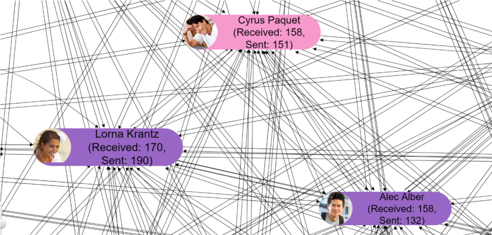
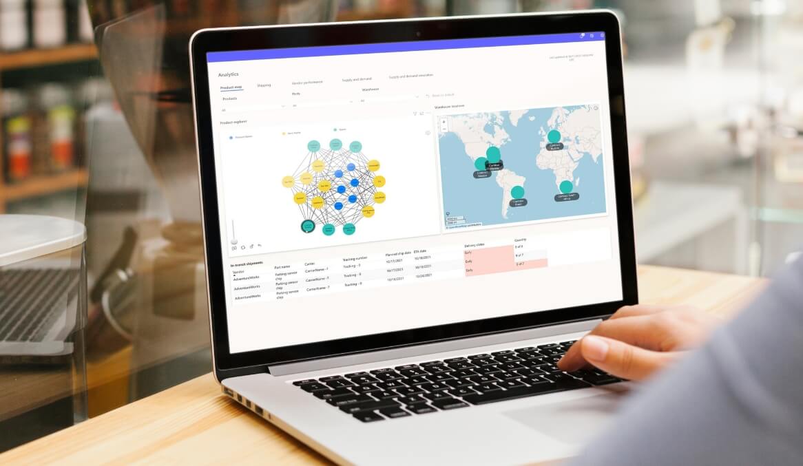
Your graph visual is ready and you can already identify the following:
- Who is sending emails to whom?
- How many emails person has sent?
Power BI Email Analysis Step 4: Add Your Graph to a Report
The graph that you just created can already be used to gain valuable insights about the communications flow in your company. However, you can push it even further by building a full-on Power BI email analysis report that features multiple additional visuals. In addition to providing extra info based on the context, they can also be used as an intuitive and easy-to-use filter for your report.
Let's start by adding more Drill Down Visuals to further analyze the data. In this example we are using:
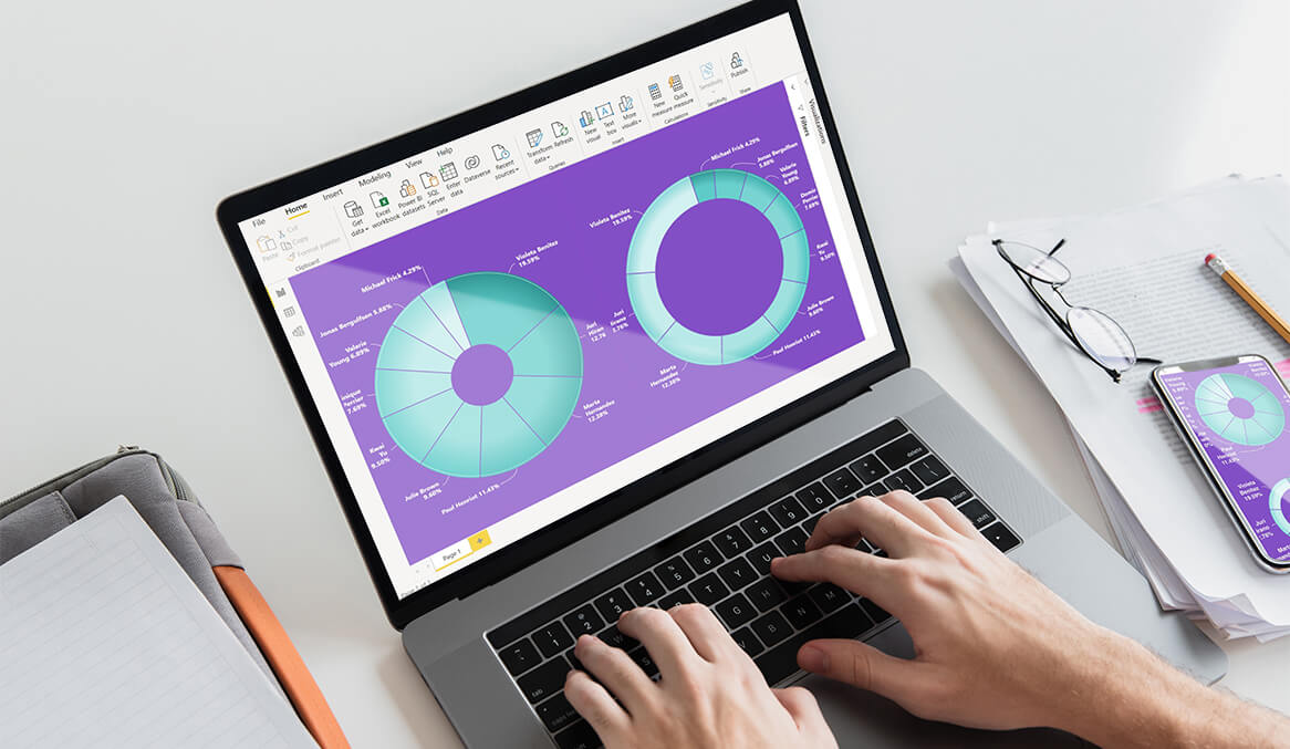
- Drill Down Donut PRO for grouping emails by sender / recipient and email topic (we will use this visual as slicer/filter)
- Drill Down TimeSeries PRO for grouping emails by time and day (this will act as time slicer/filter as well)
If you need help with setting up with these visuals, take a look at the .pbix sample file.
We suggest you also take a look at the customization option tab. ZoomCharts Drill Down Visuals offer rich customization options. The sample file will show you which ones are used in this use case and will help you get a better idea of what can be achieved in terms of design of your Power BI reports.
Now, this is the end of result of the sample use case we created.
In this report you can see:
- Senders by amount of emails sent and the topic of emails
- Recipients by amount of emails received and the topic of emails
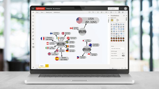
- Graph structure among senders and recipients.
- Emails by date (you can change this to days/years/hours/minutes/seconds, depending on how detailed your time data are).
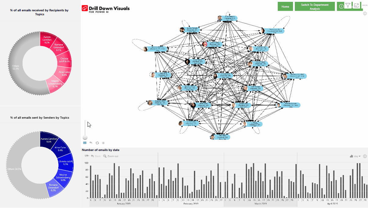
As all Drill Down Visuals support cross-chart filtering, we can analyze data using filtering with a simple touch. Let’s say we want to explore the emails sent only by Aurora Camilleri.
- Select Aurora in the Senders by Topic Donut. Now, in the recipient chart, let’s select Maxine to reveal how often they communicate
- Now, in either of donut chart lets select HR topic to see, how often they communicate about this topic.
- Notice that TimeSeries visual also has been filtered to show respective dates of communication. You can use it to further filter data and analyze communication only for a specific time period, e.g., April.
Additional Power BI Email Analysis Examples
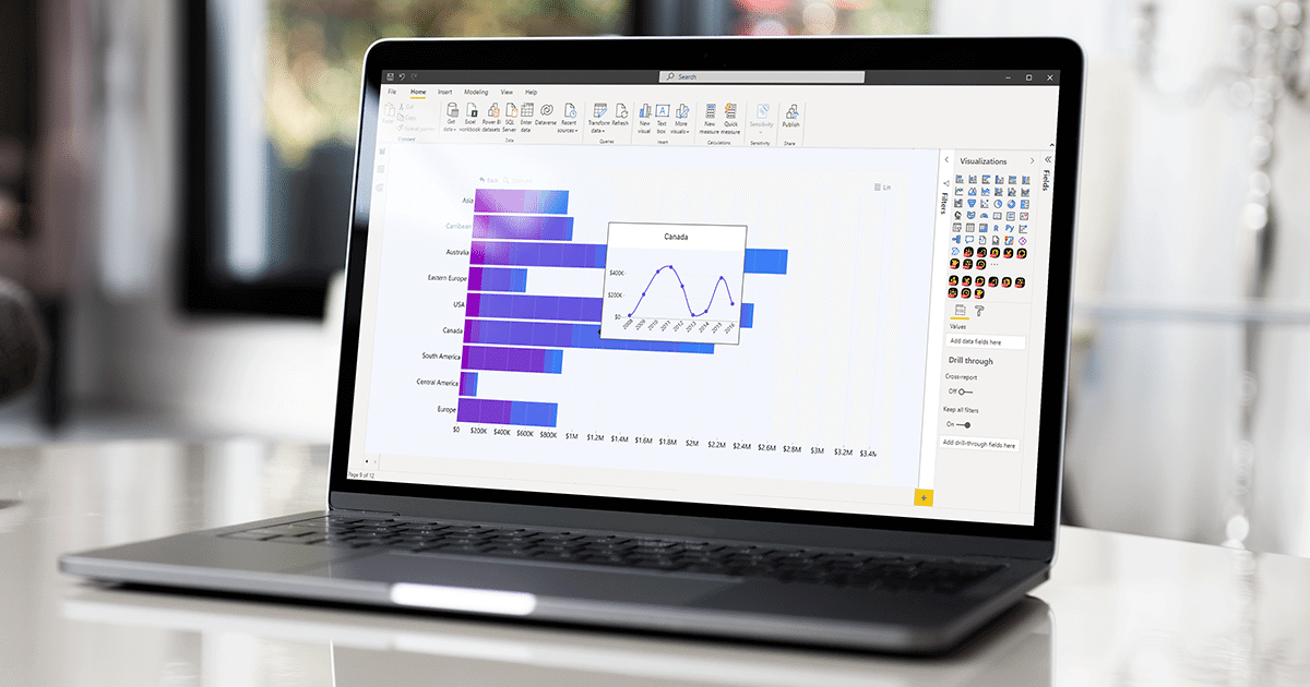
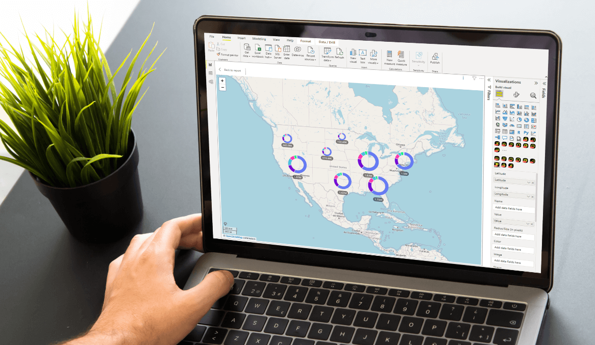
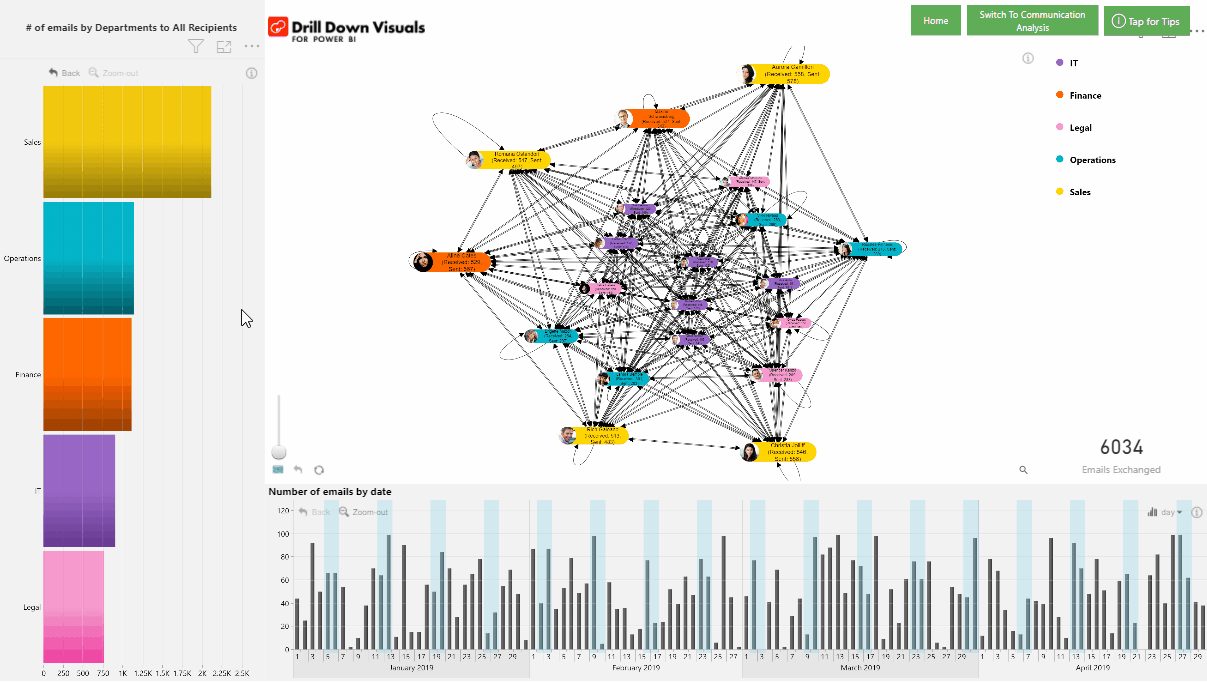
We can also use the same data to build a slightly different communication analysis, focusing on communication among departments.
In this case we are grouping email senders/receivers by department, utilizing graph customization options to color code employees by department, and using Drill Down Combo Bar PRO for additional filtering options.
For example, in this version of the report you can:
- quickly map communication among different departments
- further analyze communication down to particular employees
- apply additional time filter
- spot what amount of communication happens outside business days (thanks to holiday highlight feature of Drill Down TimeSeries visual)
Let’s see one example – communications of the Operations department:
- Click on Operations department to see with which other departments they communicate
- Click to turn off Finance, Legal and Sales in the graph legend, to see what communication happens only between Operations and IT department
- Or select a person on a bar chart to see what communication operations department has with that particular person.
For further details on how to build this particular chart combination, check out the sample .pbix file.
Power BI Email Analysis Report Live Demo
Now that you know how to use Drill Down Visuals, we welcome you to explore this example to get a taste of the possibilities that these visuals unlock.
We welcome you to download the sample .pbix and data file as well, to see how exactly these use cases are built, what customization options were used and what other features did we apply.
Conclusion
Connections can be observed in every aspect of business. Exploring and understanding the connections is tricky, but the Drill Down Graph PRO in combination with other Drill Down Visuals makes it simple, powerful and productive. Just imagine what else you could explore with this approach in your company and what new improvements could become possible. Read more about the features that this powerful visual offers in our blog article about Drill Down Graph PRO!