Feb 12, 2026
How to build an AI Jobs Dashboard with AI and ZoomCharts JavaScript Charts
AI is everywhere right now. It’s in the tools we use, the products we build, and increasingly in the job market itself. That overlap sparked a simple idea: if AI is reshaping jobs, why not use AI to help visualize what’s happening in the job market?
AI is everywhere right now. It’s in the tools we use, the products we build, and increasingly in the job market itself. That overlap sparked a simple idea: if AI is reshaping jobs, why not use AI to help visualize what’s happening in the job market?
To explore that idea, we built an interactive dashboard showing AI job listings around the world. The focus was not the accuracy of a single job board, but speed, accessibility, and workflow.
The question was simple: how easy is it for a non-developer to go from data to a compelling, interactive dashboard using everyday language?
1. Starting with a Synthetic Dataset
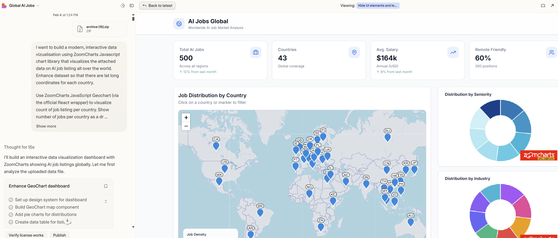
We began with a publicly available Kaggle dataset that represents global AI job listings and salary trends and added it to the prompt in Lovable.
Dataset source: https://www.kaggle.com/datasets/bismasajjad/global-ai-job-market-and-salary-trends-2025
It’s important to note that this is a synthetic dataset. It’s designed to reflect realistic patterns rather than mirror any single live job portal. That actually made it ideal for experimentation: the structure resembles real-world job data, without being tied to one specific source.
In practice, the same approach works just as well with real data – whether that means scraping job listing websites (where AI can help again), aggregating multiple sources, or connecting directly to your own job portal’s database or API.
2. Preparing the Data Using Plain Language
The dataset listed countries, but it wasn’t immediately usable for geographic visualization. Instead of writing transformation scripts, we simply described the problem.
Prompt example:
Enhance this dataset by adding latitude and longitude for each country so it can be visualized on a world map.
That was enough. AI handled the enrichment step and returned a map-ready dataset. No developer knowledge required, just a clear description of intent.
In a real-world scenario, this step could just as easily include:
- Cleaning scraped job listings
- Normalizing country names
- Enriching records with industry or seniority tags
All through conversation rather than code.
3. Describing the Dashboard, Not the Implementation
Next came the dashboard itself. Instead of thinking in terms of components or libraries, we described the outcome we wanted.
Prompt example:
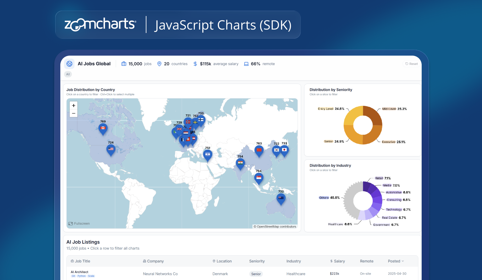
Build a modern, interactive dashboard using ZoomCharts JavaScript library.
Use a world map to show the number of AI job listings per country.
Add donut charts for seniority and industry distribution, and include a table to explore individual job listings.
From that description, the first version of the dashboard came together quickly. The ZoomCharts GeoChart handled the map, while ZoomCharts donut charts provided distribution views.
Built-in zooming, hover tooltips, and filtering were already present – without needing to explicitly request them.
This is where the roles become clear: AI makes it easy to build. ZoomCharts makes it interactive by default.
4. Iterating Like a Conversation
Once the dashboard existed, refinement became a series of small, natural adjustments – the kind anyone can articulate, regardless of technical background.
Prompt examples:
Switch the dashboard to a light theme.
Remove legends from the donut charts.
Show job counts on map droplets instead of country names.
Countries without data should be white.
Reduce droplet sizes so large countries don’t dominate the map.
Make sure cross-chart filtering works for all charts, table and KPI cards.
Each prompt nudged the dashboard closer to something clean and explorable. ZoomCharts’ patented interactivity and customization options handled the heavy lifting: smooth zooming, consistent styling, and intuitive hover behavior came out of the box.
AI simply made those capabilities accessible without needing to understand how they’re implemented.
5. Going Beyond Charts with AI
Not everything in the dashboard comes from the charting library itself. Elements like KPI cards and the data table sit outside ZoomCharts. Traditionally, that’s where dashboards become complex – syncing state between charts, filters, and UI components. Here, AI filled in the gaps.
Prompt example:
Add KPI cards showing total jobs, number of countries, and average salary.
Make the table update when a country is selected on the map.
The result is a layered experience: charts for exploration, UI elements for orientation, and a table for detail. AI made it easy to generate the missing pieces and connect them into a coherent whole.
6. From Synthetic Example to Real-Time Insight
While this dashboard is built on synthetic data, the workflow scales directly to real-world scenarios.
You could:
- Scrape job listing sites using AI and feed the results into the same dashboard
- Connect your own job portal to provide both search and real-time market overview
- Combine multiple sources to show where demand is growing and where it’s slowing
Instead of being just another job search interface, the dashboard becomes a way to understand what’s available, where, and in what context.
7. What This Experiment Shows
The real takeaway isn’t about AI jobs – it’s about accessibility.
AI removes the technical barrier. You don’t need to know how to scrape data, transform datasets, or wire up charts. You describe the goal, and the pieces fall into place.
ZoomCharts brings depth: rich interactivity, customization, and performance that turn static visuals into explorable data stories.
From data to first dashboard takes minutes. After that, it’s simply a question of how far you want to take the experience – whether for experimentation, internal insight, or a real-time product feature.
Frequently asked questions
No. This experiment intentionally focuses on using plain language rather than code. AI can handle data preparation and dashboard wiring, while ZoomCharts provides interactivity out of the box. Development experience helps, but it is not required to get started.
No. Synthetic data was used to demonstrate the workflow, but the same approach works with real-world data. You can connect APIs, databases, scraped job listings, or internal datasets and visualize them using the same patterns.
AI simplifies the creation process by translating intent into structure. ZoomCharts provides the interaction layer: zooming, filtering, drill-down, performance, and visual consistency. Together, they make advanced dashboards accessible and explorable.
Yes. ZoomCharts JavaScript charts are designed for performance and large datasets. The same setup can be used for internal tools, customer-facing dashboards, or real-time analytical products.
You can explore the ZoomCharts JavaScript Charts gallery and developer documentation to see real examples, configuration options, and integration guides for different frameworks.

Want more info like this?
Subscribe to our newsletter and be the first to read our latest articles and expert data visualization tips!