ZoomCharts Documentation
Switch to Version 2.0 (BETA)
Display style
The display style of nodes and links is fully customizable.
Node display
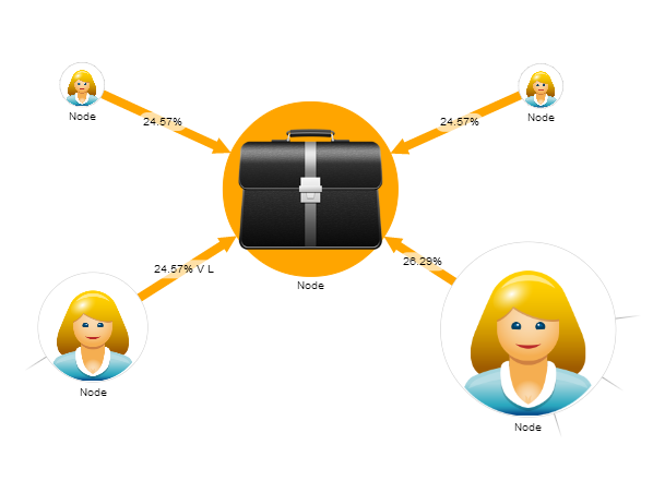
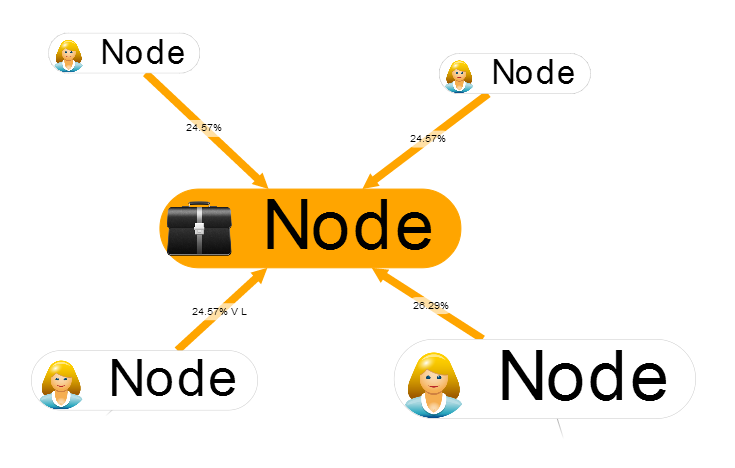
There are two distinct node looks to choose from using a global setting settings.style.node.display or per node setting node.display.
- "image" emphasizes the image on node.

- "text" emphasizes the text.

Currently the mode is a global setting. This can change in future versions.
Style attributes
Node and link objects have a number of style attributes.
Node style attributes
display: node display mode - one of "image"(default), "text", "roundtext"radius: node radiuslabel: label textlabelStyle: label rendering style, structure same as Items, default value =settings.style.nodeLabel.fillColor: fill colorlineColor: border line colorlineWidth: border line width in pixelsimage: image URL to renderopacity: node opacityimageCropping: cropping method to apply, one of: false, "crop", "letterbox", "fit", true. Note that imageCropping does not work on images loaded from another domain (like Facebook)items: array of items to show on the node, see Itemscursor: cursor to show when pointer over the node. One of HTML cursor names
Link style attributes
radius: radius of the link line (actual size is 2x radius)length = 1: link length multiplier. Each link has a default length based on node sizes and number of neighbor nodes. The default length gets multiplied by this value.strength = 1: link strength. When there is no room to place all links at desired length, links with bigger strength take precedence. Useful range:[0.. 10]fillColor: color of the linklabel: link label textlabelStyle: label rendering style, structure same as Items, default value =settings.style.linkLabeldashed: if true link is drawn as dashed lineitems: array of items to show on the link, see Items.fromDecoration: decoration at the "from" end, one of "circle", "arrow"toDecoration: decoration at the "to" end, one of "circle", "arrow"cursor: cursor to show when pointer over the node. One of HTML cursor namesdirection: preferred direction of the link. Possible values: "D", "U", "R", "L".
Style rules
Style rules is a more powerful system to dynamically construct and update the visual look of nodes and links. Whenever a property is changed on node or link, style functions are evaluated to update the look.
A typical set of style rules looks something like this:
    nodeStyleFunction: function(node) {
            node.label.title = node.data.name;
            node.radius = node.data.size;

            if (node.data.image) {
              node.image="/images/people/"+node.data.image;
              node.fillColor = "white";
            } else {
              node.image = null;
              node.fillColor = "gray";
            }

            if (node.focused) {
                node.fillColor = "orange";
            }
        }
    },
    linkStyleFunction: {
        function(link) {
            var linkColors = {
                "friend":"orange",
                "family":"green",
                "acquaintance":"grey"
            };

            link.radius = 10;
            link.fillColor = linkColors[link.data.type];
        }
    }
Style setting precedence
There are different style settings available that are applied on top of each other. For example, if you define shadow for selected nodes, when the node is hovered, the shadow might now be shown because the hover style takes precedence.
Here is the order how the different style settings are applied:
- node (always)
- nodeLocked (when node.userLock)
- nodeExpanded (when node.expanded)
- nodeFocused (when node.focused)
- nodeBackground (when node.background)
- nodeNotLoaded (when not node.data.loaded)
- node.data.style (style defined in the data object, not in the settings; always)
- nodeClasses (for matching node.data.className)
- removedColor for nodes (when node.removed)
- nodeSelected (when node.selected)
- nodeHovered (when node.hovered)
- link (always)
- link.data.style (style defined in the data object, not in the settings; always)
- linkClasses (for matching link.data.className)
- linkSelected (when link.selected)
- linkHovered (when link.hovered or link.from.hovered or link.to.hovered)
- removedColor for links (when link.removed)
- allObjectsStyleFunction
- nodeStyleFunction
- linkStyleFunction
- nodeLabel (always)
- nodeAnchor (always)
- linkLabel (always)
Auto scaling
There are several options to automatically distribute node and link radius values over a specified range.
The following distribution algorithms are available:
linear- distribute the values linearly.logarithmic- distribute the values logarithmically.
There are multiple automatic distribution settings:
settings.style.nodeAutoScaling- set to desired algorithm name to automatically distribute node radius values over a range.settings.style.linkAutoScaling- set to desired algorithm name to automatically distribute link radius values over a range.settings.style.linkStrengthAutoScaling- set to desired algorithm name to automatically distribute link strength values over a range.settings.style.linkLengthAutoScaling- set to desired algorithm name to automatically distribute link length values over a range.
The distribution ranges can be specified by the following settings:
settings.style.nodeRadiusExtent[min, max]node size, defaults to[30, 150].settings.style.linkRadiusExtent[min, max]link size, defaults to[0.6, 30].settings.style.linkLengthExtent[min, max]link length, defaults to[0.1,1].settings.style.linkStrengthExtent[min, max]link strength, defaults to[0.1,50].