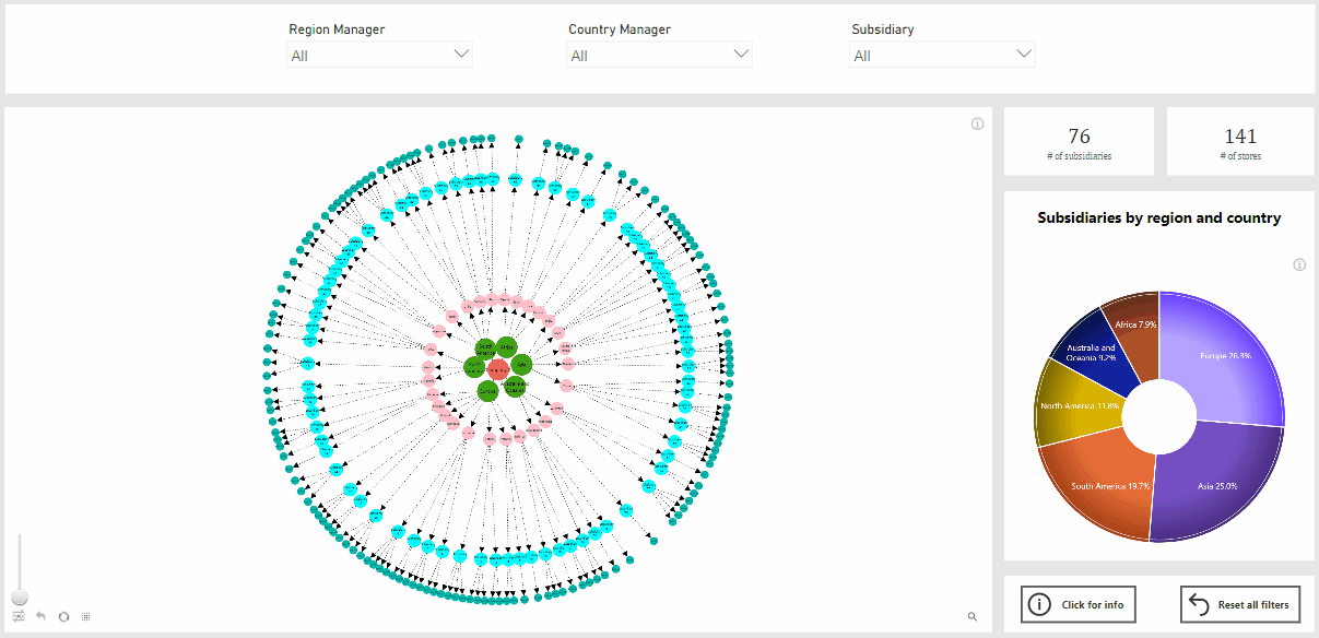
Use case for a graph visual: mapping subsidiaries of an international organization
Sep 22, 2020
- How to build a graph visual to explore hierarchical relationships
- How to use multiple interaction options for better data exploration experience
- How to apply multiple customization options offered by Drill Down Graph PRO
Exploration of hierarchical relationships is the one of the most common use cases for the graph visual. From mapping an organizational structure, listing teams, employees and supervisors, to creating an overview of IT infrastructure and even creating a detailed visualization of a value chain – all these are use cases in high demand from business decision makers. Unfortunately graph visual is still underused because of its complex nature and time resources required to build a quality visualization. However, with this use case we want to demonstrate how building a graph visual can be both- rather quick and easy. And most importantly – with a high value for business.
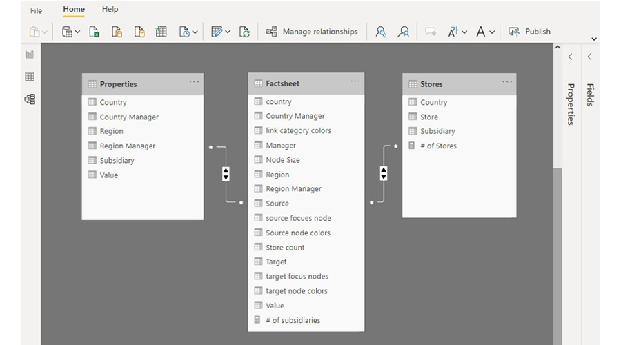
1. Setting up data
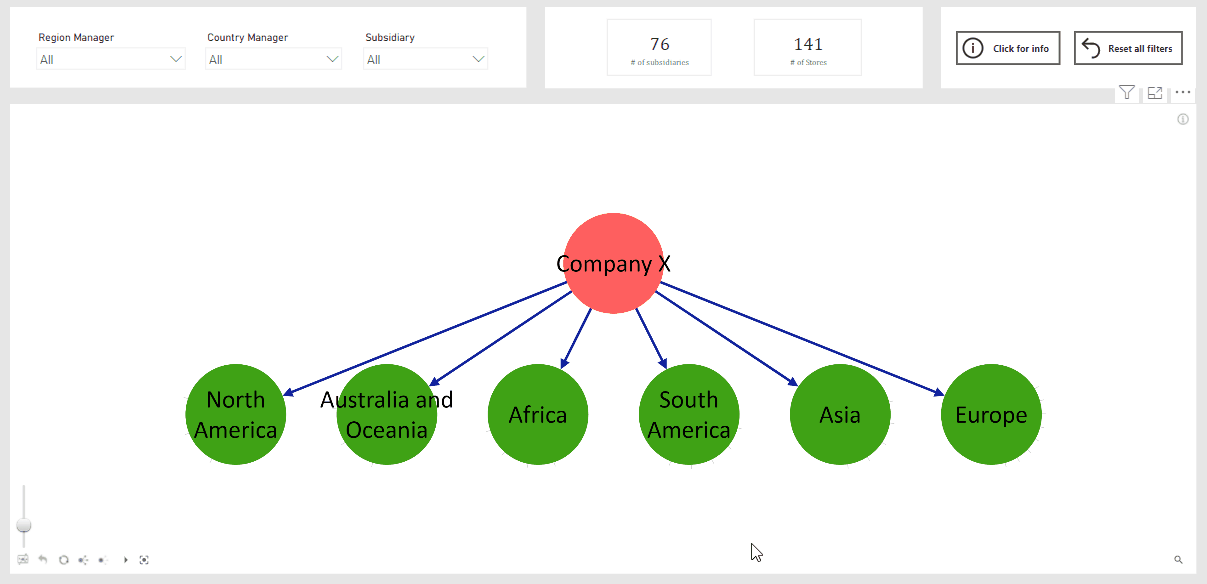
- Fact sheet – this is the main table listing all data necessary for the graph – source and target information (regions, countries, companies and stores), data used for graph customization such as node sizes, colors and link categories, and additional information we will want to display in the graph (region and country managers)
- Regional – additional dimension table to describe properties for each region, that will be used to add additional filters to the report
- Stores - additional dimension table to describe properties for each store, that also will be used to add additional filters to the report
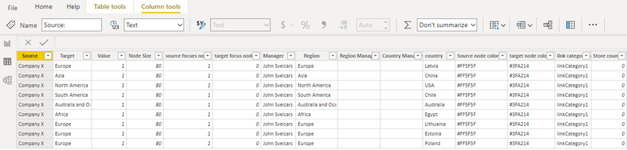
- Source nodes – list of regions, countries and subsidiaries (column Source in the Fact Sheet)
- Target nodes- list of regions, countries, subsidiaries and stores (column Target in the Fact Sheet)
- Value – value creates a link between source and target nodes. In this case we are using value 1 for all instances, because its only purpose is to show that there is an existing relationship (column Value in the Fact Sheet)
- Source Node Color- will determine the color of the source nodes (column Source Node Color in the Fact Sheet)
- Source Node Radius - will determine the size of source nodes (column Node Size in the Fact Sheet)
- Source Focus Nodes – this field allows to determine, which is the main (focus) node when there are multiple hierarchy levels. Value 1 = true, value 0 = false (column Source Focus Node in the Fact Sheet)
- Target Node Color - will determine the color of the target nodes (column Target Node Color in the Fact Sheet)
- Link Category Class – is used to split links into multiple categories, which in return allows to customize each link category separately, e.g., set different color for each (column Link Category Colors in the Fact Sheet)
- Tooltip Content- will determine what information will appear in the tooltip (columns Manager, Regional Manager and Country Manager in the Fact Sheet)
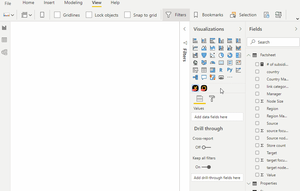
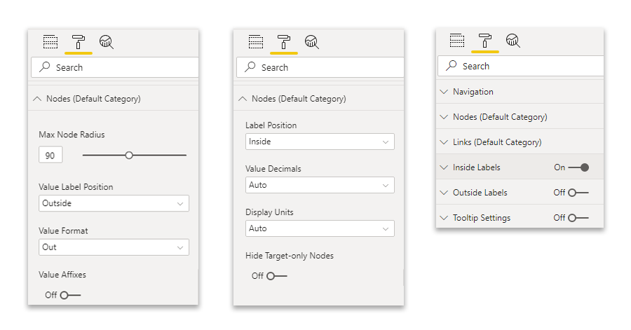
2. Customizing chart and interactions
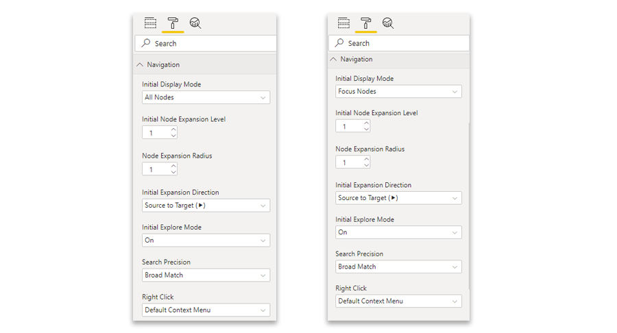
- The label position for the node value is set to be “outside”
- The label position for the node name is set to be “inside”
- And here comes the “hack” - once node value is set to outside, you will be able to turn it off completely, as it is done for this use case
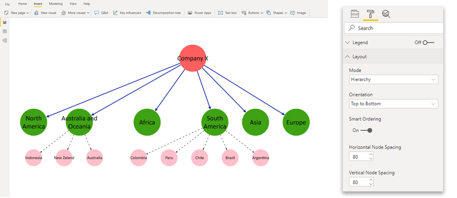
3.Adding additional elements to the report
4. Demo report
Subscribe to news
Subscribe to our newsletter and be among the first ones to receive updates about latest developments, releases and other useful information that will help you get the most of our visuals.
ZoomCharts JavaScript Charts: Best New Features of 2022
2022 was a big year for data visualization, and it was an even bigger year for ZoomCharts JavaScript Charts. We implemented many useful and much-requested features such as conditional formatting, new data aggregation options, and more. We’re even more excited to share the upcoming features that you can expect in 2023. Read all about them!
Read More Dec 22, 2022Analyze your Google Sheets data with ZoomCharts Spreadsheet Analytics
ZoomCharts Spreadsheet Analytics is a tool that allows you to receive an instant interactive report out of your spreadsheet data just by browsing that... Read More
Jan 05, 2017Turn your spreadsheets into interactive reports in seconds
We introduce Spreadsheet Analytics. That means there is a new way to visualize and explore your spreadsheet data. Spreadsheet Analytics is an application build... Read More
Nov 09, 2016Arrange a Meeting with ZoomCharts at Collision in New Orleans
We are excited to be exhibiting at Collision tech conference in New Orleans on April 26-28. Attending this top-notch event? Pre-arrange a meeting with... Read More
Apr 14, 2016data visualizationdata visualisationcollisionconferencetech conferencedata visualization conferencebig datahtml5 charts and graphsjavascript graphs and chartshtml5 charts and graph libraryhtml5 chartshtml5 graphsjavascript graphsjavascript chartschart librarygraph libraryinteractive chartsinteractive graphs
Meet Us at Data Visualization Summit in San Francisco
Hello the West Coast, we are coming! Happy to exhibit at Data Visualization Summit in San Francisco on April 21-22. Want to meet us there and get an exclusive... Read More
Apr 14, 2016data visualizationdata visualisationdata visualization summitdata visualization summit san franciscoconferencetech conferencedata visualization conferencebig datahtml5 charts and graphsjavascript graphs and chartshtml5 charts and graph libraryhtml5 chartshtml5 graphsjavascript graphsjavascript chartschart librarygraph libraryinteractive chartsinteractive graphs
Case Study: Meemim Uses NetChart to Build an Enterprise Collaboration Platform
Canadian start-up Meemim believes that visualization and social networking can lead to better knowledge management. Meemim’s CEO Alexandre Pestov tells us... Read More
Mar 29, 2016data visualizationdata visualisationbig datahtml5 charts and graphsjavascript graphs and chartshtml5 charts and graph libraryhtml5 chartshtml5 graphsjavascript graphsjavascript chartschart librarygraph libraryinteractive chartsinteractive graphscase studydata visualization case studyNetChartnet chartmeemim
Data Visualization for Software Development
Visualization is to data what color is to television – both allow to rediscover something we knew in a whole new light. With data universe rapidly expanding,... Read More
Mar 17, 2016data visualizationdata visualisationbig datahtml5 charts and graphsjavascript graphs and chartshtml5 charts and graph libraryhtml5 chartshtml5 graphsjavascript graphsjavascript chartschart librarygraph libraryinteractive chartsinteractive graphssoftware developmentdata visualization for software development
Data Visualization for Internet of Things
When you can create socks that can communicate with your TV, you know that things are changing. Internet of Things is here, and it’s expanding fast. Since... Read More
Mar 16, 2016data visualizationdata visualisationbig datahtml5 charts and graphsjavascript graphs and chartshtml5 charts and graph libraryhtml5 chartshtml5 graphsjavascript graphsjavascript chartschart librarygraph libraryinteractive chartsinteractive graphsinternet of thingsdata visualization for internet of things
Data Visualization for Business Analytics
Ever stared at a spreadsheet feeling like you are looking for a needle in a haystack? Well, the haystack keeps growing by quintillions and quintillions of... Read More
Mar 03, 2016Data Visualization for Cyber Security
Big Data is no longer the hype that it used to be till a couple of years back. It’s a reality now – the data revolution is already here. The web has... Read More
Feb 09, 2016Data Visualisation for Online Banking
How do you feel when you are presented with a large volume of unexciting data which can actually take hours to extract any meaningful insight? To be more... Read More
Feb 02, 2016Ho Ho Holiday Special Offer from ZoomCharts
The ZoomCharts team wishes you happy holidays and a very special New Year! To make the most out of the next year, we've came up with a special holiday deal for... Read More
Dec 15, 2015Approaching Businesses at Data Visualisation Summit in London
When Data Visualisation Summit announced its slogan “Telling your story with data”, we knew the ZoomCharts team had to exhibit there, so on November 11-12... Read More
Dec 10, 2015Exhibiting at TechCrunch Disrupt in London
Another great chance to put us on the radar of potential customers! We're exhibiting at TechCrunch Disrupt in London on December 7-8. TechCrunch Disrupt is... Read More
Dec 04, 2015Starting Big at Web Summit 2015 in Dublin
The ZoomCharts team had an opportunity to attend Web Summit 2015 on November 3-5 in Dublin, one of the largest technology conferences in the world. The... Read More
Dec 04, 2015TypeRacer Fans Can Now Compare and Visualize Their Scores
Are you a fan of TypeRacer.com? Want to see the big picture of your typing progress since the beginnings? Compare your performance with the scores of your... Read More
Nov 25, 2015Meet Us at Data Visualisation Summit in London
To help you get more out of ZoomCharts, we'd love to meet you in person and show you our newest features. As our team is going to London on November 10-13,... Read More
Oct 28, 2015Battling for Best Startup Title at Web Summit in Dublin
Proud to announce ZoomCharts has been shortlisted for the Web Summit BETA pitch! We'll be battling in front of the world’s leading investors, media and... Read More
Oct 28, 2015ZoomCharts Receives Rising Star Title
Awesome news! On October 22nd, ZoomCharts received the “Rising Star” title and was named as one of Latvia's best new exporting brands. “Rising... Read More
Oct 28, 2015ZoomCharts v1.9 - Setting Milestones
ZoomCharts v1.9 is now available! ZoomCharts has always been a niche leader but now our multi-touch support has got even better! See the new features in a... Read More
Oct 13, 2015Your Powerpoint presentations will come alive with ZoomCharts!
With almost every presentation we create, we face a fundamental challenge – how to display and present huge amount of data without losing audience interest... Read More
Aug 25, 2015ZoomCharts Experience: Episode 4, Performance
ZoomCharts HTML5 charts are built with a particular focus on mobile users. Fluid animations, speedy rendering, multitouch support, Big Data readiness are just... Read More
Aug 05, 2015ZoomCharts New Release v1.5
ZoomCharts is rapidly growing because of the increasing number of businesses and professionals that choose working with our interactive data visualization... Read More
May 27, 2015Learn the Art of Data Visualization and Its Evolution with ZoomCharts
Don’t limit yourself to infographics and static charts. With the ZoomCharts interactive data visualization software you can bring your presentations to the... Read More
May 22, 2015The Big Challenges in Big Data
Business professionals are increasingly looking to big data analysis tools as data consumption increases on a large scale every day. But as these needs develop... Read More
May 21, 2015Avoid Common Presentation Pitfalls with ZoomCharts
Presentations are a highly stressful part of life for many. Whether in school, on the job, at events or conferences, or in front of an interview panel, having... Read More
May 21, 2015Why Professionals are Choosing ZoomCharts
In celebrating its second year of business, ZoomCharts is reflecting on the significant traction it has gained in that short time, and its success in... Read More
May 21, 2015ZoomCharts Experience: Episode 3, Date Picker
Exploring the intricate details of your big data sets can be frustrating when your tools do not provide you with the functionality you require to go deeper... Read More
May 21, 2015Why Data Visualization is a Necessary Tool of the Future
It’s no secret that we live in a data driven world: a world where technology has allowed us to get to the point where, according to IBM, more than 90% of the... Read More
May 21, 2015Explore Social Networks with ZoomCharts Intuitive Combination Charts
Take big data exploration to the next level with combination charts from ZoomCharts. See it all in action at https://social.zoomcharts.com/ Explore the... Read More
May 20, 2015The Billion Dollar o-Gram and Necessity to Visualize Data
People who are dealing with the data analysis and large data bases often struggle with making sensible reports and presentations that allow the target audience... Read More
May 20, 2015ZoomCharts team at the Latitude59 conference in Tallinn, Estonia: May 14-15, 2015
One of the world’s leading data visualization software providers ZoomCharts attended Latitude59 event in Tallinn, Estonia to meet existing customers and talk... Read More
May 19, 2015ZoomCharts For Web Design Day 2015: June 12, 2015
ZoomCharts is offering data visualization tools to support speakers at the Web Design Day 2015 conference, taking place June 12th at the New Hazlett Theater, 6... Read More
May 12, 2015ZoomCharts For UXLx 2015: June 3-5, 2015
ZoomCharts is offering data visualization tools to support speakers at UXLx 2015, taking place June 3rd through 5th, 2015 at the FIL Meeting Centre (Centro de... Read More
May 12, 2015ZoomCharts Team at the Collision Event in Las Vegas on May 5 - 6, 2015
What a legendary event it was! ZoomCharts interactive data visualization software made heads turn and people talk, which resulted in a dramatic increase of our... Read More
May 11, 2015ZoomCharts For QCon New York: June 10-12, 2015
ZoomCharts is offering data visualization tools to support speakers at the QCon New York conference, taking place June 10th through 12th, 2015, at the New York... Read More
May 11, 2015How to use Facet Chart - Browser Shares, Hierarchical Structure
https://zoomcharts.com/en/gallery/all:facet-chart/examples/gallery/facet-chart-browser-shares The Facet Chart Hierarchical Structure tool, part of... Read More
May 11, 2015ZoomCharts For Confab Central: May 20-22, 2015
ZoomCharts is offering data visualization tools to support speakers at Confab Central, taking place May 20th through 22nd, 2015 at the Hyatt Regency... Read More
Apr 24, 2015ZoomCharts For An Event Apart San Diego: June 8-10, 2015
ZoomCharts is offering data visualization tools to support speakers at An Event Apart San Diego, taking place June 8th through 10th, 2015 at San Diego Marriott... Read More
Apr 24, 2015Prearrange Meetings with ZoomCharts at Collision 2015 in Las Vegas
On May 5 - 6, 2015 ZoomCharts team will be attending the Collision event in Downtown Las Vegas, Nevada, United States. Please contact us to prearrange... Read More
Apr 23, 2015Business Insider Announces ZoomCharts the Fastest Growing B2B Startup in the World
Hard work combined with a clear business vision and dedication pays off. One of the biggest business and technology news websites Business Insider has... Read More
Apr 17, 2015How to Use Pie Chart - Donut, One Level
https://zoomcharts.com/en/gallery/all:pie-chart/examples/gallery/piechart-donut-with-custom-core-single-level-britney-spears ZoomCharts’ advanced data... Read More
Apr 15, 2015ZoomCharts at Collision Tech Conference 2015
ZoomCharts is very excited to be attending the Collision Tech Conference on May 5-6, 2015 in Downtown Las Vegas. Collision is the world’s largest and... Read More
Apr 15, 2015ZoomCharts For Loyalty Expo 2015: April 27-29, 2015
ZoomCharts is offering data visualization tools to support speakers at Loyalty Expo 2015, taking place April 27th through 29th at Loews Royal Pacific Resort at... Read More
Apr 15, 2015ZoomCharts For International Conference on Networking, Information & Communications 2015: May 18-20, 2015
ZoomCharts is offering data visualization tools to support speakers at the International Conference on Networking, Information & Communications 2015 (ICNIC... Read More
Apr 15, 2015ZoomCharts For How Design Live: May 4-8, 2015
ZoomCharts is offering data visualization tools to support speakers at How Design Live, taking place May 4th to 8th, 2015 at the Hyatt Regency Chicago, 151 E.... Read More
Apr 14, 2015ZoomCharts For GOTO Chicago 2015: May 11-12, 2015
ZoomCharts is offering data visualization tools to support speakers at the GOTO Chicago International Software Development Conference, taking place May 11th... Read More
Apr 11, 2015ZoomCharts For Future of Web Design London: April 27-29, 2015
ZoomCharts is offering data visualization tools to support speakers at the Future of Web Design London conference (FOWD London), taking place April 27th... Read More
Apr 11, 2015ZoomCharts For Cyber Threats World Summit: May 15, 2015
ZoomCharts is offering data visualization tools to support presenters at the Cyber Threats World Summit 2015, taking place May 15th, 2015 at the Lalit Mumbai,... Read More
Apr 11, 2015March 2015 ZoomCharts Facebook Contest Winner
What a success the ZoomCharts Facebook contest... Read More
Apr 07, 2015Taking 21st Century Movie Watching Further with ZoomCharts
As video rental stores become a thing of the past, and home entertainment becomes more prominent going into the future, the means of choosing what to watch... Read More
Apr 03, 2015Try ZoomCharts for FREE
Looking for an HTML chart library that lets you visualize massive data sets interactively on any device at incredibly fast speeds? Data visualization... Read More
Apr 03, 2015ZoomCharts Sees Global Recognition as One of the Most Powerful Data Visualization Tools
ZoomCharts is enjoying international recognition, with impressed users as far reaching as countries such as Thailand. An increasing number of professionals... Read More
Apr 03, 2015Happy Easter from ZoomCharts!
From the entire ZoomCharts team, we’d like to wish everyone a safe and happy Easter, whether your plans consist of a large consumption of food, chocolate,... Read More
Apr 01, 2015ZoomCharts Experience: Episode 02, Related Items
This is the second installment in the new ZoomCharts experience video series. These video shorts will continue on a regular basis to offer a fun, fast, and... Read More
Mar 31, 2015ZoomCharts Experience: Episode 1, Swipe & Pinch
This is the first installment in the new ZoomCharts Experience video series. These video shorts will continue on a regular basis to offer a fun, fast, and... Read More
Mar 26, 2015Labs of Latvia Dubs ZoomCharts a Rising Star
This just in: ZoomCharts is among the latest in tech trends you should know about. Labs of Latvia has dubbed it a “rising star” in its roundup of the best... Read More
Mar 25, 2015Getting Seemingly Unmanageable Big Data Under Control
A few short years ago, it would be impossible to predict the precise way in which data has evolved, and just how much data we generate today. To say it has... Read More
Mar 25, 2015How to Use Time Chart Legend
https://zoomcharts.com/en/gallery/all:time-chart/examples/legend/time-chart-legend ZoomCharts’ line of advanced data visualization software makes it easy... Read More
Mar 24, 2015ZoomCharts For UX Mobile Immersion Conference: April 13-15, 2015
ZoomCharts is offering data visualization tools to support speakers at the UX Mobile Immersion Conference 2015, taking place April 13th to 15th at Salt Lake... Read More
Mar 19, 2015ZoomCharts For Fluent: April 20-22, 2015
ZoomCharts is offering data visualization tools to support presenters at the Fluent conference, taking place April 20th through 22nd at the San Francisco... Read More
Mar 19, 2015ZoomCharts For WebVisions NYC: April 2, 2015
ZoomCharts is offering data visualization tools to support speakers at the WebVisions NYC conference, taking place April 2nd, 2015 at Projective Space, 72... Read More
Mar 19, 2015ZoomCharts For LeanUX NYC: April 15-19, 2015
ZoomCharts is offering data visualization tools to support speakers at the LeanUX 2015 conference, taking place April 15th through 19th at Brooklyn Bazaar, 165... Read More
Mar 19, 2015ZoomCharts For National Conference on Emerging Trends in Information Technology: March 21, 2015
ZoomCharts is offering data visualization tools to support presenters at the National Conference on Emerging Trends in Information Technology, the theme of... Read More
Mar 19, 2015ZoomCharts For Digital Summit Charlotte: April 1-2, 2015
ZoomCharts is offering data visualization tools to support speakers at the Digital Summit conference, taking place April 1st through April 2nd at Le Méridien... Read More
Mar 19, 2015ZoomCharts For IBSSICETRET: April 6-7, 2015
ZoomCharts is offering data visualization tools to support presenters at the 3rd International Conference on Emerging Trends and Research in Engineering and... Read More
Mar 19, 2015Increase your SALES with ZoomCharts
ZoomCharts had an excellent time participating in the TechHub Rīga March Meetup on March 12, 2015, taking place at Kaļķu street 12/14, Rīga, LV-1050,... Read More
Mar 18, 2015ZoomCharts For Web Afternoon: March 27, 2015
ZoomCharts is offering data visualization tools to support participants at Web Afternoon, taking place March 27th, 2015 from 1-6pm at Polygon Atlanta, 264 19th... Read More
Mar 18, 2015ZoomCharts For ICACTA 2015: March 26-27, 2015
ZoomCharts is offering data visualization tools to support presenters at the International Conference on Advanced Computing Technologies and Applications,... Read More
Mar 18, 2015ZoomCharts Featured on Stanford University Website
ZoomCharts continues to see a steady increase in popularity as more and more professionals from a variety of fields, including business, technology, finance,... Read More
Mar 17, 2015Business Newspaper Dienas Bizness About ZoomCharts
ZoomCharts is honored to be featured on the Dienas Bizness (Daily Business) website db.lv, Latvia’s biggest business newspaper. DB offers the latest... Read More
Mar 17, 2015ZoomCharts: One of the World’s Most Promising Startups
ZoomCharts is thrilled to be featured as one of the world’s most promising startups by Launching Next. Launching Next showcases startups to thousands of... Read More
Mar 12, 2015ZoomCharts Data Visualization Tools on the Procurement Monitoring Bureau of Latvia Website
ZoomCharts data visualization tools have become very popular amongst government agencies and bureaus because of its capabilities to process massive amounts of... Read More
Mar 09, 2015Saint Patrick’s Day Activities that Won’t End in a March 18th Hangover
March 17th is Saint Patrick’s Day, a day that marks the death of the patron saint of Ireland, and which has also in the last few years evolved into a day... Read More
Mar 09, 2015ZoomCharts For ICCCAN 2015: March 20-21, 2015
ZoomCharts is offering data visualization tools to support presenters at the 2nd annual International Conference on Computing, Communication & Advanced... Read More
Mar 09, 2015ZoomCharts For The Great Indian Developer Summit: April 21-24, 2015
ZoomCharts is offering data visualization tools to support speakers at the Great Indian Developer Summit (GIDS), taking place April 21st through 24th at the... Read More
Mar 09, 2015University of Latvia’s Mega Screen
Some innovative minds at the University of Latvia are currently crafting a unique, futuristic tech tool that is unlike anything that exists in the market... Read More
Mar 06, 2015ZoomCharts at the Labs of Latvia Ignition Event
ZoomCharts was delighted to be a part of the ignition event that took place at Birojnīca, Mill Street 84/2, Rīga, LV 1050, Latvia, on March 3rd, 2015 to... Read More
Mar 05, 2015ZoomCharts at The Mill Riga
ZoomCharts had an awesome time at The Mill’s party in Rīga on February 27th, 2015, mingling, chatting, and getting the opportunity to meet other startup... Read More
Mar 05, 2015Win ZoomCharts License Valued at $699 USD!
Enter now to win a ZoomCharts Developer License, valued at $699 USD: Click Here to Start 1. Like us on Facebook at https://www.facebook.com/zoomcharts 2.... Read More
Mar 05, 2015How to Use Pie Chart - Donut Chart, Flat Theme, Hierarchical Structure
https://zoomcharts.com/en/gallery/all:pie-chart/examples/gallery/pie-chart-donut-chart-flat-csdd-car-market ZoomCharts’ advanced data visualization line... Read More
Mar 03, 2015How to Use Net Chart - Interactive Node Filtering
https://zoomcharts.com/en/gallery/all:net-chart/examples/filters/node-filter ZoomCharts’ advanced data visualization software makes viewing and analyzing... Read More
Mar 03, 2015ZoomCharts at TechHub Riga Meetup: March 12, 2015
ZoomCharts is very excited to be part of the TechHub Rīga Meetup on March 12, 2015, taking place at Kaļķu street 12/14, Rīga, LV-1050, Latvia.... Read More
Feb 27, 2015ZoomCharts Featured on Japanese Website nikkei BPnet
ZoomCharts is proud to have been named among the best data visualization providers by Japanese technology website, nikkei BPnet. One of ZoomCharts’... Read More
Feb 27, 2015ZoomCharts For NIMBioS Investigative Workshop: March 11-13, 2015
ZoomCharts is offering data visualization tools to support participants at The National Institute for Mathematical and Biological Synthesis’ investigative... Read More
Feb 25, 2015ZoomCharts For the New England Statistics Symposium: April 24-25, 2015
ZoomCharts is offering data visualization tools to support speakers at the 29th New England Statistics Symposium, taking place April 24th to 25th, 2015 at the... Read More
Feb 25, 2015ZoomCharts For ENAR 2015 Spring Meeting: March 15-18, 2015
ZoomCharts is offering data visualization tools to support presenters at the ENAR 2015 Spring Meeting, taking place March 15th through 18th, 2015 at the Hyatt... Read More
Feb 25, 2015ZoomCharts For Probability Theory and Combinatorial Optimization Conference: March 14-15, 2015
ZoomCharts is offering data visualization tools to support speakers at the Probability Theory and Combinatorial Optimization conference held by Duke... Read More
Feb 25, 2015Duke UniversityDukeDurhamNorth CarolinaNCFuqua School of Businessprobability theorycombinatorial optimizationJ. Michael SteelePi DayUniversity of CaliforniaStanford UniversityMcGill UniversityJohn Hopkins Universitythe Massachusetts Institute of TechnologyPompeu Fabra UniversityUniversity of PennsylvaniaLehigh UniversityNational Science FoundationInstitute of Mathematical StatisticsWharton School
ZoomCharts For Columbia - Princeton Probability Day 2015: March 6, 2015
ZoomCharts is offering data visualization tools to support speakers at Columbia-Princeton Probability Day, taking place Friday, March 6, 2015 at the Princeton... Read More
Feb 25, 2015ZoomCharts For Agile India 2015: March 23-30, 2015
ZoomCharts is offering data visualization tools to support speakers at Agile India 2015, taking place March 23rd to March 30th, 2015, at the Chancery Pavilion,... Read More
Feb 25, 2015ZoomCharts Releases New Software Version 1.4
The ZoomCharts team is proud to unveil the newly updated ZoomCharts software, v1.4 At once we are introducing an early sneak peak to a new chart type: Geo... Read More
Feb 21, 2015How to Use Time Chart - Area
ZoomCharts’ Area feature simplifies the process of presenting information in time charts by allowing users to view your data with greater speed and... Read More
Feb 19, 2015ZoomCharts For Wisdom 2.0: February 27 - March 1, 2015
ZoomCharts is offering data visualization tools to support speakers at the Wisdom 2.0 Conference, taking place February 27th through March 1st, 2015 at the... Read More
Feb 18, 2015ZoomCharts For ICON: March 31 - April 2, 2015
ZoomCharts is offering data visualization tools to support speakers at ICON, taking place March 31st through April 2nd, 2015 at the Phoenix Convention Center,... Read More
Feb 18, 2015How to Use Network Graph - Nodes With Custom Thumbnails
Custom Thumbnails is one of the many features from ZoomCharts’ line of advanced data visualization software that can help you make the most out of your data.... Read More
Feb 18, 2015ZoomCharts For LAUNCH Festival 2015: March 2-4, 2015
ZoomCharts is offering data visualization tools to support speakers at the LAUNCH Festival, taking place from March 2nd to 4th, 2015 at the Fort Mason Center,... Read More
Feb 18, 2015ZoomCharts For SXSW Interactive: March 13-17, 2015
ZoomCharts is offering data visualization tools to support speakers at SXSW Interactive, taking place from Friday, March 13th through Tuesday, March 17th, 2015... Read More
Feb 18, 2015ZoomCharts: Making Future UI Available Today
ZoomCharts Co-Founder and CEO Janis Volbergs gave a well received presentation at a UI/UX meetup event to talk about the array of progressive ZoomCharts... Read More
Feb 17, 2015How to Use Time Chart - Stacked Bars
ZoomCharts’ Stacked Bar feature makes reading and comparing information in time charts easy. There is no need to scroll or flip between separate charts. This... Read More
Feb 14, 2015ZoomCharts for ICCSEA-2015
ZoomCharts is offering data visualization tools to support presenters at the Fifth International Conference on Computer Science, Engineering and Applications... Read More
Feb 12, 2015ZoomCharts for ITCCMA-2015
ZoomCharts is offering data visualization tools to support presenters at the Second International Conference on Information Technology, Control, Chaos,... Read More
Feb 12, 2015ZoomCharts for DMAP 2015
ZoomCharts is offering data visualization tools to support presenters at the International Conference on Data Mining and Applications (DMAP 2015), taking place... Read More
Feb 12, 2015ZoomCharts for SAP TechEd Bangalore 2015
ZoomCharts is offering data visualization tools to support presenters at the SAP TechEd Bangalore 2015 conference, March 11-13th, 2015 at the Bangalore... Read More
Feb 12, 2015ZoomCharts Takes the Screen at TechChill Baltics 2015
A ZoomCharts presentation graces the screen at the popular ZoomCharts demo booth at the TechChill Baltics 2015 technology startup conference on February... Read More
Feb 12, 2015TechChillTechChill BalticsTechChill Baltics 2015TechChill Baltics conferenceTechChill Baltics 2015 conferenceRigaLatviaBalticsBaltics tech conferenceLatvia tech conferenceRiga tech conferencetech conferencetechnology conferencetechnology conference Balticstechnology conference 2015startup conference
ZoomCharts for 360|intersect: April 25-26, 2015
ZoomCharts is offering data visualization tools to support speakers at the Big Data Developer Conference, taking place from April 25th to 26th, 2015 at the... Read More
Feb 10, 2015ZoomCharts at TechChill Baltics 2015
ZoomCharts is proud to be a part of the TechChill Baltics 2015 conference, taking place in Riga, Latvia on February 10, 2015, beginning at 10am at the... Read More
Feb 05, 2015TechChillTechChill BalticsTechChill Baltics 2015TechChill Baltics conferenceTechChill Baltics 2015 conferenceRigaLatviaBalticsBaltics tech conferenceLatvia tech conferenceRiga tech conferencetech conferencetechnology conferencetechnology conference Balticstechnology conference 2015Palladiumstartup conferencestartup
Firmas.lv: Using ZoomCharts' Pie Graph for Latvian Business Exploration
ZoomCharts line of advanced data visualization software lets you take ordinary data and turn it into an exciting way to dive deeper into vast amounts of... Read More
Feb 03, 2015pie chartpie chartspie graphpie graphsbusiness statisticsforestproductionagricultureconstructionretailenergytransportlogisticstransportationreal estateITinformation technologycomputerstourismhospitalityentertainmentservicestelecommunicationsmediaadvertisingeducationcreativemedicinepharmacyfoodbeveragefinanciallegalbusiness services
ZoomCharts for the DRIVE Conference: March 11-12, 2015
ZoomCharts is offering data visualization tools to support presentations at DRIVE/, taking place from March 11th to 12th, 2015 at the Hyatt Regency Bellevue on... Read More
Feb 03, 2015DRIVESeattleBellevueWashingtonHyattHyatt RegencyHyatt Regency BellevueHyatt Regency Bellevue on Seattle’s EastsideinnovativeITdata professionalshigher educationnon profitcorporate sectorsAmazonAdobeYale UniversityHarvard UniversityColumbia UniversityBill & Melinda Gates FoundationAmerican Red CrossSeattle Children’s Hospitalreportinginformationanalyticsmodelingvisualizationhigh tech
ZoomCharts for DEVNEXUS 2015: March 10-12, 2015
ZoomCharts is offering data visualization tools to support presentations at DEVNEXUS 2015, taking place from March 10th to 12th, 2015 at the Cobb Galleria... Read More
Feb 02, 2015DEVNEXUSDEVNEXUS 2015AtlantaGeorgiaCobb GalleriaCobb Galleria Centreprofessional software developers conferenceprofessional developers conferencedevelopers conferencesoftware conferenceHTML5big data integrationJavaScriptfunctional web designresponsive web designUX designDevOpsIBMMicrosoftGitHubOracle
ZoomCharts for DeveloperWeek: February 6-12, 2015
ZoomCharts is offering data visualization tools to support presenters at DeveloperWeek 2015, taking place from February 6th to 12th, 2015 at Pier 27 at the... Read More
Feb 02, 2015San FranciscoPier 27Embarcaderotechnologytechnology eventdeveloperdeveloper weekdeveloper week San Franciscodeveloper week conferencedeveloper week expoConference & ExpoAccelerate 2015hackathonGirlDevWeekRobotics Dev SummitDevOps Summitworkshopsopen housesHTML5WebRTCFull-Stack JavaScript developmentmobile web designNode.jsdata sciencedistributed computingGoogleFacebookIBMBlackberryMicrosoft
ZoomCharts for Big Data TechCon 2015: April 26-28, 2015
ZoomCharts is offering data visualization tools to support presentations at Big Data TechCon, taking place from April 26th to 28th, 2015 at the Seaport WTC in... Read More
Feb 02, 2015advanced data visualizationdata visualizationinteractive data chartinteractive data graphinteractive data chartsinteractive data graphsdata chartdata graphdata chartsdata graphsadvanced data chartadvanced data graphadvanced data chartsadvanced data graphsbig dataBig Data TechConTechConBostonMassachusettsSeaport WTCIT professionalsbig data professionalsdata analystsbusiness analystsdeveloperssoftware architectsdata scientistsproject managersHadoopSparkYARNRHBaseHivePredictive Analyticsmachine learningNoSQLMongoDBCassandraNeo4j
ZoomCharts for Big Data Developer Conference: March 23-25, 2015
ZoomCharts is offering data visualization tools to support presenters at the Big Data Developer Conference, taking place from March 23rd to 25th, 2015 at the... Read More
Jan 31, 2015Santa ClaraCaliforniaHiltoncustomized trainingbig data expertstechnicalnon technicalbig dataHadoopSparkNoSQLmachine learningprogrammingdatabasesprofessionalsengineersdevelopersarchitectsnetworking specialistsmanagersexecutivesstudentsdata analystsdevelopersQAperformance engineersdata warehouse professionalsales professionalstechnical marketers
Happy Valentine’s Day to All Couples, Singles, and Those Soon to Be Divorced
For some, the highly romanticized holiday of Valentine’s Day is warmly anticipated as a day to celebrate the love shared with their romantic partners, and... Read More
Jan 31, 2015ZoomChartsValentineValentinesValentine’s Dayhappy Valentine’s DayValentine’s effectdivorceValentine’s Day divorceFebruarydivorce in FebruarydivorceValentine’s singlesValentine’s couplesNational Retail FederationNRFForbesLegalMatchSan FranciscoAttorneyFee.comAttorneyFeeSeattleAvvo.comAvvoanti-Valentine’s DaySingle’s Awareness Day
How to Use Time Chart - Using Dashed Lines
The possibilities for data analysis are opened up with ZoomCharts’ advanced data visualization software. Start planning for the future today with the Dashed... Read More
Jan 30, 2015ZoomChartsinteractive data chartinteractivedatacharttime charttimedata visualizationadvanced data visualizationdashed linesforecast dataproposed datafutureeducational fieldssciencesmathematicsanatomybiochemistryecologymicrobiologynutritionneurosciencephysiologyzoologychemical engineeringgeochemistrymolecular biologygeologypaleontologyphysicsastronomyalgebracomputer sciencegeometrylogicstatisticsartsmusicdancetheatrefilmanimationarchitectureapplied artsphotographygraphic designinterior designmixed media
How to Use Time Chart - Custom Background Image
With ZoomCharts’ Custom Background Image feature, you can incorporate custom visuals into your graphs to enhance data presentation. Instead of a bland... Read More
Jan 30, 2015ZoomChartsadvanced data visualizationadvanced datadata visualizationinteractive data chartinteractivedatacharttime chartcustomizationbackground customizationbackgroundcustomimagecustom visualssciencesmathematicsanatomybiochemistryecologymicrobiologynutritionneurosciencephysiologyzoologychemical engineeringgeochemistrymolecular biologygeologypaleontologyphysicsastronomyalgebracomputer sciencegeometrylogicstatisticsartsmusicdancetheatrefilmanimationarchitectureapplied artsphotographygraphic designinterior designmixed media
McKinsey & Company Sees Big Value in Big Data Analytics
It is no secret that data analytics tools are increasingly proving to be invaluable at improving efficiency and increasing profit margins in business. Major... Read More
Jan 28, 2015ZoomChartsadvanced data visualizationdata visualizationinteractive data chartinteractive data graphinteractive data chartsinteractive data graphsdata chartdata graphdata chartsdata graphsadvanced data chartadvanced data graphadvanced data chartsadvanced data graphsbusinessMcKinseyMcKinsey & Companyglobal firmmanagement consultingmanagement consulting firm
Using ZoomCharts’ Network Graph in Management Theory
ZoomCharts is a world leader in advanced data visualization software with good reason. ZoomCharts graphs can support a massive amount of data input, allowing... Read More
Jan 27, 2015ZoomChartsinteractive data chartinteractivedatachartdata visualizationadvanced data visualizationinteractive data visualizationchartsgraphsnetnet chartnet graphnetwork graphMTASeducationalRussiaRussianmanagementmanagement theoryorganizational systemsVN Burkovascholarsteachersgraduate studentsstudentsdisplaylegendshowhideclickfilterdragdropzoom inzoom outhoverfastspeedseamlessseamless user experience
Using ZoomCharts' Network Graph for Education
ZoomCharts graphs let you turn ordinary data into a fun and interactive way to delve deeper into your subjects of interest. You can show or hide any... Read More
Jan 27, 2015ZoomChartsinteractive data chartinteractivedatachartdata visualizationadvanced data visualizationinteractive data visualizationchartsgraphsnetnet chartnet graphnetwork graphSELTSouthern Educational Leadership TrustexpandshowhidedragdropUKUK-basededucationaleducationleadershipcareercareer trainingpublic serviceschildrenyoung peopleengagementlearning
DevClub.lv Event: Viesturs Zarins Introduces ZoomCharts
DevClub.lv hosts discuss the JavaScript-focused agenda and the three presenters for the night at the highly attended event on January 15, 2015, as an intrigued... Read More
Jan 23, 2015An Interactive Look at Pharrell Williams with ZoomCharts’ Network Graph
ZoomCharts’ line of advanced data visualization software offers a fantastic way to enhance the user experience in data presentation by letting you organize... Read More
Jan 21, 2015ZoomChartsinteractive data chartinteractivedatachartdata visualizationadvanced data visualizationinteractive data visualizationchartsgraphsnetnet chartnet graphnetwork graphPharrellPharrell WilliamsMadonnaJustin TimberlakeBeyonceJay ZBritney SpearsDaft PunkSnoop DoggKelisNellyMystikalN’SyncCelepediaGermanwikicelebrityentertainmentThe Neptunessingersongwritermusicmusicianproducermusic producerfunfastspeedcustomizablezoomzoom inzoom outaltertweakdragdropefficiency
ZoomCharts at DevClub.Iv: Developing a JavaScript SDK Presentation
ZoomCharts Co-Founder and CTO Viesturs Zariņš gave a highly successful presentation at XXVII DevClub.lv on January 15th, 2015 at the Microsoft Latvia office.... Read More
Jan 20, 2015ZoomChartsinteractive data chartinteractivedatachartdata visualizationadvanced data visualizationinteractive data visualizationchartsgraphsJavaScriptJavaScript SDKViesturs ZariņšDevClub lvLatviaPowerPointPowerPoint presentationDOSfastspeedbig datatouch enabledanimationsGitHubWebStormChromeWebGLminificationminifycustom build scriptperformanceBrowserStackautomateddebugdebuggingremote debugging
How to Use Net Chart - Label Style Example
Customizing your data displays to suit your company’s needs is a cinch with the label style feature from ZoomCharts. Style functions let you style your data... Read More
Jan 16, 2015How to Use Network Graph - Company Network, with Icons
Managing company networks is made simple with ZoomCharts’ Company Network, With Icons tool. Information can be stored, viewed, and changed easily, as soon as... Read More
Jan 14, 2015How to Use Pie Chart - Donut, One Level with Custom Background Image
Dull data presentation is now a thing of the past thanks to tools such as ZoomCharts’ advanced data visualization line of software. Data visualization opens... Read More
Jan 13, 2015How to use Facet Chart - Legend
Take your presentations to the next level with interactive representations of your data, which makes it easy and efficient to understand, analyze, and present... Read More
Jan 09, 2015JavaScript focused XXVII DevClub.lv Event
On January 15th, 2015 from 6:30PM to 10:00PM ZoomCharts will take part at the “JavaScript focused XXVII DevClub.lv” event that will take place at the... Read More
Jan 08, 2015ZoomChartsdata visualizationeventpresentationRigaLatviasoftwaredatavisualizationscreensdkhtml5javajavascriptXXVIIDevClubweb developerswebdeveloperschartsgraphschartsgraphchartdynamicinteractiveHLScanvasdevelopmentwebmasterwebmastersMicrosoftMicrosoft LatviaMicrosoft Latvia OfficeJanuaryJanuary 152015Thursday
How to use Pie Chart - Legend placement
Data visualization tools offer complete control over the presentation of complex data. Unlock the possibilities within your databases by employing efficient... Read More
Jan 07, 2015How to use Time Chart - Mixed - Columns and Area
Working with a mass amount of data can seem daunting, but the process is becoming increasingly easier with advanced data visualization tools. ZoomCharts’... Read More
Jan 03, 2015Happy New Year from ZoomCharts!
From the entire team here at ZoomCharts, we would like to extend a big thank you to all of our loyal customers and potential clients who have expressed... Read More
Dec 31, 2014How to use Net Chart - Interactive Highlight
Keeping your connections, talking points, or production path and processes in order is easy with our Interactive Highlight feature. You can zoom in, zoom out,... Read More
Dec 23, 2014interactive data chartinteractive chartszoomchartszoom chartsinteractive data chartinteractive highlightinteractive chartseducator chartscharts engineerscharts educatorscharts consultantscharts marketerscharts manufacturerscharts project managementcharts managementcharts movedata chartsdynamic datadynamic charts
ZoomCharts Team Hits the Bobsleigh Track in Sigulda
The ZoomCharts team certainly knows the meaning of the “work hard, play hard” motto. Regularly confined to a world of graphs and interactive data, they... Read More
Dec 20, 2014ZoomCharts Releases New Software Version 1.3
December 16, 2014 — A world-renowned leader in interactive data visualization software, ZoomCharts has introduced improvements to its line of advanced data... Read More
Dec 17, 2014All Tech Roads Lead to San Francisco
In Good Company, Very Good Company. ZoomCharts co-founders, CEO Janis Volbergs and CTO Viesturs Zarins pose with former Latvian president Vaira... Read More
Dec 12, 2014